


 AnnakaOBlakeMDavidLSabrinaJ
Our group decided to write an indie ballad. The bands that influenced us were The Shins, Two Door Cinema Club, and Right Away Great Captain.
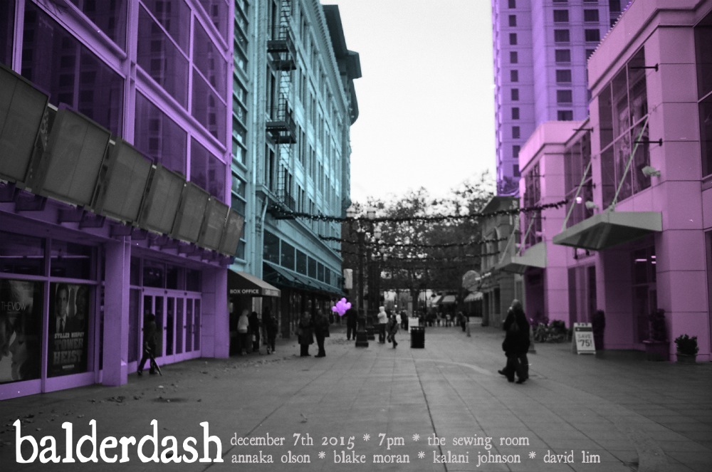
For my poster design I chose to use a photo that I took in San Jose as the background. I then edited the photo so that it was in black and white with soft candy colored buildings. I used similar colors in my t-shirt design, but instead of using a photo of San Jose I used a photo that I took of some flowers. The soft candy colors represented how our music was acoustic and light sounding, and the antique looking font on both designs helped show how vintage indie bands inspired our song. In both my t-shirt and poster I chose to keep the same color scheme and an old antique looking font. By using these same elements I was able to keep both designs different, but still visually connected.
My group was not influenced by a specific type of genre or artist, but by a combination of them. We wrote the lyrics by taking all of the group members ideas and blending them together so that everyone had some input on the final product. I think our final song was a good representation of all of our ideas.
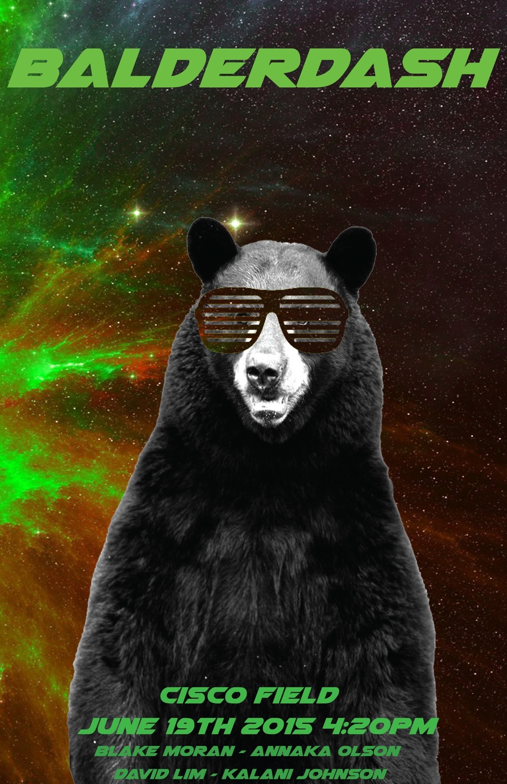
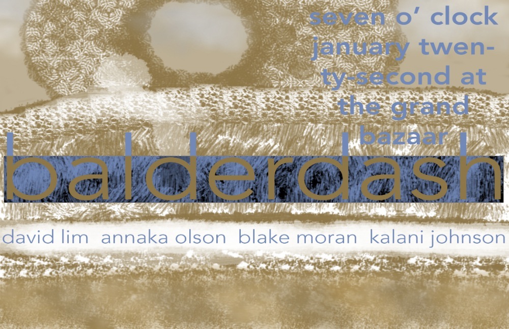
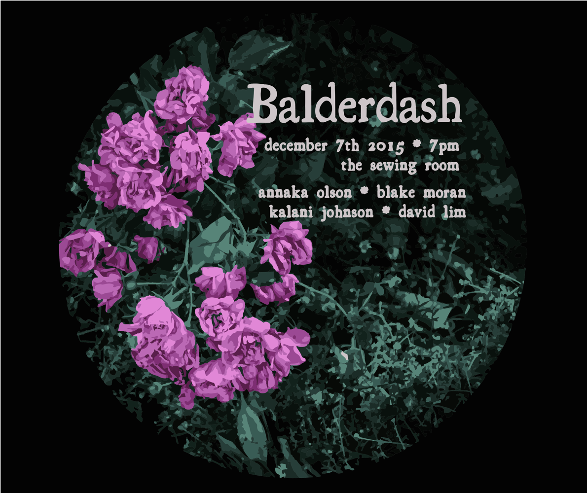
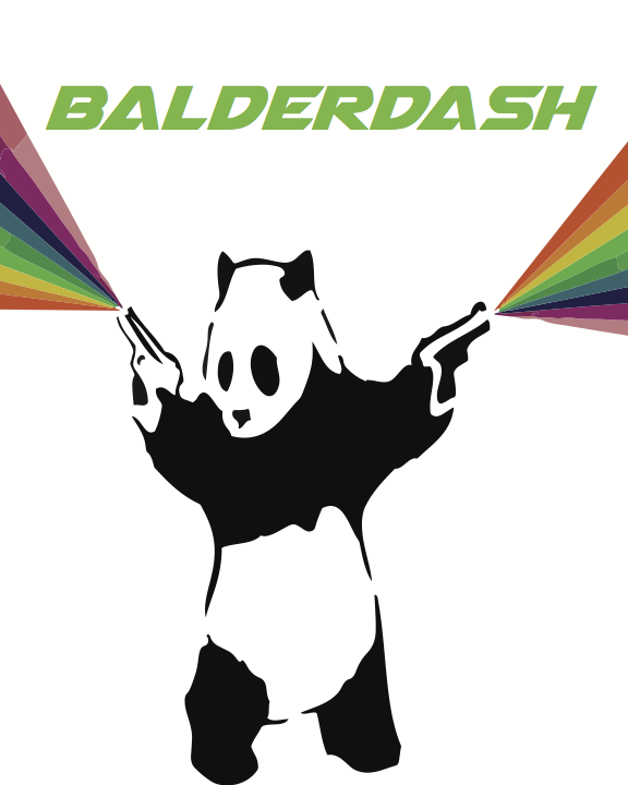
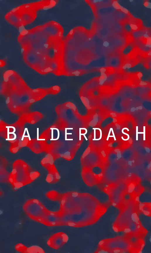
Our group name, Balderdash, means to not make sense, random or obscure. When I created my t-shirt and poster that gave me very broad guidelines. I tried to think of the most random animals doing the most random things and that is what ultimately led to the finish product. I chose the neon green for the font and color scheme because I felt neon green is one of the most obscure color there is. Ultimately I wanted the viewer to look at my design and be confused, that was really the effect I wanted to capture.
For our music video project, we were formed into groups to create our song and music video. We had to create a band name in order to represent our group, and my group’s was named Balderdash. This means “anything” or “random” in German, and represented out indie rock vibe fairly well. For my poster, I created a landscape with brushes, and let the music guide me. I limited myself only to two colors, which were chosen specifically to give a sepia tone with earthy undertones. It was supposed to be mystical in a sense, however more so unreachable and magical, only able to exist as an idea. This was to reflect our song we created, which also has a similar atmosphere. For my t-shirt, I decided to go with something more like a lava lamp and retro in a sense. The lava lamp was supposed to represent how the globs float up and down in a never ending stream, until it eventually breaks from all of the heat and overuse. This is a parallel to love and devotion for an individual, which is the focus of our music.
Our song is a soft pop Style. Since I am a film student I didn’t personally help with making the original track instead helped by giving my input on what to add or take out once the original was up.
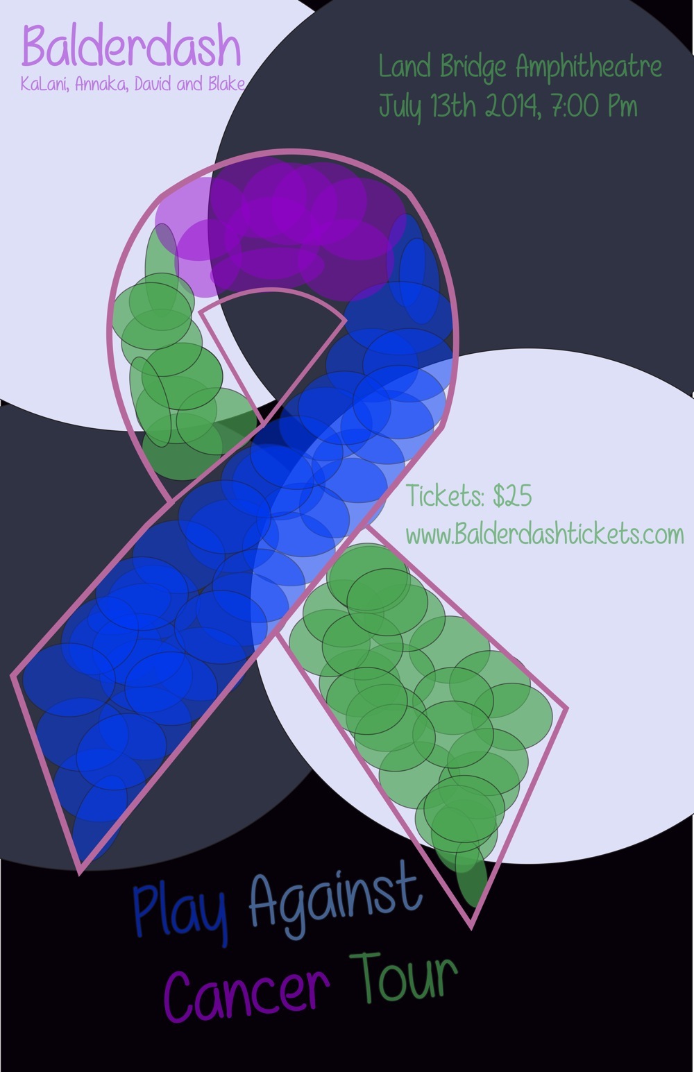
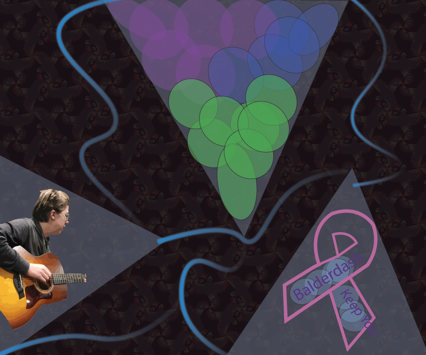
I chose a lot of circles in my poster and T-shirt because our song is definitely on the softer side. I chose the font “MF Really Awesome” because it has a nice softer flow yet is easily readable. As for the cancer theme in our last unit I talked about an old coach I had who passed away from stage four pancreatic cancer and I wanted to bring some kind of awareness into this even though it’s not much. I also made the ribbon pink because when I was younger my mom made it through breast cancer. As for the colors inside the ribbon I started off with just playing with greens and blues circles created in Illustrator and slowly evolved into more.
AlexanderPArleneODanielaC
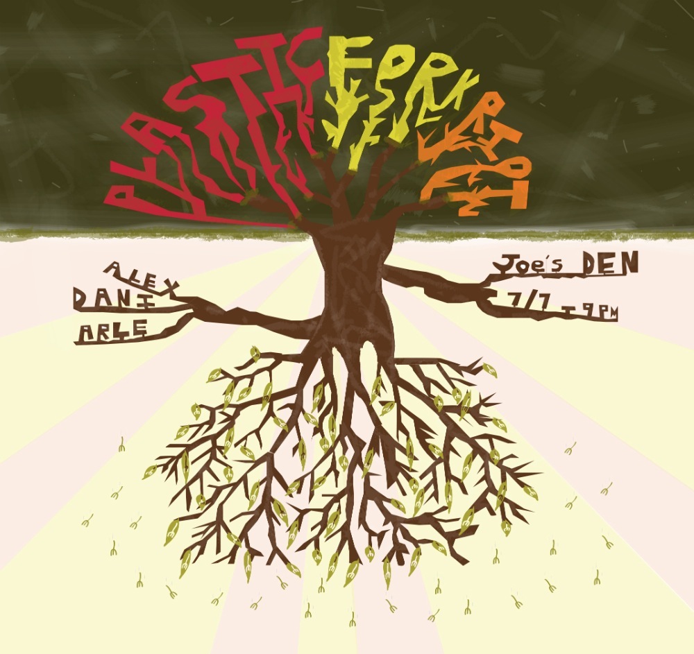
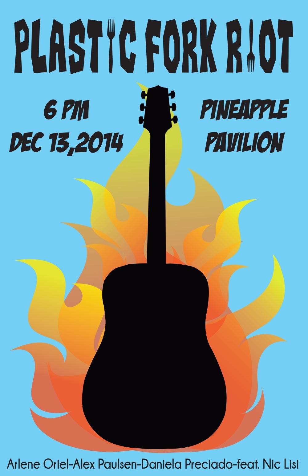
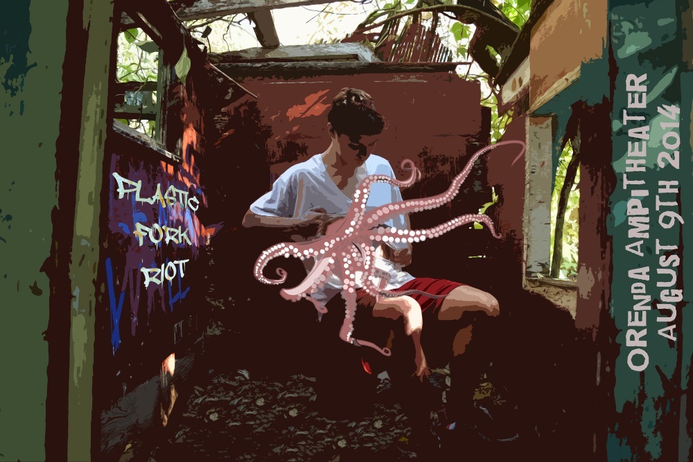
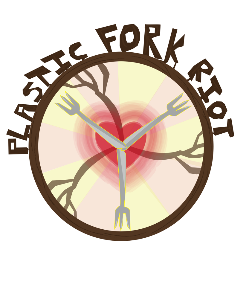
Our band, Plastic Fork Riot, has a music style similar to folk music. The tempo is slow and the only instruments are vocals and an acoustic guitar. Jack Johnson was a major influence for our music, he emits the same style of soothing, calm music that we wanted to achieve.
In my poster and t-shirt art, I picked earthy tones to emphasize the cozy feeling of our music. I used darker shades as well; extremely bright colors don’t go hand in hand with Plastic Fork Riot’s slow pacing. I didn’t use a defined font, instead I created my letters using the pen tool. My designs were not striking just as the music is not too intense. I wanted to create something soft, clean, and calm.
The type of music that influenced our song was indie rock. My group and I were inspired by artists such as Jack Johnson and John Mayer. We really enjoyed the live, acoustic quality of their music, and we felt that that was the kind of sound we wanted our own song to have.
My music video and poster are unified by the same color scheme of red, orange, yellow, and blue, which are all colors that are present in flames. I also used a font that I felt visually connected to the music, as it was a clean font but not perfect. Additionally, I replaced the I’s in the band name with silhouettes of plastic forks, for an even better connection between the font and the band name. Both my music video poster and t-shirt design show contrast. On my poster, there is a silhouette of an acoustic guitar being engulfed by flames. The light blue background gives the poster a nice, balanced touch. In my t-shirt design, there is a nature trail in the background, and on top of that there is an illustration of a flame, creating a contrast between tranquility and imminent danger. One minute, it can be as peaceful as a nice stroll through nature, then it can be as violent as a raging fire the next. Both my t-shirt design and my poster touch on what my group’s song and music video center around: the shortness and uncertainty of life. We never really know what to expect, and whatever happens, we just have to keep strong and fight on, even when the odds aren’t in our favor.
Plastic Fork Riot is a modern folk band originally influenced by a variety of artists such as; The Front Bottoms, Jack Johnson, Defiance Ohio and more.
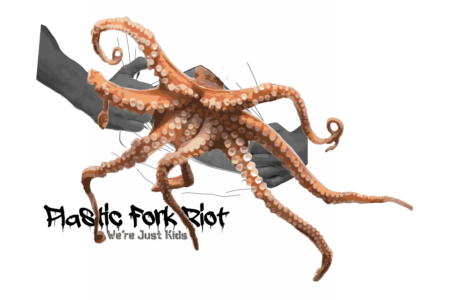
For my bands poster I decided to convey the outbreak of desires and innermost yearnings we channel into our music. The Octopus is a metaphor, for the creature inside us all that is wild, free, and closer to its origins of existence. Our newest song expresses our desire to let that portion of our selves escape from the confines of our hearts, and not let growing up in this crumbling society take it away. The room is representative of a safe haven, where the teenaged boy can go to let it out, I made the font resemble graffiti to display our frustration with the dire state this world is in, and our desperation for our voices to be heard.
CarterLNiamhMRocioRSofiaB
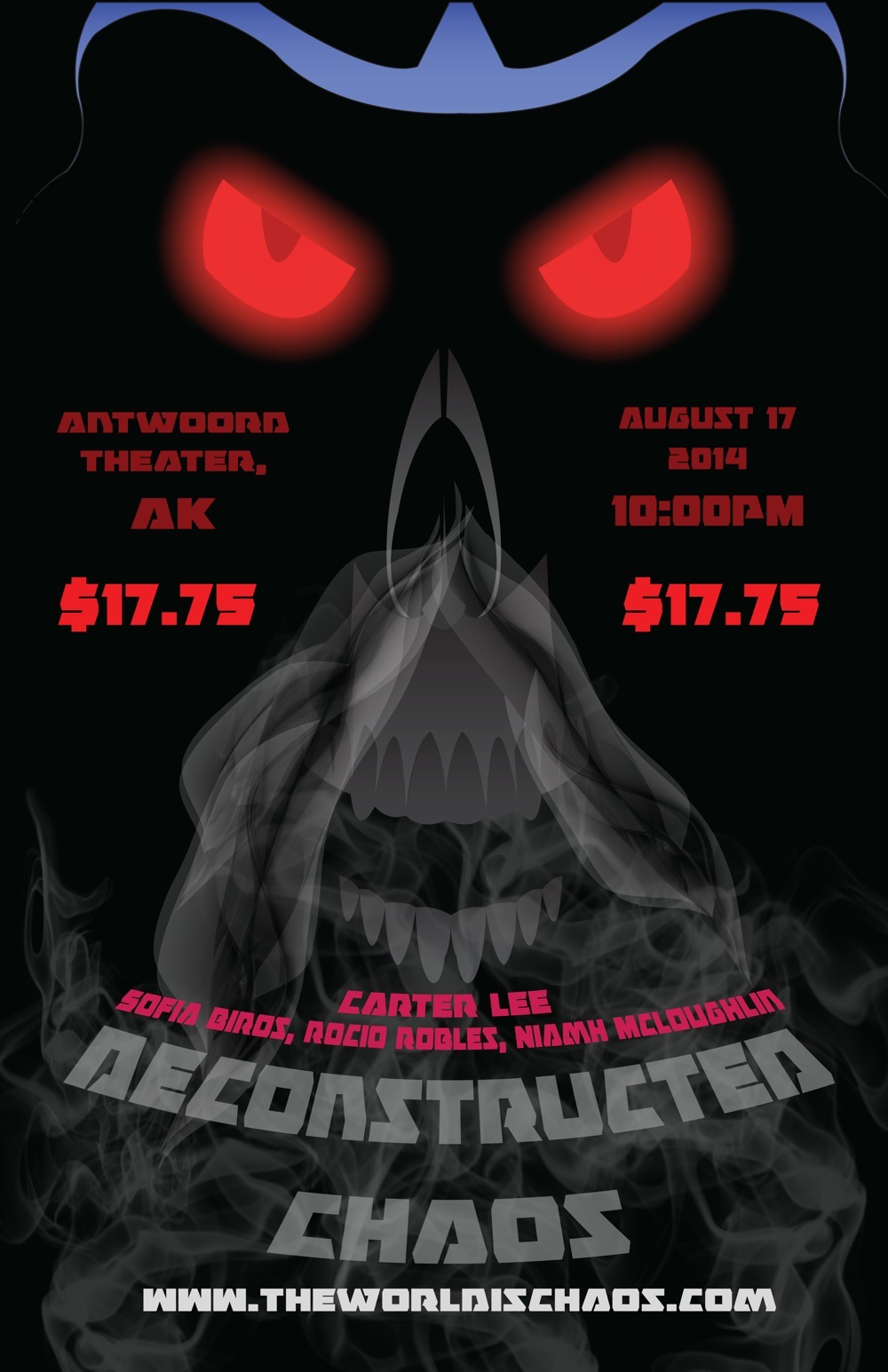
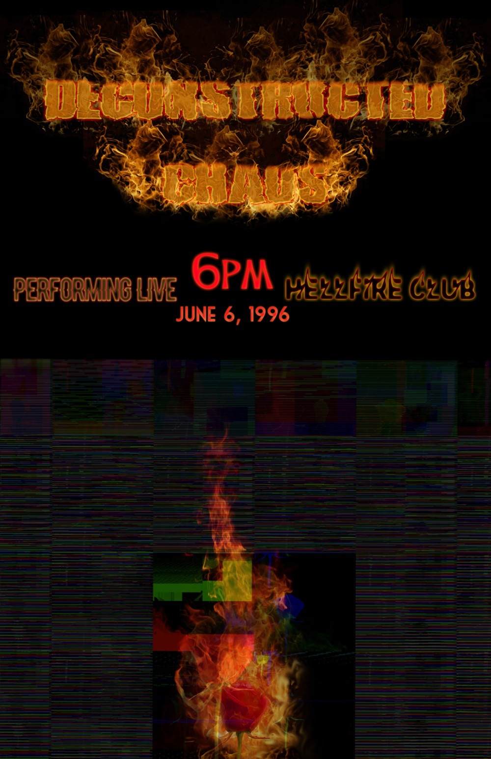
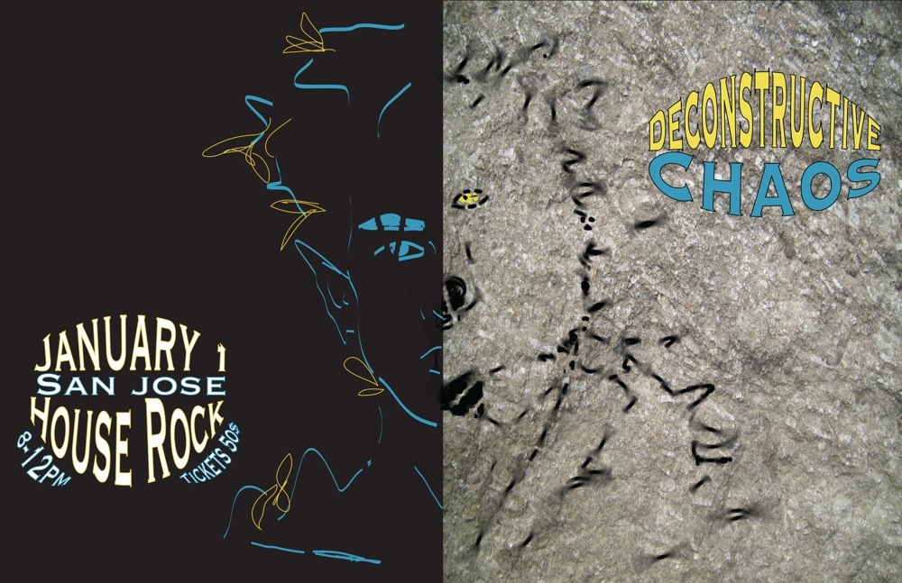
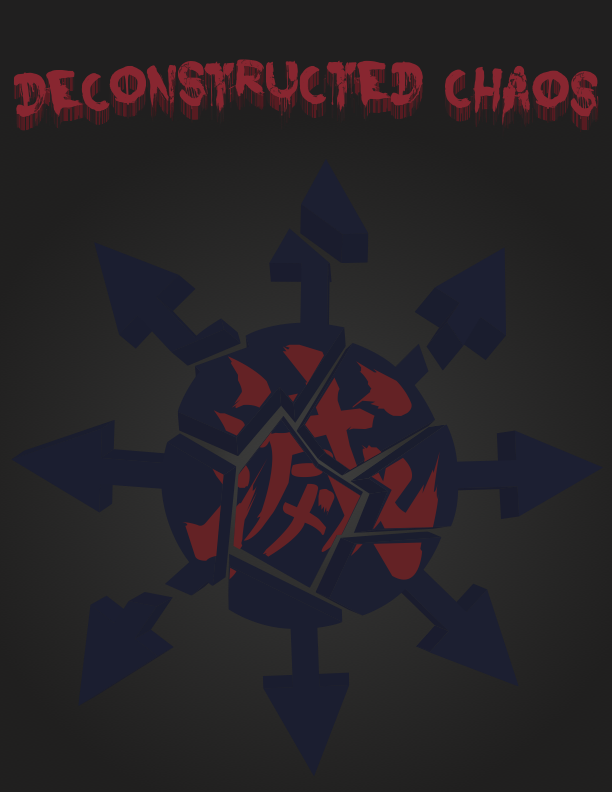
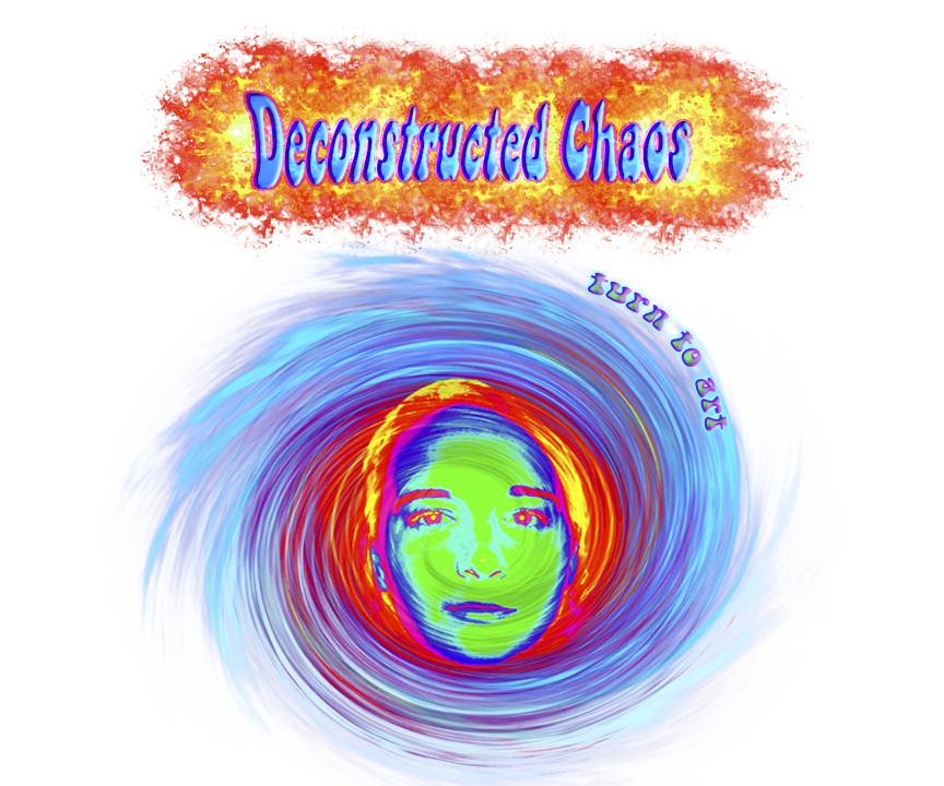
The type of music that inspired Deconstructed Chaos was electronic, the music ended up being more country in the official Music Video due to lack of musical talent, nevertheless I still tried to do an electronic/punk kind of poster and T Shirt, bands like Daft Punk and Die Antwoord inspired my work and art style for the poster, representing a very experimental and tech style of art.
The Poster and T Shirt represent the punk kind of music style by having tech like text and dark and bold colors, with smoke and a skull representing a dark chaotic feeling with the universal symbol for chaos and the Japanese symbol for destruction shattering representing the band name Deconstructed Chaos.
Deconstructed Chaos’s goal from the beginning was to create something chaotic and intense. We were originally going in the direction of electronic and “zef”. We were especially influenced by the South African Rap group, Die Antwoord, who were the masterminds of zef culture. Zef is a counter-cultural movement that is the ultimate South African style.
I chose to use very bright colors on my t-shirt and poster design because I wanted to make sure it was intense. I also knew I wanted my main design aspect as fire since our music video includes a lot of fire effects and burning flowers. The fire is supposed to represent the craziness and intensity that goes behind art because that is what our song, “Turn to Art,” is about.
Band members:Sofia Brios, Niamh McLoughlin, Carter Lee. For this project I was put into the test. When I worked with my band members we had to create a tasty song that would go with a music video. I was unsure what type of music I wanted to contribute to the music portion of this unit. I listened to some of my favorite music for inspiration, and the top one’s that peaked my interest were “Pumped up kicks” by Foster the People, “Iron” by Woodkid, and one of my group members, Niamh, showed me this group called Die Antwoord. And after watching a music video called “ Ugly Boy” , I knew we needed to create a song similar to this band. Although we went through some issues in creating a melody that can fit with the song that we have written, the song became more of an indie folk song. Yet we still kept the idea of a creative, artistic music video for our song.
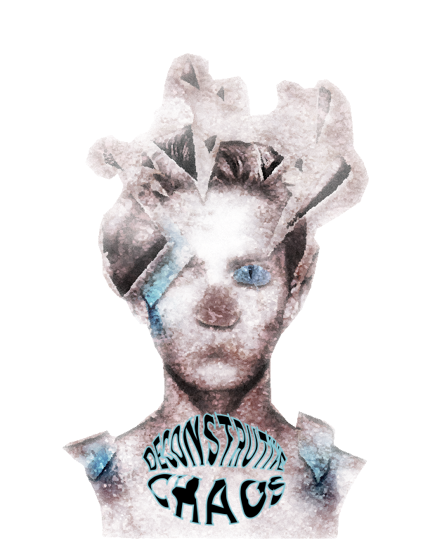
I was assigned to create a concert poster, and a t-shirt for this part of the unit. Since my band is called Deconstructive Chaos I had this idea where I would distort a figure into many pieces, and create a wild image for the t-shirt that would attract the peoples attention. I used some light blues to emphasize the structure of the image, and I really went in and distorted the image that used to be only a photo of a man. I had a hard time deciding what I truly wanted for my concert poster. I wanted to fit the theme of chaos, but connected to my t-shirt design. I decided to use the same idea of a face, but instead I use a wolf’s face, and man’s face for this portion. I connected the two faces together and distorted them in two different ways, one that is all blurred and scribbled, the other is distorted, and out of balance. I used the similar colors of blue, and white to connect my poster with the t-shirt, along with the concept of distortion into both my works of art.
Originally, our band planned on creating a techno/hip hop style song, something that felt very surreal and was interesting to the listener. We were influenced by “Zeff,” a South African counterculture movement that encompasses the band “Die Antwoord,” along with Chvrches and The XX. However, as the project progressed, we found it very difficult to produce this style of music. We took a complete 180 and turned to a softer sound. Our final product is a melodic, singer/songwriter style song, with lots of guitar and it focuses on the vocals.
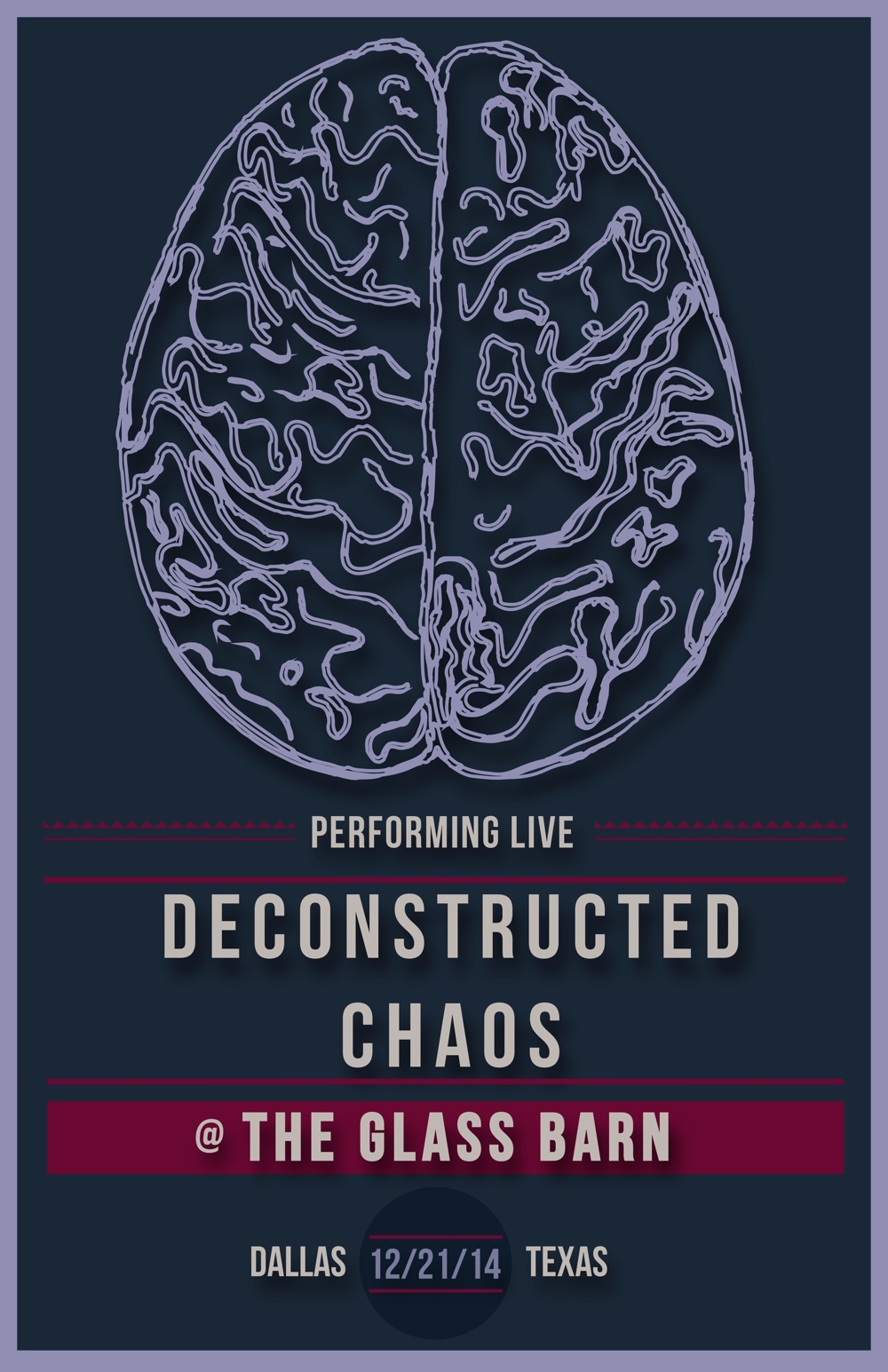
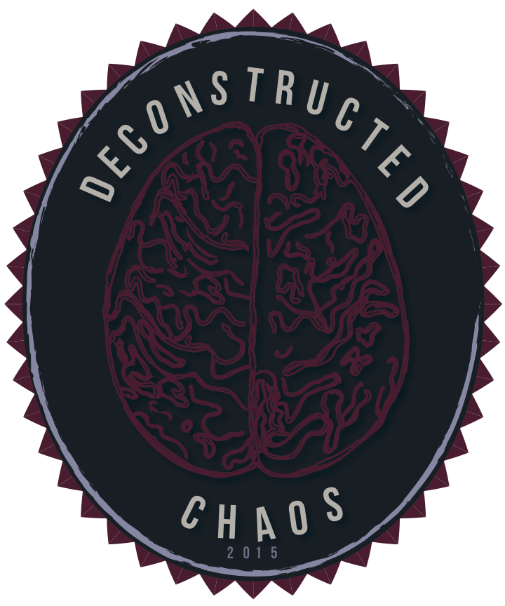
My poster and t-shirt still represent the original song ideas we brainstormed. I wanted to work with dark, bold colors, along with angles and shadows. However, because the song became more mellow than planned, my design pieces became more calm and focused. The central focus of both my poster and my t-shirt is a sketched brain. This outline represents the mind; sometimes we have our thoughts together and organized, other times, our minds are inattentive and scattered. This is based on our band name-- Deconstructed Chaos. I believe that the brain is extremely chaotic, however, chaos can be broken down (deconstructed) in order to gather your thoughts and maintain homeostasis. I chose a block, sans serif font to convey my idea of mental balance. This font pulls everything back together-- much like what we have to do when our minds are all over the place. Both my poster and my t-shirt use the same colors (navy, maroon/magenta, and lilac), fonts and images, in addition to the shared layout and design additions (such as drop shadows). These design components match my website as well, signalling to the viewer the connection of all of my materials.
EleanorTNicolasLRachelM RicardoJ
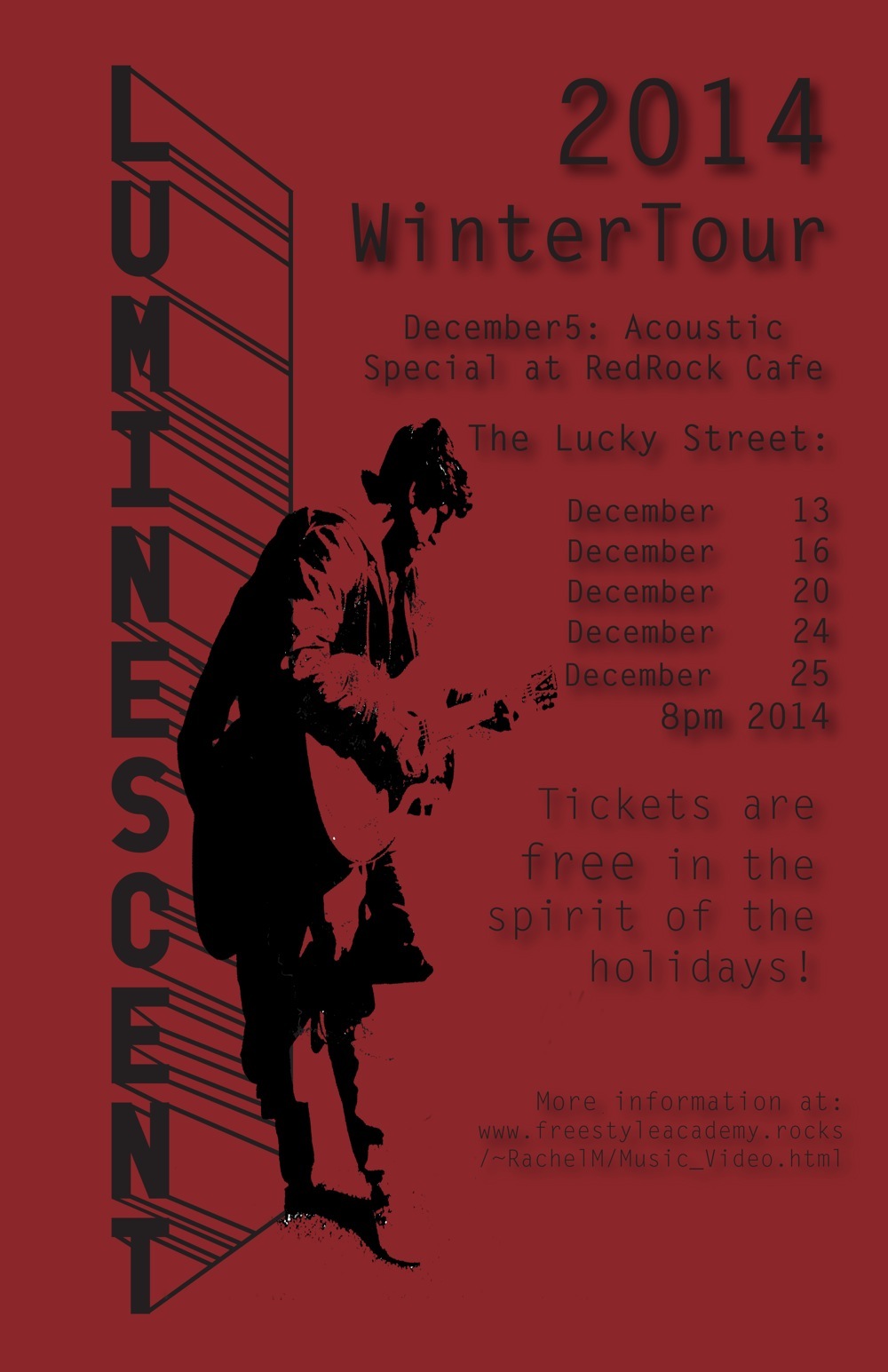
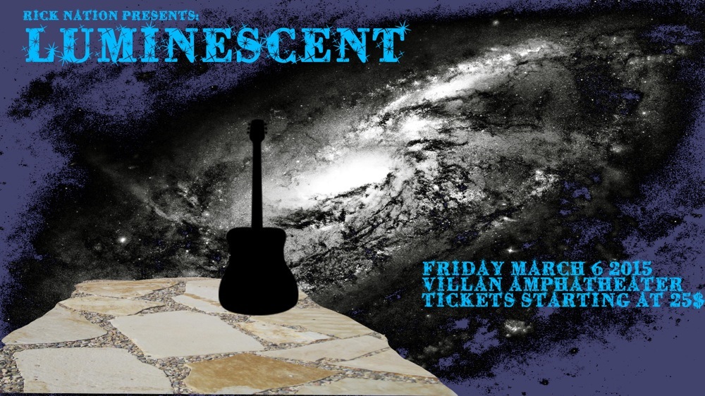
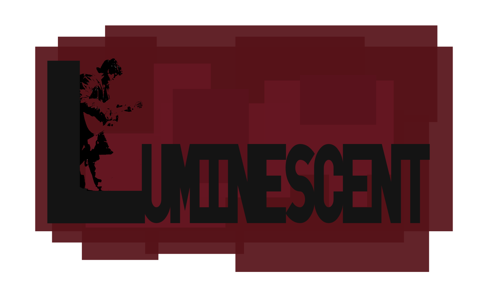
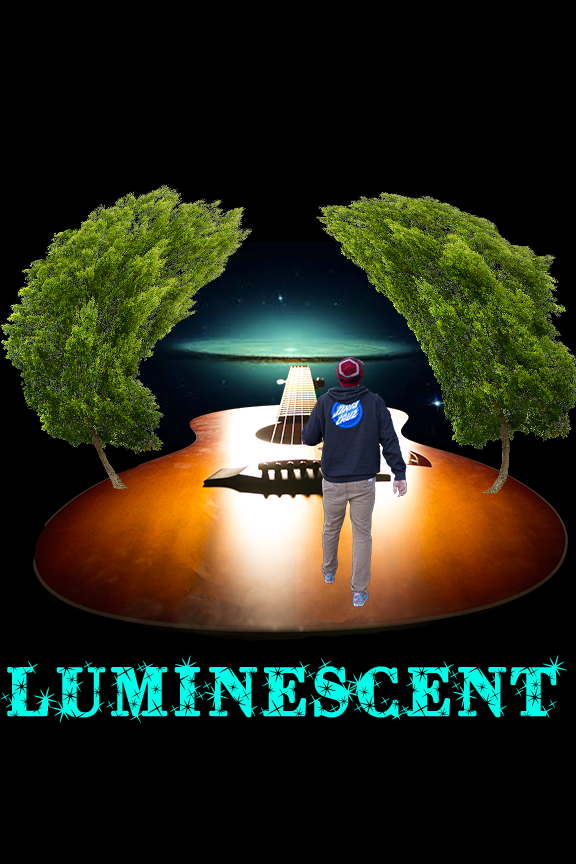
Since Nic is a talented guitarist, we decided to create a love song that would have a detailed acoustic melody that could have extra instruments added in easily. My group was inspired by male artists whose songs focus on lyrics rather than instruments. This included John Mayer, Jack Johnson, and Ed Sheeran. I wanted to showcase the mobility that a guitar provides, because it can easily be played and carried anywhere. Luminsecent’s music is strong enough on its own that Nic does not need a stage to perform on.
Without the need for a stage to perform on, Luminescent often plays in small cafes, fields, or back alleyways. I chose different hues of red to create a schoolyard brickwall image and thick black letters for clarity. I also thought that using the band name Luminescent as the wall he leans against would draw focus to to the subject and title, which are the most important pieces of information. None of the artists that we were inspired by are very flashy, so I wanted to create a poster and tshirt that were simple but had interesting details.
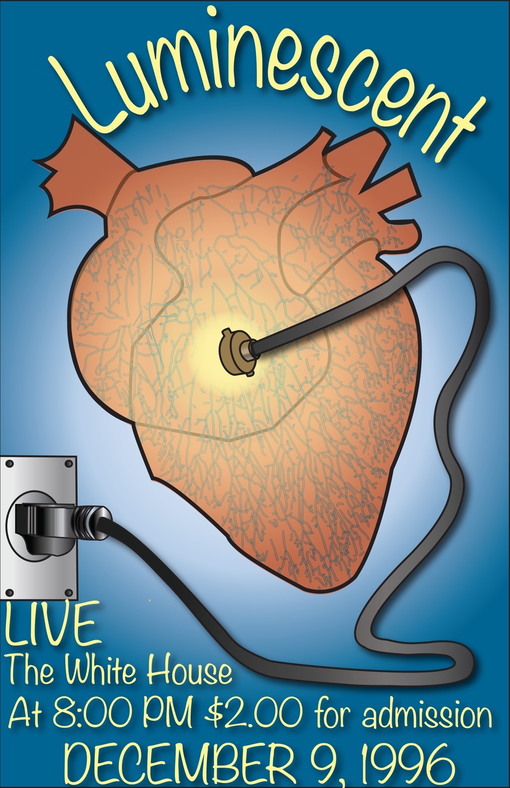
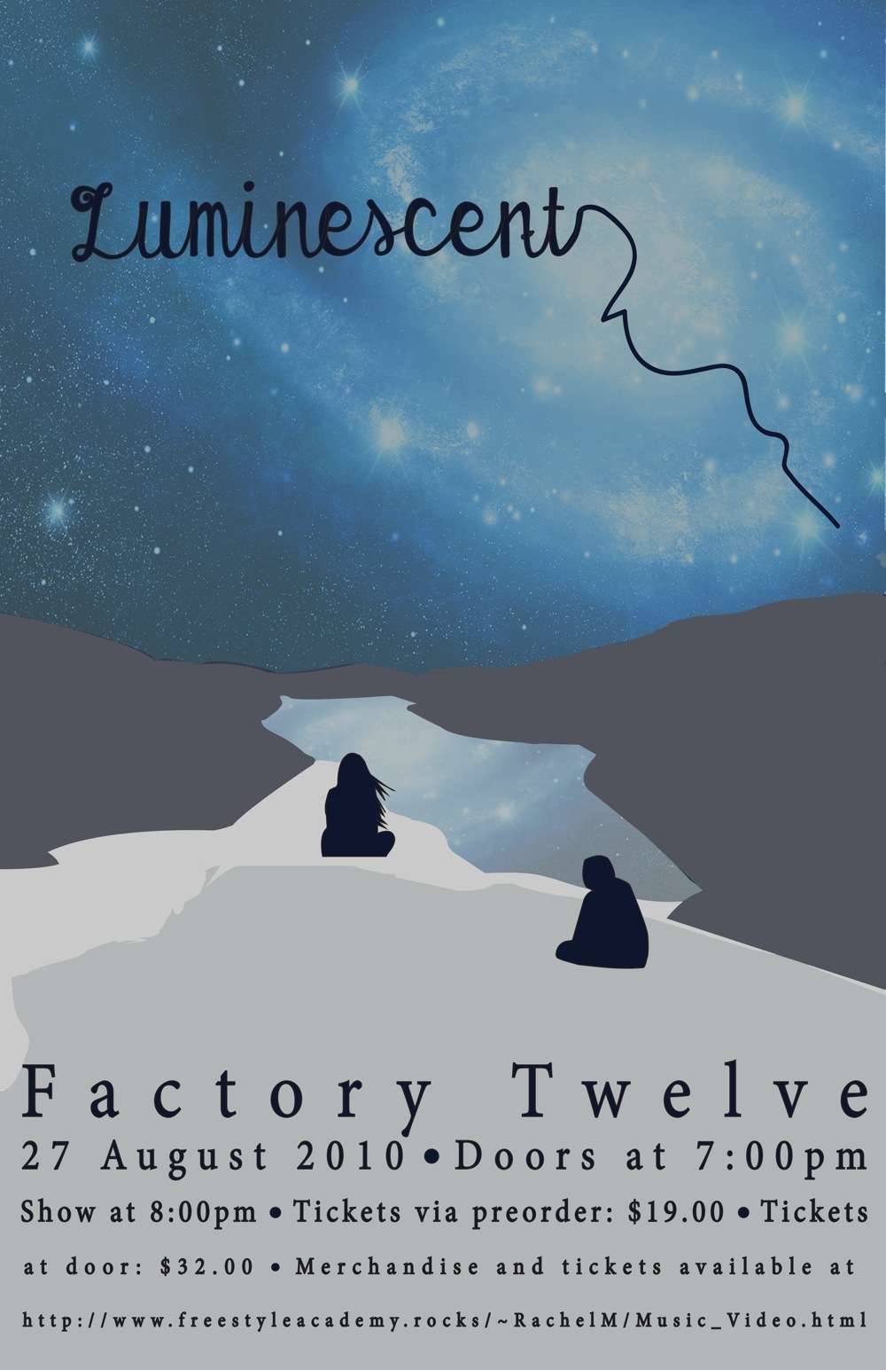
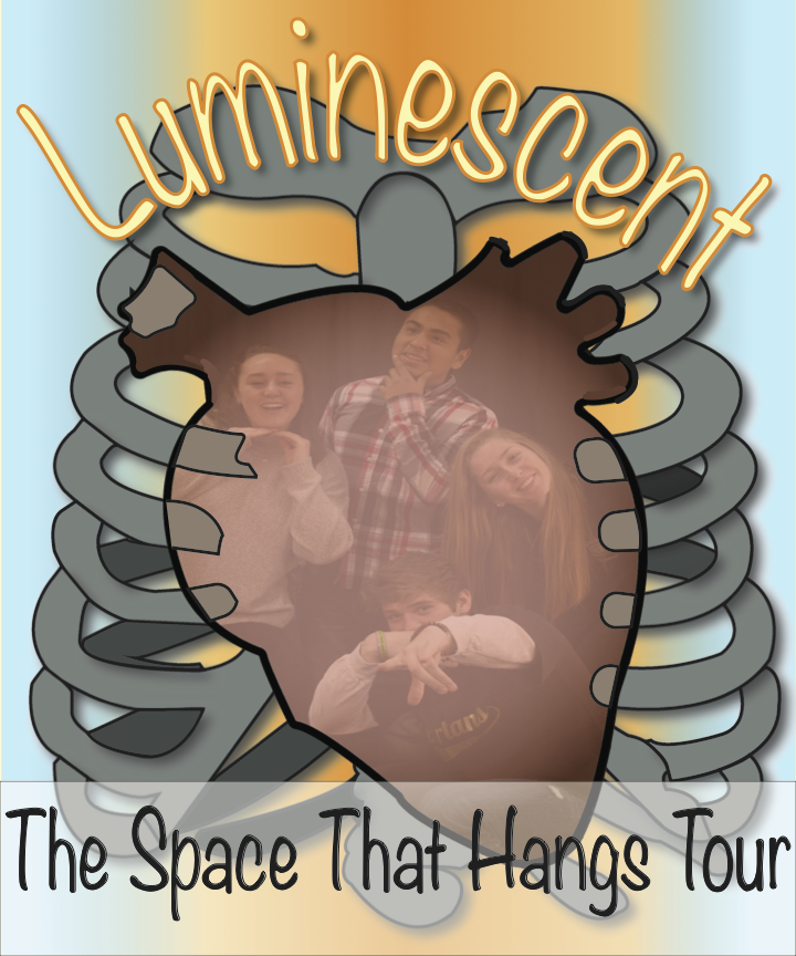
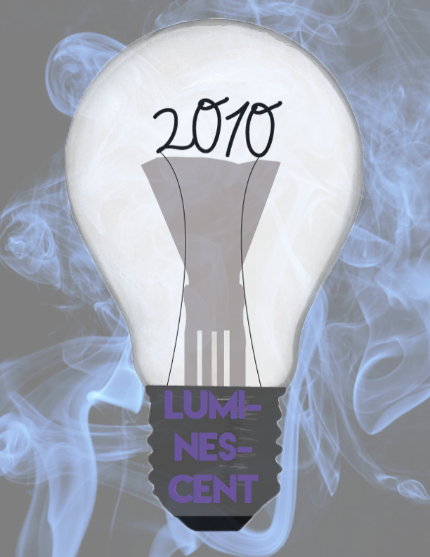
My Band is named “Luminescent.” We wrote music inspired by Ed Sheeran and Jack Johnson. Our music was supposed to bring a light, uplifting feeling using airy and spacial chords in ascending tonal progression. This music would best be depicted by glowing pastels, and a light soft yellow.
The poster displays a heart plugged into a wall socket, which causes it to glow like a lamp. The bright, yet soft colors with low opacities allow for a glowing feeling to go along with our group’s name, "Luminescent." The t-shirt displays something similar but slightly different. The design element of the heart has been tweaked slightly to incorporate a picture of our group inside a rib cage. A similar color scheme gives the same glowing feeling, reflecting the light and uplifting music of our song. A heart was chosen as a design element to reflect the poppy folk genre that our music entails. Hearts are traditionally a symbol of where human’s carry emotion, and much emotion is found in this music. Fonts for both poster and t-shirt were similar. Both fonts are in a cursive style to mimic the light and fluid music.
Our band’s music style could be described as light pop or gentle indie music. What I particularly like about our song is that it doesn’t exactly fit one genre of music, which is also representational of our group’s different aesthetics and musical preferences. I would say that our music was inspired by artists such as The Mowgli’s, John Mayer, and Ed Sheeran.
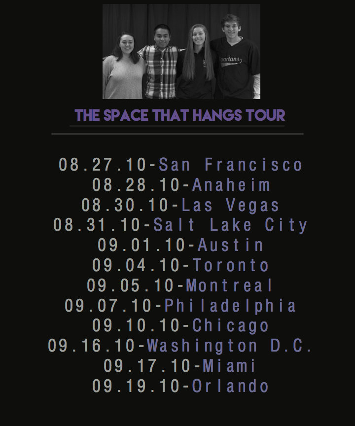
My poster represents our song entitled, “The Space that Hangs” by having a hanging line off my title. Additionally, I wanted to incorporate the theme of our band, which is luminescence, or a strong emission of light. This is evident by the galaxy in the sky. Also, the song is about two people who have since drifted apart, but will always be connected in some way, which is clear by the two people in my poster; also taking into account the significant gap of space in between the two individuals. The bottom text is fictional, but is representational of our band’s first fictitious concert. My t-shirt is related to my poster by the common theme of luminescence, which is evident through the light bulb. The blue smoke in the background visually unites the blue luminescent colors in both my poster and t-shirt.
My music video was influenced by Ed Sheeran. Ed Sheeran produces soft and love music. As a group we all decided to take that approach from the beginning. The song itself turned out to be slower than we first had planned for it to be but video wise the shots came out just as we wanted them too.
My poster and shirt both have a galaxy on them because the song talks about how how the guy doesn't know if he’s wasting time and is confused of what to do, to me the galaxy best represented that. I chose to use a teal, black and orange color because it gives that sad lonely mood. To show loneliness I also tried to recreate a forest like atmosphere in the T-Shirt design using the guitar as the “ground” and the trees just coming around Nic. The reason why I chose the font I did was because it has a cold look specially with the sparks on them and the teal color. Nic was using a beanie throughout the music video so I wanted to show the temperature with the font and color I chose
ElisabethTEthanLJamesAIsabellaK
My music genre is Indie/Alternative Folk. I chose this genre of music because it's the easiest for me to write, and it's my favorite musical style. I was inspired by bands like City and Colour, Iron and Wine, and Matt Corby.
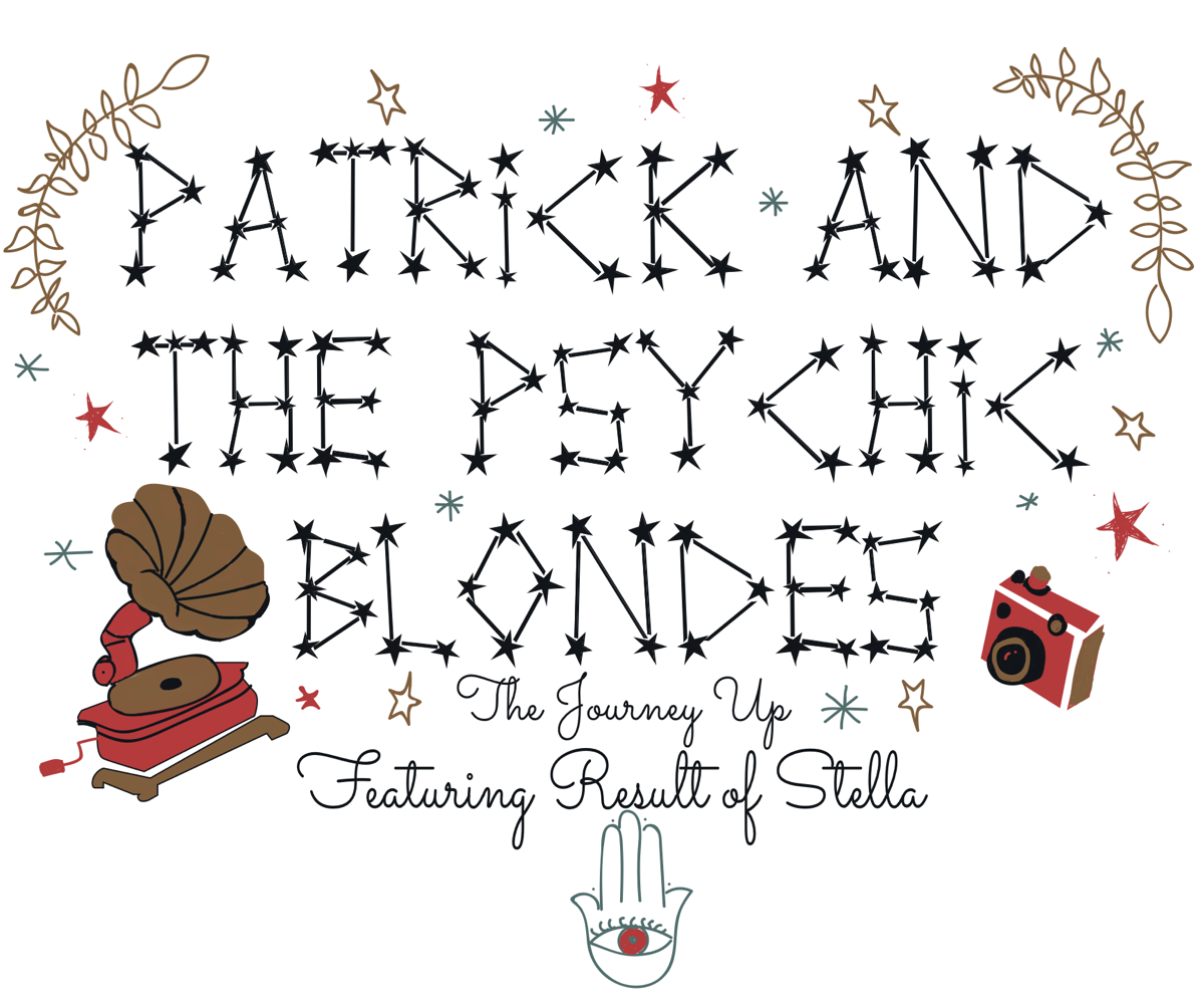
My poster and T-Shirt designs use sunset and jewel tones, but err on the muted side, as my music is upbeat but has a softer feeling. I incorporated a lot of aspects of nature (such as stars, clouds and leaves) and a rustic, vintage or hand drawn feeling, because that is the culture of the indie folk genre. I used a starry font called Milky Way, because I felt it tied into my nature based design. I also used a font called Sacramento, because the classic cursive evokes a retro feel. My colors were a combination of a dominant navy blue and a bronzy tan, with secondary accents of coral, silvery blue and lighter tan. The gramophone and film camera design elements were painted and filled photos that I created on Adobe Illustrator. I created these because I wanted my design to be centered around nature and vintage things, giving it an indie folk vibe.
The music we made had a heavy Indie influence along with a small mix of other genres. Some bands we drew inspiration from were The Black Keys, Florence and the Machine, and the Arctic Monkeys.
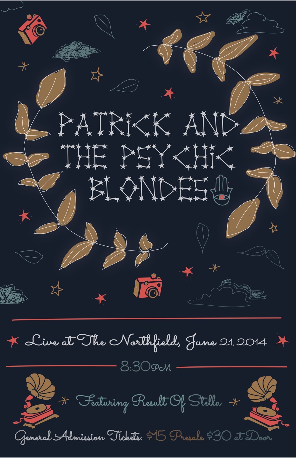
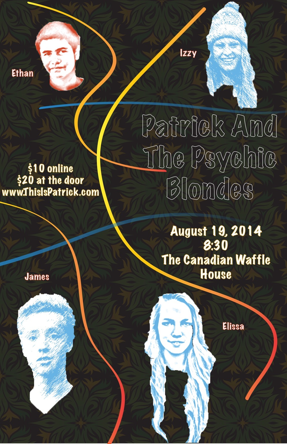
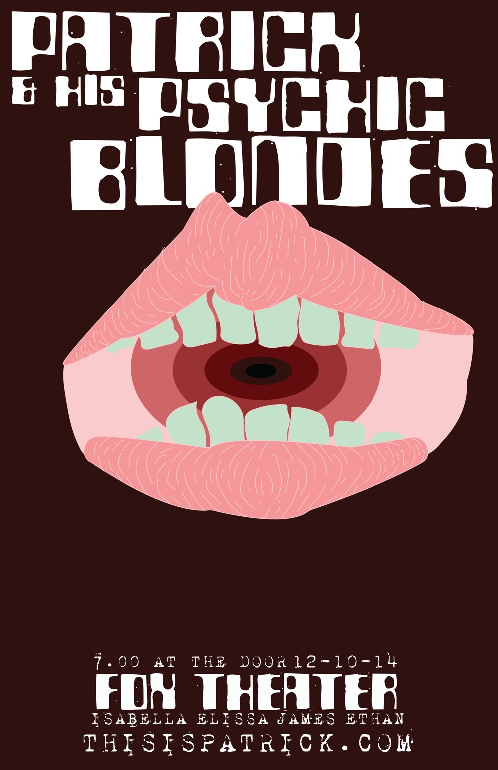
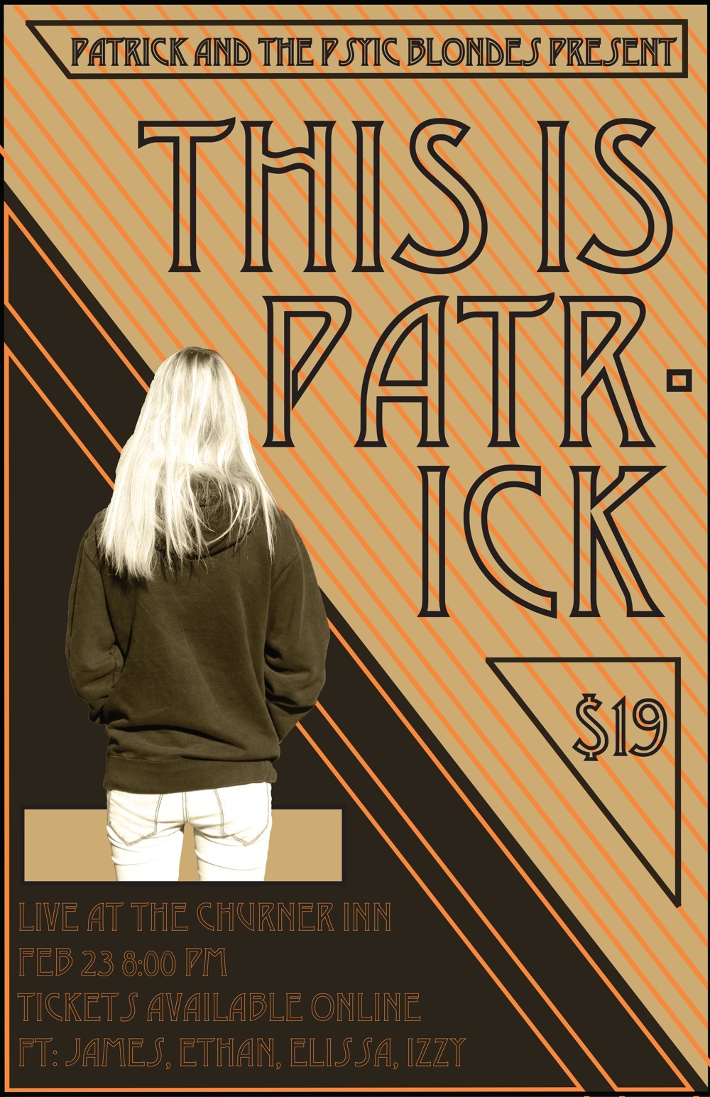
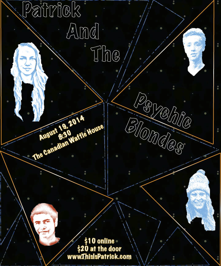
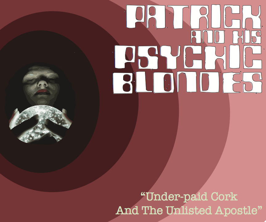
My poster and T-shirt represent the music in their relatively simple design, yet both hold hidden connections through their design. The color scheme (mostly reds, oranges, and blues) was warm vs. cool with an emphasis on having a dark background. I wanted to the fonts to not distract from the artwork, which is why I used a font with no fill for the poster and T-shirt title. In terms of design style I wanted to show two things. First was the emphasis on the groups title, Patrick and the Psychic Blondes. I wanted to let the viewer know that it was not just some random title, but something that related to my group. Since my group mates were all blonde and I was not, the title obviously represents the four of us. Second was the illusion of separation between my four group members. By isolating each person’s location at the corners of the image it would appear that we were just individuals, but by making sure that each of us was connected to the rest through color was my objective. Aside from those points, I just kept myself from crowding or over complicating the space of my two pieces.
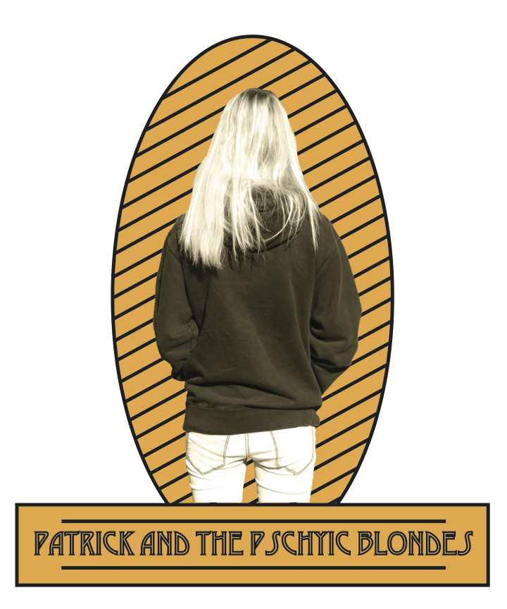
For my music video concert tee I used orange, brown and tan as my color scheme. These colors represent the style of music my group makes. Our music is very natural, there is nothing electric or exotic in our song, so I decided that there shouldn't be those aspects in my work. The name of our band is Patrick and the Psychic Blondes, so it made sense to me to have a photo of a blonde on my art. She is facing away from the camera to give the illusion that she might be watching the band play. I made sure that the tee and the poster looks similar enough so that people would realize they go together, but changed them up a bit to give each one a unique look.
My group and I were influenced by a indie folk when creating Patrick and His Psychic Blondes. We wanted a certain vibe. We imagined our song to be fast pace with piano in it. Artists from Iron and Wine to Bon Iver have shaped our vibe. Elissa Temme and Daniela Gonzalez harmonized together as they sang our song. Daniela also played piano for our group.
In both my poster and t-shirt design, I used different shades and tints of red. My poster contains a mouth with detailed line drawing in its lips and contimilery light shade of green for its teeth. Inside of the mouth different shades and tints of red circle into the center of the mouth. I used a font that would to portray our character “Patrick” in Patrick and His Psychic Blondes. In my t-shirt design I used the same color scheme. There is a graphic of a woman looking into a crystal ball. The graphics inside has the darkest values and evolves to the lightest.
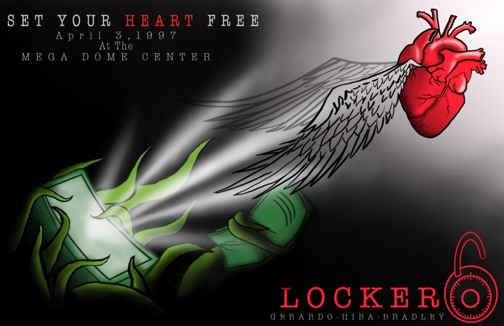
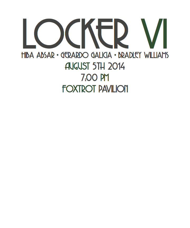
BradleyWHibaAGerardoG
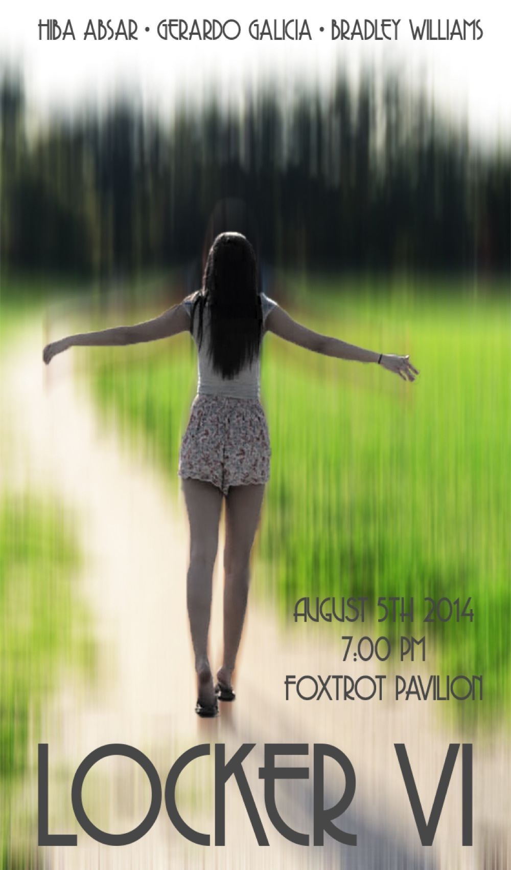
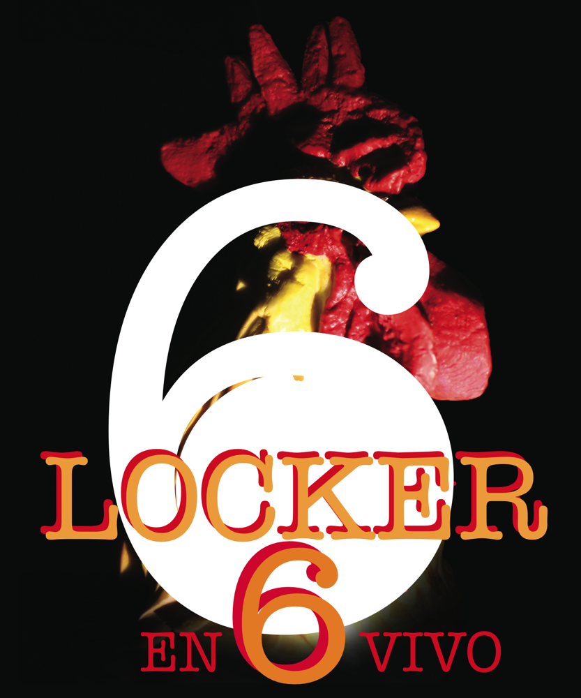
Originally I had no idea what to make for my t-shirt or my poster because we hadn’t even decided on a name. Once we choose a name I still couldn’t think of anything to sketch out. So I started by drawing a locker but I wanted something to stand out. I wanted locker 6 to stand out so I decided to redraw it completely trashed and worn out. Once I drew that I really liked it so that became my poster. For my shirt I wanted to stick with the broken locker theme so I decided to start drawing a broken locker. I wanted it to look like it was in even worse condition, so I made it completely ripped off and laying down. I drew it in the field because I didn’t like it just sitting on the ground somewhere and I just started sketching the grass.
Our music was inspired by the pop rock genre. We were influenced by the style of The Fray and OneRepublic to create a song with meaning.
The song’s main theme is loneliness. I portrayed that by altering the subject of my photograph to be black and white, which also ties in an aspect of our music video. I also blurred the background to give the effect that my subject doesn’t fit in. I kept my font simple yet bold like our music. The poster was made on Photoshop CC and the t-shirt was created on Illustrator CC.
From the start we all agreed that the song should be uplifting and poppy while still maintaining a deeper message underneath. After some debating we finally came to the decision to go with Indie rock as the style for our music video project. When looking for inspiration we looked at a couple of different bands, but the main two that had the biggest influence on our song we're Imagine Dragons and Echosmith.
When it came time to create both the music video poster and t-shirt I had a hard time trying to make them both similar. As you can see the t-shirt design is much more different than the poster. When the time to work on the shirt came I thought it would be a fun idea to create a design that was more location based instead of music genre based, and although the poster has a different look from the t-shirt I still kept some things the same, such as text font. Overall I think both my poster and t-shirt came out looking great and I had a great time working on this project!
AlexanderHAndreCJodiDLaurelO
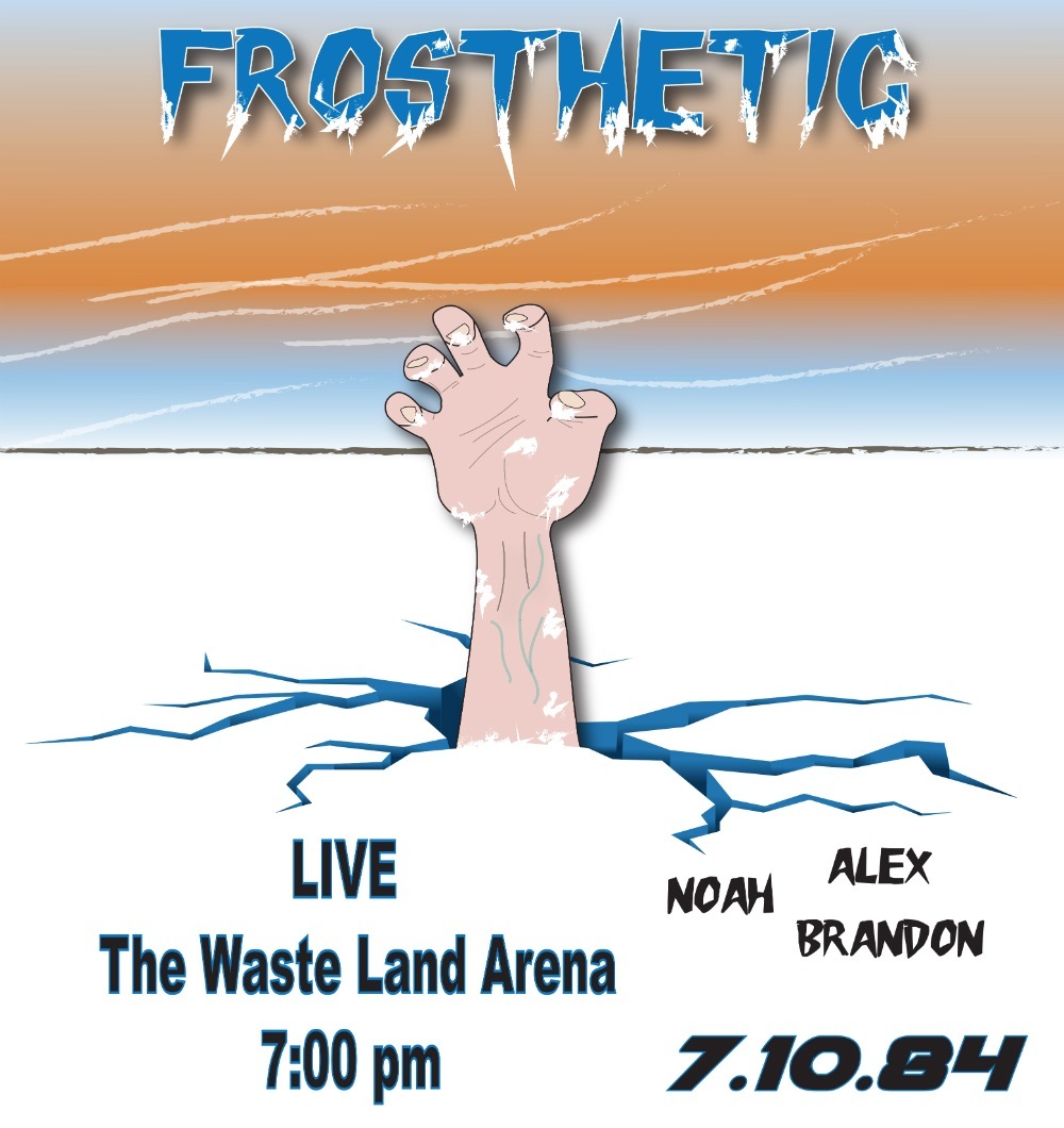
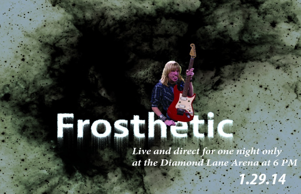
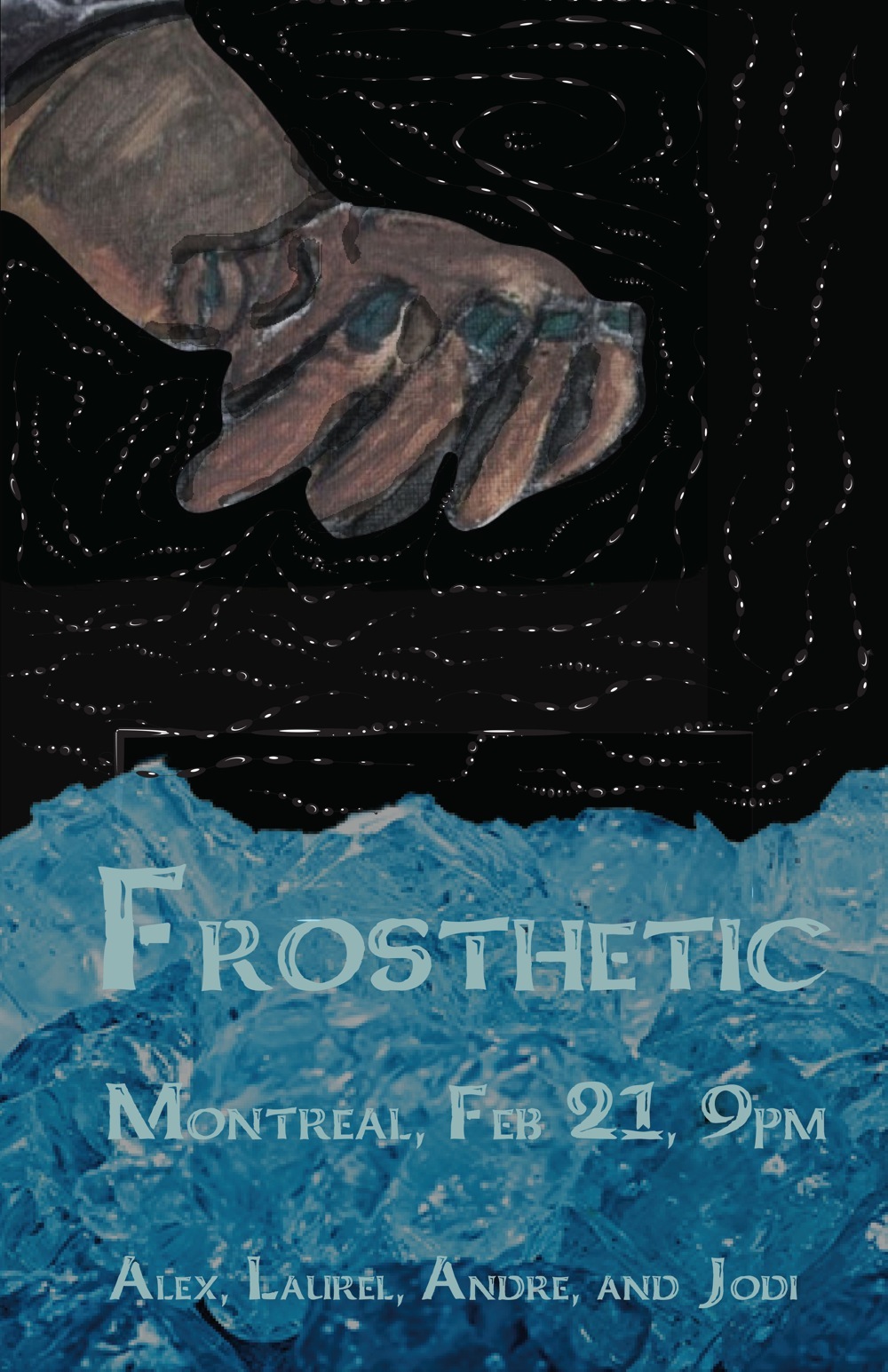
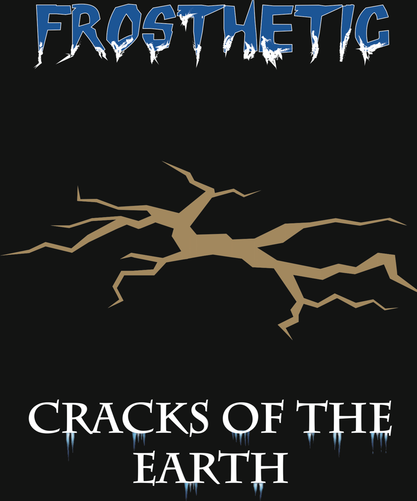
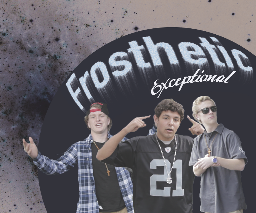
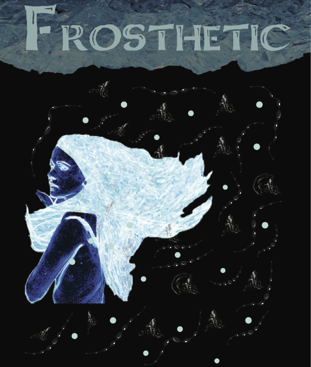
The music video unit was very interesting and difficult. I chose the band name Frosthetic so I made my band poster and shirt have ice and snow in it to show frost and an arm to show prosthetic even though it wasn’t a prosthetic arm. For the poster, I had an arm coming out of the cracked ice with the sun going down in the background. Originally I wanted to have the arm to be a prosthetic arm, but adding all that detail would be a pain and I didn’t have all the time in the world. Creating the cracks in the ground for the poster took a long time because I had to make every part within the cracks have a gradient fill so that it’d look realistic shadow wise. I also had to go over the cracks with the pen tool and trace it as exact as possible. I didn’t create the arm from scratch so I grabbed an image of a zombie arm from google and traced over it with the pen tool which took a while. Then I wanted to make the arm more interesting so I added some frostbite to the hand with the brush tool.
As for the shirt, to be honest was rushed because during the last week, I had to go out of state for my college auditions, which I ended up doing very well on. For the shirt, I couldn’t create anything too complicated because in order to print it and put it on the actual t-shirt, you would have to cut out the individual images. I thought the cracks I created for the poster were really cool and I wanted them to be used again. For the individual little icicles on the album name text, I did in fact make from scratch by using the pencil tool and the gradient tool. The last thing I did was make the back of the t-shirt and I decided to kind of parody the style of Cheap Trick’s band name logo which I always thought was cool.
My music video group had some setbacks and issues that ultimately ended in two different projects. My particular video was a rap song with two of my friends from school. The song has a catchy chorus that was influenced by R&B singers like R. Kelly and Usher and three rap verses that we wrote on the spot, with very little time left to even shoot the video. Ultimately the song came out sounding nice and we had enough time to make a quality music video.
The poster was made before my group needed to “split up” (for lack of a better term) and it features a member of the group with his guitar, since we were going to make a rock song. The background is a mysterious and cool looking pattern that I tried to mimic in my t-shirt. My t-shirt was made after the “split” and features my last minute makeshift rap crew with the same name as the band, Frosthetic. The fonts that I chose represent both genres pretty well and the clothing that the people are wearing do as well.
Originally, our group was influenced by the Red Hot Chili Peppers, the Local Natives, and Enya, but the instrumentals didn’t go with the lyrics. We made the instrumentals before the lyrics and ended up just going with an acoustic version because we were on a major time crunch.
For the t-shirt, I wanted an aesthetic feeling to it. I copied the font, ice, and the same stroke that I used for the poster. Then, I added splotches to represent some mountain crests.When I looked at the ice, I immediately thought of somewhere in Alaska I had been to. There were mountains we hiked up, but still a huge chunk of ice dipped from the mountainside into a body of water. Then, I remembered that I made a frozen girl when we practiced doing effects in Photoshop and decided to use that. The grey mountain blotches around her weren't enough, so I added blue polka dots that were the same color of her hair. It looked too static, so I added the same stroke I had from the poster. For the poster, I wanted the strokes to be like stars. The strokes also are meant to guide your eye around the hand. I used charcoal to draw the hand and paint to shade the hand. To make the hand I combined what I learned over the summer: how to draw hands at Cornish College of the Arts and how to mix acrylic colors from the CSMA painting class. I made it in the winter in preparation to make my college portfolio.
The type of music my group displayed was very acoustic sounding with a guitar and tambourine. We were inspired by the band Family of the Year. Our guitar was our live instrument played by Annaka Olsen, and Jodi DeMassa and I created the tambourine track. The theme we tried to keep throughout our lyrics was the difference between what a teenager wants for themselves compared to what the parents want for them.
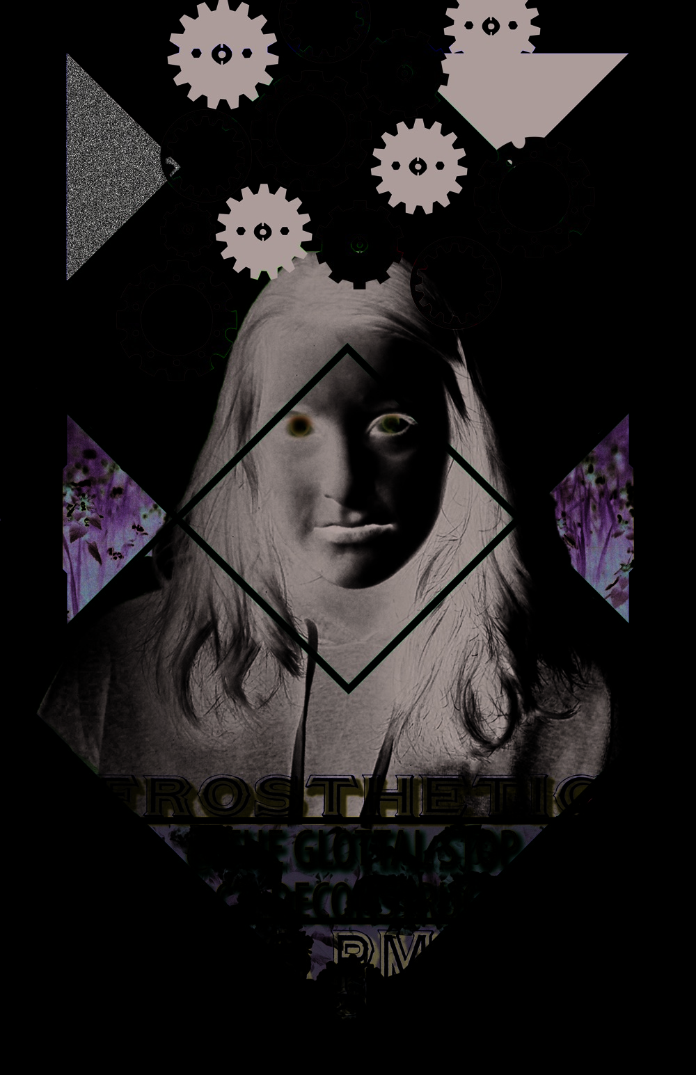
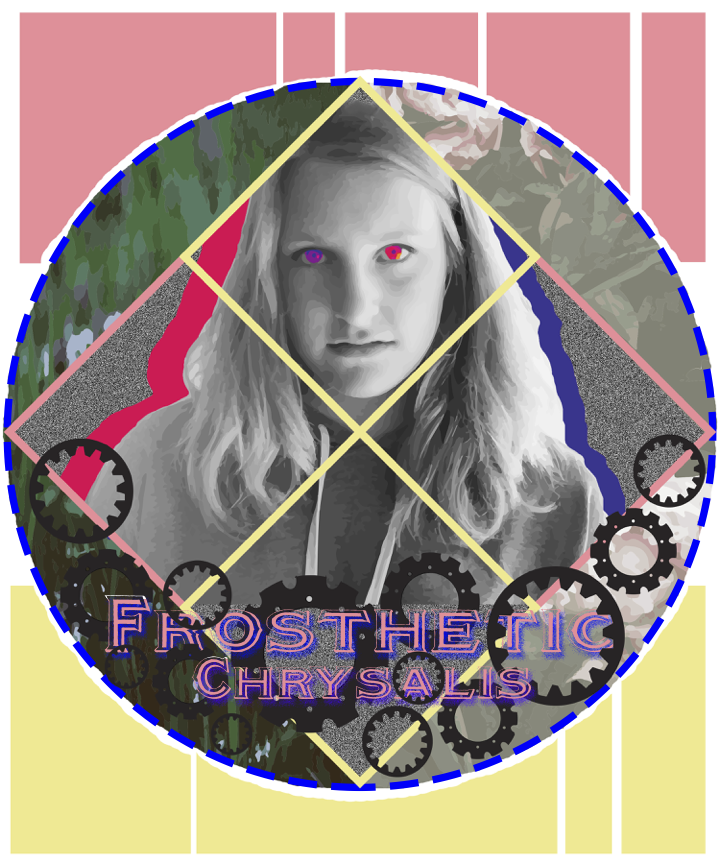
For my design project, I wanted to create a visually appealing piece that was natural in design with the geometric shapes yet contained small details for example the psychedelic eyes, gears, and static noise. I think those are all very relevant in a teenagers life because the shapes are where the child is confined to, yet the noise and psychedelic elements are the childs creativity. The gears represent how life has to go on and keep moving no matter what. My color scheme was royal blue, pink and yellow because they are shades of the primary colors, resembling the traditional way, yet they are slightly off to show a child is just shifting from tradition not throwing it away. Finally, the font I used was very bold and unique just like the girl we were trying to portray.
AndieBCayleyHThomasW
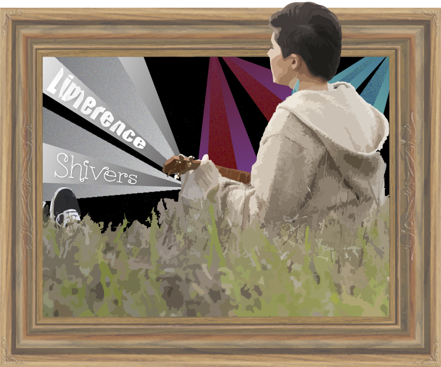
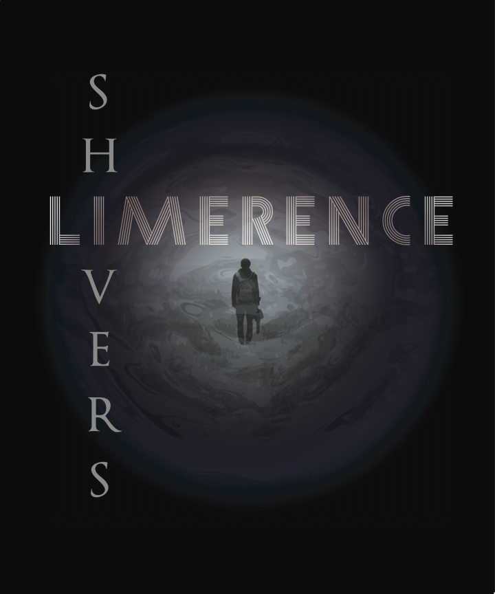
Our song, titled Shivers, is an acoustic song in the alternative genre. It was inspired by artists such as The Front Bottoms, Harlem Shakes, Jukebox the Ghost, Lorde, Twenty One Pilots, Panic! At the Disco, Saint Motel, and more. It has some darker themes and lyrics, whose discord you can hear through the use of chords like E7 and Dsus4 in the middle of other major and minor chords.
My concert poster is designed to draw the eye to its center, where the colors overlap and make the head pop out from the background. The white lines are given color when they reach the face's outline to represent music, and how when it reaches your ears it can change the way you think and perceive the world. I used two drastically different fonts for the name of my band and album, and then for the venue, date, etc. This is another reflection of our music. The chorus begins with the line, "What you see is always different from what you hear," and I used the swooping font to represent how I hear the music. I also took Impact, the other font, and used a folded-paper tutorial in illustrator on that text. It shows the truth about things appearing differently than you think they would, and the folded paper design was intended to create shadows on the text to further embody that concept. The shirt, similarly, has a black background with the colored lines and the presence of the two contrasting fonts. The lines come from the ukulele that I'm holding, embodying the music that flows from it.
Our song, Shivers, is somewhere in between indie and pop. It’s dark, moody vibe and acoustic sound was influenced by various bands, including Arctic Monkeys and Jack’s Mannequin.
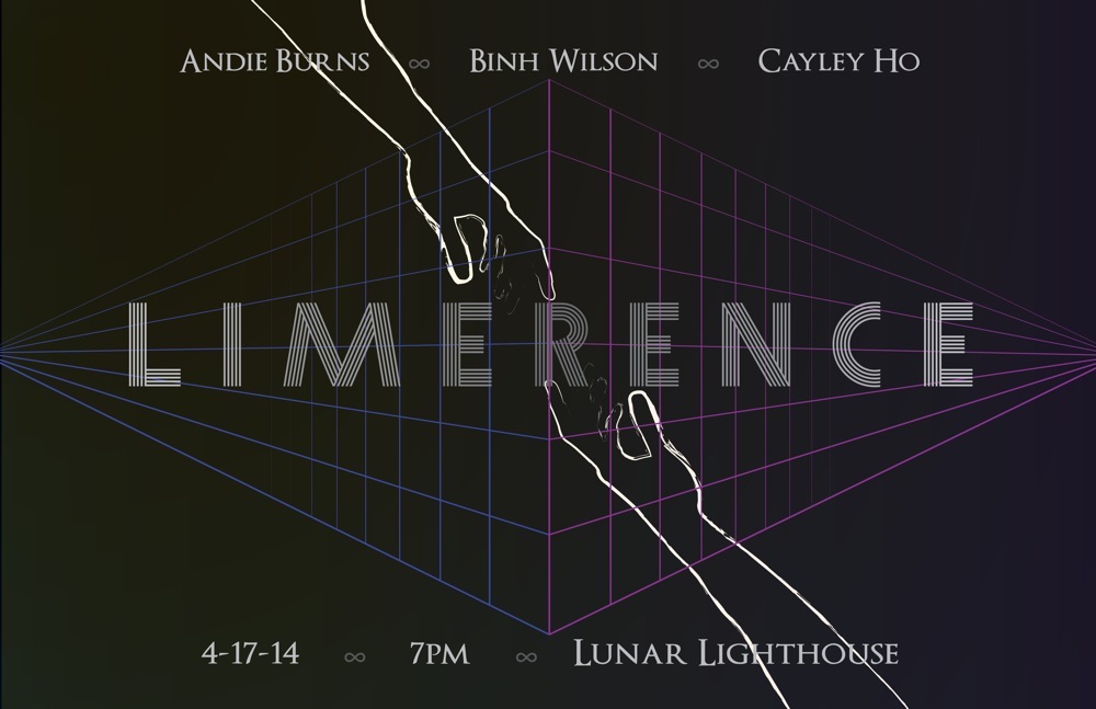
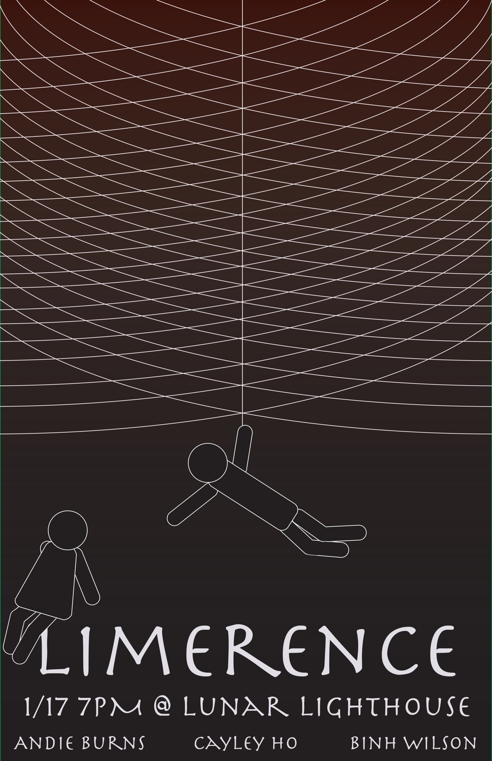
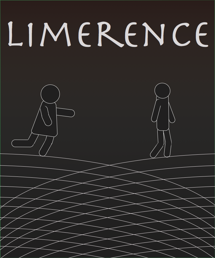
Limerence is defined as “an involuntary state of mind which results from a romantic attraction to another person combined with an overwhelming, obsessive need to have one's feelings reciprocated” We felt that this band name was fitting as Shivers was inspired by the idea of a siren luring a sailor to his doom. Our music gives off a dark and eerie feeling so I wanted to echo dark tones throughout my artwork, composing my color scheme out of cool, dark colors; blue, purple, gray, and black. One of the lines in our song is, “what you see is always different from what you hear.” Vision is a sense that cannot be trusted; it is not completely there; it is unreliable and inconsistent. In my poster, I used many converging lines to emulate the shape of an eye to reflect the theme of deceptive vision in the song. The hands reaching towards each other represent obsession, a theme present in both our song concept and our band name. The font I used was chosen to complement the design of my poster. Constructed from a series of lines, it is similar to the lines I created for my poster. I used the same fonts, color scheme, and maintained the same atmosphere in my shirt design. I also included the theme of flawed vision in my shirt design. However, instead of using lines to simulate an eye shape, I designed it to resemble the iris of an eye. I used a photo of Binh facing away from the camera in place of the pupil of the eye and edited the photo so that it would look distorted and unrealistic. Even though the focal point of my shirt is circular, I placed my text in straight, intersecting lines so that it would match both the lines in the font and the linear design of my poster.
The music we chose to use in our group was written and performed by group member Andie Burns. Having had experience with an Ukulele as well as the use of Pro Tools, she was able to come up with an outstanding piece of music that manages to stay in your head throughout the day.
While light in tone and voice, the song we chose actually is about a tragic relationship with which the protagonist is heartbroken and is trying to reconcile herself from the shock of being alone. In my artwork, I portrayed the act that comes with the feeling of limerence. Limerence is a term used to describe a deep need for one’s feelings to be reciprocated in love and in my art, both man chasing woman and woman chasing man is portrayed to show what is to come from such an emotion.
KyleK OleksiyBRichaG
Our music had a very techno beat to it, and a strong electronic vibe. I think one band that really influenced us was Disclosure, because they have a strong presence in the techno music scene. We wanted to capture a feeling of the loss of happiness many people experience as work life becomes more of a priority than social and family life.
For my poster, I wanted to make kind of a metaphorical image of someone who stands out in a big crowd, even though they are similar to those around them. Our song is about how people don’t focus on happiness enough; I’d like to think of the peace sign in the middle of the picture as the one person that does embrace happiness throughout their life, even while living in many of the same circumstances as others. In the end, I chose a digital looking font with a grungy look to try and match the feeling of the song. For the poster and shirt I tried to see what interesting things I could do with the knowledge and imagination that I’ve acquired throughout my experience at Freestyle Academy. I chose a simplistic color scheme with black and gray, and an army green as my background color. I didn’t want an overloaded look with my poster and shirt with a lot of colors, because I really wanted the accent color to be obvious.

Our group made a song that is mysterious sounding and at the same time techno-y. The lyrics are of a problem that persists within teenagers these days and how we try to be oblivious to the pressure put onto us by society. We were influenced by Owl City for the overall feel of our song, Passenger for the lyrics, and Cascada for the techno style.
Both the poster and t-shirt have a text that seems like it’s glowing, which I felt represents the hope we have for happiness. The colors I used in the background are oxford blue and nature green, which add a soft feel to the design. The calligraphy fonts I chose because it makes the music seem like a spiritually developed work, which is what we went for. I had bokeh-like circles on the poster and fog on the t-shirt to add to the dreamy feel of the song.
The type of music that we wanted to make was electric upbeat. Disclosure’s smooth, uplifting music is what our band wanted to get across our audience. Our music is about getting in touch with the brighter side of life. In one of our songs its about not letting the subject of school and family stop your happiness.
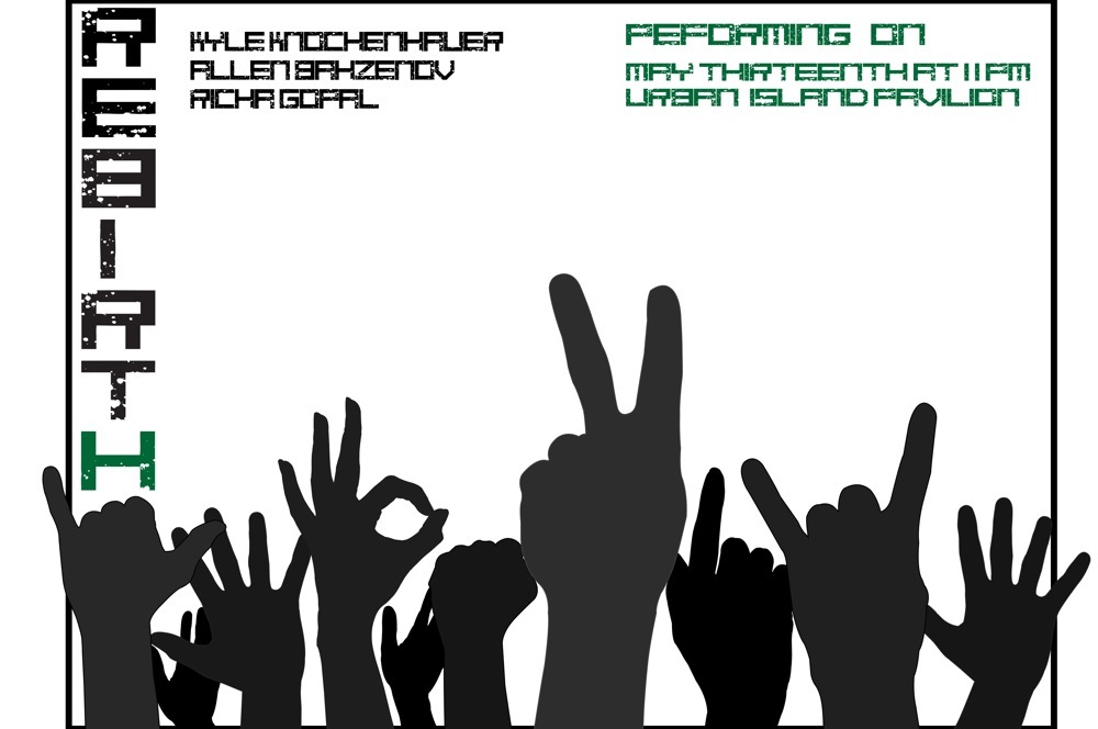
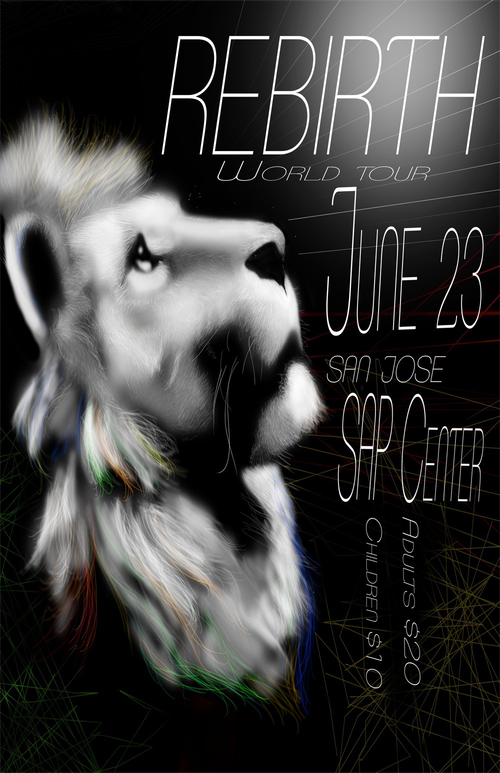
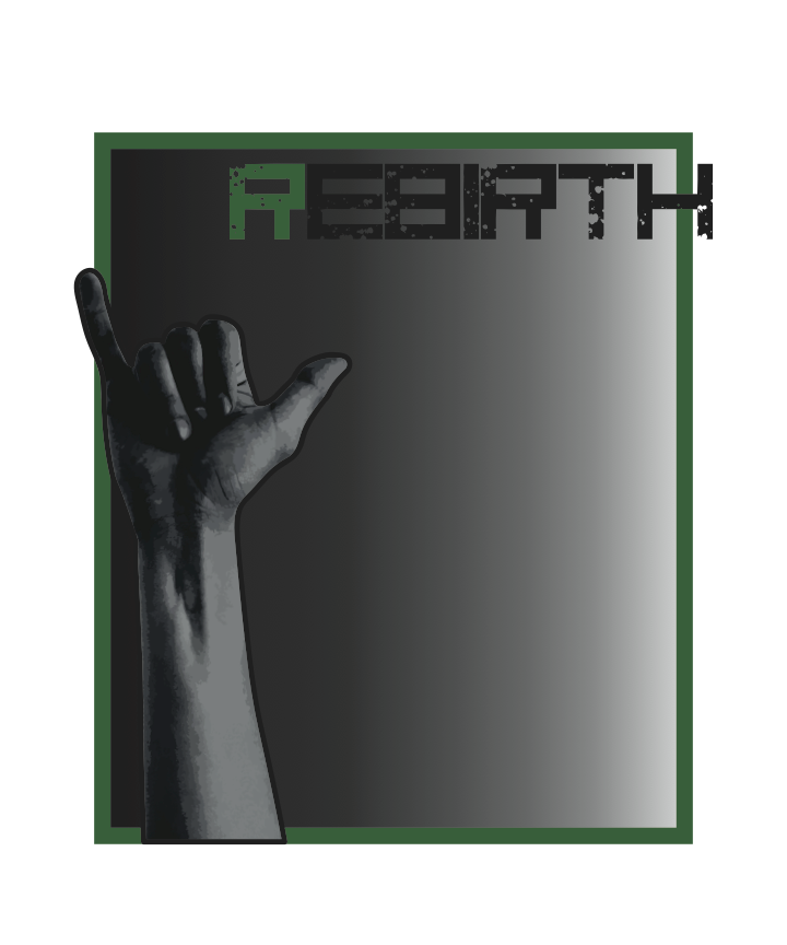
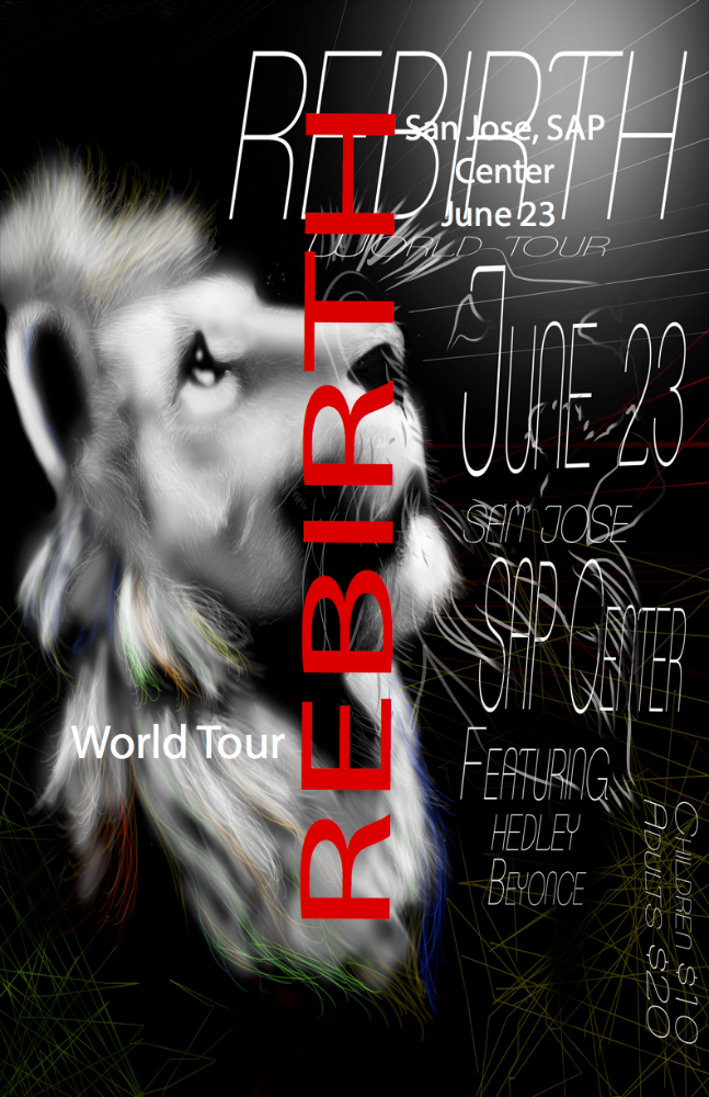
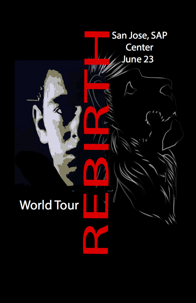
My poster and t-shirt are pretty similar. I used Photoshop to do the poster and t-shirt design! I used a lion, which in my opinion represents inner strength. In the poster and t shirt it’s looking towards the light (aka happiness), but in the t-shirt I put the singer of the group next to the line to show he’s taking after the lion. I chose the color of white because it pops on black and since our band is about brighter side of things it metaphorically makes sense. For the t-shirt I used red, white, grey-ish, and black. I made the lion for the t-shirt grey so it wouldn’t be too distracting from the words in white. I made the name rebirth in red to make it bold and noticeable. As for the poster, it’s a very similar design. I didn’t want too much of a difference between the two. I gave the lion different streaks of fur to show personality. The white rays shooting out near the light represent its happiness spreading. I felt the poster and t-shirt design worked well together!
EmmaBKiyoshiTNoraD
Our band is influenced by alternative, electronic, and indie music genres. My main influences were the bands MGMT and Blackbird Blackbird. We wanted to produce something fun and different, not necessarily upbeat, but with a catchy tempo. We also wanted to create something that would stand out.
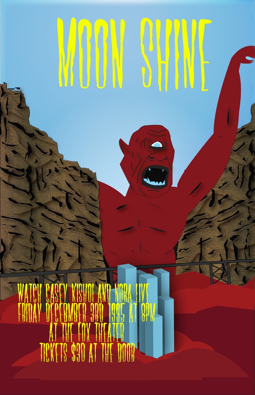
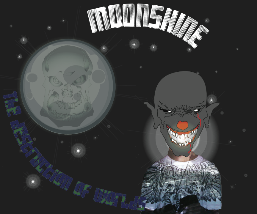
The poster I created has a giant monster coming from some cliffs towards a city. Our song is kind of sci-fi, being about aliens, so I wanted to make a surreal kind of piece. Our song is ultimately about destruction and the monster’s facial expression shows the intent to destroy the city. The font has a melty kind of effect, the reason for this choice is because a lot of horror related films, books, etc have a similar kind of creepy font. I used Illustrator to create the picture and I added the text in Photoshop. The colors I chose, red, blue and yellow, were chosen because red is a scary, dominant color, and blue is it’s opposite so it makes the red stand out more. The yellow stands out from both colors without being too dominant. For my shirt, there are aliens coming in from behind a mountain. The aliens look like they are coming from space to abduct people, or animals. I made one of the ships be in front of the text and they are all different sizes so it looks three dimensional. The shirt was also made in Illustrator.
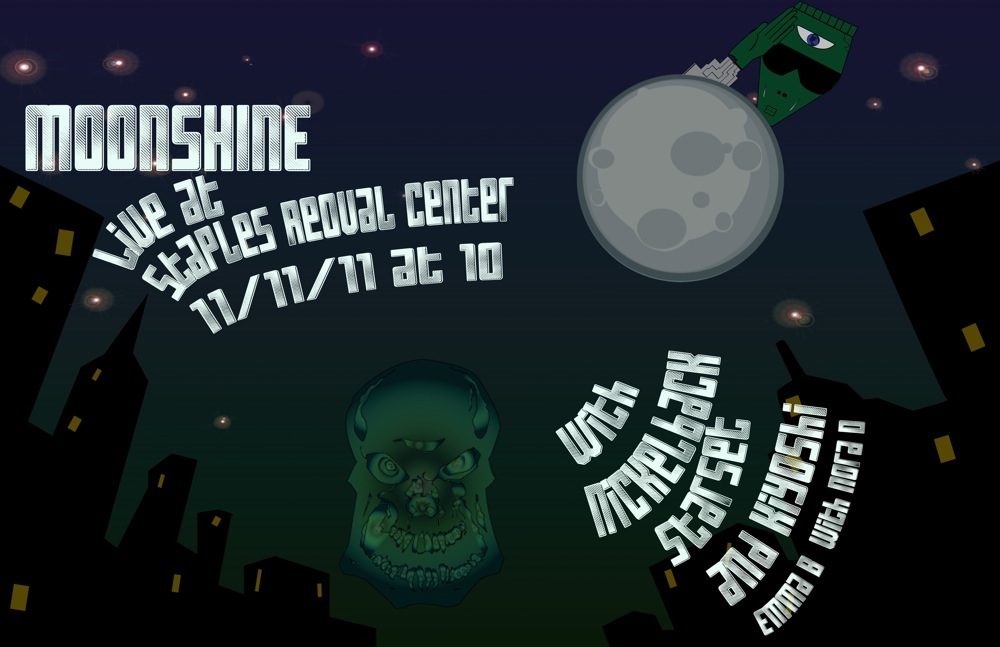
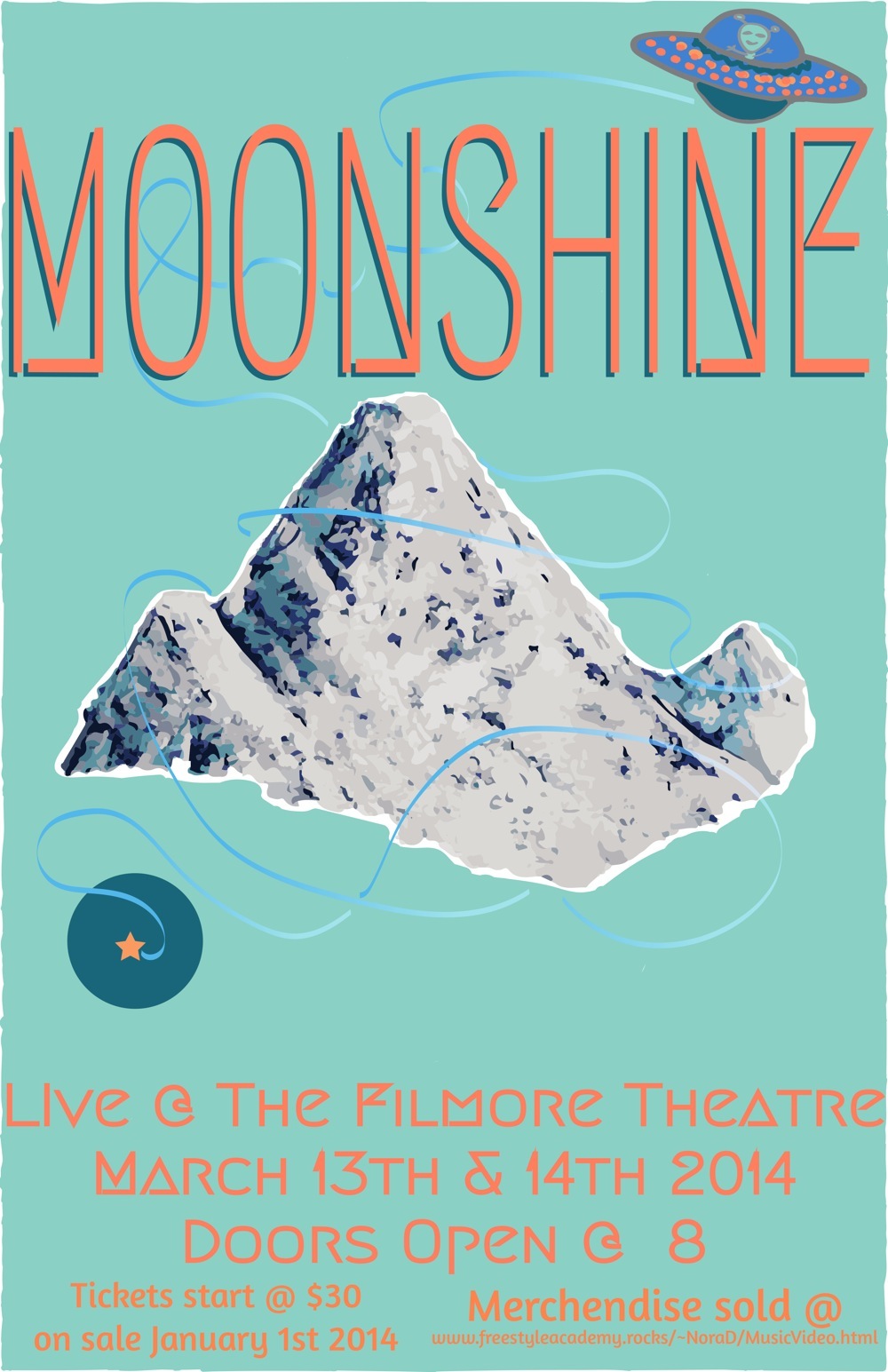
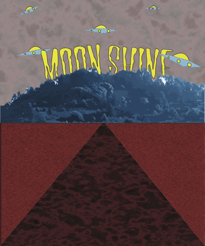
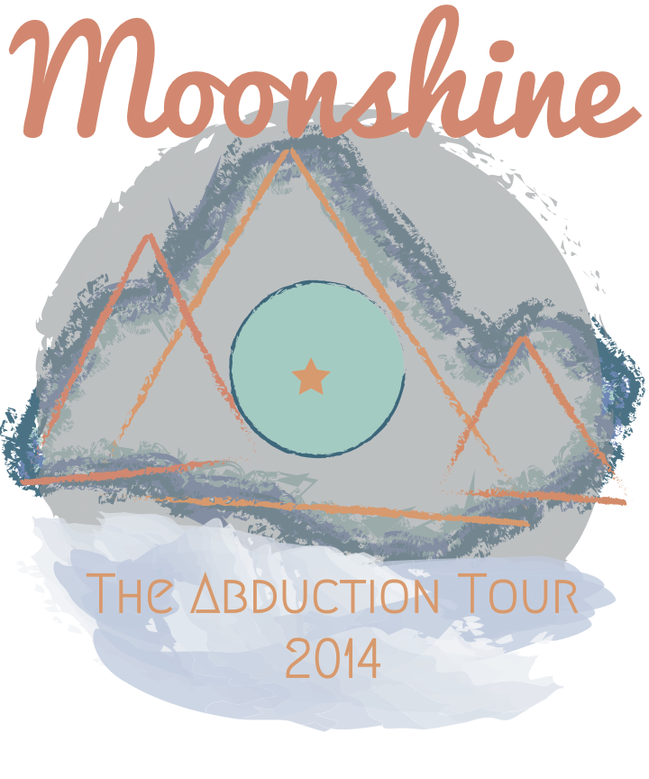
My main goal for designing my poster and tshirt for my music group was to create something out of this world. The first inspiration for my art came from the name of my group, Moonshine. Before we were even done editing the music I centered my Design around a moon I created in Photoshop and Illustrator. Once the music was completed I realized that our song had a dark tone to it. So in my arts I picked a dark color scheme consisting of green blue and grey. These colors give people the sense of an alien presence. In the center of my poster there’s a giant skull. That skull is there to represent the apocalyptic times the world world has struck with. The lines, “Tonight our world crashes together the world cries. We stand under the electric sky for the last time” basically sum up what the worlds going through. I made the alien peeping out from behind the moon to represent the fact that “the world is no longer alone” and give of the idea that you're being watched. I decided to make set it in a dark city to increase the creepy atmosphere. My tshirt compliments my poster because it features many of the same elements such as the skull and the moon. Since I had to incorporate a photograph onto my shirt, I choose a picture from us filming the video. I used this picture because it had a similar color to the rest of my design and my shirt matched the mood of my art. The grey skull in place of my head is there to represent the craziness overcoming the people during the invasion. I created a bright light coming from the skulls mouth to act as a teleportation beam, because what alien invasion isn’t complete without one. Unfortunately Moonshine is going on a permanent hiatus so this will probably be some of the last art work relating to their music.
Our group decided to follow the theme of aliens and space, so we named our band Moonshine. I wanted to do something that would contrast with the sound of our song, so I picked multiple shades and tones of blue and orange, which gave it some visual interest. For my image I choose a mountain, and I did a image trace in Illustrator with 16 colors, the effect made it more abstract. I used an effect on the UFO’s trail, which gives it a glow effect, I learned this tool during our practice poster. I choose the fonts, based on the theme of aliens, so I picked one that was more geometric, a cursive one, and a san-serif regular font that had some curves to match the cursive. I really loved discovering the different techniques from the practice design that we did and applying them to my poster and shirt designs. When I started using Illustrator I really struggled, but now I really have come to love it, and learning to use it with photoshop to create images that appear as drawings, paintings, and other things.
For my t-shirt design I really liked the mountain that I had created for my poster, I couldn’t incorporate it because the designs are supposed to be different but look like they belong together. To still keep the mountain, I traced the mountain with the three shades of blue and added a charcoal stroke, to make it more abstract. To make it more different I drew 3 triangles and added my three different shades of orange and made them fit on the mountain, and by using an organic stroke with some geometric patterns gave the image an ominous vibe. The font that I used for the band name was the cursive one, and I made it a more red orange to show contrast on the moon that was overlaid on the trace of the mountain. I took the planet in the middle to represent a world in another, which sits atop a cloud like shape that holds a geometric text with the tour name.
AleksandrAElizabethLKevinVNicholasLSashaS
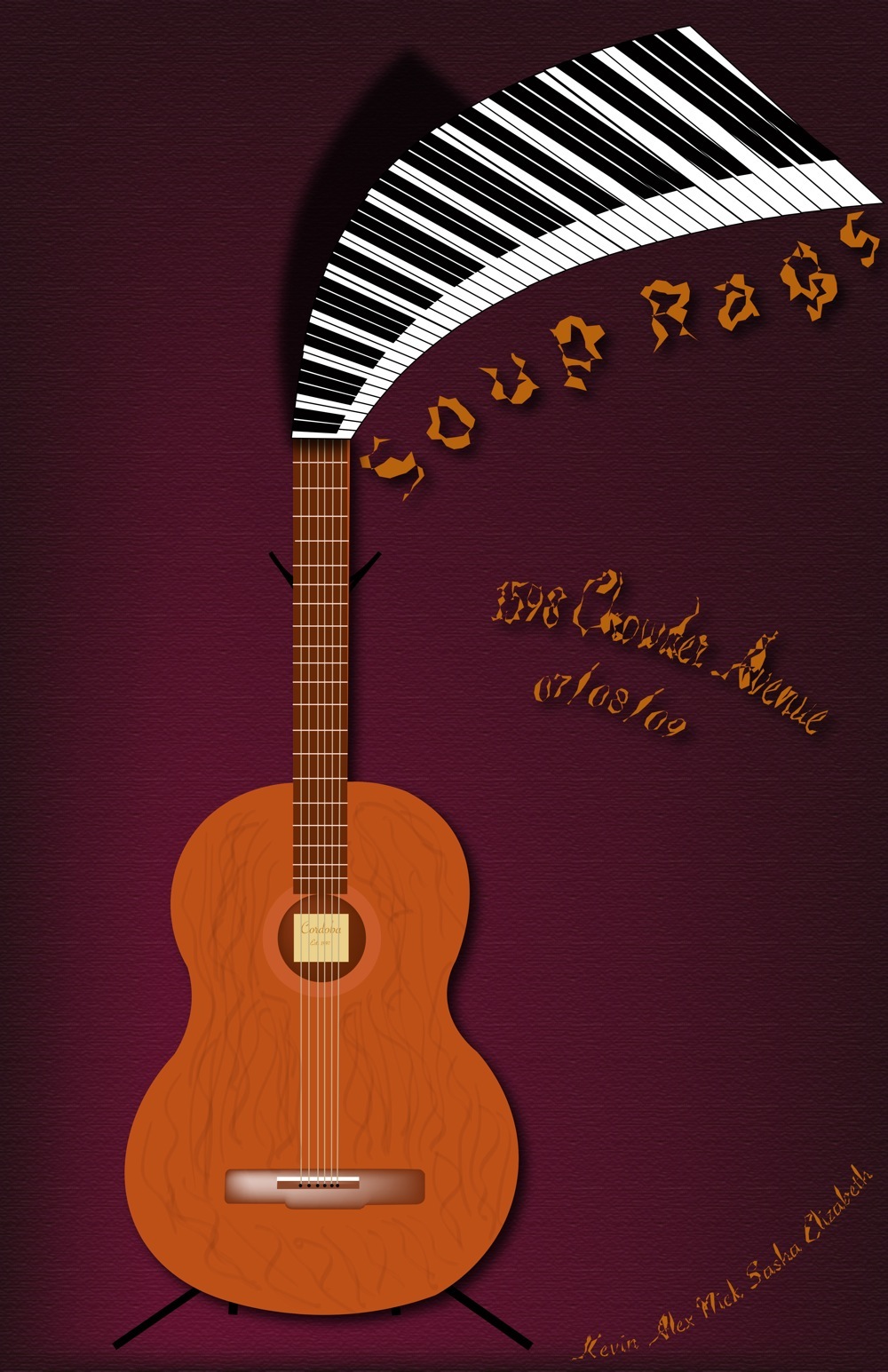
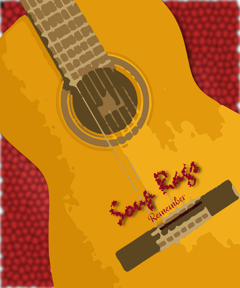
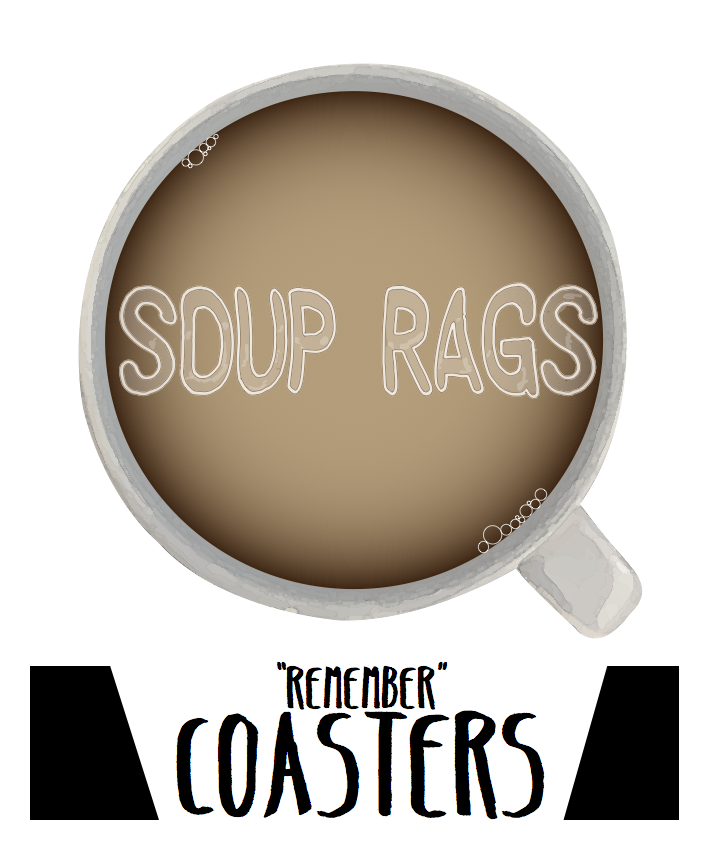
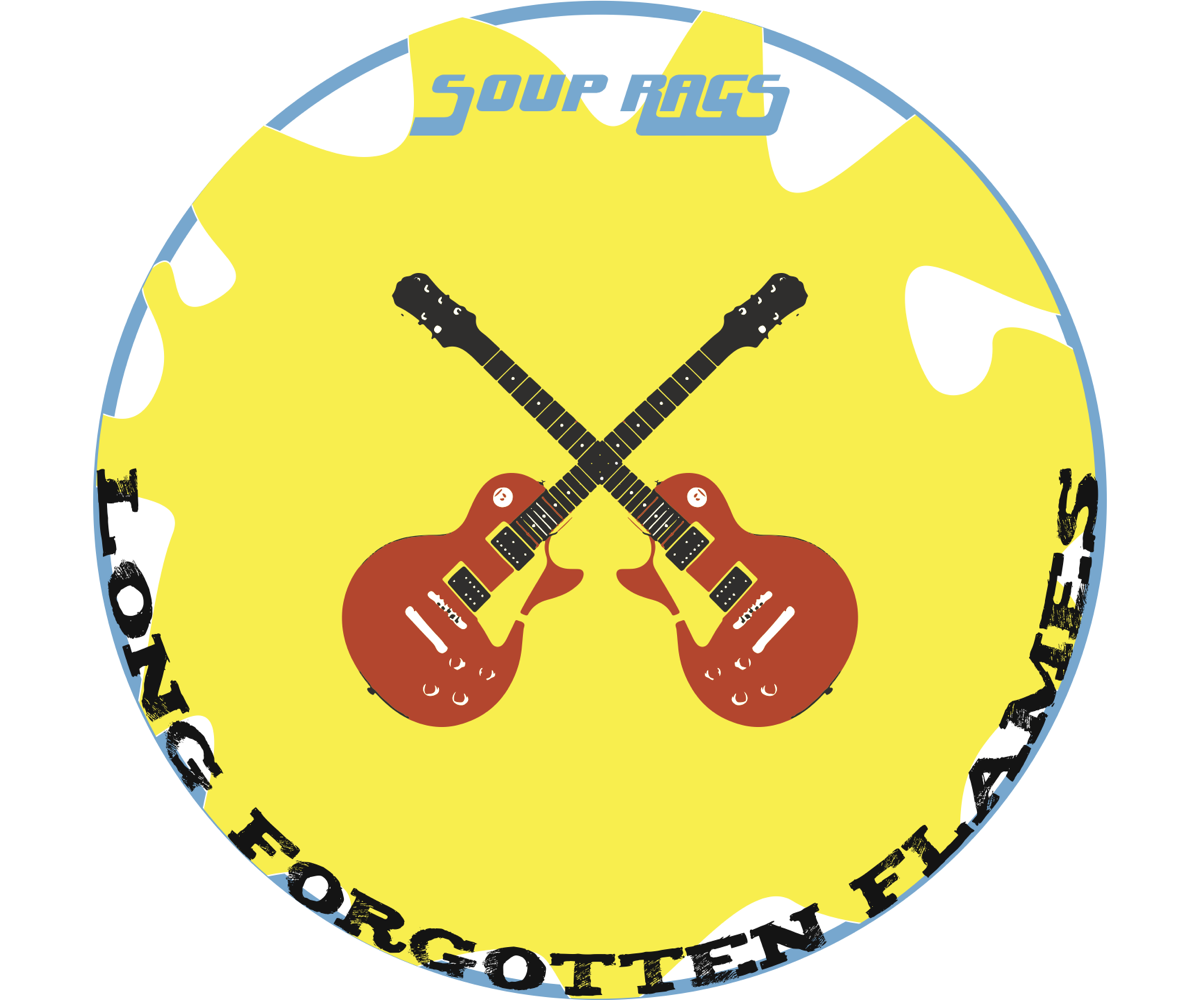
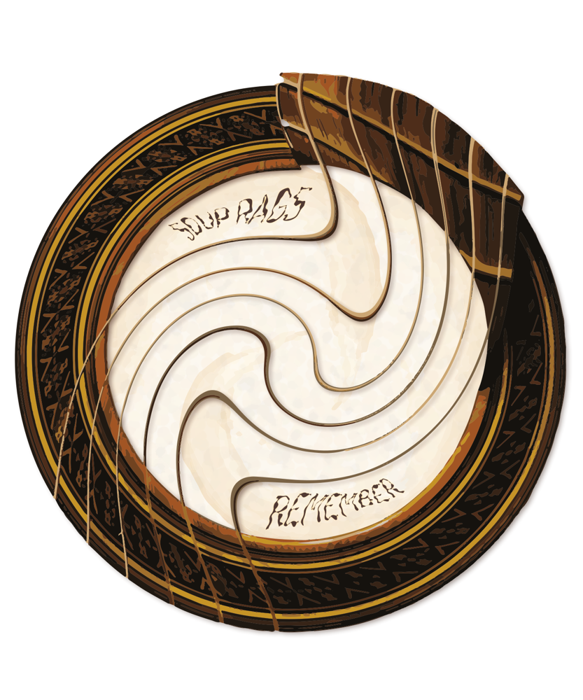
Our band, Soup Rags, created a song in the warm romantic tone resembling a coffee shop atmosphere. We wanted to go for something with a nostalgic and cozy feeling, as well as a memorable melody that resonates with our listeners. We had our vocalist record the music twice in harmony, to further strengthen the idea and appeal we were going for with our music.
My poster and t-shirt were designed with the same romantic and warm feeling to it as our music conveys. I used colors often found in coffee shops, like dark red/burgundy to resonate with the feeling of our song. I used the pen tool in Illustrator to trace a photo of a guitar and piano to create a design of a guitar and piano because those are the instruments found in our song. For the piano, I used effects in Illustrator to distort the keyboard and make it more visually appealing.
The lyrics we used were very centered on romance, so we chose something more melodic for our instrumental part. Our music was indie rock, utilizing instruments such as guitar and piano.
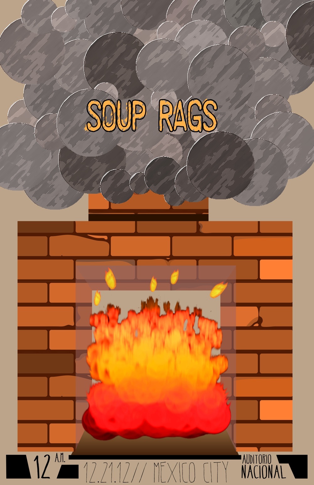
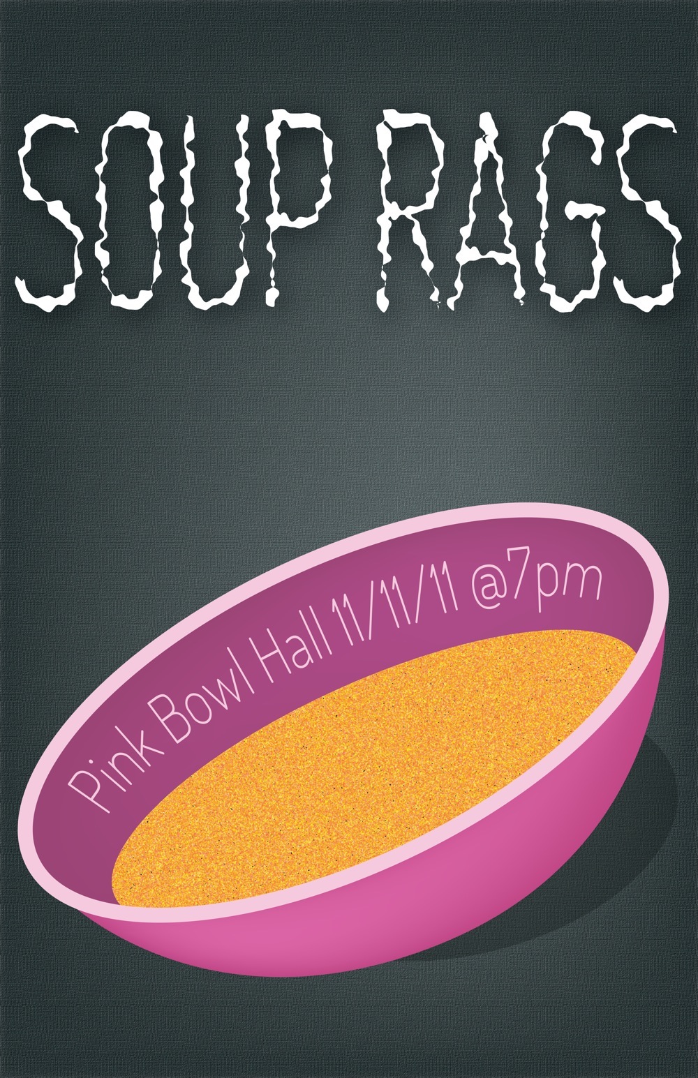
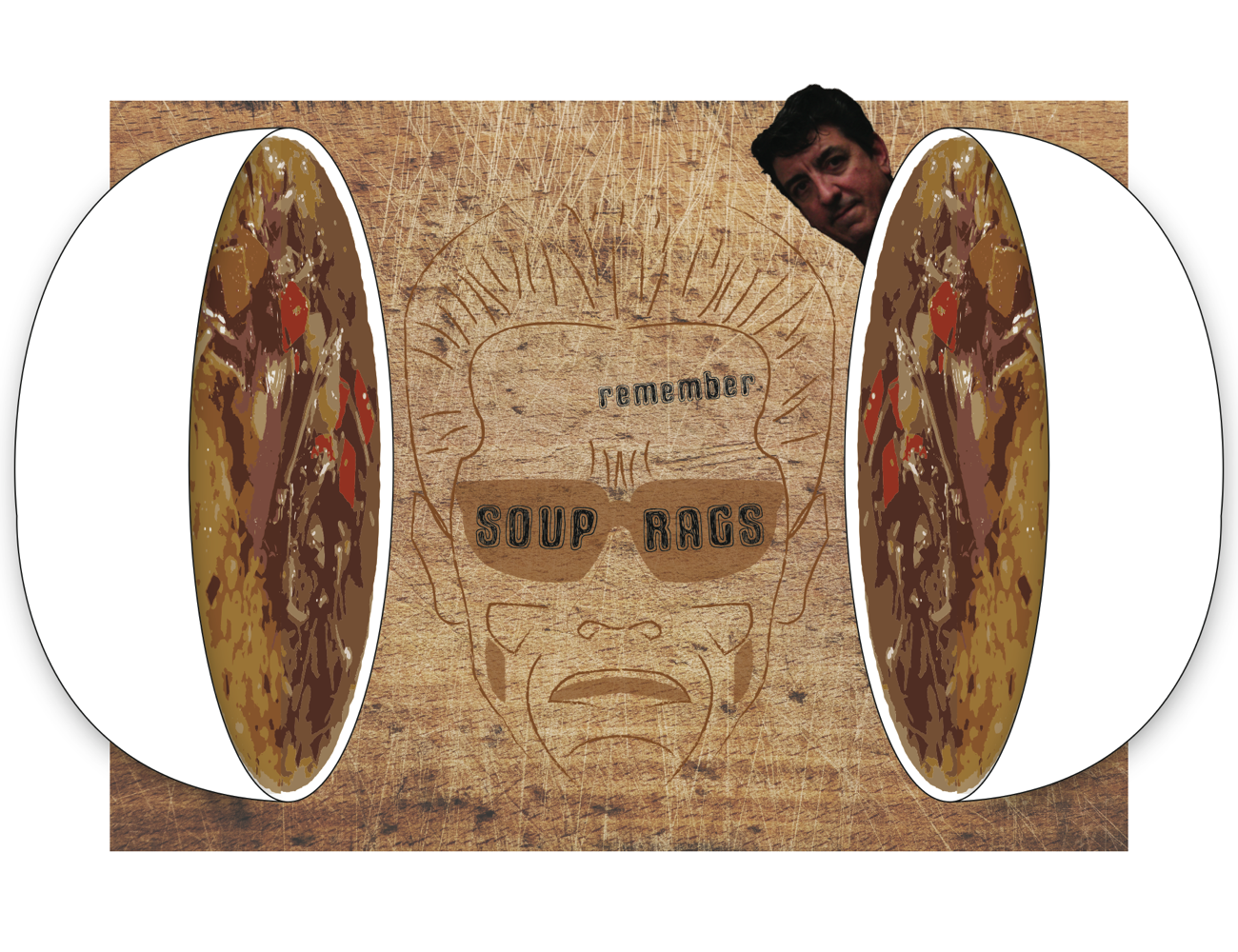
For the concert poster, I wanted to capture the warm tone of the lyrics. I decided on the fire early on, which I created from a frame in After Effects. I dragged the image into Illustrator to create the rest of the image around it. I created a brick pattern for the chimney/fireplace. I made the smoke out of circles of varying tints/shades and sizes and placed a filter over it to make it look more stylized. Our band name was Soup Rags, so I decided to go with an alphabet soup type of font which I found on DaFont. The T-shirt had to feel united with the poster, but it couldn't be an exact copy. We were required to incorporate a photo in it, so I decided to use my photo as the primary focus of the T-shirt. I wanted to keep the warm tone, and I took a picture of a steaming latte. I decided to try to replicate latte art in Illustrator for the band name.
Our music choice was influenced by the band “Abdominal Putridity.” As it progressed, the song got milder, but still retains much of the Abdominal Putridity influence.
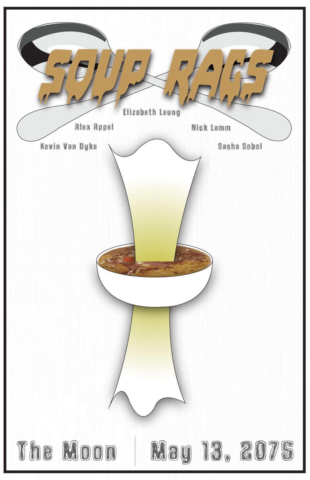
The idea behind my poster design was to create something that combined both soup and rags. So what I decided to do was to put a rag going through a bowl of soup and soaking it up, making them like family. I put cross spoons at the top behind the band name to represent a family-like unity, as though the soup and the rag are saying “Cheers” to each other over a big dinner of soup and rags later to clean up. All of the fonts are very soup-cereal-like and remind me of a day in my early childhood when I ate the most perfect soup; this soup had just the right amount of soupiness, as well as crunch, which is why I separated the soupy and the crunchy texts on the top and bottom. The t-shirt was similar, expressing unity between two soup bowls that double as headphones that Arnold Schwarzenegger is listening to. I used a cutting board as the background because you make parts of soup using a cutting board.
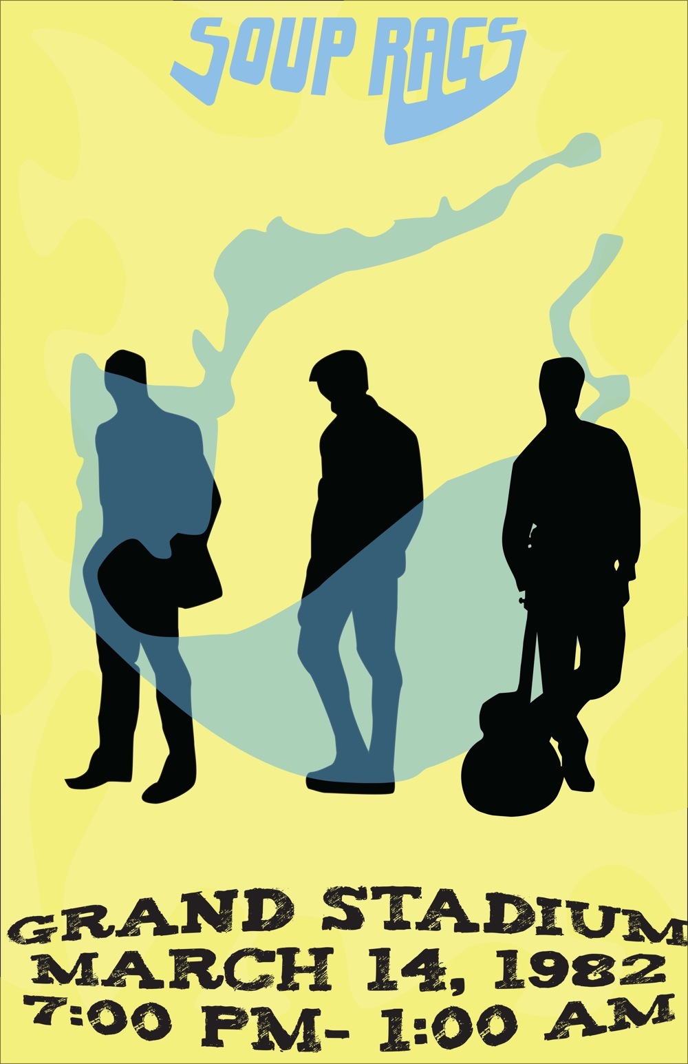
The genre of our fictitious band “Soup Rags” ran all over the place during the course of the song and video’s production, so I went with the constant overarching theme of laid-back guitars and rhythm. The goal was to create a poster that was reminiscent of classic rock bands, and the art that accompanied them. In the end, it came out more beach-rock than I intended, but I still found the poster to be fitting for our theme, even though our final song was very coffee shop/folk.
For the poster, I wanted to capture the relaxed vibe of the band via the casual silhouettes, combined with a light border to bring out the foreground. It went through several drafts to create the proper effect I wanted, as the border easily could become detracting. Despite being very light, I feel it does it’s job.
I think the genre we were initially going for was rhythm and blues. However, the song may or may not have shifted in genres over the course of its conception. I am not entirely sure what it is because I’m not a music person by any means.
Our band name is Soup Rags. I took it quite literally and created a concert poster and a t-shirt design featuring a bowl of soup. Throughout, I used Dosis, a slick sans serif font, to seem contemporary and cool. I applied a few distortion filters to the text so that it better embodies the fuzzy nature of romance. When I was creating my poster, I wasn't entirely sure where I was going with it. I made the soup orange because it seemed like a soupy color at the time and because it resonates with the warm and nostalgic feel of the song. I added a texture to the background to make it look a little more like a rag in order to incorporate the other part of our band name. When I started working on the t-shirt, I decided to get rid of the blue-green and pink parts of the color scheme as they seemed irrelevant and I used a warm and cozy brown, orange, and yellow color scheme instead. To carry on with the romantic theme of the song, I used the sound hole of an acoustic guitar as the soup bowl.
EmilyPHunterCPaulPStellaGYujieW
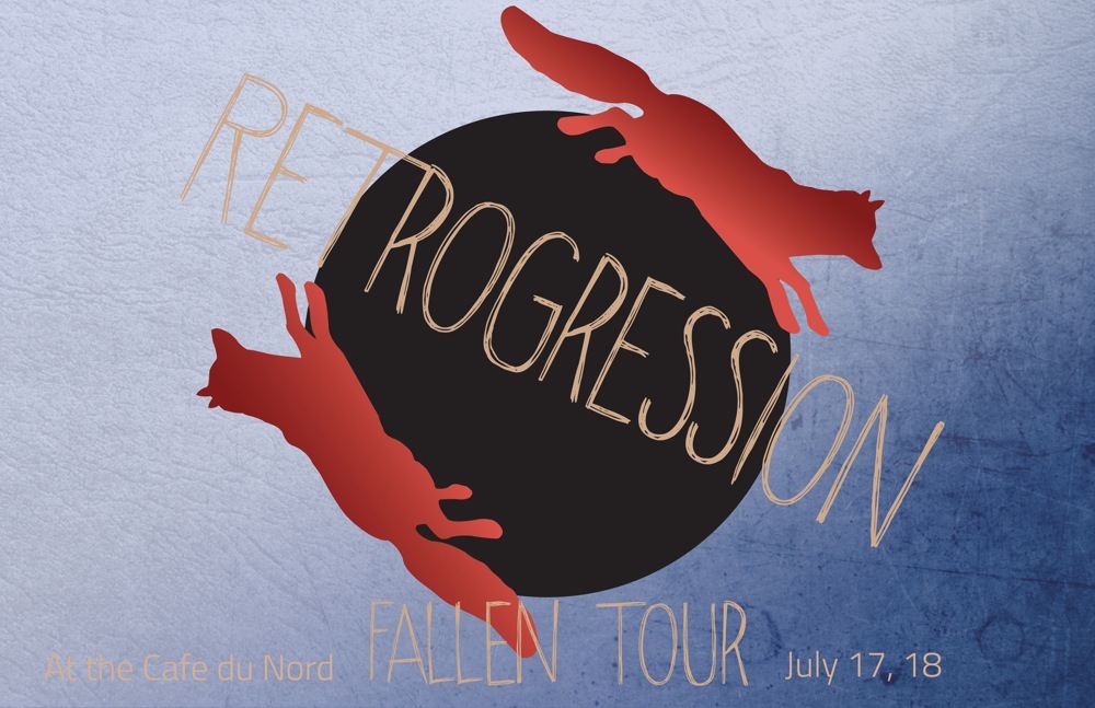
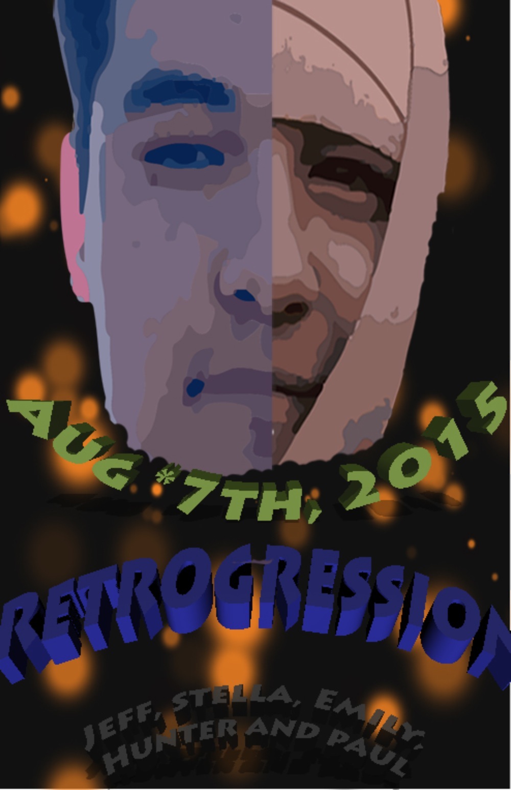
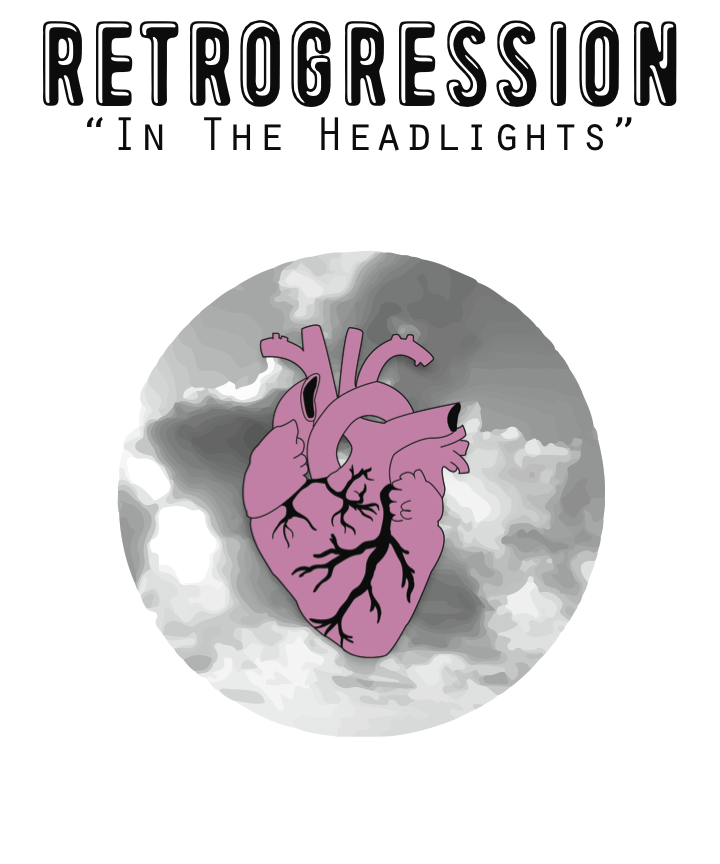
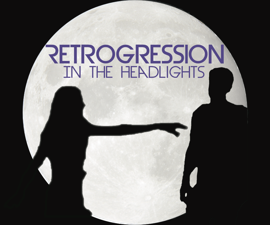
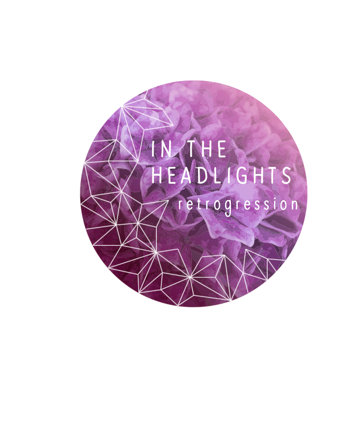
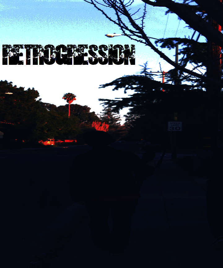
Retrogression is a classic Alternative/Indie band. In our song ‘In the Headlights,’ we created a satirical story about a cliche romance gone wrong. We were influenced by bands like She & Him and Iron & Wine, and used clashing elements and ideas to carry out our theme.
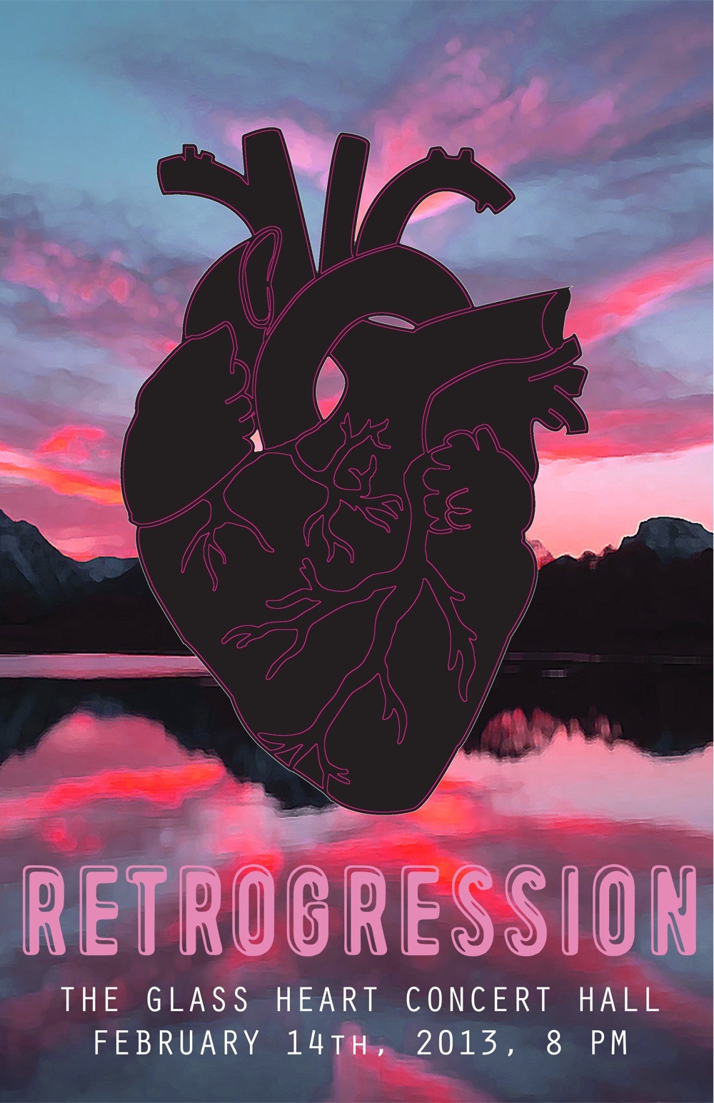
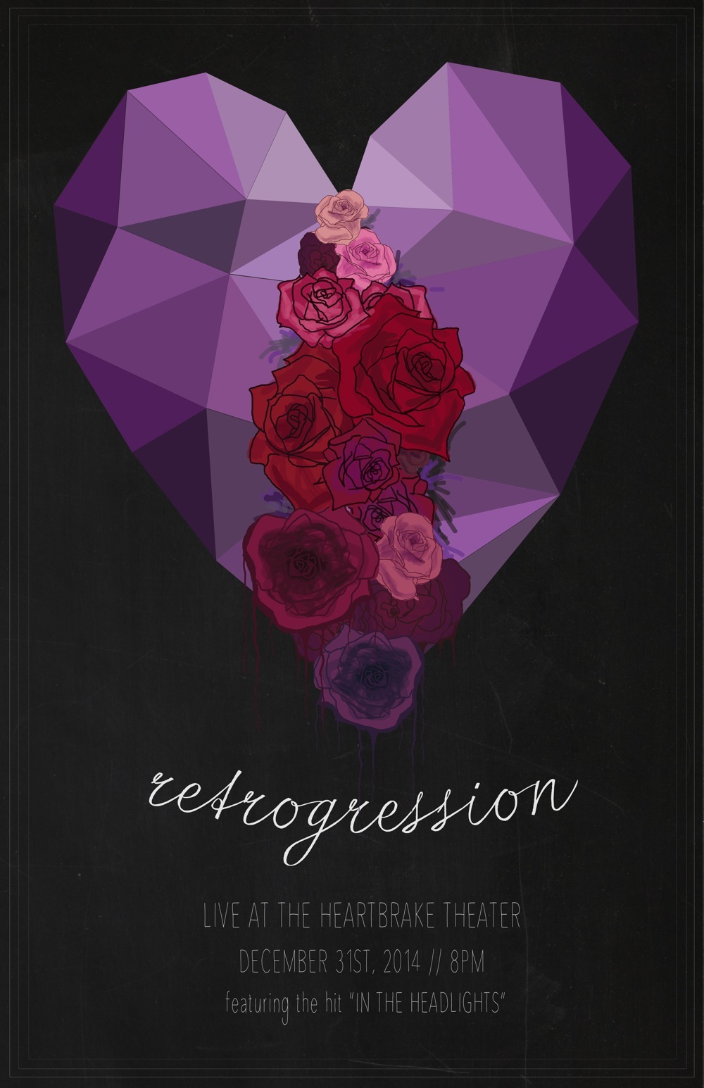
For the design portion of the Music Video Unit, we created both a poster and a t-shirt for our fictional bands. I traced a drawing of a heart in Illustrator and put a glow effect on it for the poster. The heart is black on the inside and pink around the edges, and the bright sunset behind it juxtaposes the two elements. The song is about opposites and expecting the unexpected, so that’s why there is an opposite element in each piece of artwork - the black heart in the poster, and the black and white sunset in the t-shirt. For the t-shirt, I used the same heart graphic without the effect and with a different shade of pink. I incorporated sunsets into both designs to match with the theme of the song: cliche with a twist. I combined sweet images and graphics with dark colors, and I used a cute font to reflect the romantic color scheme.
Retrogression is an alternative band that took inspiration from a plethora of sources. In order to get the cliche romantic love story feel, we listened to the one and only, you guessed it: Taylor Swift. Who else is the crème de la crème of sappy love stories? Taking stylistic choices from her music videos and songs, we were able to get a feel that really screamed cliche! In the second half, we originally were going to have it be much more chaotic so we listened to a lot of creepy movie soundtracks and spontaneous industrial music. [See: “Don’t Hug Me, I’m Scared”]
For my poster, I wanted to instill the idea of two lovers chasing each other. I was able to show this by having two foxes running around the center logo. As seen in the music video, the girl is losing sight of the lighter side of the relationship and moving her view of him from love to hatred. The texture in the top left is very free and flowing while the bottom right is dark and chaotic, showing the state of their minds and their relationship with each other. In my shirt, I wanted to keep a simplistic design while still holding the idea of teenage love. Though there is color variation between the two pieces, I felt as though my color scheme wouldn’t work well on a tshirt and therefore chose to pursue a purple and white to compliment the black shirt color. Having the girl reaching her arm out towards the man showed her overwhelming love for him, the irony being that she eventually kills him.
Our music is a dark twist on the cliche teen love story. Initially, our idea was to make a satire on cliche and simplistic teen love songs, however, it ended up turning into more of a love song gone wrong. Some of our inspiration came from internet parodies that mock cliches. We looked at a few of the parodies that play on the cliche love song.
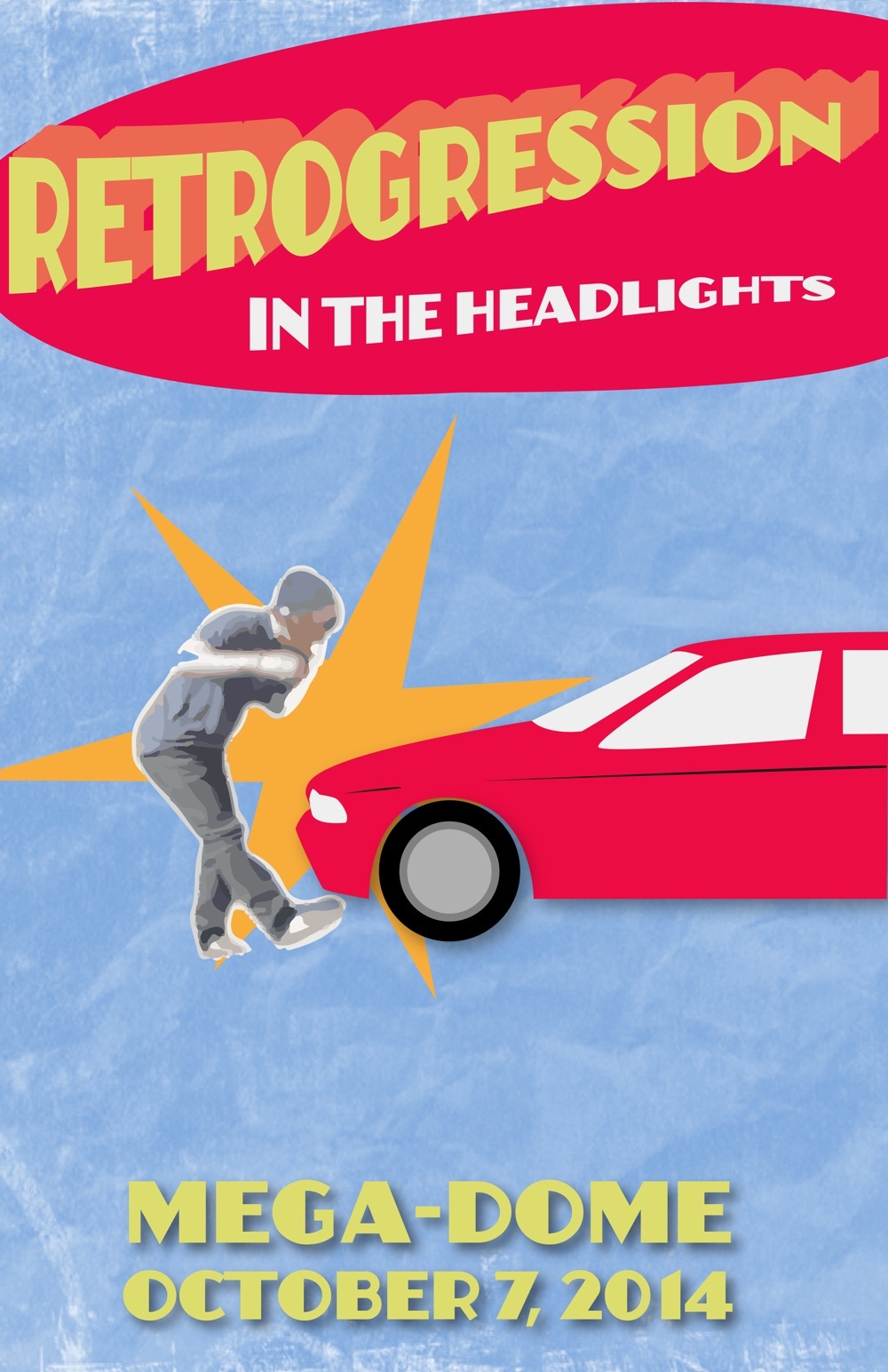
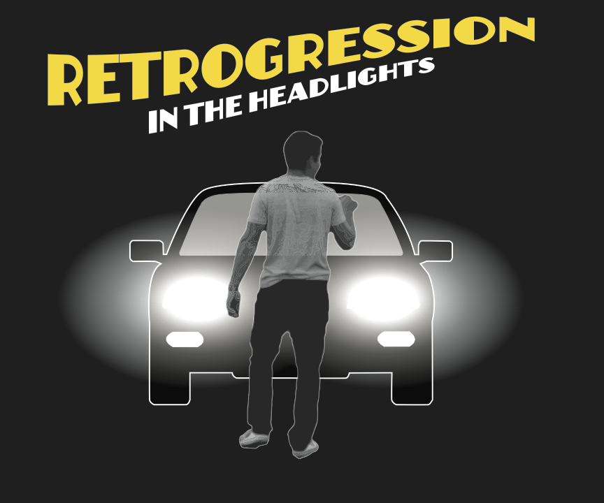
Both my T-shirt and poster include the car crash, which is a main part of the music video. The car crash represents the large shift in the tone of the song and I wanted this to be represented in the artwork. The poster features an old fashioned comic font to give it a “Retro” look since the name of the band is Retrogression. I picked a vivid color scheme for the poster to represent the cliche of the song. The T-shirt features a depiction of the name of the song, In the Headlights. I made the shirt design mainly black and white, with the exception of the yellow title, to match my choice of using a black shirt for the backdrop and to highlight the bright headlights of the car. I wanted the shirt design to represent the darker side of the story so I decided not to use color.
For our music video, we decided to fuse indie/pop and dark humor to create a traditional, intentionally cliche love ballad with a twist. We were inspired by teen love songs, such as the stylings of Taylor Swift and Jason Mraz, and used that to write our lyrics and compose melodies for the song. We then took a darker tone with some soulful piano playing and more intense lyrics from our own imaginations that grew as we developed the story as a group.
My poster and T-shirt both feature geometric lines, representative of the harsh edges that have formed around seemingly beautiful and romantic objects; in the poster the heart is fragmented by the lines, and in the t-shirt the flowers (symbolizing love and affection) are likewise broken apart. I took on a more sinister color scheme, establishing deep purple as the primary color, sprinkling burgundy in as the secondary tone, and then adding some brighter pink as the accent color to represent the love that was once there. The darker colors are evident in the roses emerging from inside the heart, and also in the shadow side of the T-shirt’s circle with a peek of brighter pink on the light side. As for fonts, in the poster I attempted to reflect the lovey-dovey aspect of our song with the cursive font but stayed true to the other side of our story with a shakier, more grim font in the poster and the T-shirt. Because there was already so much going on in such a small T-shirt space, I decided to keep it simple and leave the cursive font out, as there was enough of the romanticized elements in the design anyway.
At the beginning of our music video, we were struggling with picking the musical style we were going to use for our song. We started to watch lots of music videos on different websites. Eventually, we get inspired by Taylor Swift, but we decide to add on a little bit of twist: We wanted to produce a music video that contained a cliché cheesy love story with a bit of dark humor at the end.
For my poster design, I wanted to show the dark humor in my music video, so I used a dark brown background to show the moodiness. Then with the help of Illustrator, I image traced two of my actor’s faces and combined them into one. For my font choice, I made 3D text in Photoshop; it lends an interesting texture to the poster and pops out when viewers look at it. Combined with the orange sprinkle on the background which I created with the eraser tool, it adds variety to my poster. For my T-shirt design, I wanted to also involve the elements of my music video. I started by picking a production photo from my group, then I used the curve tool to make it look almost like a silhouette. This produces a strong visual effect. I chose a sci-fi font in white, which complements the dark color of my T-shirt design.
AlexanderKDanielPMaxwellEMorganM ThomasH
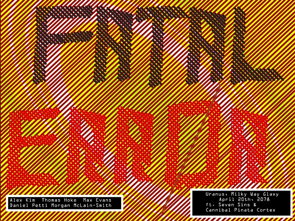
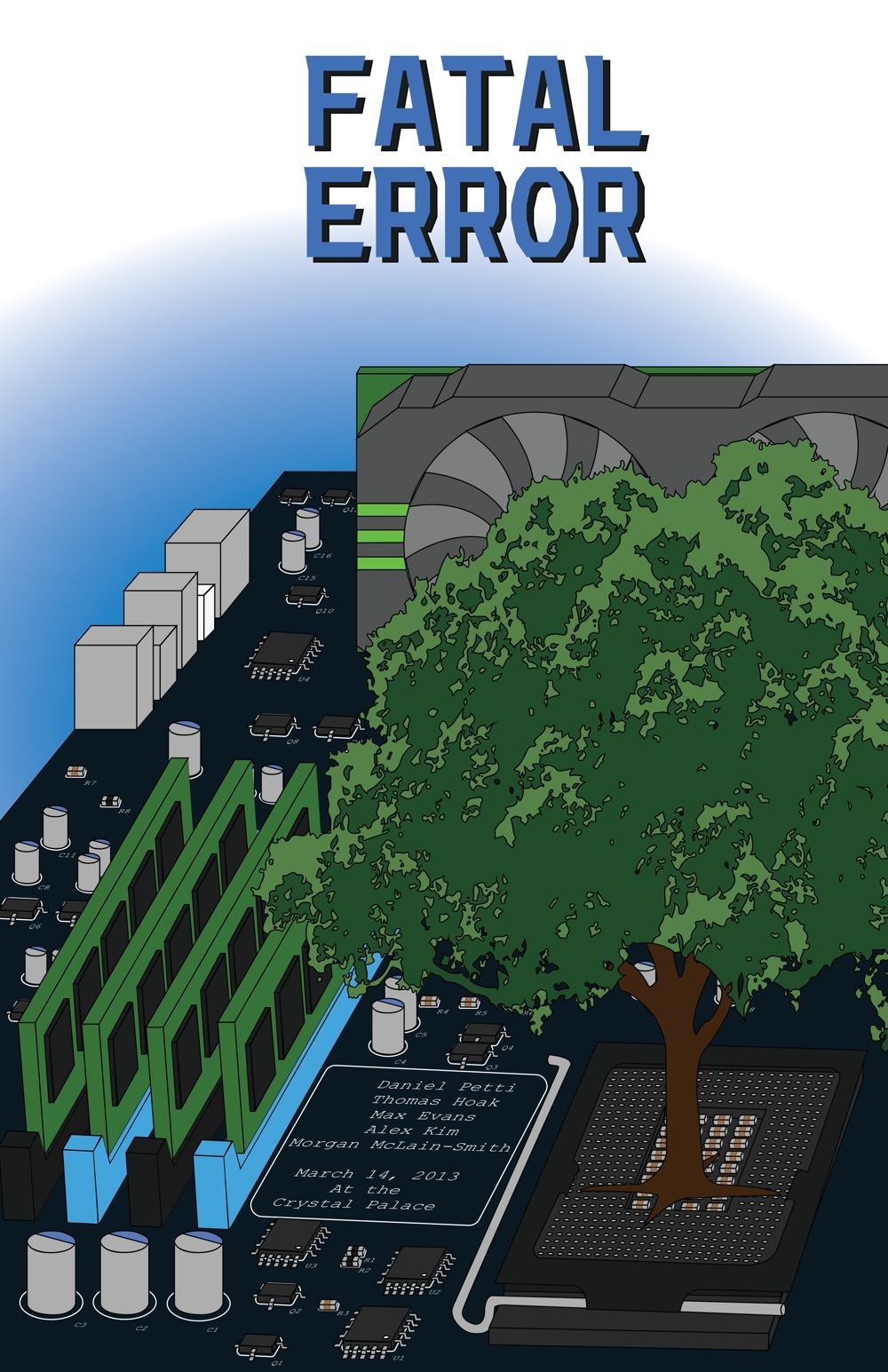
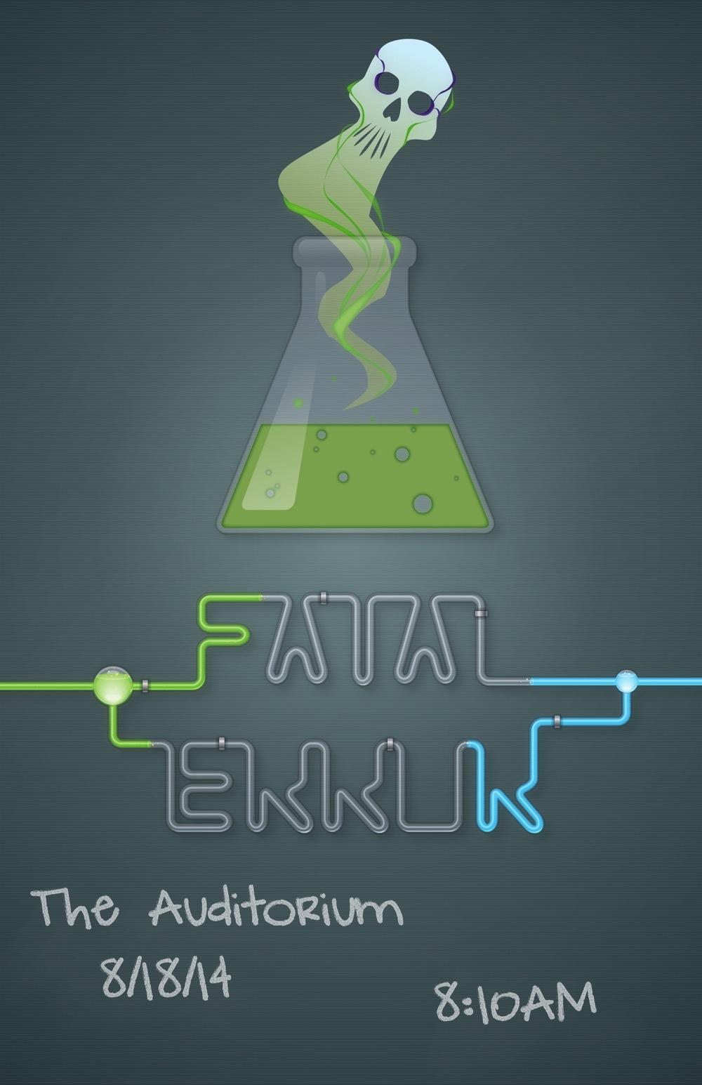
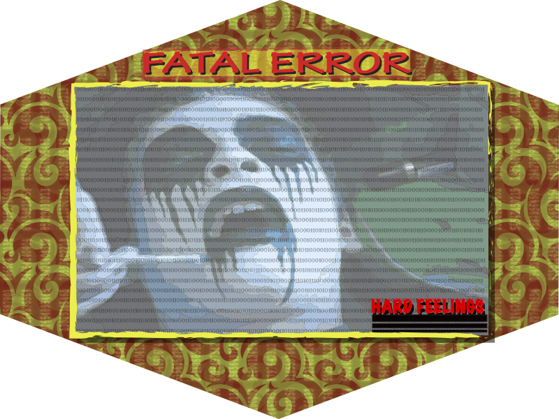
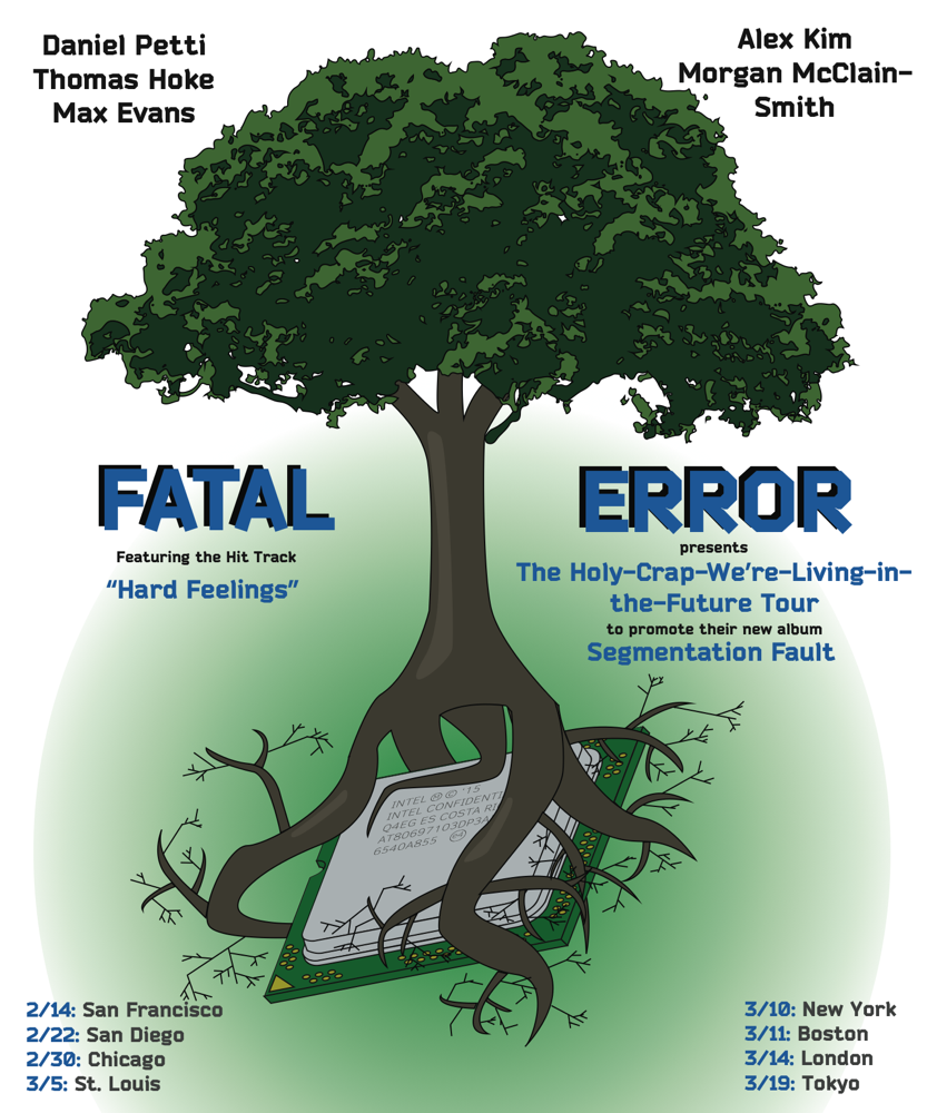
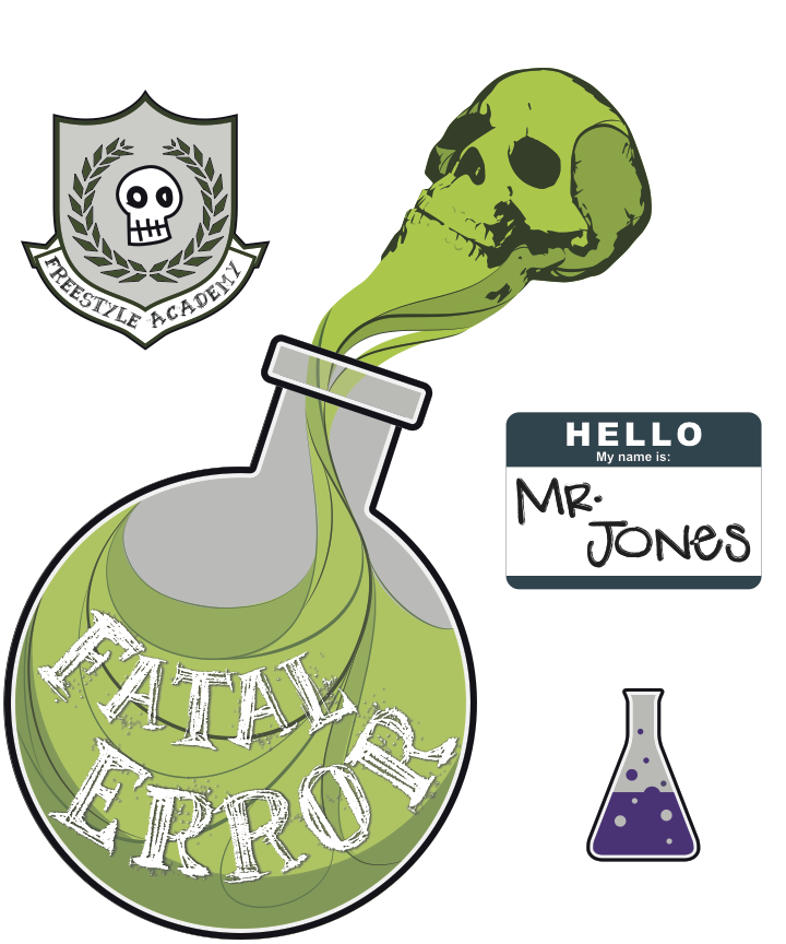
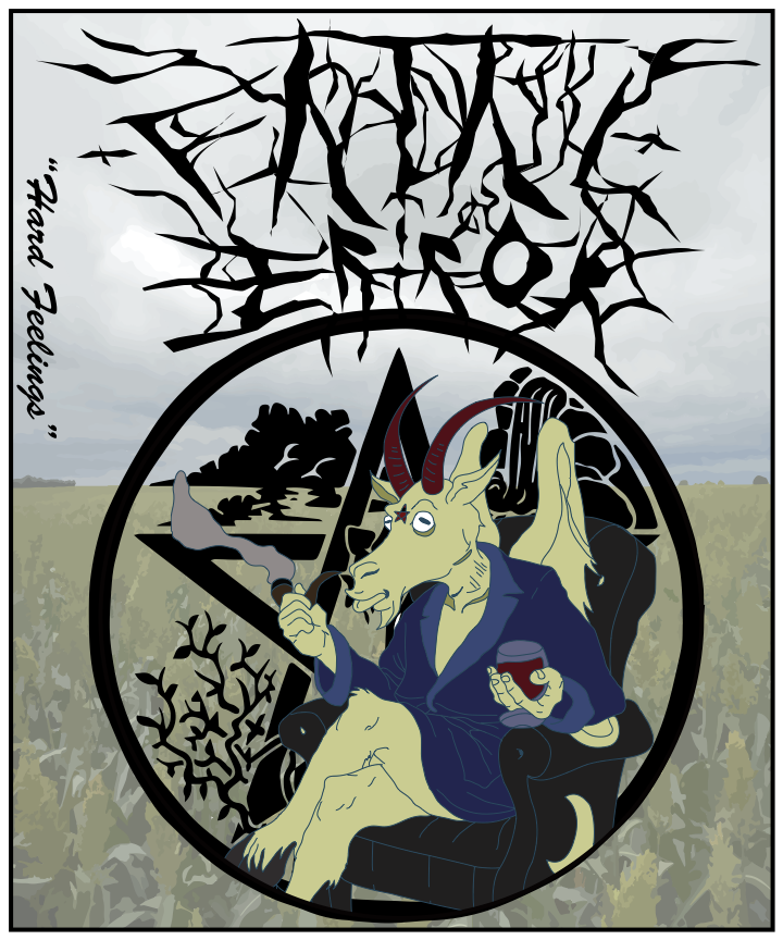
Fatal Error is a hardcore metal band, incorporating of upbeat verses. Such a unique genre, combining different genres makes Fatal Error’s music a whole new genre. Inspiration was found by utilizing the interests and dislikes of our band members, creating a song that incorporates the feelings of each member.
The colors used are meant to give the viewer and listener a feeling of angst, anger, passion, and fault. Red and yellow were the colors that I feel portray the feeling we were trying to convey in our music. These feelings link the metal chorus,and the lyrics of our song “Mr. Jones” to illustrate the life of a man who is constantly angry and annoyed. The colors and design elements help the listener relate to the feelings of Mr. Jones, and ultimately the feelings of the band members of Fatal Error. The numbers used in the background of the T-shirt represent the errors experienced by a computer, because faults in technology are some of the most experienced errors in this modern age and I wanted to capture this feeling of a lack of control in a way people can universally relate to.
Our band was pretty hard to categorize; our choruses were definitely heavy metal, but our verses were almost classical. We had a bass drop and a fugue. Our original piano and strings morphed into synths by the third verse. The only thing I really had to work off of when I was designing my poster and T-shirt was our band name, which was “Fatal Error”. I decided that that name was a good excuse to do something kind of nerdy, but (hopefully) looked really cool.
I guess, then, that for my poster, I was most influenced by the art that I saw on EDM posters. I tried to copy the clean lines and almost isometric 3D look that I noticed in a lot of them. Luckily, Illustrator lends itself fairly well to this style. I also took my teacher’s words to heart when she told us that “God is in the Details”. I nearly made myself crazy drawing every individual pad on a CPU socket, every little SMD resistor, every lead on a tiny QFP, even all the silkscreen markings around all the components on the board. I chose a modern-yet-natural analogous color scheme, which worked well for accentuating both the electronic and biological components that were fused together in my design. My T-Shirt design was quite similar: the tree was once again a central theme, only this time, I had to draw roots. I spent a lot of time making the CPU in this design, (perhaps it is the one conspicuously absent from the poster?) as realistic as possible. Once again, I found myself drawing a lot of individual pads. The font I used for the writing on the CPU (which is not quite the one Intel uses, but the most similar-looking one I could find) did not have the mask work protection symbol, so I made it myself. I guess I figure that if I’m going to have to wear this thing, I should probably give it my best effort.
At first, our group struggled to think of a theme for our band. To give us some inspiration, we listed out all the things we hated in the world, ranging from Toyota Rav4’s to floppy bacon. In the end, we simply decided to combine all the things we hated and create a song/band where we could sing out our hatred. Our band is called ‘Fatal Error’, because that’s the error we get whenever one of our programs at Freestyle Academy crashes without saving, which is just one of the many things that makes us all so very angry. We didn’t exactly have any bands that influenced ours, but the metal part of the song was inspired by Cannibal Corpse.
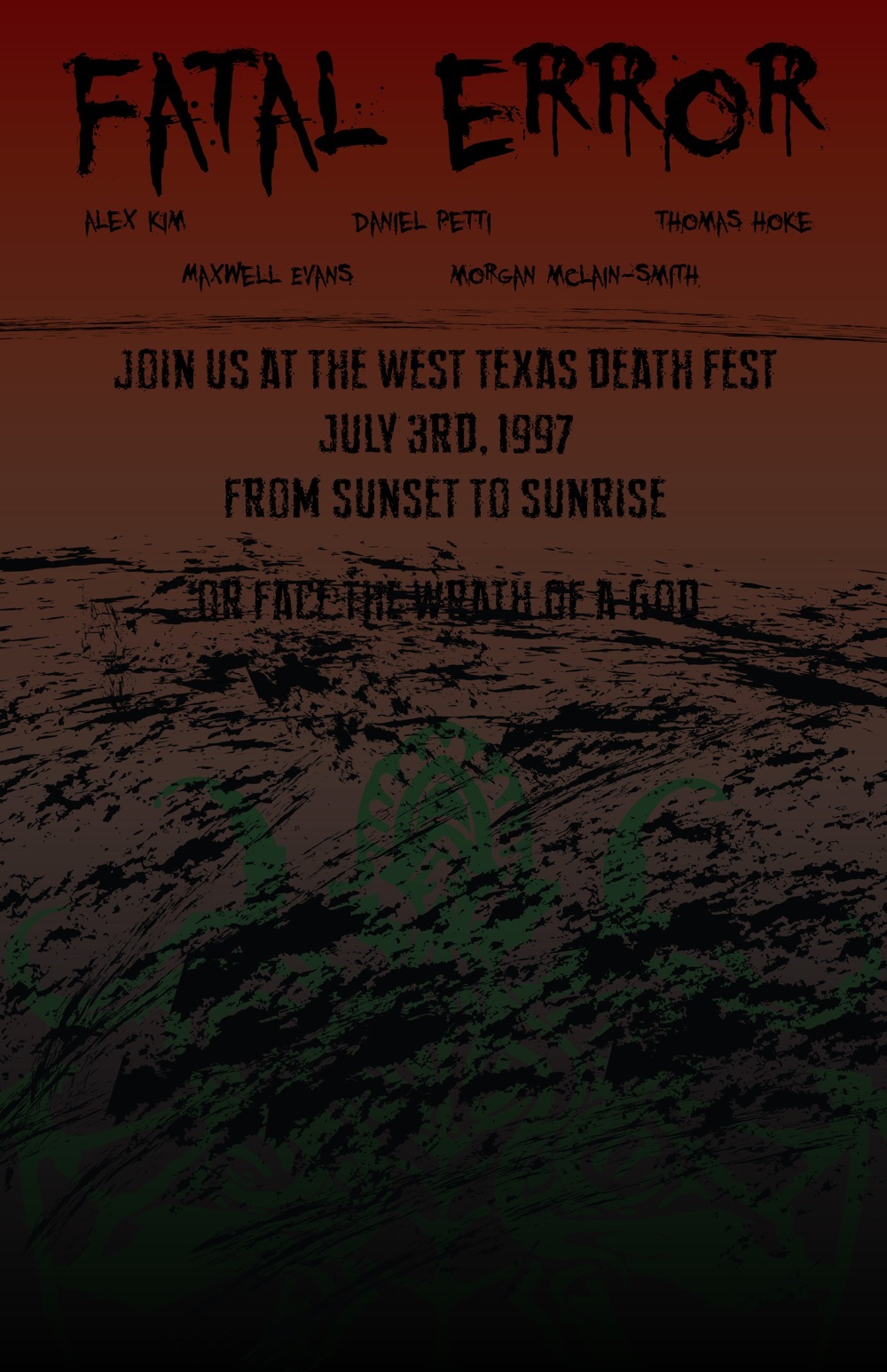
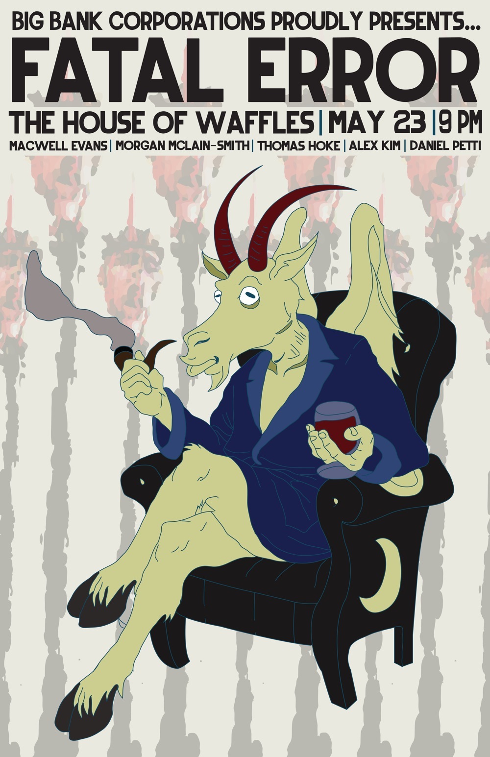
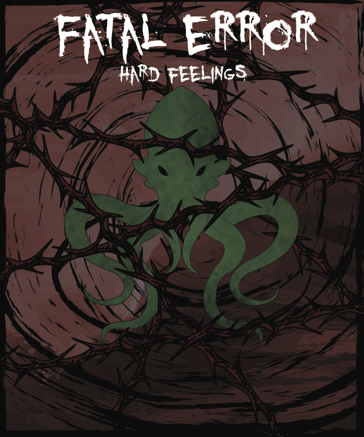
As for my poster and t-shirt, I decided to go with a Cthulhu theme. Cthulhu is a deity that has several tentacles and is often depicted as a giant humanoid with a squid-like face and lives a the bottom of the ocean. I used it has the basis for my music art because all the art it is depicted in is it being very angry, smashing boats and disturbing the ocean waves. The idea was given to me a by a fellow band member, Morgan McLain-Smith, who planned to used Cthulhu but later changed her designs. I wanted the poster to have a subtle Cthulhu, because the idea around him is that you never really see him, but you can always sense him if he is nearby, hence him being surrounded by black.As for the t-shirt, the way we place the designs on the t-shirt does not transmit black very well, so I knew I couldn’t do a ‘rise from the dark’ design again. Instead, I went with thorns surrounding Cthulhu’s head, because thorns are often associated with anger. The color scheme was a Complimentary red and green, with lots of black and white. The green was because that’s Cthulhu’s main color, and the red because it’s associated with anger. I wanted the font choice to be a metal-like font, so I googled ‘metal-like fonts’, and those were the ones that came up. I thought they fit perfectly with the Cthulhu design.
Our band was inspired by pop, death metal, and comedy bands. When we first began to discuss our music, we all agreed we wanted to go for a more humorous video. Since Thomas was part of a metal band, it seemed a waste not to take advantage of that resource, but we also wanted people to be able to understand our lyrics. With this in mind, we decided to play up the juxtaposition between the different genres of music rather than just relying on one. We listened to metal bands such as Abominable Putridity and took cues from comedy bands like Flight of the Concord.
For my poster and t-shirt I was inspired by the "experimental" style of our music, which I represented through a chemistry theme. By depicting a chemistry experiment gone wrong, I was able to fuse the idea of a "fatal error" with Mr. Jones’s job as a teacher. My color palette of neon green, blue, and purple was intended to invoke toxicity. I used skulls as they are often used to symbolize poison, and because of their prominence in the death metal genre. My font choices were inspired by markers and chalk, tying back into Mr. Jones profession.
Fatal error specializes in a special blend between a more classical/melodic sound and a more slam/death metal sound which I believe to be unique to the band. I was personally inspired by the early 2000’s UK slam/death scene, but in a more playful manner. As a band, we were mainly inspired by our general hatred for the Toyota Rav4, one of the worst cars ever concocted onto God’s green earth.
My T-Shirt takes on a harsh and darkish tone, making the design more metal than the average poster. I used a gloomy font to mirror the sullen tone of the design, as well as more pasty looking colors. I chose to make the goat sitting in the chair to be a sickly yellow to resemble the unkind aesthetics of jaundice. I paired it with a very dark black chair for contrast, and black is also a very metal color for those of you who don’t know. The background of the poster depicts impaled heads on a stick to go along with the harsh and hated theme, but also for unorthodox and unconventional aesthetic appeal. For the background of the T-Shirt, I used a feature called Image Trace in Illustrator to turn a photo of a corn field that I took during the profile project into a vector based illustration. In the end, I am happy with the vibe that the T-Shirt and Poster give off when displayed both individually and together as a whole.
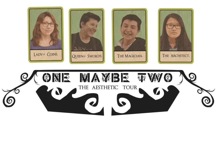
AnastasiaGJillianBPatrickOThuy-TienL
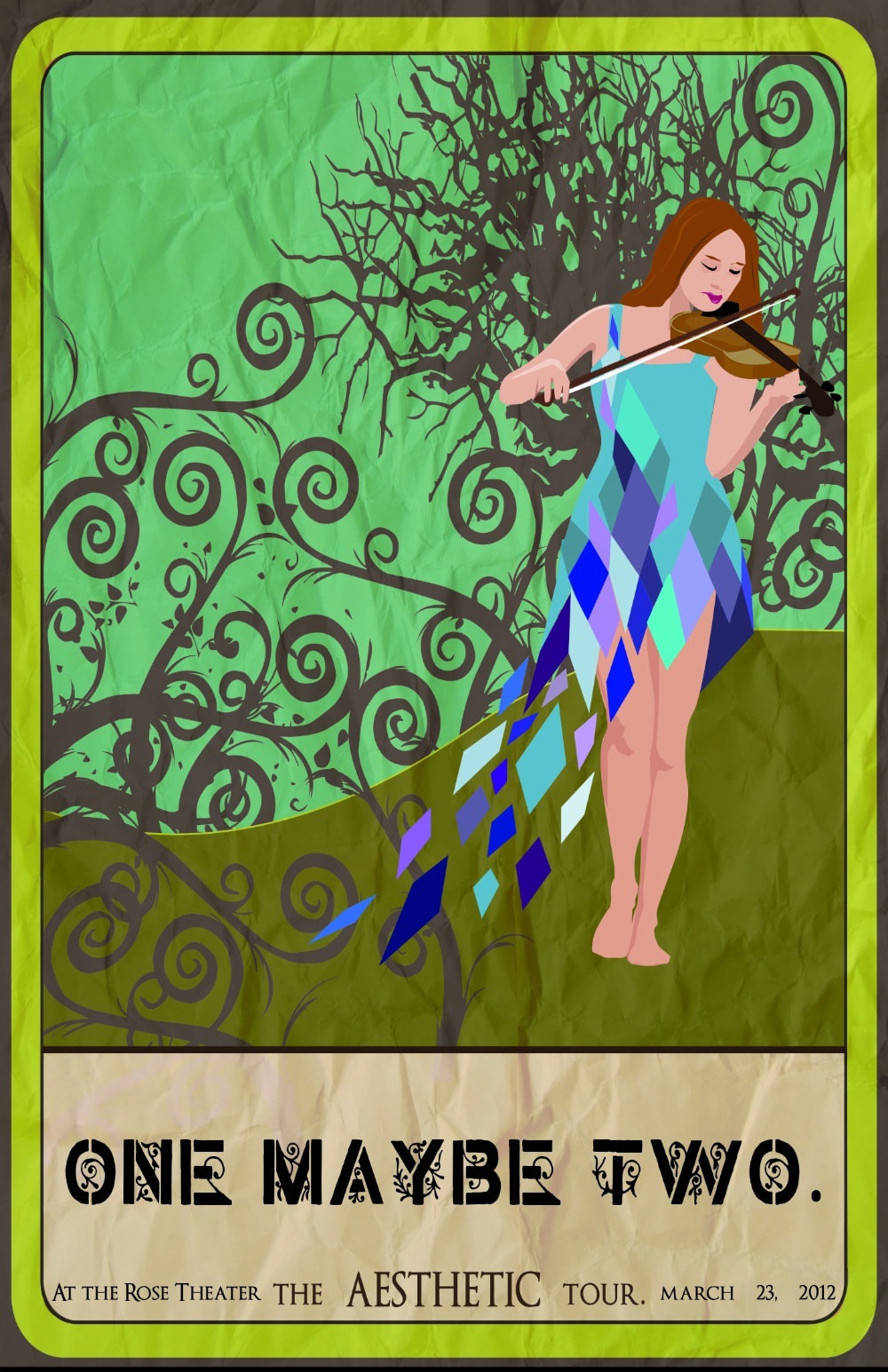
One Maybe Two is an indie rock band which incorporates classical instruments like the Violin into what is typically an acoustic genre. We took inspiration from band such as Of Mice and Men, and from artists such as Lindsey Stirling.
For my Poster and T-shirt I wanted more of an earthy and natural feel, so I used browns and greens. I also chose an old rustic font with leaves to further support the natural feel. The tarot card design for my shirt and poster were inspired by the idea of old traditions, much like the feel of acoustic songs, while the newer geometric shaped in my poster, represent the synthetic sounds and violin we added to our musical piece.
One, Maybe Two drew inspiration from the alternative music genre. Particularly, it was influenced by bands such as Everything Everything and Jukebox the Ghost. Although it doesn’t fit neatly into an established genre, One, Maybe Two certainly used ideas and styles present in these bands and in the alternative genre as whole.
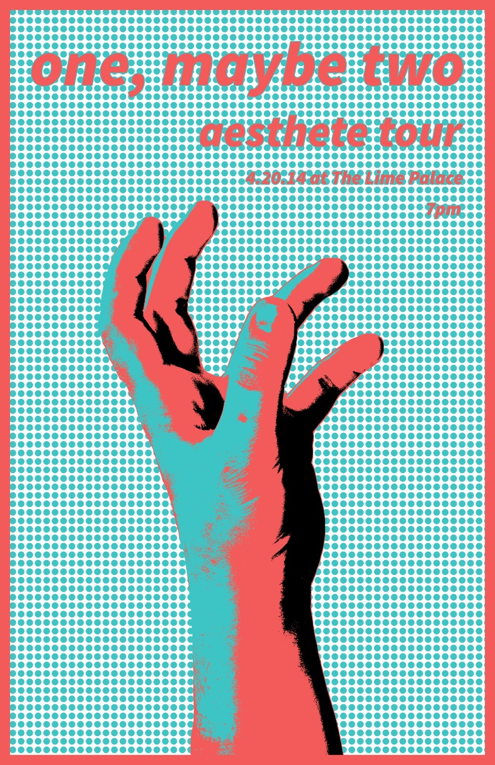
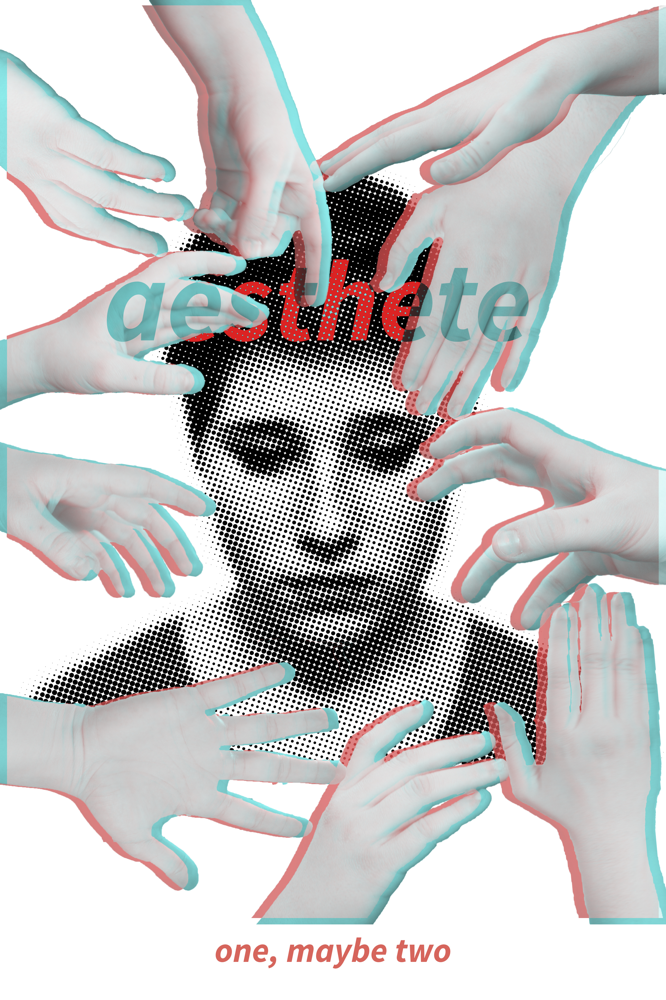
My poster and T-shirt were designed to echo the simultaneous multiplicity and simplicity of our song and band. The themes present in the name One, Maybe Two are displayed through the 3D effect on the hands on the T-shirt, and more subtly in the 3D image colors of the poster. The few colors and simple lines of the poster reflect the song in how its bright nature is emphasized by sparse instrumentation and inelaborate visuals. The very basic, unadorned font serve to offset the dotted patterns in both the poster and T-shirt, remaining easily readable and putting focus back on other aspects of the design. I further tied together the two images by using the reaching hand in each, albeit in slightly different ways. Together, they are unified, two images as one, as the band’s name and the music video’s constructions suggest.
Our band was centered around a Indie/Alternative music style. Our goal was to represent life and how seemingly simple it is at the beginning, however, as you grow up can seem more of a mirage. The bands that represented our type of style and vision was like One Republic, and other various indie and Alternative music styles. My Poster and T-shirt design were built to parallel the theme of many popular indie bands with surrealism and minute details that are hidden by one simple main visual. I wanted to use water-like blue to complement our video and the name of our song ‘At Bae.’ Blue was a strong color so I wanted to complement it with a strong orange, a triad color on the color wheel. In reference to my poster I incorporated the orange as the sunset and the text, while in contrast on my t-shirt I kept the orange as a strong complement color of the stickers. I used fonts that were unique and show a more of a surrealistic look. The Eye in both images was used to show and explain the concept of our song and about how one can define life and all the possibilities. Specifically in the poster I have the eye as the center to put emphasis on the power of perspective I also have the eye posed looking at the stars, which represents the infinite possibilities one can live their life.
Musically, I am not a picky person; I listen to all genres of music. I like whatever’s catchy or sounds good. Towards the beginning of this project, my group and I had a hard time deciding what direction we wanted to go in regarding the type of music for our band. We finally came to a consensus when we realized all of us loved indie rock music and looked up to artists like the Arctic Monkeys and Franz Ferdinand. We chose to pursue that direction; One, Maybe Two was born, and the rest is history.
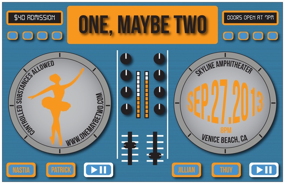
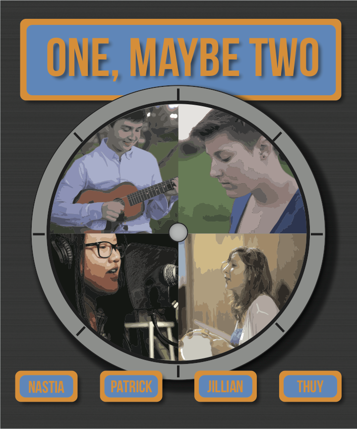
For my music video poster, I wanted to design something that represented the lively nature of my band. I chose my color scheme to be the complementary colors, blue and orange, because I did some research and apparently, the combination of blue and orange creates a happy color scheme. As for the actual design, I chose to design a DJ turntable because my group originally wanted to incorporate Electronic Dance Music/dubstep in our song. However, we discovered soon after that we were too ambitious and due to time limitations and the fact that none of us really knew how to make EDM, we decided to scratch that idea. We’ll probably make an EDM song at some point and we all still love EDM, so the turntables represents that aspect of our band. I included the ballet dancer in one of the turntables to represent one of the scenes from my music video: Nastia dancing to the slow melody of our song. I chose to use a sans serif font for my poster because I wanted a font that was bold and clean, but not too formal like the serif fonts. For my t-shirt, I wanted to design something that included all of my group members. I took screenshots of various scenes from our music video (one for each of us) and combined all the screenshots together into a circle to represent the unity of One, Maybe Two. Since my t-shirt design had to relate to my music video poster, I went with the same blue and orange color scheme and font choice that I used for my poster. Overall, I am very happy with the results of my music video poster and t-shirt design. I hope you think it looks cool too! Buy One, Maybe Two merch today!
AnnaWChristopherOElizabethJZacharyD
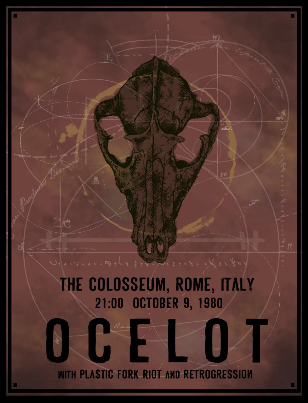
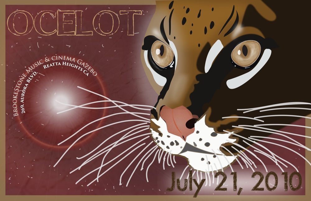
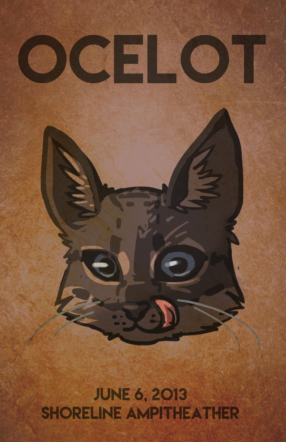
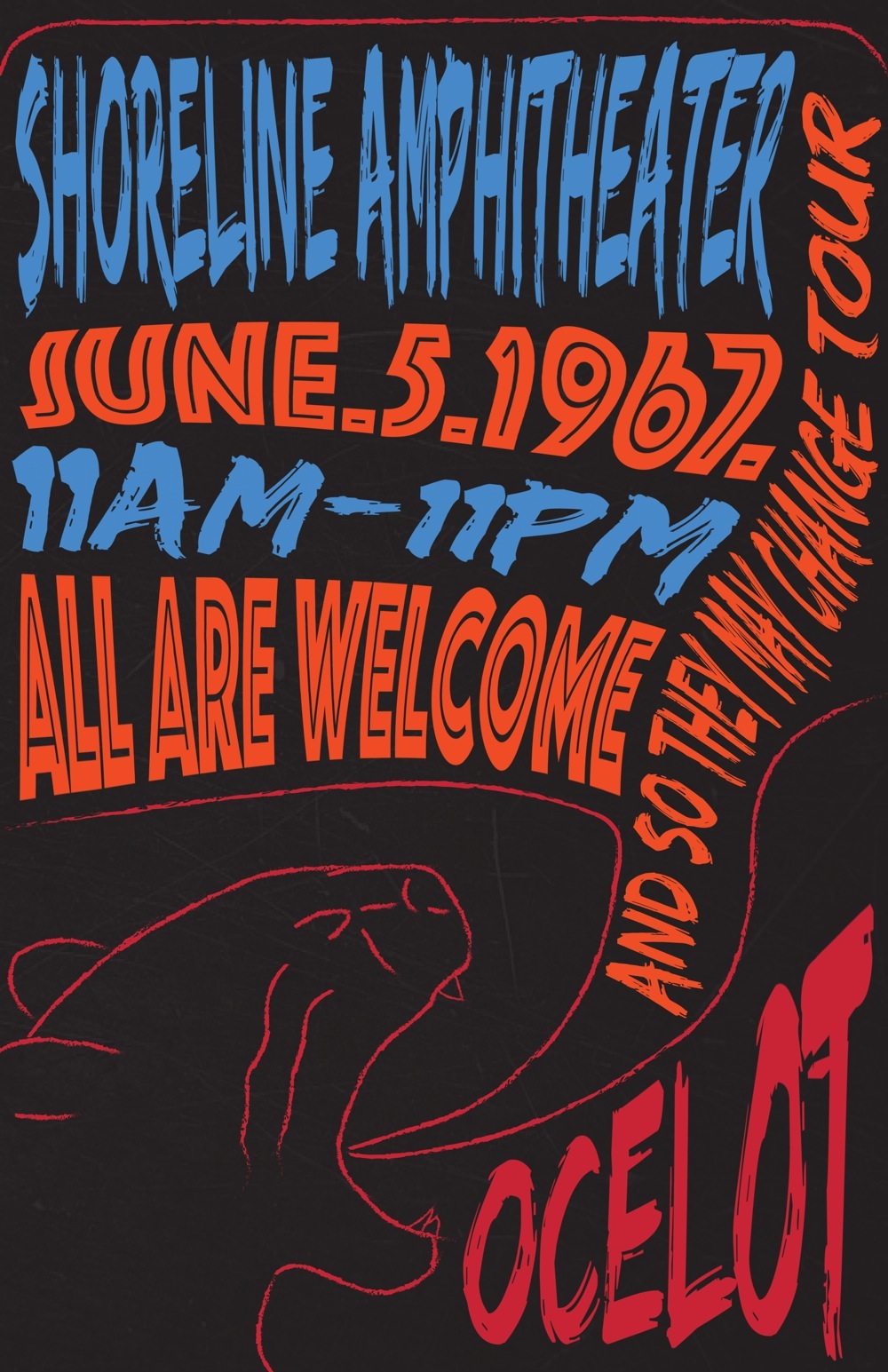
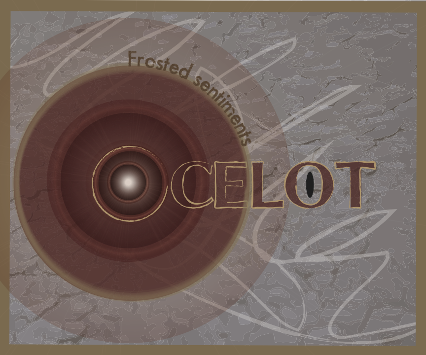
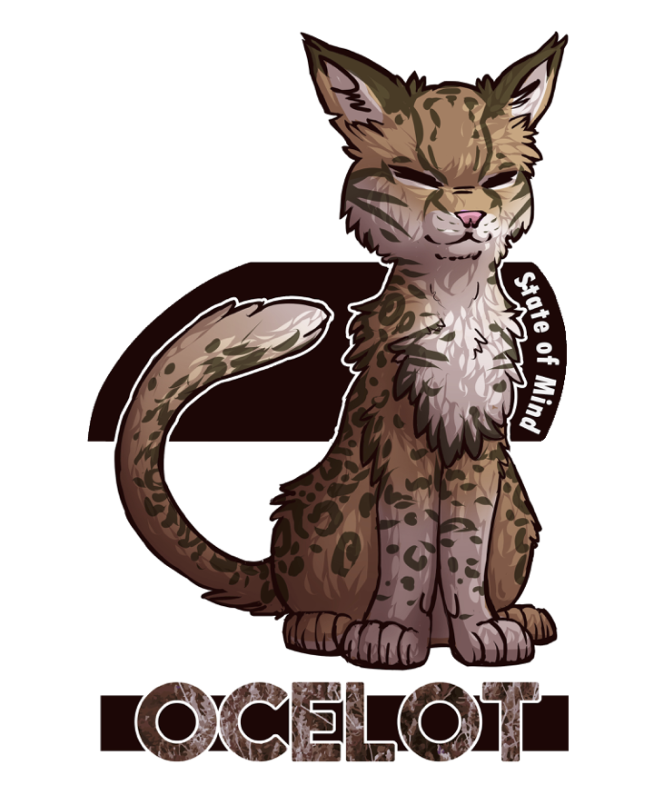
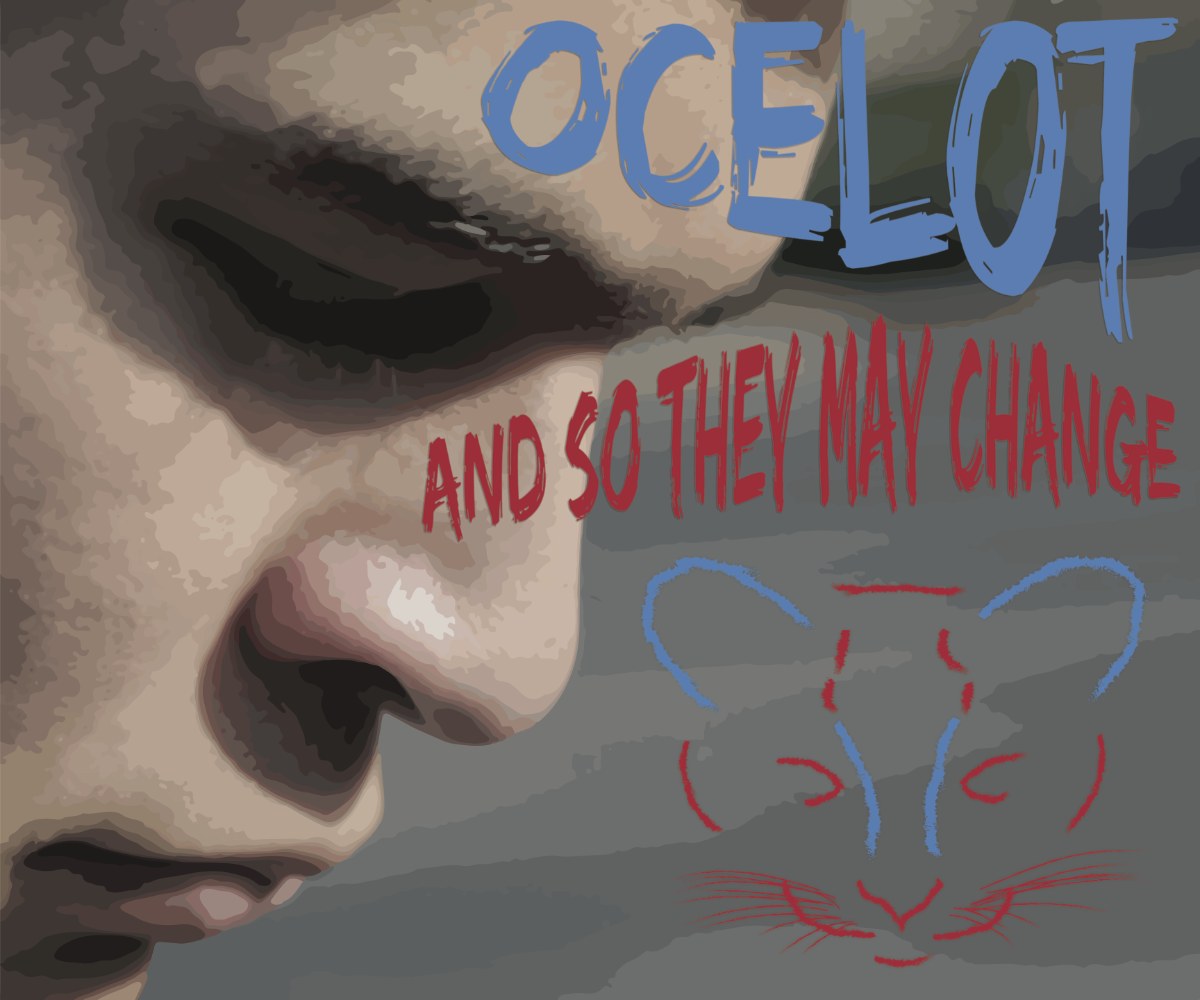
My Band, Ocelot, creates indie rock music. The music uses real live instruments, drums, piano, guitar and male vocals. The bands Fleet Foxes, Denmantau, and Modest Mouse. We tried to capture a nostalgic, but not particularly sad vibe.
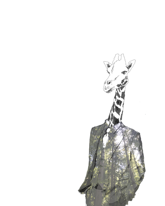
My poster is a dark red with tan and dark green, nearly black, accents. In the center of the space there is a wolf’s skull, sketched and shaded in a rough, messy manner. I chose to draw the skull in a rough manner to reflect the imperfection that makes our song interesting. The poster is dark, with the skull and harsh scratches, but I also wanted to convey mystery and intrigue. To me, geometric markings and lines usually used to plan out architecture or map out the constellations above us, represent human exploration and curiosity. Throughout history great thinkers; artists, scientists, philosophers, mathematicians; have sketched out the world around them, and I wanted to include these nearly mysterious symbols to show that there is exploration in our music. I chose a muted red for the background because red is slightly morbid but also passionate, and it is muted to give the viewer a glimpse at the bit of the nostalgia. The font that I used in both the poster and the t-shirt design is bold and strong but the edges are rough and give the words a worn and broken down appearance when a viewer looks closer. In the design on the t-shirt, I drew the giraffe and suit outline in the sketched, rough style that I used for the skull on the poster. I did this for the same reason, to keep continuity and to represent the informality of our music. The choice to place a forest in the interior of the suit on the t-shirt is to convey a different type of mystery and awe, because what is more awe-inspiring and strange then nature? I decided to deviate from the animal represented in our band name to highlight irony and unique aesthetics which are used in the sound of the song.
When our group deliberated the types of music genre’s we were interested in, we became tied up on whether we should go in the psychedelic rock direction or the indie rock direction. The choice wasn’t easy, as everyone was set on a specific music choice, but this being a collaborative music video project, we needed to ensure that our entire group was on the same page. We listened to various types of music from several unique artist to get a better idea on our music style: from the Fleet Foxes, to Local Natives, and even a crazy band by the name King Gizzard and the Lizard Wizard. We finally decided that we wanted a light mix between light rock and indie, and really tried to create something that was slightly unorthodox, but still marginally mainstream.
To create an intriguing music video, we decided to create a narrative plot that tells the story of a male and female who grew up together and eventually the male slowly falls in love with his long time friend, but she doesn’t feel the same about him. Our music ended up becoming more of an indie in genre, so I looked in the pantone book which explains the meanings of colors, and it described red as stirring passion/ emotion, which was the perfect color for our song. So I used red, and by utilizing the powers of Google, I looked up various indie bands and their cover art, in which I found that many of their designs incorporated animals. That is why our group came up with our name ‘Ocelot’, so the animal theme could be translated into all our group’s artwork. Similarly, for the fonts that I picked (from Dafont), I looked for fonts traditionally used in indie cover art. With all of these components, I created something that was non traditional (like our music), but also used the imperative principles of design (line, shape, color etc.). In the end I hope that my artwork successfully portrayed our theme.
Our band, Ocelot, falls into the genre of indie rock, with some influences including bands such as the Fleet Foxes and Foster the People. We chose indie rock because the genre is quite diverse, and the overall style would be compatible with the guitarist and drummer that we brought in to record the music.
Both the t-shirt design and the concert poster have very earthy, warm colors. The designs I drew for both of them are very lively, with a textured look on top of them. Specifically for the poster, I overlaid a photo of a textured wall over the entire piece to align with the indie rock feel. For the t-shirt, I made the ocelot that I drew the main focus, so I overlaid a photo of some plants only over the text that said “OCELOT”. The showy, sans serif fonts I used on them added another unique touch. All of these elements combined gave off the indie rock feel of our band.
Our group’s music of choice was heavily influenced by artists like Tame Impala and Cage the Elephant. We wanted to exude feelings of longing and angst in our music. Music is an exploration and we wanted our project to explore the teenage world.
When creating the music video poster and t-shirt, I wanted my design elements to flow together. In this way, it seems to parallel the psychedelic concert posters from the 60’s and 70’s. A lot of the music that was produced around this time forced the listener to interpret a personal meaning. It was a different experience for each individual and this is what I was going for in my music video and supporting artwork. More literally, my poster and t-shirt show an Ocelot, reflecting the name of our band. My concert poster shows an Ocelot’s roar, while the t-shirt shows a more stylistic depiction of an Ocelot from the front combined with a live-traced screen grab from our group’s music video. Our music video emphasized the contrast between two worlds using color grading. This choice was reflected in the design for my poster and t-shirt. A cool blue is contrasted with a dark orange, and backed by a scratched black background. I chose a main font that had the same primal feel as the rest of my work. Simplicity was another theme that I wanted to emphasize in these two pieces. In my opinion, many concert posters seem busy and the viewer can get lost. I tried to combine a design with strong contrast and lines that draw the viewer’s eye through the composition.