The Explorations Unit is my last unit at Freestyle, and it was a fun one. I've had an absolute blast at Freestyle for the past two years, and this was a fun way to end it. The Explorations Unit is devided into a humor part and a exploration/mediation part called Blink. All the pieces I created can be found on this website. The main goal of the Explorations Unit was to answer the question "What is thought?" through different skills I've learned at Freestyle.
The Explorations website is a responsive website, which means the layout adapts to different sized devices. For example, the website looks different on a desktop computer than it does on a laptop or a smartphone. Learning responsive web design through css was really interesting, because being able creating an adapting website is an important skill. It'll make my websites a lot more professional and easier to navigate, since many different devices can be used. In addition to the website, I had to create a mini-project for Web/Audio. I didn't have that much time left, so I decided to play around with a photogallery code and edit it so that it would also adapt to different size browsers. It was more difficult to arrange than rest of the website, but I learned useful things.
I hope you scroll through the website and enjoy the last pieces I will make at Freestyle. Leaving this place is bittersweet, and I can't thank the teachers enough for the amazing job they've done. Learning how to use different applications and now being able to create my own website, book or poster is not only super useful but also a fun skill to have. Through Freestyle I've been able to get involved in some important work, like human trafficking safe houses(my documentary project junior year), but also learned about things like music videos and magazine design. I've enjoyed this experience so much, and will miss it a lot!
Blink was one of the subunits of the Explorations Unit. I started off by reading the book Blink, which studies how our unconscious works to make snap judgements. It was a very fascinating book that I enjoyed a lot. I also did some free writes on different prompts, that I then edited to match a specific author's style.
In Design, we did some mediation and then responded to different prompts immediately through multiple different art forms. It was fun and a lot more relaxed than some of the pieces I've created at Freestyle. However, at the end, I took one of my free writes and one of my design pieces and combined them in Adobe Photoshop to create a completely new piece. You can find all of that below.The main idea behind my piece “Space” is to remind the viewer that sometimes it is good to take a step back and look at the big picture. People usually want to be right where things are happening, but that limits us to just a little portion of the truth. To really understand the situation, or to make the right decision we sometimes have to take a step back. The prompt for this assignment was to create something relating to Kurt Vonnegut’s quote “I want to stand as close to the edge as I can without going over. Out on the edge you see all the kinds of things you can’t see from the center.” I used acrylic paint to paint the planets and stars, which I then scanned and moved into Adobe Photoshop. At the bottom you can see a picture I took with a Nikon D80 camera. I used a custom font and a Photoshop plugin to add visual interest to the piece, and the text ties the picture and painting together.

The Humor Unit was another subunit of the Explorations Unit. I studied different comic artists and learned a lot about how you can use humor to bring across your point while making the audience laugh. Even though making people think while laughing is kind of difficult, I learned about different humor techniques that make it possible. I then paired up with Fiona S. and together we created a 5 minute infomercial for our humor presentation. You can find that below.
After creating the infomercial for English, I created a Design piece relating to the humor presentation. I wanted to emphasize how ridiculous infomercials are by creating a flashy and obnoxious poster for our Pour On! Makeup product. The artist statement and piece can be found below.
For the Humor Unit I paired up with Fiona S. Together we made an infomercial for Pour On! Makeup. We used a lot of exaggerism, hyperboles and absurd humor to bring across how ridiculous infomercials are. After doing some research and watching infomercials, it was clear that we’d need lots of reminders of how amazing our product was and how this was the only chance like, EVER, for you to buy our fabulous product. We also wanted to use a product as ridiculous as pour on makeup, because it is clearly useless. Infomercials often have products that aren’t necessary, and we wanted to point that out in our humor piece. I used Adobe Photoshop to create a poster for the infomercial. I illustrated a TV, and then added a picture of Fiona holding the product as well as information that told the viewer more about the product. The whole point was to make the colors clash, and make the poster look as trashy as possible - we are talking about infomercials after all.

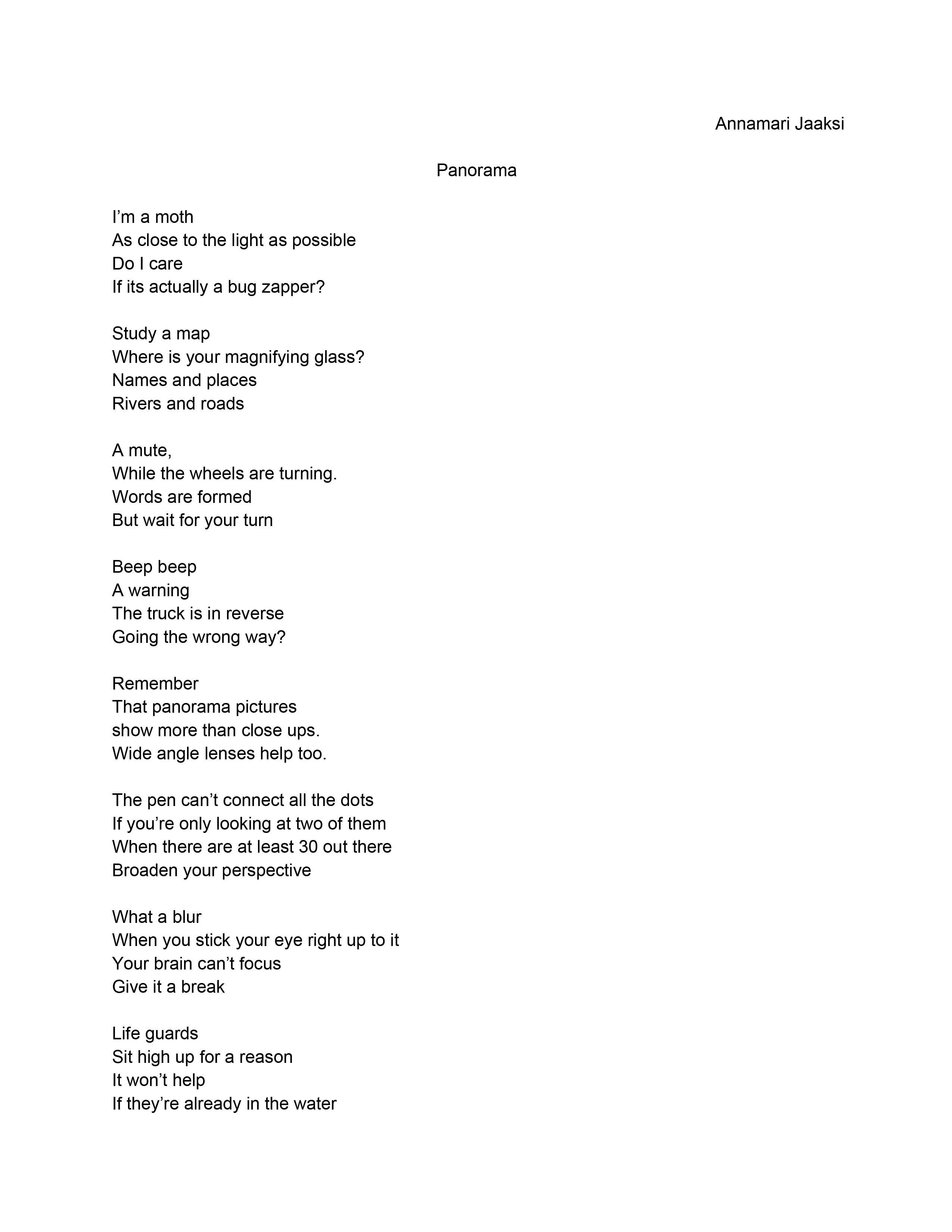
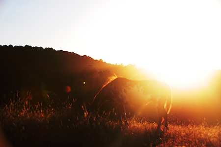
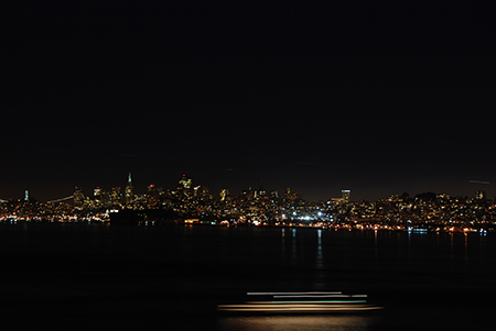
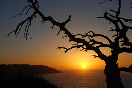
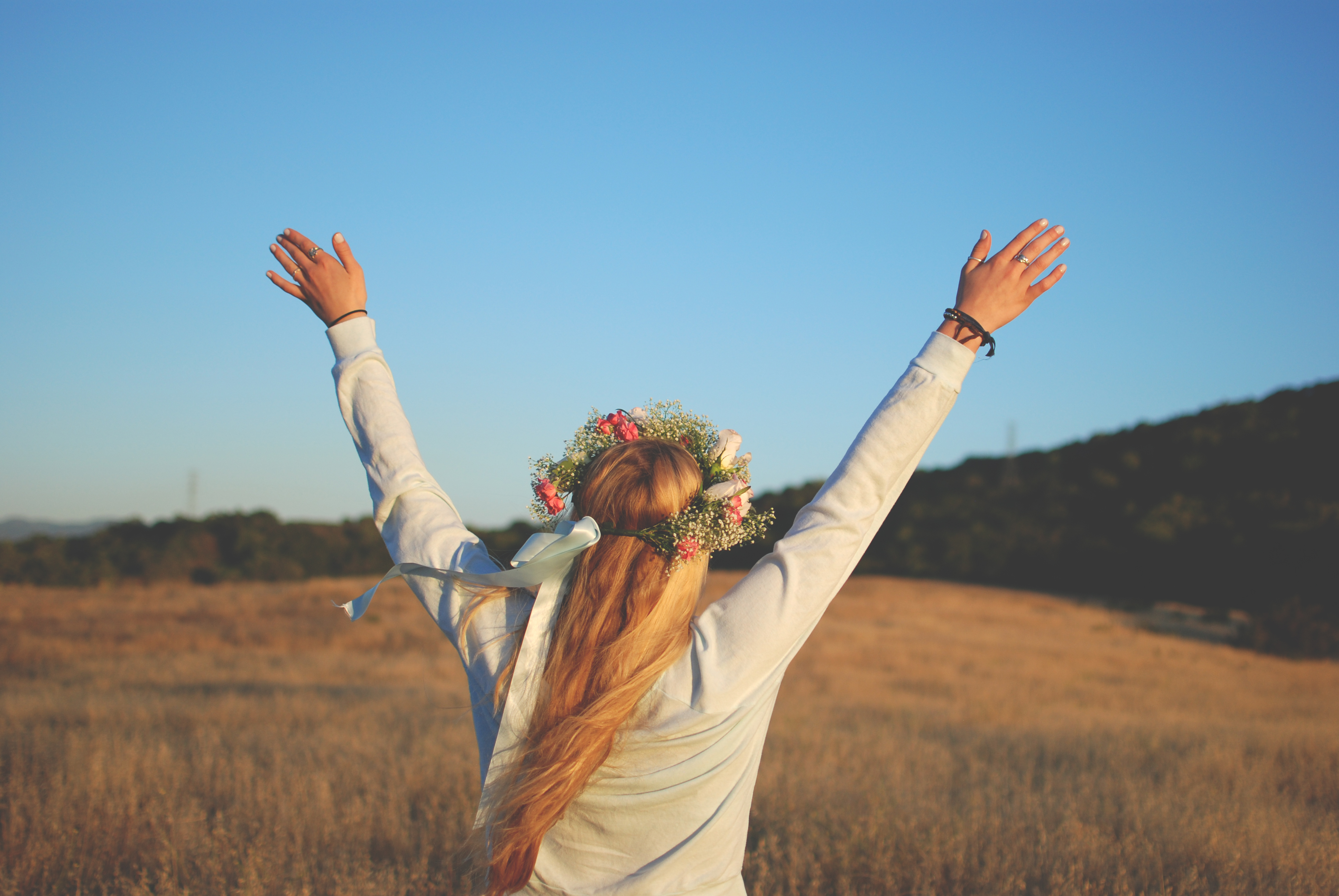
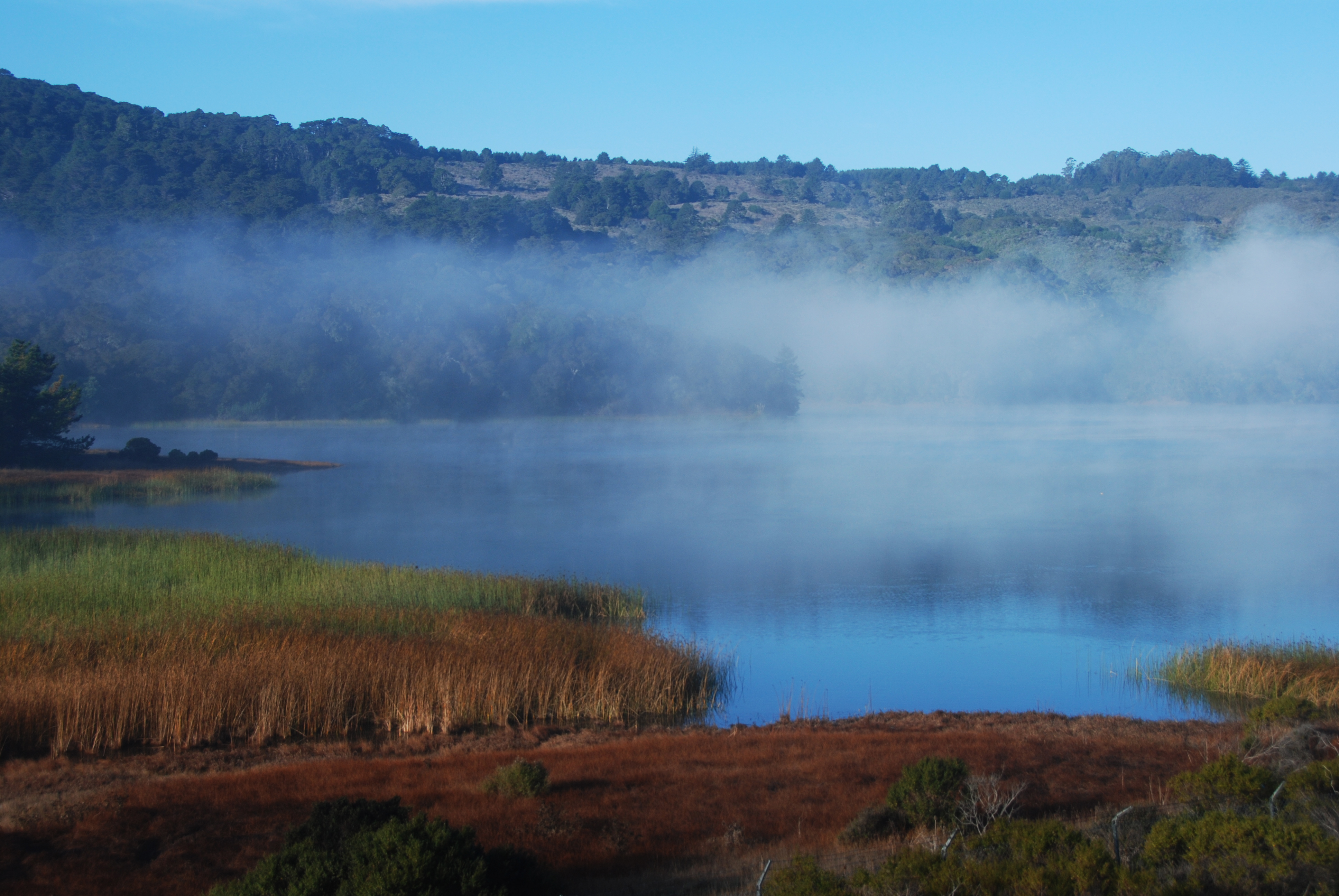
The mini-project was a subunit of the Explorations Unit that focused only on Web/Audio. I had to pick some concept related to either web design or music, and create a small project based on what I learned. I decided to work on creating a fun photogallery since I really enjoy photography. It was a challenge to create a nice looking gallery that still adapts with this website to fit the size of the browser.


