

Introduction
How well can you tell a dialogue-driven story?
The Narrative Perspectives unit took place over the course of November to February and had a wide array of projects. The largest project we had in each class related to the book Citizen: An American Lyric, by Claudia Rankine. The book is a collection of lyrical essays that describe the experience of a black woman in America, and so after reading and analyzing it in English, we wrote our own lyrical essays. In Design, we created Japanese stab-binding books to display the themes from our essay, and then in Digital Media, we created songs that displayed a narrative.
English
Listener Lyric
A lyrical essay is a nonfiction genre of writing that combines poetry, essay, and memoir as well as breaking the rules of the standard 5-paragraph essay. In English, after reading Citizen, we used it as inspiration when writing our own about someone with a different identity than us. Our first task was to find an interviewee and listen to them speak about their experiences as a certain group in America, hence why the project was called the Listener Lyric. We created transcripts and used that as the basis for our essays, and then experimented with different creative ways to represent our topic. Here is my essay:
BREAKING NEWS: NO ONE CARES.
But it’s not really news. You’re not shocked, she’s not shocked. Actually, it was kind of expected.
Why don’t we care?
How could we care if you don’t even care yourself?
But it’s not that you don’t care; actually you do. A lot. Maybe you should share your thoughts…?
Hah, that’s funny! It’s not a big deal. Your parents would be disappointed, so you lay low.
BREAKING NEWS: THEY DON’T BELIEVE YOU EXIST AND THEY’RE NOT AFRAID TO SAY IT.
So do the artists think you are a hologram? An imaginary species conjured up by their overactive fantasies? You know you exist, but they’re not entirely sure you do, and the people who hang up their artwork believe what they say.
I’m here! you cry, but they look straight through you.
Hm? Where?
Here!
Oh, ok. Hey, I found one!
BREAKING NEWS: EVERYONE LOOKS AT THEIR PICTURES.
The artists spend hours crafting beautiful portraits with Prisma colored pencils, the buttery expensive ones rich with color. They’ve drawn so many of your friends. Maybe they could draw one of you?
Um.
Please?
They scribble a figure out in a couple seconds.
Comically emasculated but knows karate.
You stare at the image they’ve drawn, thinking it looks nothing like you or anyone you know. Try again, you say.
They look around and at each other uncomfortably.
Intellectual but socially inept.
You’re not sure if that’s any better. They say it is, but it’s not hard to get it completely right.
Why are you still complaining? You have Mulan.
Mulan is great. More Mulans would be nice.
If you want another Mulan, maybe you should buy us some new colored pencils.
You’re not about to spend your parents’ money.
BREAKING NEWS: YOU EXIST AND HAVE STORIES TO TELL.
This is important. This is your life and the lives of the people who will dictate your life. The world should be educated, and if it’s through the media, so be it. It’s the least you can do to show the artists your people are a part of this nation and deserve to be drawn. You grab a fistful of money from your dad’s wallet and run down to the art store, buying the most buttery and rich colored pencils you can find. You run back to the artists and hand them the pencils.
Cool, thanks, they say.
Can you draw a portrait of me now?
The artists exchange glances and then nod. They spend about half an hour fleshing out an image.
The studious Asian sidekick who aids the white main character.
BREAKING NEWS: IT’S HARD FOR YOU TO MAKE HEADLINES.
Why don’t they tell your stories too? Just like any other American, you have a unique personality and individuality that does not strictly align with stereotypes. They tell the stories of other Americans, so you deserve to see yours told as well.
You will make yourself so bright and visible that they cannot deny your existence.
BREAKING NEWS: BTS IS THE FIRST K-POP GROUP TO REACH NO. 1 ON THE BILLBOARD TOP 100 CHART.
…What?
This is incredible. Excitement bubbles up in your chest and an overwhelming wave of pride washes over you. You feel compelled to go out to the street corner and shout this out to the world. An East Asian band full of East Asian boys beat every other American musician.
The artists are forced to draw you and draw you well. The people who hang up their pictures did not know you could be good at music or dancing, but the hammer chips away at their flawed perceptions and they don’t question it as much.
BREAKING NEWS: YOUR PICTURE IS STARTING TO BE DRAWN.
They’ve only finished a few, but those few are beautifully done. They’re still learning how to draw you properly, and it might take some time before it’s perfect, but you can’t wait to see what else they’ll create.
Digital Media
Music Production
In the last month of second quarter, we had to create either a cover or an original song using a combination of the music softwares Pro Tools and Reason. The objective was to produce a piece of music using Reason MIDI instruments, Pro Tools MIDI instruments, live musical tracks, and effects to enhance the song. I chose to create an original song, so I started my process by writing out the lyrics. The song is about change and the feelings that come with people in your life leaving and moving on. At the time of the writing of the lyrics, it had really hit me that this was our final year and everything I’d ever known would change after it’s over. All my friends and I would be going off to college and the thought that I could possibly never see them again was weighing heavy in my mind.
Because this was a very emotional topic for me, I felt that it was a given that the music itself would have to be depressing as well, so I took a pretty piano piece I really liked that I’d learned in freshman year and sort of improvised it until I found a melody I thought would work. The original piece is called “Flight of the Monarch” and is by one of my favorite contemporary composers, Melody Bober; you can listen to it here. Below is a video of my piano improvisation on it:
ARVE Error: Mode: lazyload not available (ARVE Pro not active?), switching to normal modeI decided on the main melody and then began to digitize it. I created the same melody on a piano in Reason, experimenting with various effects and sounds to get it as close to a real acoustic piano’s sound as possible. Once I had that down, I worked around it with other instruments and added a beat, strings, and supporting pads in Pro Tools.
Here is the final version of the song:
Lyrics:
[Verse 1]
Wonder where we will be
When we finally forget
You say, "Wait 'til the world catches up
"And then you can regret"

[Verse 2]
Wonder who you will be
When we decide to meet again
You say, "We'll stay the same so would you please
"Put down the pen?"

[Chorus]
But I can't help but know, know
When the days turn dark and cold
The butterflies will fly away
And I'll wander on my own
And I can't help but know, know
When you walk away, you'll show
You're still in love, burn a line
But you'll replace me in time

[Verse 3]
Lately, it's hard to slow down
You've been painting much less
But can we take some time to unwind
In the few months we have left?

[Verse 4]
Wishing things would never change
Wonder why we even met
Because in the end, you'll see it's always
Built to forget

[Chorus]

[Bridge]
Butterfly
Don't fly away

[Outro]
I can't help but hope, hope
When the days turn dark and cold
The butterflies won't fly away
And I won't wander all alone
And I can't help but hope, hope
When you walk away, you'll show
You're still in love, burn a line
Please don't replace me any time
Mandalas
The second project we did in Digital Media was create mandalas in Adobe Illustrator. Here is my black and white mandala:
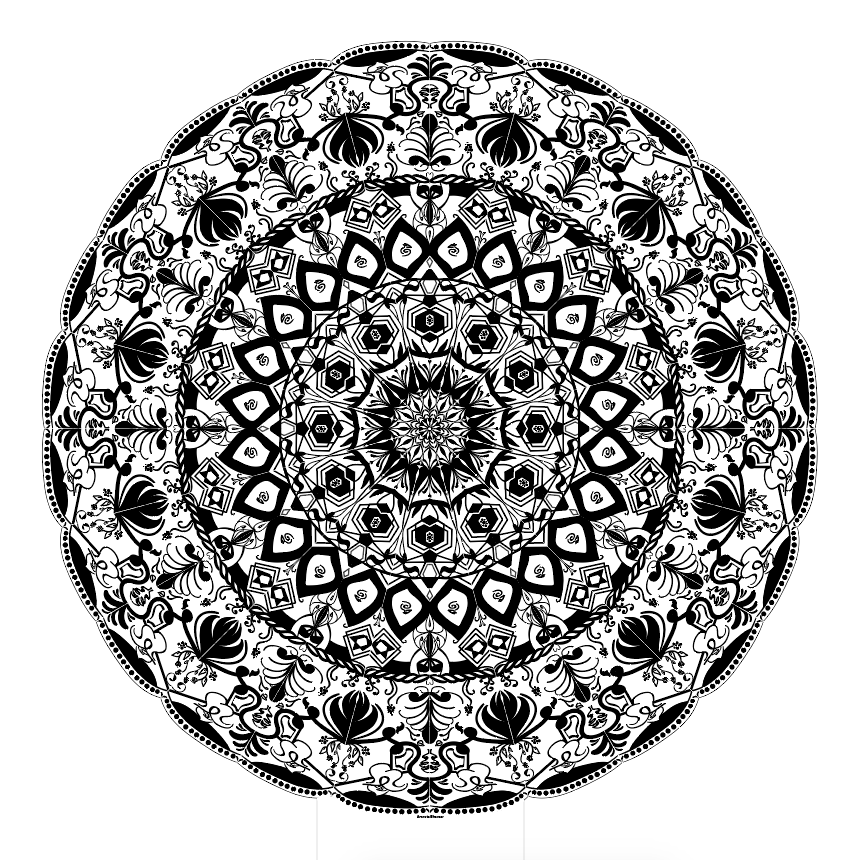
I created this using an fx in Illustrator that allowed me to repeat the pattern I drew all around the circle and a clipping mask that hid anything drawn that was not in the slice I was working in. Here’s a video of me revealing all the separate layers of my mandala and showing the process of creating it:
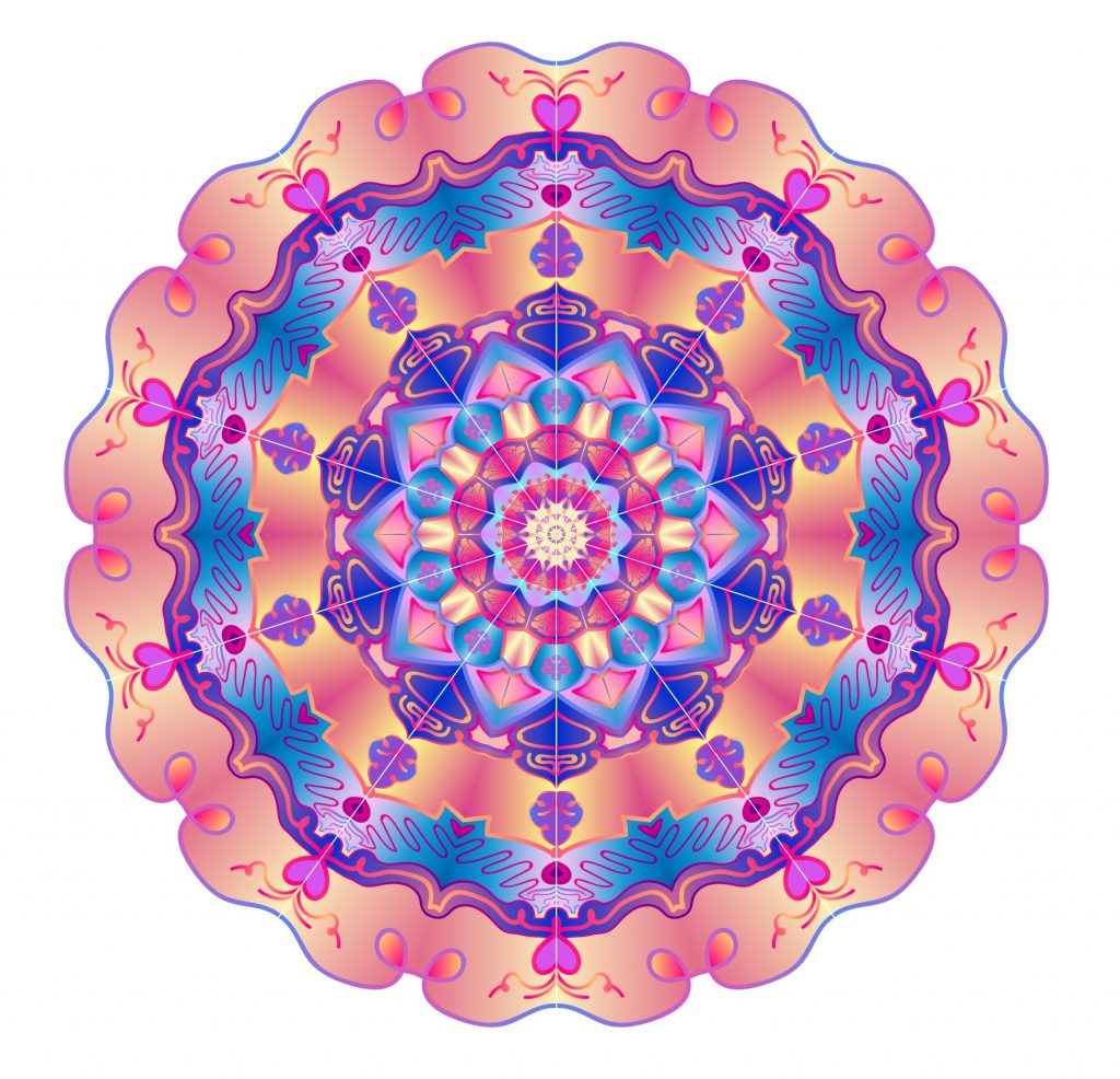
ARVE Error: Mode: lazyload not available (ARVE Pro not active?), switching to normal modeHere’s my colored mandala:
Freedom Project
The freedom project was pretty similar to the Explorations project from junior year in that we had free reign to create whatever we wanted, as long as the end result was in a video format. For mine, I decided to create another song (surprise) in Pro Tools and screen-recorded me drawing some conceptual artwork to go along with it. I sped up the footage of the drawing from an hour and a half to 2 minutes and 30 seconds in After Effects, and then added the music on top of it. Here is my Freedom Project:
ARVE Error: Mode: lazyload not available (ARVE Pro not active?), switching to normal mode[Chorus 1] It's got a price It's got a price that's way too high I'll roll the dice Watch this crime Watch this crime I won't define Watch my filthy crime [Verse 1] It's pretty clear the bombs are near Cold War nuclear fear Better steer right off the road So you won't feel yourself explode Buddy says that I should pay "Don't pretend you can't, okay?" Bold hands try to pry Gold land that is and will stay mine [Chorus 2] Yeah I be believing Quick to run the meeting See the views and hear the tunes That they want me eating Yeah, but this is shopping Blow the fears of stopping That's how you know x2 That I be believing Seventeen and seething Wish the world would work Around me 'cause I'm always cheating Rocking, mockingbirds hopping That's how you know x2 [Chorus 1] [Verse 2] 'Cause here in Snow Globe City We only see what we see They try to tell you break the glass With matches, no hatchets, "No catches" "Believe me, you know, I been here before" "Trust, I already found the door" "You been searching for" "So let me give you a hand" But I've also got a plan Plan for me, you can leave Maybe snow globes are for peace And mine's full of sand It's got waves and warm land Palm trees, ocean breeze You can leave [Chorus 2] [Chorus 1]
Design
Citizen Photography Project
My lyrical essay explores the lack of representation within American media for East Asian Americans. The passage that I chose encompasses the sentiments my interviewee conveyed to me about this subject, the main one being disappointment, but also hope because there has been more representation in the media for this group of people.
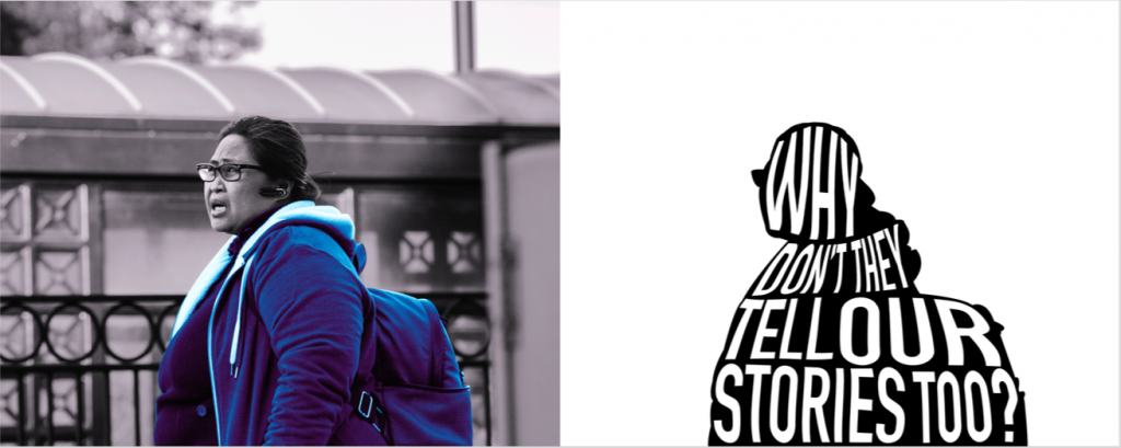
I chose this specific photo to exemplify my passage because of the raw emotion written on the subject’s face. I thought that the expression on her face fit with the feelings my interviewee described to me. Additionally, this photo was shot at the train station in downtown Mountain View, where the subject was waiting for a train, just like how East Asian Americans have waited to be represented in American media. The background clearly shows the train station, so it could be a visual metaphor within the photo for the lack of representation Asian Americans know all too well. I also liked the color of the woman’s clothes and backpack, which were all blues and purples and I thought they fit the mood of the photo and my lyrical essay. Because there is such little East Asian representation in American movies and music, they are virtually invisible in American media. I chose to make the colors of the woman’s clothes and backpack brighter to show that she does exist, even if the media does not.
To edit this photo, I first used the pen tool in Photoshop to trace around the subject’s jacket and backpack and then made that into a selection. I then inverted that selection and made everything outside it grayscale. After adjusting the brightness and contrast of the colorized part, I used a gradient map to adjust the levels of purples and blues and even them out across the shirt, jacket, and backpack. Then, I made a selection of all of the woman and copied the shape onto the right side of the canvas. The typeface I chose is tall and blocky and could be like the font of a newspaper headline. It’s kind of ironic because the phrase in it implies that a group of people’s stories aren’t being told, yet the font looks like it could be used in a headline. In order to fill the shape with text effectively, I rasterized the text and warped it to fit it the best it could.
Japanese Stab-binding Book
The major project related to Citizen in Design was the Japanese stab-binding book. This project took place from mid November to February and was the most time-consuming one we’ve had this year. I started off by taking two pieces of cardboard and duct-taping a skinnier piece of cardboard to each one to create the spine and enable the book to bend properly. I then glued pretty pieces of paper to the front and back cover and then cut out a neutral piece of paper to cover up the backside. After that, I cut out a small frame with leftover cardboard, covered that with some of the paper I used for the back cover, and then taped a string of beads to the backside of the frame.
To create the inside content of the book, I started off by picking quotes and lines from my Listener Lyric interviews and essay, and then found kanji related to the feelings or ideas they were about. I fit each kanji inside an InDesign template and then used that template to trace the kanji on vellum. Using the template, I then traced the kanji onto cut pieces of vellum and used black India ink and a brush to paint the kanji. We also did macro nature photography and edited those photos in Photoshop to look like watercolor paintings, and then printed them on watercolor paper for the kanji to go over. For the quotes and lines in English, we simply printed them on vellum paper, but we needed something to go under them, so I drew a couple Japanese-style illustrations in Adobe Illustrator and put them in a template like the kanji. I then ripped up a bunch of Japanese newspaper and stained the pieces with tea so that it would look aged. I glued the pieces onto a piece of parchment paper, overlapping them, and then traced the illustrations onto it. Like the kanji, I used a brush and black India ink to fill in the drawings. I then sprayed the sheets of newspaper with a matte fix spray, and ordered all the pages together.
In order to create the binding of the book, I clamped the covers and pages of the book together and drilled holes on the side in the hemp-leaf binding pattern using a drill press.
I then followed a tutorial on how to bind the book, using a needle, wax thread, and pliers. Here is a video of me flipping through my finished book:
ARVE Error: Mode: lazyload not available (ARVE Pro not active?), switching to normal mode
Minimalist Movie Poster and Packaging
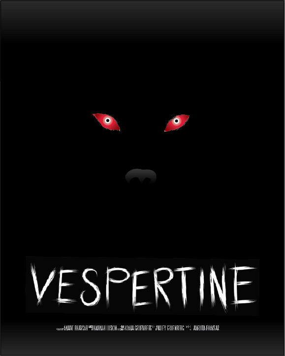
In Design, we were tasked with coming up with a movie plot where we are the main character. What I came up with is a horror movie called Vespertine, and the main character (me) has a dog that goes missing one day. I spend weeks looking for him, but can’t find him. Eventually, he makes it back on his own, but seems different. Weird things start happening around the house and the dog acts different and strange. Eventually, I figure out that her dog is dead and his body is just being possessed by a demon, and so I make several attempts to get rid of him before finally figuring out how to do so.
Because the movie centers around the dog, the poster, package, and ticket all do as well. Since the assignment was to keep the design minimalist, I chose to make the graphic on the poster just the eyes and nose of the dog, and it was also creepier that way. To make it extra scary, I made the eyes of the dog red and the pupils really small. I created the font of the title using Adobe Illustrator on an iPad. The letters are supposed to look like they’re made up of little tufts of dog fur while also being tall and skinny to fit the horror aesthetic of the rest of the poster.
The design of the packaging is very minimalistic as well. Each side of the pages have a red claw mark over a textured background, and as you open it, each mark is revealed.
The ticket design is of a red and black paw with claws to stay consistent with the demonic dog theme. All of the graphics were drawn with the pen tool in Adobe Illustrator, and to create the textured background, I took a picture of dust texture and lowered the opacity to about 4%. None of the illustrations are very complex to keep the design clean, simple, and minimalistic.
ARVE Error: Mode: lazyload not available (ARVE Pro not active?), switching to normal mode