
Introduction
How do you ignite your passion
and elevate your skills and experiences
to create your ultimate and most successful Freestyle project?
The Zenith project is the second longest project we worked on at Freestyle, after the Documentary project. The word zenith is defined as ‘the time at which something is the most powerful and successful,’ so this should be my most successful project at Freestyle. (Unfortunately, it is not, but it comes close!)
My Zenith Project was to create a font for Devanagari letters, or the letters that Hindi and Marathi are written in. I’m interested in typography, so designing type for another language would be really cool. The final media form would be a typeable font and some temporary tattoos made with the font. This is a new challenge for me because I have no idea how to create a typeable font but I think it would be a really cool skill to learn. I’ve also always wanted to figure out how to type Devanagari with an English keyboard but keep postponing it, so through this project, I would be forced to figure out how and hopefully even improve my skills in reading and writing Marathi and Hindi.
Process
To plan out how I would spend my time over the next few months, I created a calendar with milestone dates I would attempt to follow. The calendar took into account the number of workdays we would have in class and how much time it would take to complete each portion of the project. As I went along with the project however, there were several times where I grossly underestimated how much time a certain part would take due to technical malfunctions and issues. Here is what my calendar looked like:
March
8 - Write out all the characters I need to create
15 - Sketch out different styles the font could be in and
     decide on one
19 - Finish digitizing ¼ of them
21 - Finish digitizing ½ of them
26 - Finish digitizing ¾ of them
29 - Finish digitizing all of them
April
2 - Make the font typeable using https://www.calligraphr
    .com/en/
5 - Sketch out ideas for type illustrations and tattoo
    designs
9 - Start digitizing tattoo designs
16 - Finish ⅓ of the tattoos
19 - Finish ⅔ of the tattoos
30 - Finish all the tattoos
May
1 - Print out all tattoos
1 - Cut up all the tattoos
2 - Add process to website
2 - Add final result photos to website
2 - Finish ½ of the slides
3 - Finish all the slides
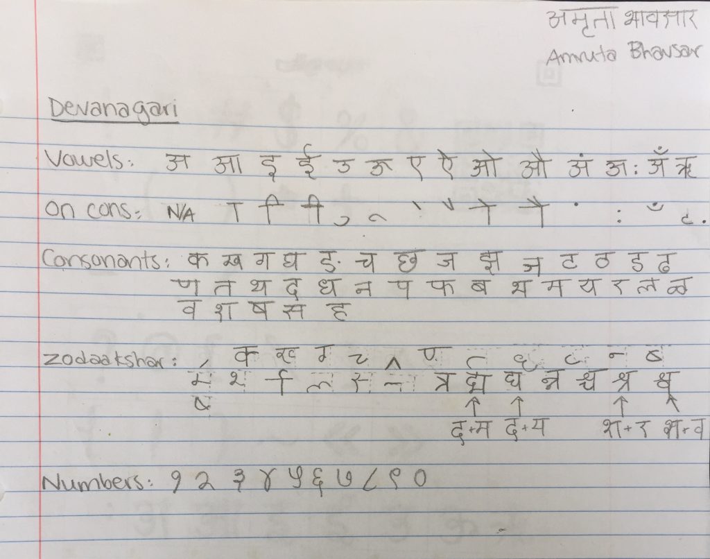
My first deadline was to write out all the letters and characters I’d need to design. Because I’m not really fluent in Hindi or Marathi and not completely familiar with writing or typing it, I needed to figure out how many different letters there were, the variations of each, and how they would connect together.
The next thing I moved onto was figuring out what I wanted my font to look like. I ended up deciding very quickly that I wanted to create a curly, cursive-like font, so I went into Calligraphr and downloaded the Hindi alphabet template. I printed it out and then carefully sketched out all the letters and symbols.
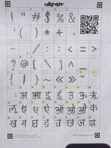
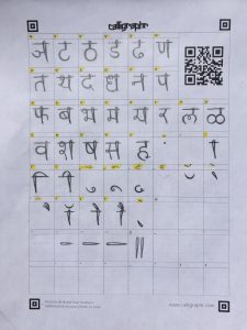
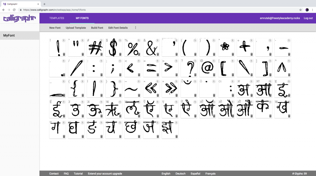
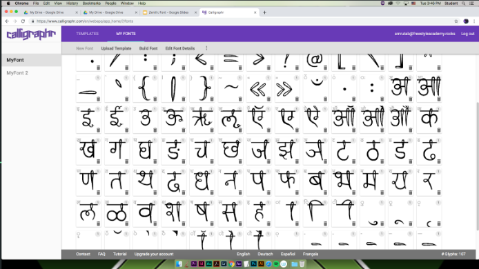
After solidifying the style of my font, I uploaded the templates into Calligraphr and the characters showed up in the workspace. The way that they were scanned was kind of messy though, and I didn’t like the way they looked, so I cleaned up all the symbols using the tools in Calligraphr. This was the part where I severely underestimated how much time I’d need. Almost every letter/character took 10-15 minutes, and there were 100 I had to complete. I ended up falling behind a couple deadlines, simply because of how time-intensive and draining the process was, but I was finally able to get them all done by the beginning of April. This is what the letters looked like before I edited them:
Here’s an image of a half-edited letter in Calligraphr’s editing program:
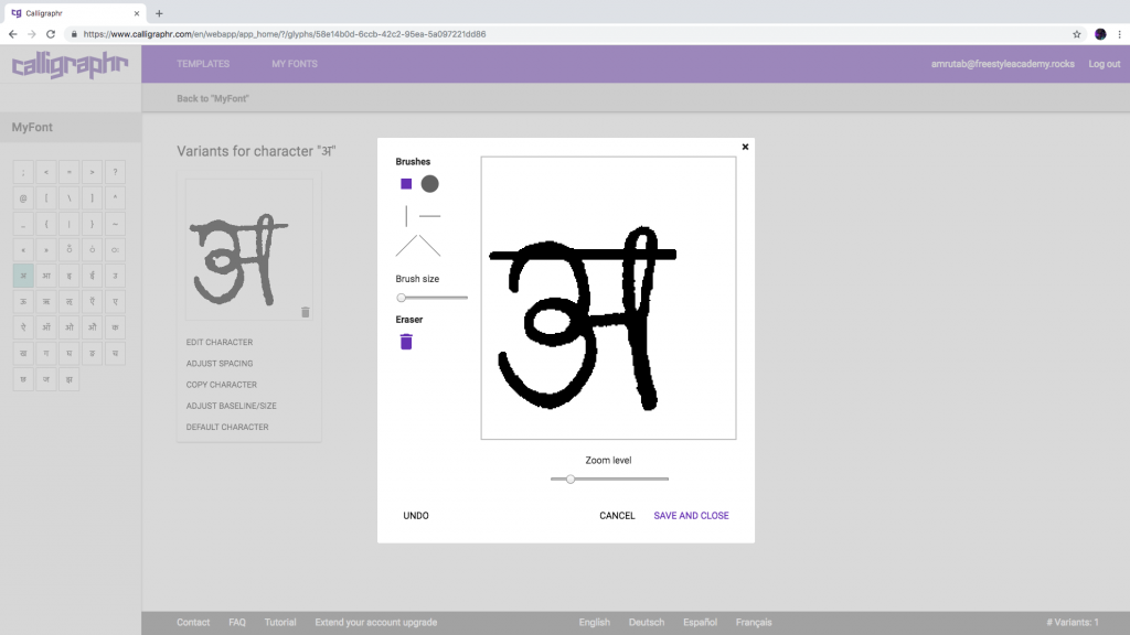
One of the biggest contributors to the length of this step was the inefficiency of Calligraphr’s functionality and overall usability. I was unable to copy and paste any of the letter designs, which would have been a useful tool to have, considering many of the letters in Devanagari look similar and it wouldn’t have resulted in them looking more irregular than I would have liked. Additionally, the editing tools Calligraphr provides are very limited. There are 6 brushes to choose from, so I ended up using the circle-shaped brush on the smallest size setting in order to be precise, which was less than ideal.
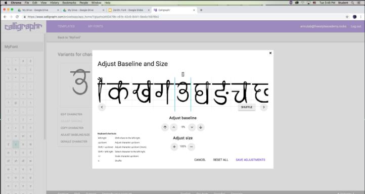
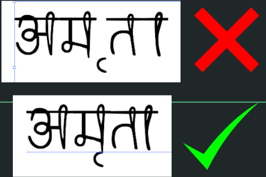
After getting through the tedious process of editing the characters, I adjusted the size and baseline of each of the characters, using the previous edited character as a reference.
I then came up with a name for it. The Hindi word for ‘font’ is ‘लिपि’ (pronounced lih-pee), and since the font design has a lot of loops, I decided to call it ‘लूपी’ (pronounced loo-pee), or simply ‘loopy.’ I then clicked the ‘Build Font’ button in Calligraphr and downloaded the file that popped up. I installed it and then tested the font out. Unfortunately, not all of the characters showed up, as I was using the free version of Calligraphr, so I upgraded to the premium version. Unfortunately, once I did, all the data I had stored onto my account deleted and my font was gone.
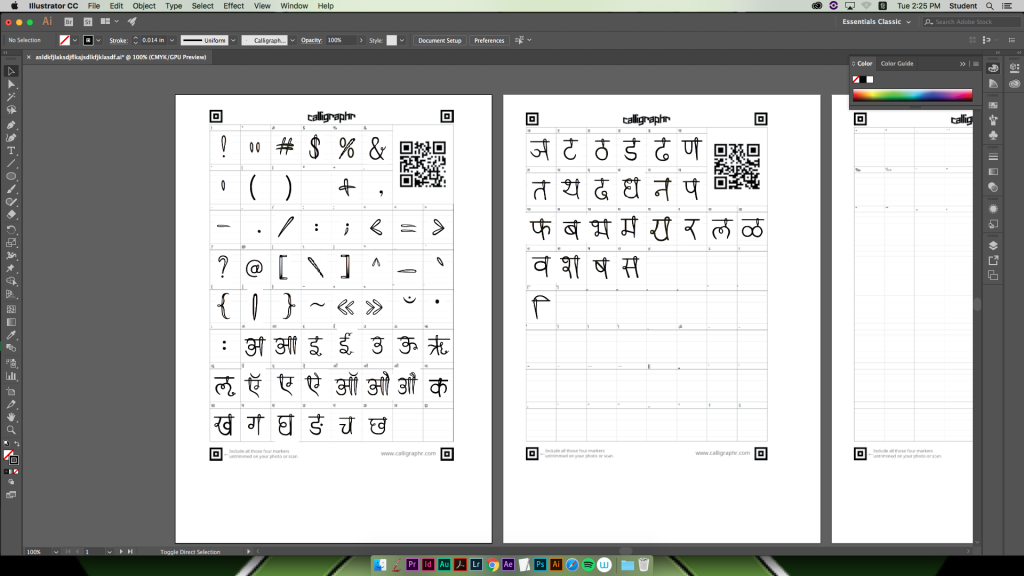
Thankfully, I still had the 75-character font, so I opened it, took a screenshot of each character, and opened an Illustrator file with a digital version of the Calligraphr templates. I placed each of the screenshots in their respective spots and pen-tooled the rest of the missing characters.
I then uploaded the new template into Calligraphr, and thankfully, most of the characters came out clean.
After a few touch-ups and baseline adjustments, I built the font once again, and thankfully, all the characters showed up when I tested it out. However, my next challenge was that some of the kerning pairs were extremely off.
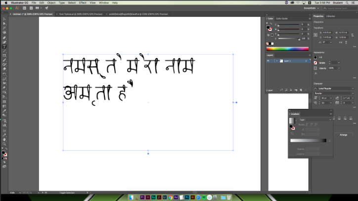
Calligraphr didn’t offer any tools to help me fix this issue, so I downloaded another program called FontForge. Immediately, I found that it was a much easier program to use than Calligraphr and that I could be so much more precise with it. In FontForge, I was able to create multiple kerning pairs for individual characters, but once I was about half-way through, FontForge crashed and my file was deleted. This was when I decided that it was time to call it a day, as Zenith presentations were the next day, so while the finished font is typeable, the kerning isn’t ideal.
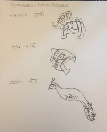
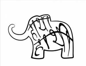
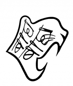
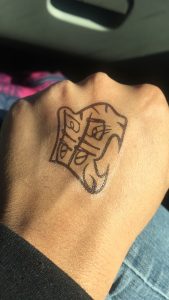
Along the way, I had been creating tattoo designs as well. Here are my preliminary sketches of what I wanted some of them to look like:
I went back and forth between Adobe Illustrator and Photoshop when digitizing the tattoos. Most of the drawing was in Illustrator, and in Photoshop, I warped the text to fit the shape of the animal better.
I later decided that it might be cool to create flower tattoos as well, so I came up with these two designs, the former of which was meant to be a half-sleeve tattoo:
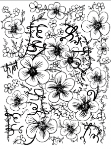
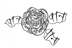
I then printed out the designs on temporary tattoo paper and put a couple of them on.
Reflection
For my Zenith project, I decided to design and create a font for Devanagari letters, and ended up creating tattoos using the font a little while later. This idea originally came to me because I was trying to get better at reading and writing Hindi, and it hit me that you can make fonts for other languages, and that it would be really cool if I could make one for Hindi. When I was thinking about the project and what it would entail though, I didn’t think it would be enough to simply create a font, but that implementing it and applying it to a piece of art could be really cool as well. I later realized that this was a bit more than I could chew, but at the time it seemed reasonable. The idea for temporary tattoos came from my friend, when we were brainstorming little gifts that we could give to the players of an Overwatch team when we went to meet them back in February. I had designed and created temporary tattoos for them, so I thought it would be cool if I did the same for my Zenith, this time using a font I created.
My research paper was about the death of indigenous languages and the reasons for it. I learned that languages across the globe are dying at an alarming rate, and through this, certain viewpoints of the world are also dying as well. Even though Hindi is technically a “language killer” (a dominant language that people choose to learn over lesser-known regional languages), I decided to create a font for it because one of the topics I focused on in my paper was how so many Indians are putting all their energy into learning English, and thus brush Hindi and other Indian languages aside. As someone who did something comparable and is currently regretting it, I felt that this was something that would mean a lot to me and further encourage me to improve my Hindi. Additionally, learning the words and phrases I used in the tattoo designs helped me improve my grammar and vocabulary as well, if only just a little.
In this project, I mainly collaborated through getting peer feedback and critiques on my font and tattoo designs. For some of the translations though, I had to ask my parents for a little help, which they gladly provided. If I could do this project over, I would definitely switch the program that I used to actually build the font. Calligraphr, the program I used, was fine for what it was, but I wanted to make a really nice, clean font, which took a very long time to accomplish using Calligraphr’s interface. Not only was it imprecise, tedious, and volatile (my font deleted itself twice in Calligraphr), but once I downloaded my font and started typing in it, a number of the kerning pairs were extremely off and made some of the words hard to read. Near the end of the project, I found another program called FontForge, which allows you to set individual kerning pairs, be extremely precise, and set the baseline and size of the individual characters very easily and as exact as you needed them to be. Also, I would probably give myself a lot more time to complete certain aspects of the project. For example, I severely underestimated how long it would take to digitize all the letters and characters, which is why I fell behind a couple deadlines.
The 21st Century Skill I improved on the most is probably technological literacy. This project required me to use a multitude of programs, the main of which being one I was unfamiliar with, so figuring out how to use it was a challenge on its own. Moreover, I think I improved on my self direction as well. Making the deadlines was tough as I didn’t know what I was getting myself into since I’d never made a font before, so it was hard to make those decisions. I do think that through this experience, I have learned to overestimate the amount of time that I should take to finish something because it is better to end up with more time and finish something right instead of trying to do something quickly and it not turning out the way you wanted it to. This is something I learned from this project that I will definitely put into use in the future. The 21st Century Skill that I probably improved on the least was teamwork and collaboration, simply because the design of my project didn’t really allow for lots of collaboration to take place. I think that I definitely accomplished the objective of igniting my passion and elevating my skills and experiences, as this was a new challenge for me and one that I’d never encountered anything similar to, and typography is something that I’m interested in. However, I don’t feel like this was my most successful Freestyle project, simply because I did not have enough time to end up with the end result that I was hoping for. Maybe I had bitten off a little more than I could chew, but I really wish I could have set all the proper kerning pairs for my font so that it would type and read properly.
While this project had many ups and downs, it was ultimately one of the most valuable experiences I’ve had at Freestyle, and one with a lot of lessons to be taken away and applied to future endeavors. The final font may not have ended up exactly the way I wanted it to, but it was okay because I gave it my best effort given the constrained time and technological difficulties and learned a lot from it.