Introduction
During the conceptual unit I found myself exploring new forms of media, navigating the world of poetry, art, and web production – all of which were foreign to me. I found myself tinkering with DSLR cameras and audio recorders, as well as experimenting with applications such as Adobe Photoshop and Avid Pro Tools. As the unit passed by I found myself immersed. I came into English class excited to test my communication skills and discuss with my class. In Digital Media I was pushed to convey my ideas in creative ways, ways that would never have even crossed my mind before this year.
What I really appreciate from my freestyle classes is the freedom to be creative. My English class was nothing like the English classes I had before. I was shocked by how we were let loose on some projects, allowed to write about whatever we wished. This freedom allowed me to write stories that I was passionate about, and I am proud of my results. Digital Media also introduced me to a variety of different tools I could use to express my ideas. I had never had an interest in photography before, but now I’m hooked. I love being able to capture a moment in time, telling a story with just a photo. I also learned how to revise and edit, and I learned that pushing myself to create the best product means reworking and sometimes scrapping my original plan.
Haiku
Our first assignment in English was to write a haiku based on our conceptual statements. What sets a haiku apart from other forms of poetry is the limit on words. This restriction forced me to be mindful about the weight of my words, while also exploring the prompt “I am exploring the feeling of anguish through collecting.” Additionally, we were prompted to create a video with visual and audio elements to enhance our haiku.
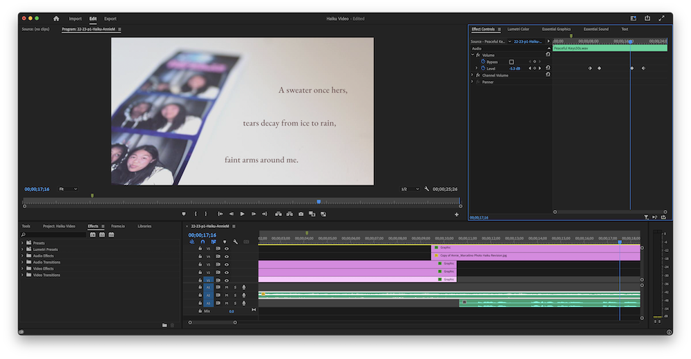
The production of my haiku video introduced me to the first of many applications I would learn this year: Premier Pro. Premier Pro allowed me to add more emotion to my haiku with the addition of music and subtle panning, and I like the ambiance that the final result embodies.
Poetry
During the poetry unit we spent some time analyzing some fantastic poets for inspiration, my favorites being Billy Collins and Ada Limón. We spent a lot of time brainstorming and playing with different ideas, all building up to an original free verse poem.
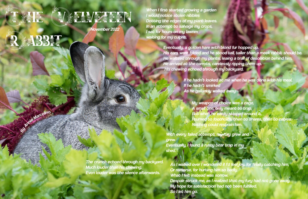
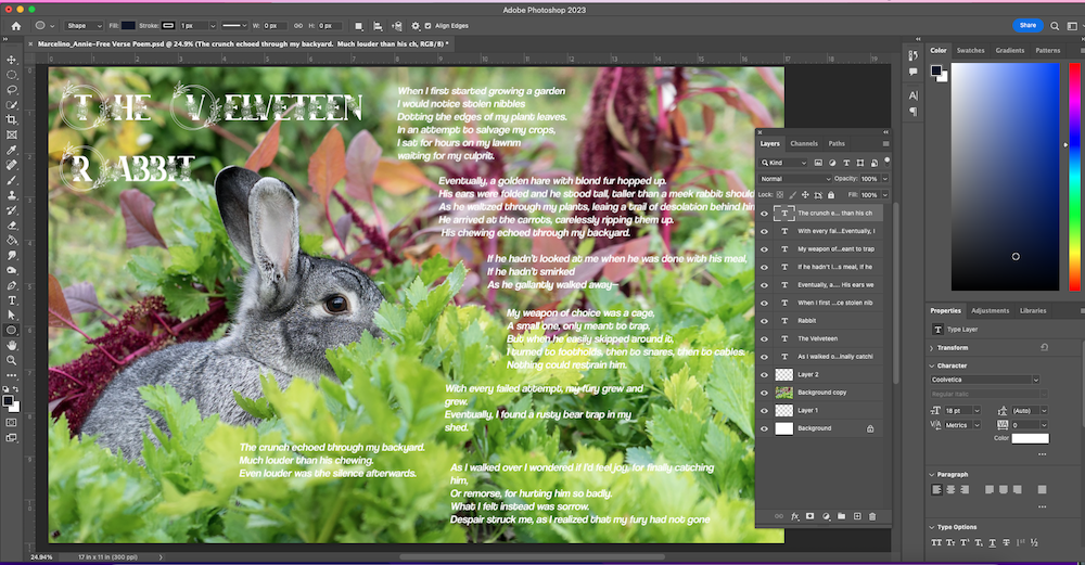
The Velveteen Rabbit explores ambition, and what comes after achieving your goals. I wanted to show the gradual corruption of ambition, and how sometimes that can build into obsession. The title itself is an allusion to a story of the same name. Real velveteen is expensive, but is often mistaken for synthetic velveteen, which is cheaper and of lesser quality. This is a metaphor for the speaker’s goal; initially he works towards what he believes will change his life, but when meeting the goal he is disappointed. The speaker of the poem is an old man whose initial objective is harmless – to protect his garden from a rabbit. I chose to lengthen my words in the first stanza to create a feeling of calmness and harmony. For example, I used words with the -ing ending, like “growing”, “dotting” and “waiting”. In the second stanza, the lines are longer and all contain end-stops. These lines are structured this way to represent the elegance of the rabbit being introduced, as well as to represent the control he has over the speaker. I used consonance with a hard “C” sound in the last two lines of this stanza, most obvious in “carrots, carelessly”. This harsh sound introduces us to the turning point of the poem, where the speaker gradually becomes more unhinged. When catching the rabbit seems like an unattainable feat, his desire grows. I used shorter lines to show the escalation, and to create a sense of panic and intensity within the reader. The climax of the poem is in the second to last stanza. I purposefully used the word “crunch” to shock the reader. The last stanza uses consonance with the “S” sound, like in “sorrow” and “despair struck me”, to show the speaker finally slowing down and revaluting his actions. I was particularly inspired by Clint Smith’s “Something You Should Know”, as well as “Eating Poetry” by Mark Strand. I liked the structure of “Something You Should Know”, it is a narrative split up into three parts. I especially liked how the last paragraph focuses on the speaker’s internal struggles, something I tried to emulate in The Velveteen Rabbit. I also appreciated the speaker in “Eating Poetry”, and I liked the way Mark Strand made the reader feel. “Eating Poetry” is disturbing, but it makes you contemplate, a feeling I tried to emphasize in the second to last stanza of my poem. Overall, I wanted readers of The Velveteen Rabbit to question their own ambitions, and think about how far they are willing to go to achieve their goals.
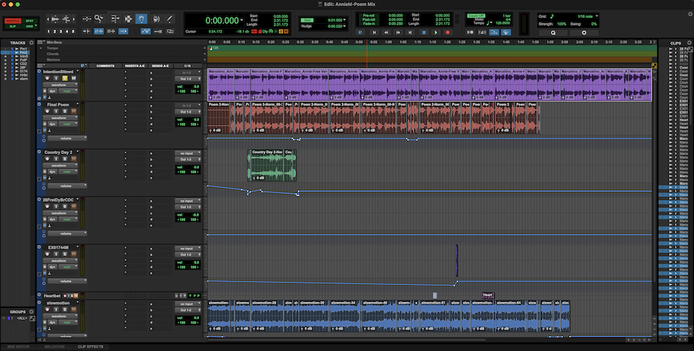
This was the first time I used audio as a form of media to express my art. At first I struggled with Pro Tools, the application we used, but overtime I grew more comfortable. The ability to change the volume of the music in the background as well as tune up my initial recording really made my poem come together. I also learned about the value of SFX, which I found I could use to invoke different emotions such as suspense.
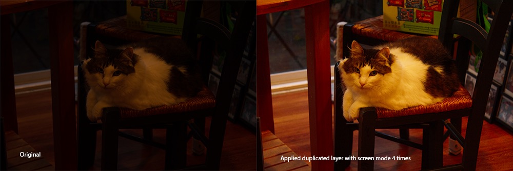
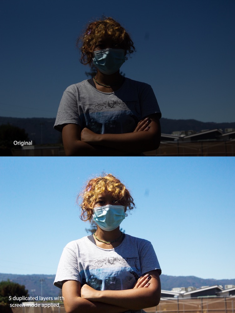
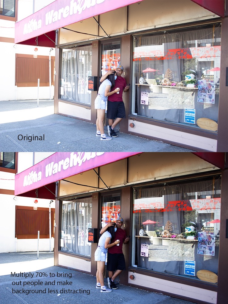
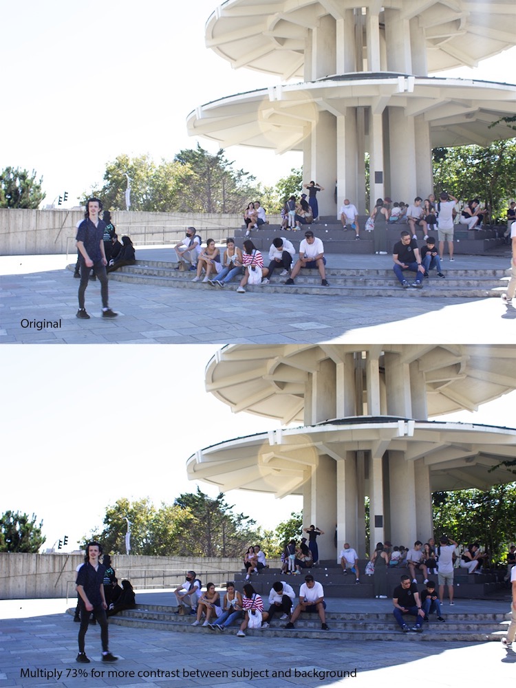
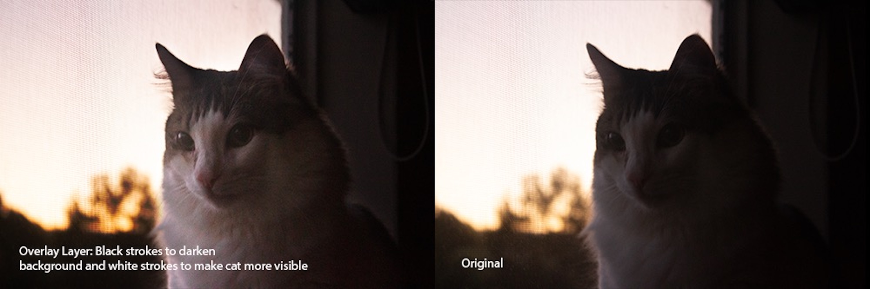
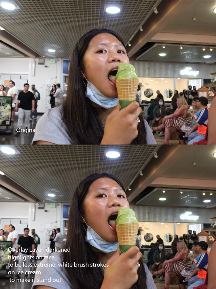
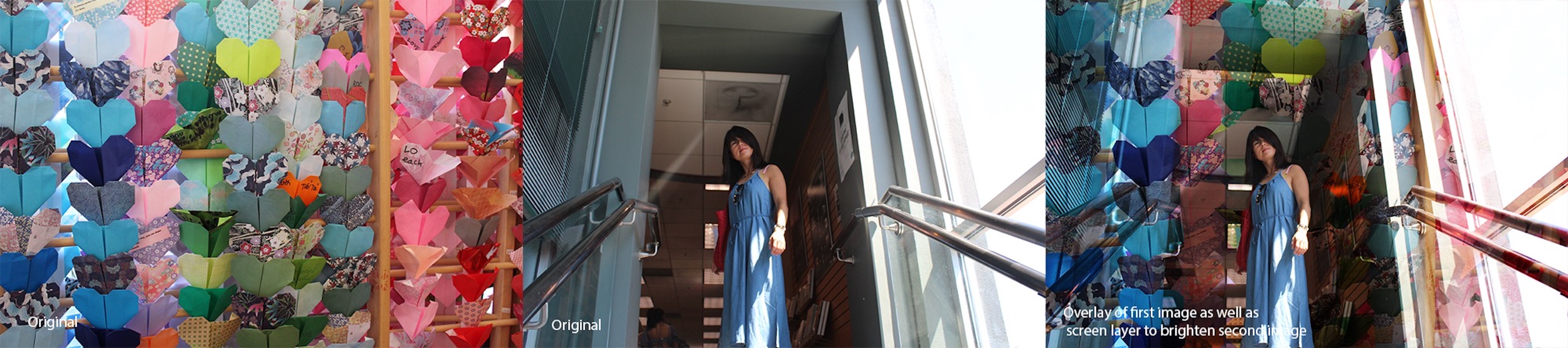
Photoshop Blend modes
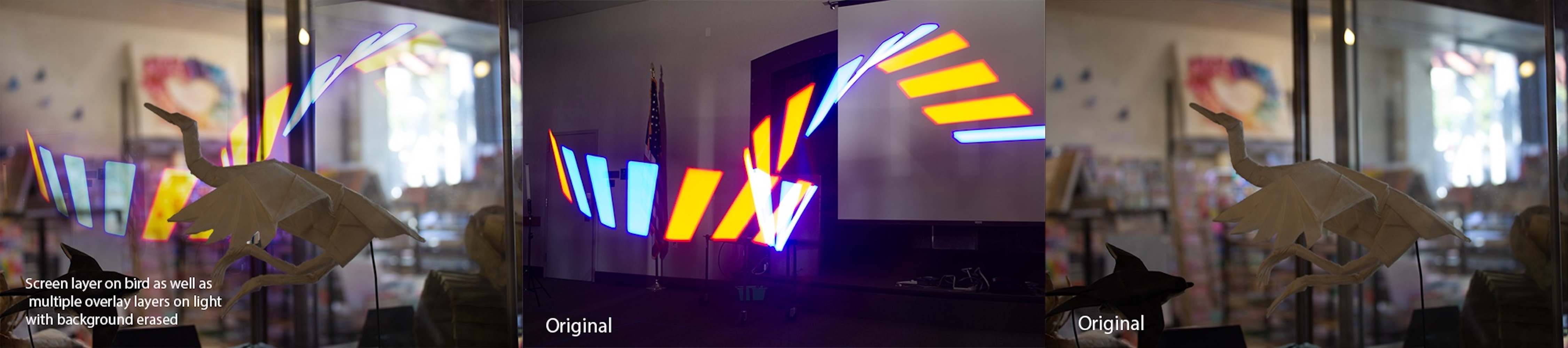
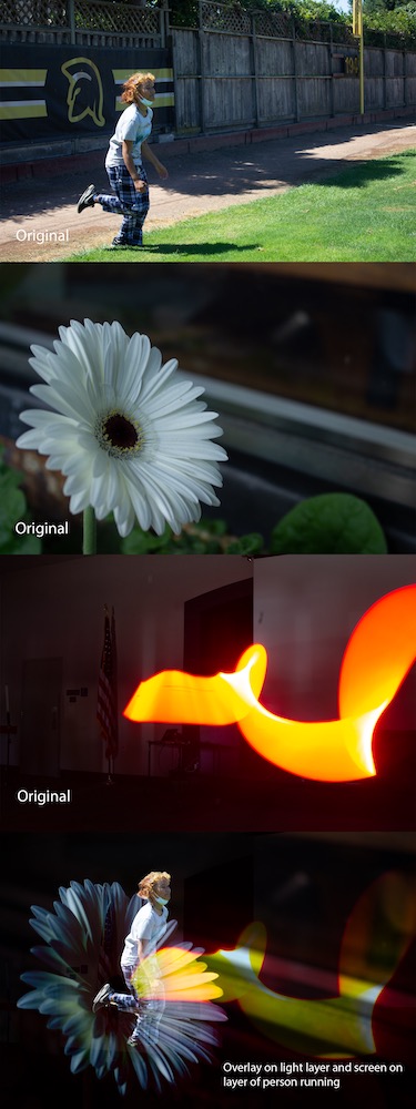
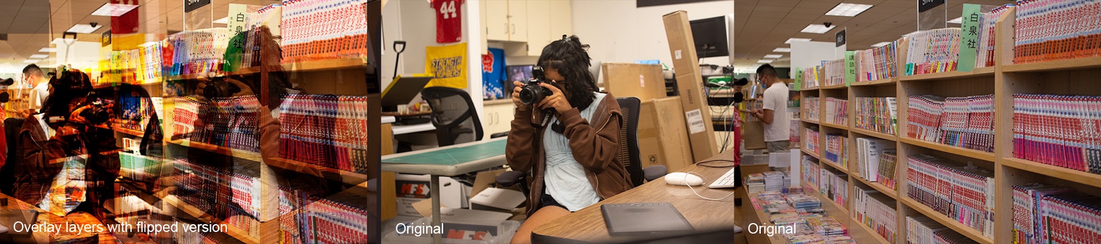
At the beginning of the year we were asked about what we were looking forward to, and immediately my mind went to “learning Photoshop”. With this assignment, I got a taste of what I could do with it! We learned how to adjust photos with different blend modes, our main focus being on the screen, multiply, and overlay blend mode.
I can see myself using these different blend modes to adjust my photos for my photo blogs. I definitely appreciate being able to change the lightness/darkness of photos as it is something I struggle with when taking raw photos. I also appreciate how flexible it can be and how I have many options and can be creative with what I make.
Design
I chose design as my elective because I love looking at the details of things, as well as figuring out how things work. In such a short time we’ve learned so much, and I already feel such a strong sense of community in my class. We started off with using our DSLR cameras to take high quality photos, and we transitioned over to working with Photoshop to touch them up and finalize our products.
Alphabet name
Our first introduction to design was creating an alphabet name, a project in which we found the letters of our names in our surroundings. There were only two rules: no logos and no creating the letter yourself. These restrictions forced me to be creative, looking closely at my environment in cracks and crevices I usually wouldn’t give a second thought to.
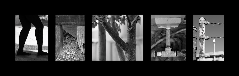
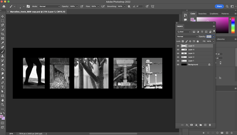
This project furthered my understanding of Photoshop and the many different things I can do with it. I learned to add filters to photos to turn them black and white, compile a group of photos into one psd file, flatten images, and most importantly create an art piece that I’m proud of!
Conceptual Photo
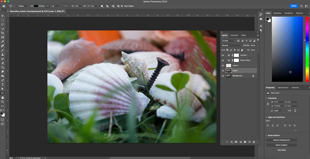
Our next project gave us a lot more free range, and we were assigned with creating a conceptual photo based on our conceptual statement. Conceptual art can be defined as an art form where the idea holds more value than the execution or appearance – essentially you’re trying to convey a concept to your audience in an abstract way. We learned about thumbnails and about how to think beyond the boundaries. I definitely had to think outside of the box to create a photo that showed “anguish through collecting“.
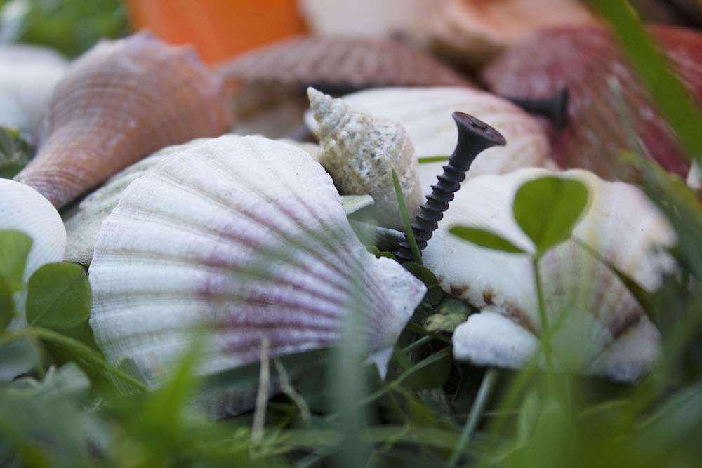
I chose to use nails to represent the feeling of anguish, contrasted with an assortment of beach shells to represent the experience of collecting. To me, collecting is a calming process because of its structure, and I often like things to be organized. When things don’t go as planned I feel a sense of anxiety and panic, which is conveyed through the shells spilling out of the beach bucket. The shells take up most of the space in the photo, overwhelming the viewer. The nails are piercing the shells throughout the scene, emphasizing the extent of the panic, almost to the point of physical pain. However, the low angle of the shot makes the nail seem beautiful and composed. The juxtaposition of the beauty of the shells with the dark nails portray balance, and how one cannot exist without the other.
Throughout this project, I learned how to use the many different tools in Photoshop. I learned how to make selections with the pen tool, add filters, and add adjustment layers to make non-destructive edits. One of the most important things I learned is that editing is subtle. I kept this in mind when adjusting my photo, maintaining a natural look. My original photo was very dark, so I used a curves adjustment layer to increase the exposure of the entire piece. I also added a cooling filter to neutralize the warmness of my original photo. I then used the quick selection tool to select the background, and I added a gaussian blur filter so that my foreground would pop out more. Lastly I used the pen tool to carefully select the main nail in the photo, and I used a curves adjustment layer to slightly brighten the nail as it is the focus point.