Explorations Intro
The Explorations project was a project assigned at the end of the year, with no specific guidelines except to learn a new skill by developing a product. So long as the project was somewhat related to the elective class, it would be approved. This opened up a lot of room for creativity. A little too much, for me at least. I did not know where to start, and so I thought through different project ideas, and settled on the one that would be most doable in the time allotted.
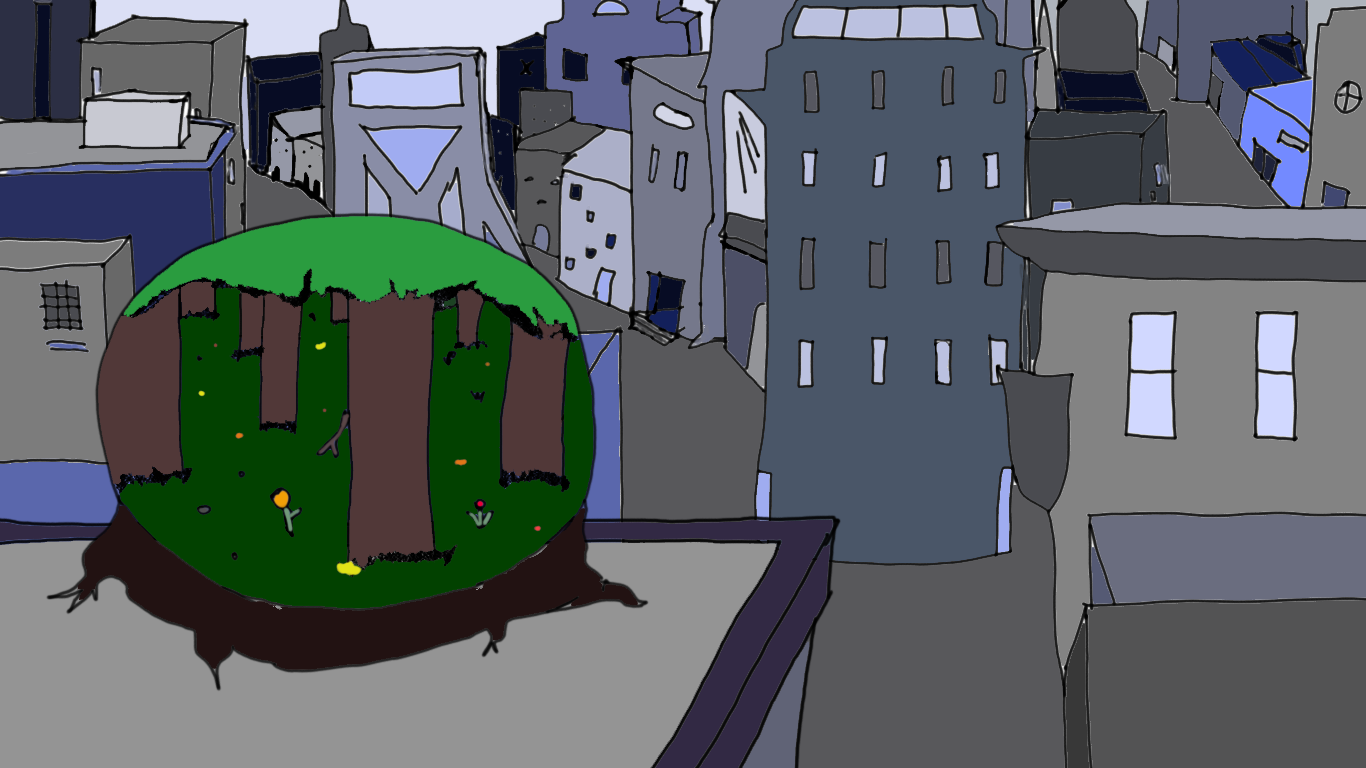
I decided to focus on color scheme, and developing my understanding of it. To demonstrate learning this skill, I created an illustration for a background. It was an image that would have a mix of nature and city, so that I could practice choosing appropriate colors for each element. This project helped me develop the skill of visual literacy, which is to say beginning to understand the different aspects and elements that make designs of certain things more appealing.
Process
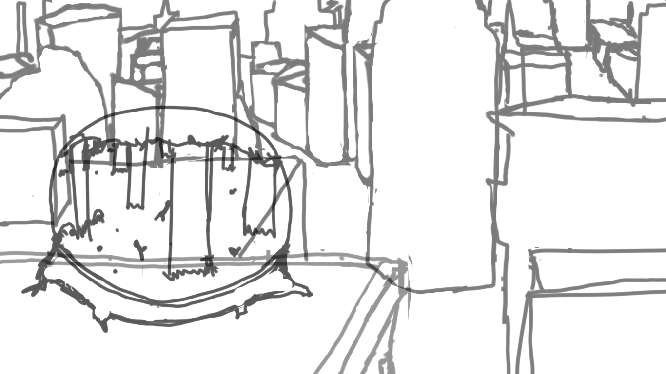
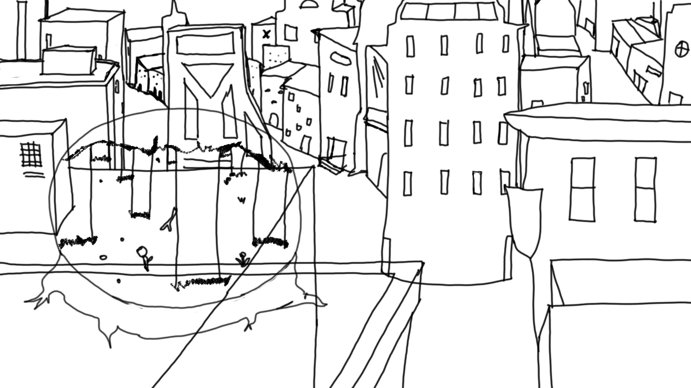
The process of creating my project first involved quite a bit of research. I dove into different websites to learn the basics of color scheme, and found a lot of information, like how different colors can spark different emotions in the viewer, and that depending on which colors are put together, it can have a variety of different effects. After this research, I sketched a drawing and outlined it. I organized the layers and made sure to name them, so that I could find what I needed easier. Then I began to color. I used a mix of green and brown for the nature part of the illustration so that it would come off as more earthy and vibrant. For the city, I chose more plain, faded colors that were darker, like blue and purple and gray. I wanted to make it seem modern, and industrial, while also giving it a cool tone. This leaned towards a monochromatic theme, which would contrast with the bright globe, and that is what I desired to achieve.
Final Production
The final product eventually came out as the following image:
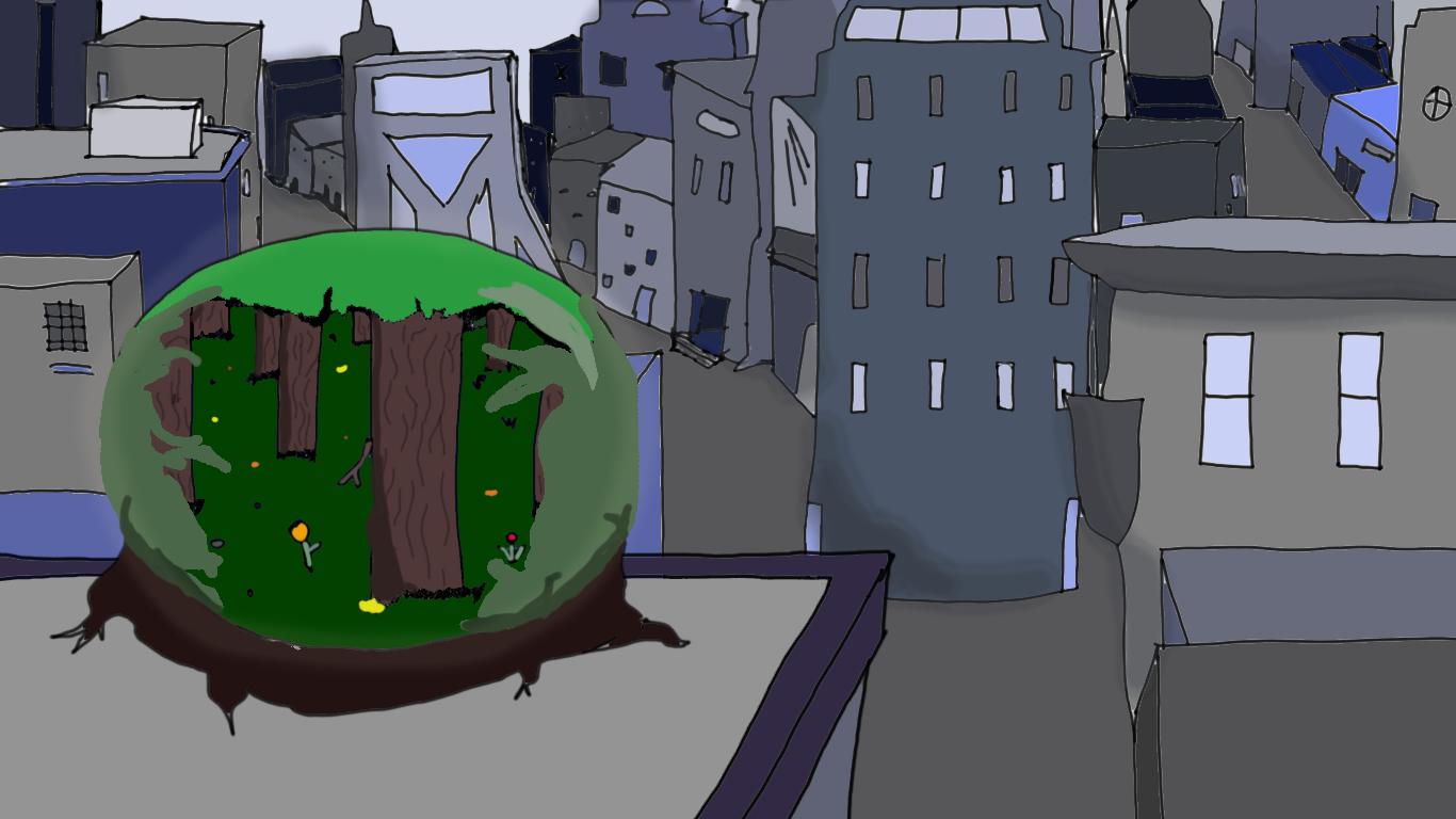
I am somewhat satisfied with my work, seeing as the time given was very limited. I am more happy that I can present something that demonstrates the skills I have learned, and that I am now somewhat knowledgable on the subject.
Infographic
The infographic was assigned as a project to learn how to portray ideas in a simple but professional way.
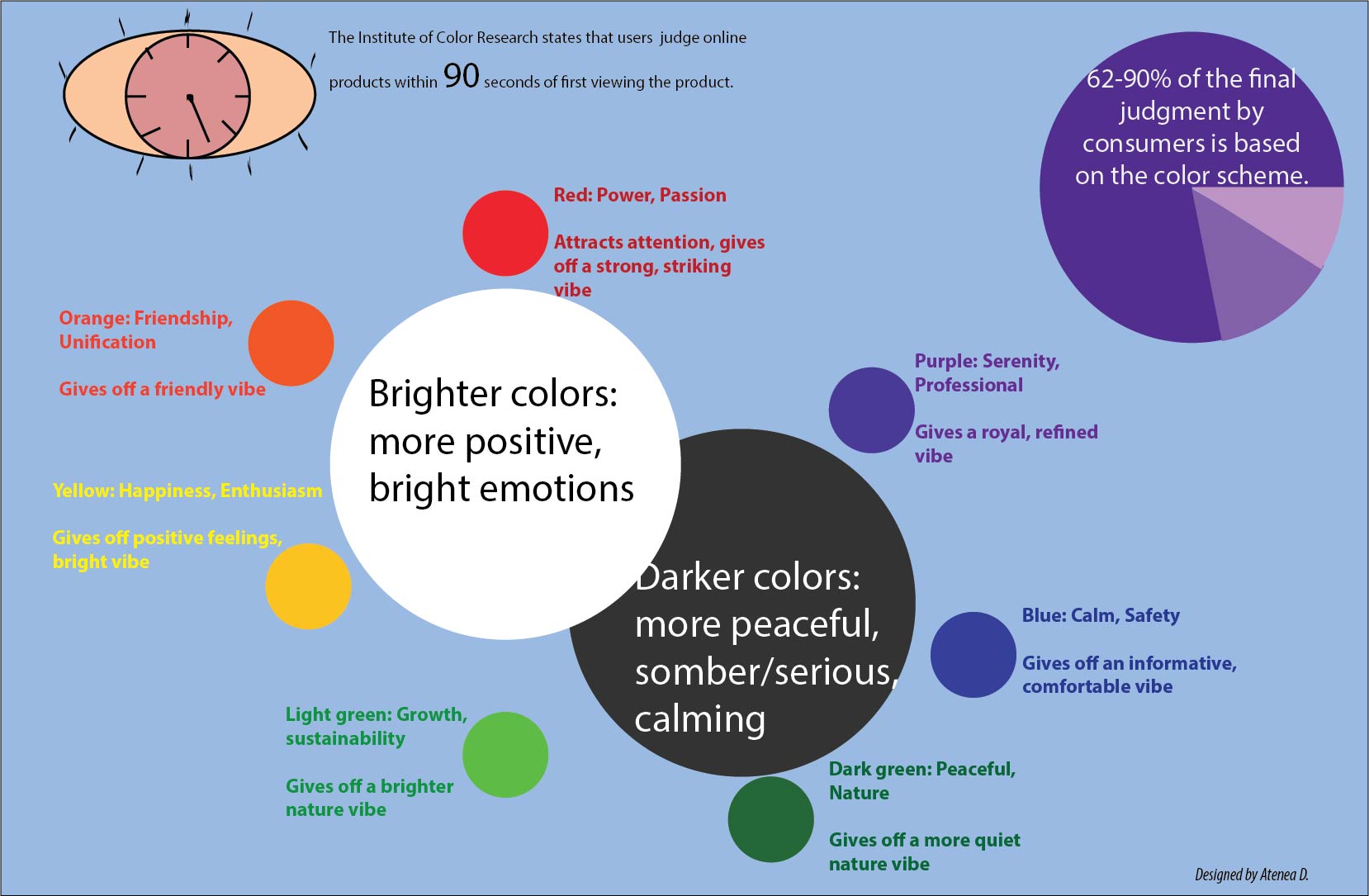
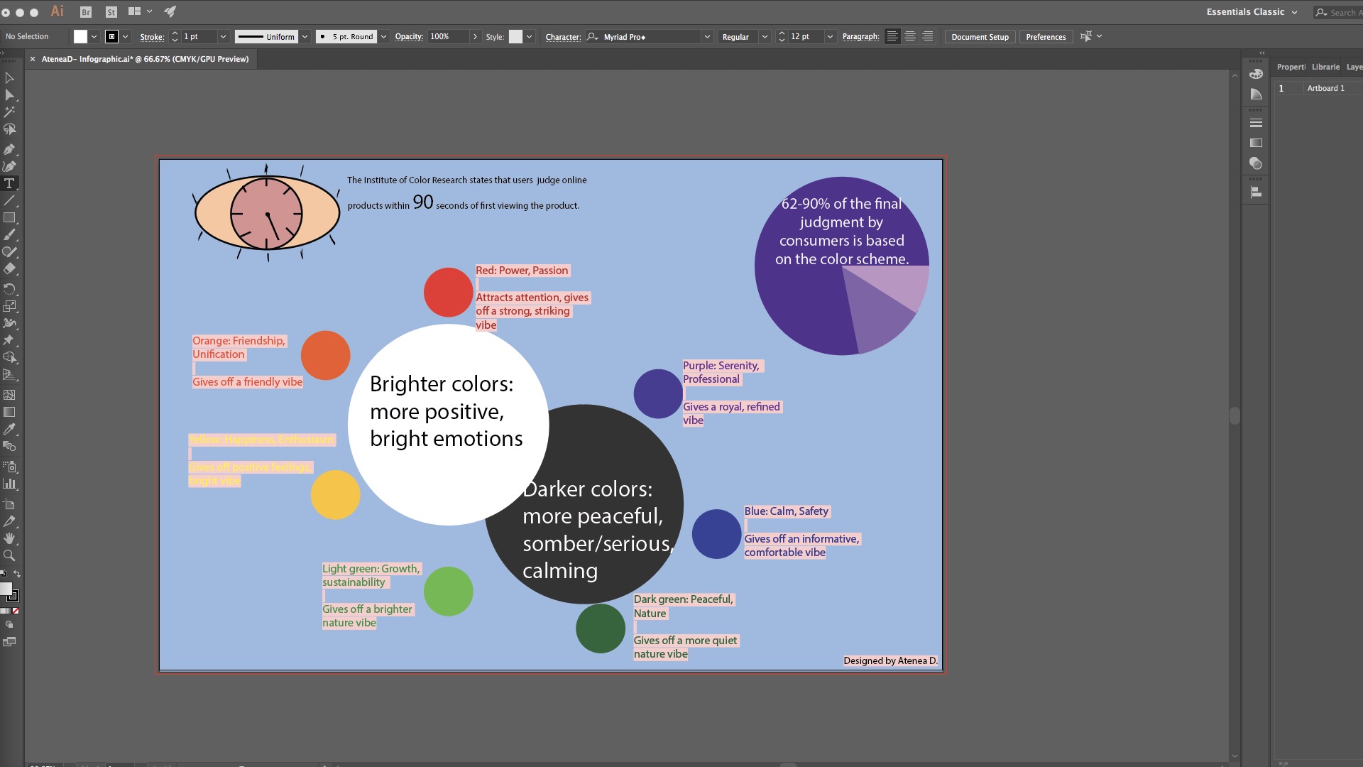
The image was created in Adobe Illustrator, where I utilized different tools, such as text tools and shapes, so that I could keep a design that was simple and easy to follow. I wanted it to be informative, and having odd shapes could be distracting and detract from the delivery of the information.
Explorations Presentation
At the very end of the year, on the final day, we presented our projects to the junior class and the Freestyle teachers. We had to talk about the process of creating the project and the skill we learned. We had to explain it to our classmates, and the research that we did in a timely manner, no longer than five minutes. Practicing these presentation skills is key for later in life, when in business especially. One needs to know how to get in front of a group of people and speak concisely and clearly. While I still have much to work on, I am happy with how smoothly my presentation went, even with my nerves.
Click to see the Explorations Slideshow PDF
Reflection
Overall, this project was pretty interesting to learn about. I really enjoyed learning about colors, especially since I learned the way companies utilize color scheme to get consumers to feel a certain way. This manipulation is very subtle, and can be seen from the logos, and now I can’t help but notice it. I also have incorporated this idea into my work, and it is something that sticks out in the back of my mind when I am doing things related to color.
Experimental Music
We were tasked to create a song that was around a minute, and there were no other specifications. We could be as creative as we wished, and use the programs we had practiced creating music with, Pro Tools and Reason 4. I decided to work with Reason 4, since I felt more comfortable with it. I started with bass and added an arpeggiator, and I found the song started developing from there. The following is the final song: