With no official name for this unit of work, I deemed it Narrative 2. The key and main project for this unit that was used for many of my productions was the Citizen Project, an exploration of identity. This project, which started in English, was used for many of the building blocks for my Design productions. For Digital Media, I explored music production by producing, writing, recording, and mixing a song. I also explored the creation of Mandalas by using Adobe Illustrator to create them digitally. In English, the main writing productions for this unit were two very different pieces. The first was our Citizen Lyrical Essay, which allowed for a lot of creative freedom and license. And then we had our research paper, which was a more traditional, straight-to-the-point piece of writing. Altogether, this unit allowed me with a lot of insights. I learned a lot about identity through examination and exploration of it in Citizen. I was able to push myself musically by creating a track that incorporated me singing, something I am not the best at and something I want to become stronger in as I continue music creation. And through my various challenging Design productions, I learned a lot about attention to detail as many of our productions built upon each other. In the end, I greatly enjoyed this unit and the mediums that came out of it. My productions can all be viewed below. Enjoy!
Digital Media Productions
Music Production
For this assignment, I choose to create an original song. Using the combined power of Pro Tools and Reason to create the song, I had immense fun putting this song. The seemingly endless instrument library of Reason helped spark my creativity and put together sounds I didn’t think would work. In my own personal music creations, I use LogicPro X so it was refreshing to be pushed to create a full song in a program different than what I usually create in. For the song itself, I was going for a Hip-Hop and R&B twist. With the vibe established, I wanted to also have different sections of the record. Many of my favorite songs have distinct beat sections and switch-ups and I wanted to re-create that in my record. There was an intro section, the main section, and an outro section. As someone who is not the strongest singer, I was pleasantly surprised by the outcome of the vocals. I wasn’t blown away by how the vocals turned out but I wasn’t disappointed. That is a section of my work that I would like to focus on in the future as I continue to create.
Mandalas
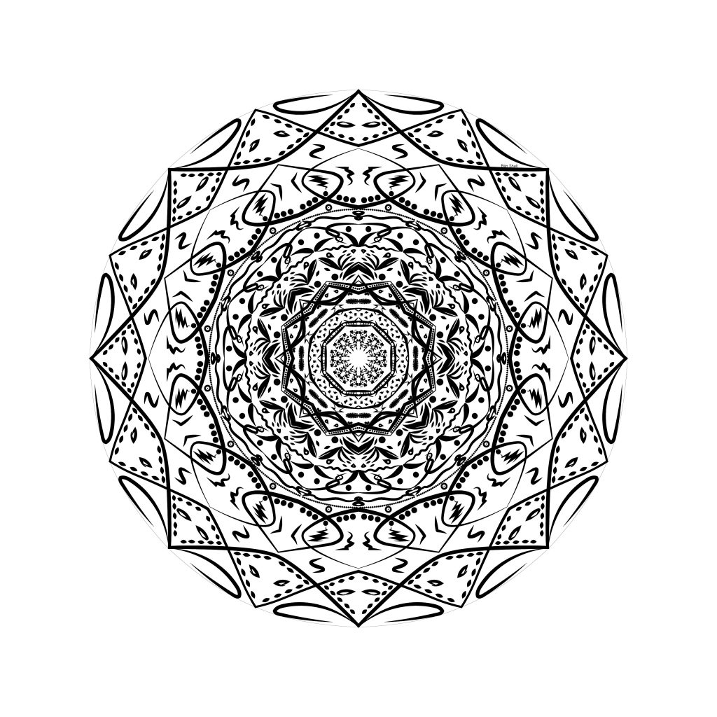
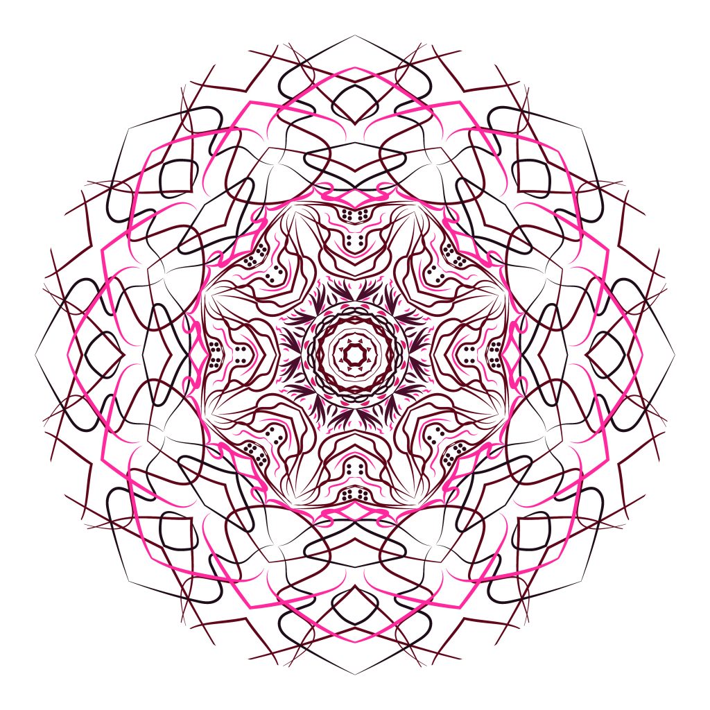
I really enjoyed this production. As someone who is not very artistically inclined with hand-drawn artwork, this project allowed me to reach creative bounds not possible with my hand and paper. I was able to take any idea I thought of and put it to use on the digital file. In the end, I was able to create a product that would have been virtually impossible to create without the computer and Adobe Illustrator.
Mandala Video
ARVE Error: Mode: lazyload not available (ARVE Pro not active?), switching to normal mode
Freedom Video
ARVE Error: Mode: lazyload not available (ARVE Pro not active?), switching to normal modeFor the Freedom Project, we were given exactly what the title of the project suggests, a lot of freedom. The only requirement is that the final product had to be in a video format and that it was at least 30 seconds. For this project, I choose to put together an original music production using sampling. For those who don’t know, sampling is the process of taking a portion of a previously released song and repurposing it into a new body of work. For this record, I sampled “Na Sacola” by Rodrigo Campos. I chopped up the guitar and vocal bits that caught my ear, sped up the sample up a few semitones and played out the sample chops. I then layered an 808 bass line on top, a staple of Hip-Hop, and put my own drum pattern in as well. Altogether, I was proud of the final product and my use of this sample.
English Productions
Lyrical Essay
In our study and exploration of identity, we were to interview an individual that had a different identity than us such as ethnicity, sexual orientation, or gender, just to name a few. To respect our interviewees and vulnerability, we kept our interviewees anonymous. After conducting an interview, we then wrote a lyrical essay based on the content of the interview and subject. Taking inspiration from Citizen by Claudia Rankine, we were given a large amount of creative license with these lyrical essays. After writing our essay, we were to either create or find an image that was in commentary with the essay. Out of the whole project, my favorite part of the process was the interview. I feel that became much closer with my subject after having a serious conversation of that gravity with them. The writing process of the essay was also very enjoyable for me. I greatly enjoyed the poetry unit last year and this essay allowed me to continue that similar vein of creativity.
Link to my lyrical essay
Research Paper
In preparation for our Zenith project for the second half of second semester, we were to research a topic that related to what we may want to do for our Zenith. The topic also had to tie into some deeper discussions about 21st century social and civic responsibility, something that our Zenith has to tie into as well. Since I am planning on making an album for my Zenith, I choose to do my research paper on sampling clearance in music. After continued research, I came to the conclusion that our current copyright laws and system are stifling the creative expression of artists because of the system’s limitations on sampling production. As someone with a dream of a future in the music industry and who plans to incorporate sampling in my future music productions, the paper had a very close to home value. Because of this, it made the research and writing itself, much easier and more enjoyable.
Link to my research paper
Memoir Essay
As we were writing our own personal essays earlier this year, honors students were also asked to read and write a response to a memoir. For my memoir, I choose to read A Higher Loyalty: Truth, Lies, and Leadership by James Comey and analyze his values along with the demonstration and connection of those values. It made for a great read with many powerful insights and stories from Comey.
Link to my memoir essay
Design Productions
Photoshop Collage
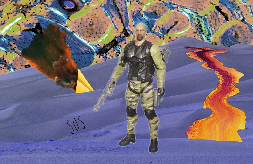
As a continuation for our Reflections unit, we continued to exploration collage as a means of learning the principles and elements of design. For this assignment, we randomly searched for digital images and pulled them into Photoshop to cut and place together. From there, we were to also create a color scheme with our images. For me, this project sounded like it would be easy and quick but it was quite the contrary. I had a hard time putting my images together in an interesting and unique way. The part of this piece that I am the proudest of is the sky and the crashed airplane. The skyline is actually a close-up photo of bacteria that I edited and applied filters too. The crashed plane was a paper airplane that I stuck into the ground with filtered nebulas coming out the back as crash flames. In the end, I was proud of my final production even though I felt that it wasn’t my strongest piece.
Citizen
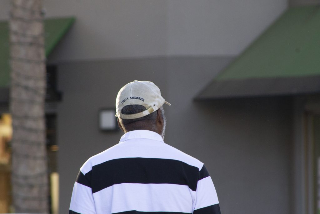
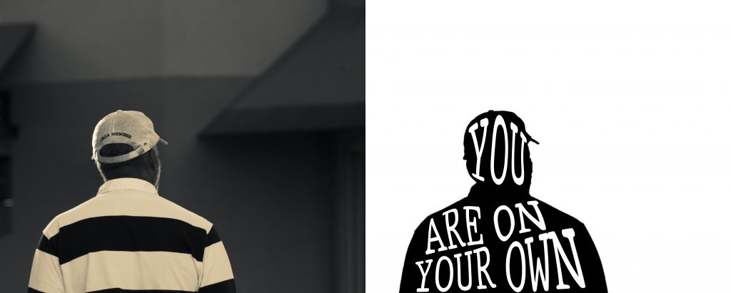
Following our lyrical essay on identity, we were to go and take candid photos of strangers in public. Our goal was to capture the facial expressions of individuals that could be paired with a quote from our lyrical essay. After getting our photos and picking out one to pair with our essay, we edited the image in Photoshop by turning the image black and white and using gradient mapping and control of hue and saturation to give the image an old-fashioned, stained looked. Then we took an outline of our photo subject and filled it with a quote from our essay. Together, the final image pairs well with the essay.
The hardest part of this project for me was the public photo part. It was hard to capture close up, facial shots of strangers in public without being awkward and intrusive to the point where they see you and their facial expressions are no longer become candid. After quite a bit of time in the field, I got the hang of it and it became easy. Looking back on it, the uncomfortable experience of putting myself out there in public made for impactful growth of handling awkward situations along confidence in my ability as an artist to capture.
Japanese Stab-Bound Book
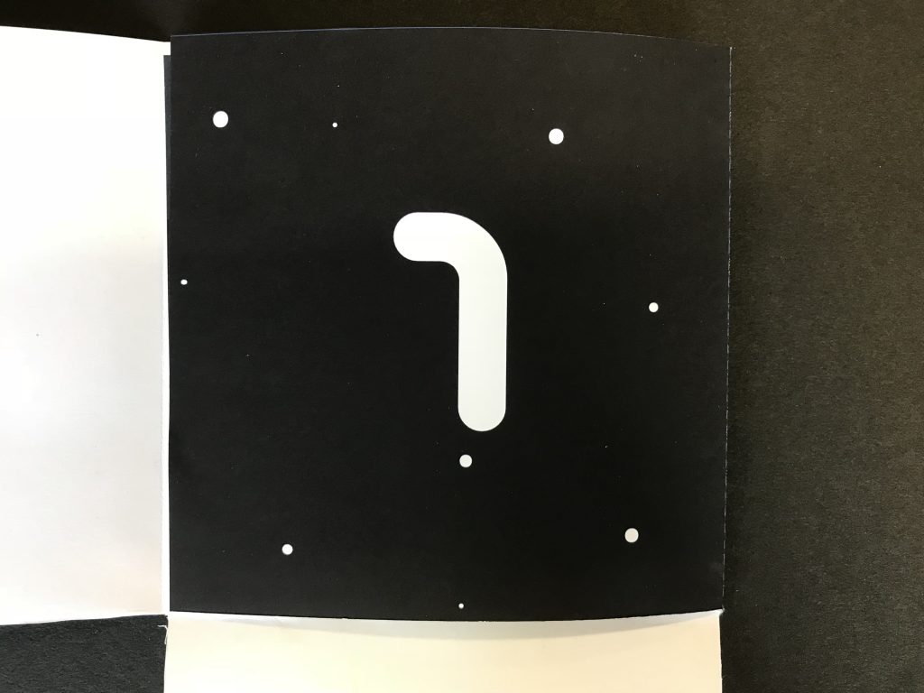
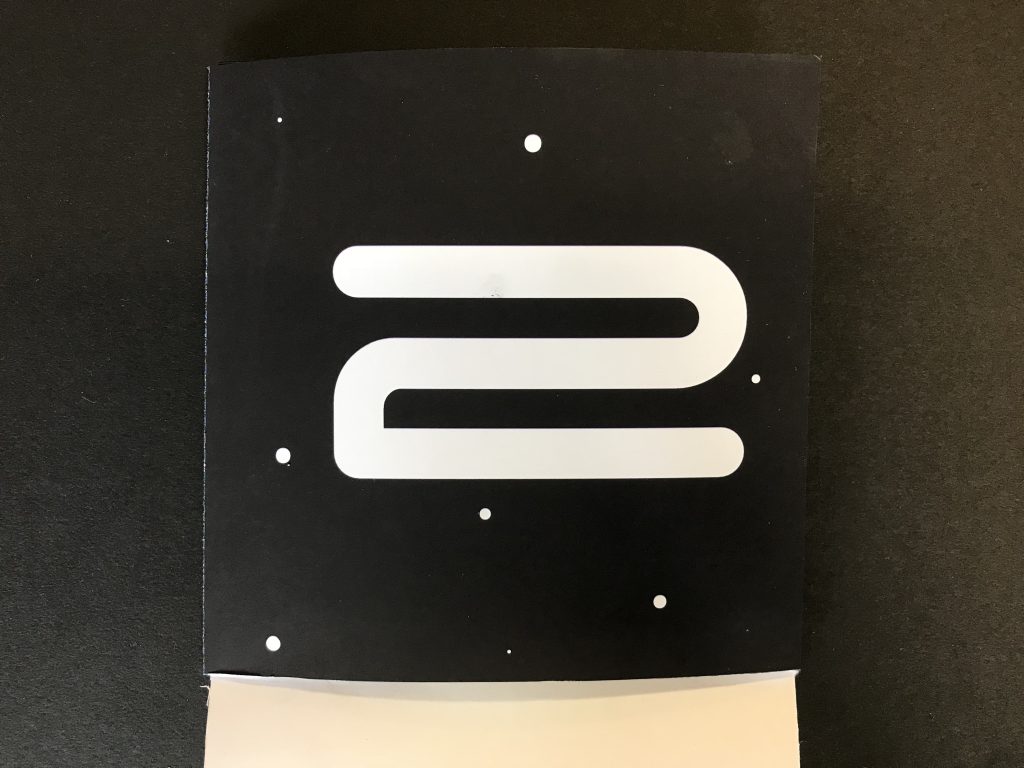
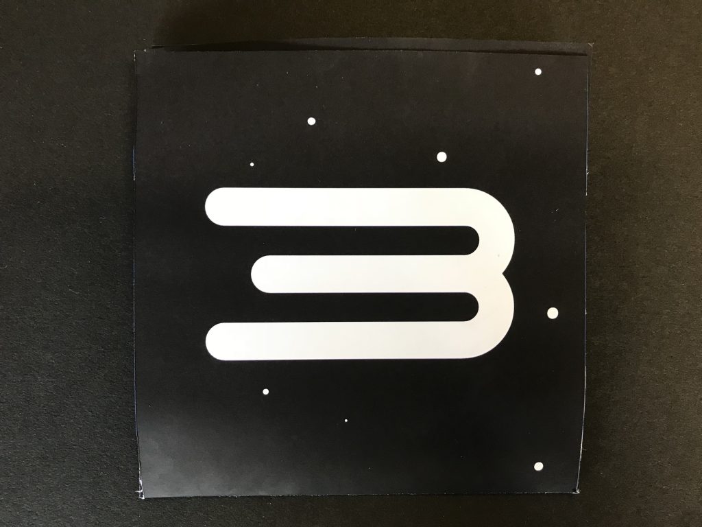
ARVE Error: Mode: lazyload not available (ARVE Pro not active?), switching to normal modeAs another continuation our Citizen diptych and our lyrical essay from English, our Japanse Stab-Bound Book also tied into these projects. We selected quotes from our interview transcript and lyrical essay and paired these quotes with Japanese Kanji that matched in meaning. From there, we produced watercolor style paintings in Photoshop by editing close up nature photos we took out in the field. The final step of the process was creating “old” paper and painting illustrations onto them. To create the old paper, we torn up pieces of Japanese newspaper, died it with tea to give it a brown, faded color, and then randomly arranged the pieces to create our own sheet of “old’ newspaper. We then proceeded to paint our illustrations onto the paper. Altogether, we created 5 packets with each of these elements in each packet. After creating a front cover, back cover, and frame by cutting cardboard and pasting paper on top, we drilled and bound the whole project together. In the end, I was impressed with how it all came together. A lot of hours and steps were put into this little book and it was satisfying to see it all come together nicely.
Movie Poster and Package
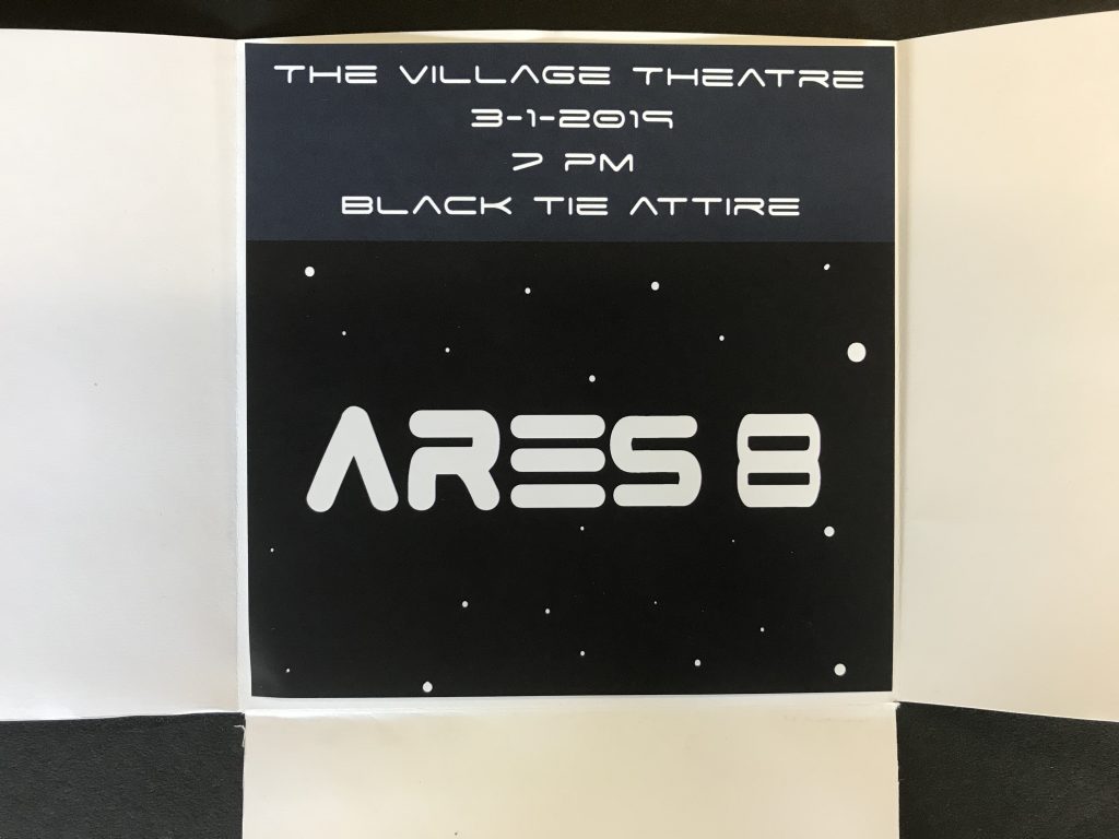
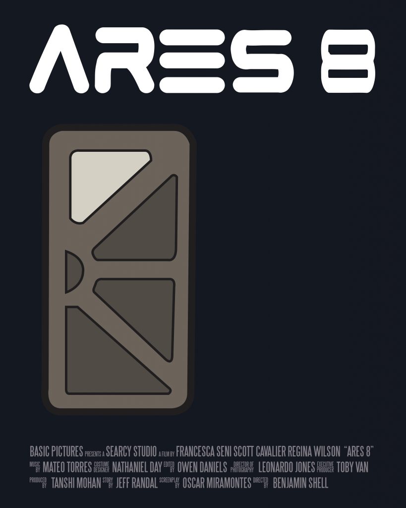
The year is 2047. Our story follows a retired astronaut who gets called back into action when the International Lunar Station sends out a precarious distress signal. Our hero puts together a crew to mount a mission, entitled Ares 8, launched to investigate the distress signal. Upon arrival, the crew discovers that the station was attacked by extraterrestrials. The story follows our hero and his crew through the perilous station, seeking to put an end the Martian foes.
To create a minimalist poster, ticket, and package, I had to think hard about the theme and message I wanted to portray. For example, to give off an eerie, space theme, I choose a dark blue/purple color as my main color. Keeping the mission in mind, I created a title font that was similar to the old NASA font, with my twist on it. For my packaging and ticket, I continued the dark space coloring with little accent dots to create a star array. A key part of a minimalist design is that the main “object” or centerpiece has to have enough detail for the viewer to understand the movie’s plot while also not being too complex or obvious. For this, I looked to an intense scene in my film. In the scene, our hero is walking down a corridor in the station towards a door with blood lining the corridor and extraterrestrials can be heard on the other side. To capture that scene, I designed a space station door and paired it by itself on the poster to emphasize the intensity of the scene.
The hardest part of this production for me was creating the font. To create my font, I took inspiration for NASA’s old font and drew into on the poster in my own manner. Unfortunately, this was easier said than done. I took great time and pain to try and get the lines and curves as systematically smooth as they were for NASA. In the end, I am very pleased with how the font and poster turned out.