Street Photography
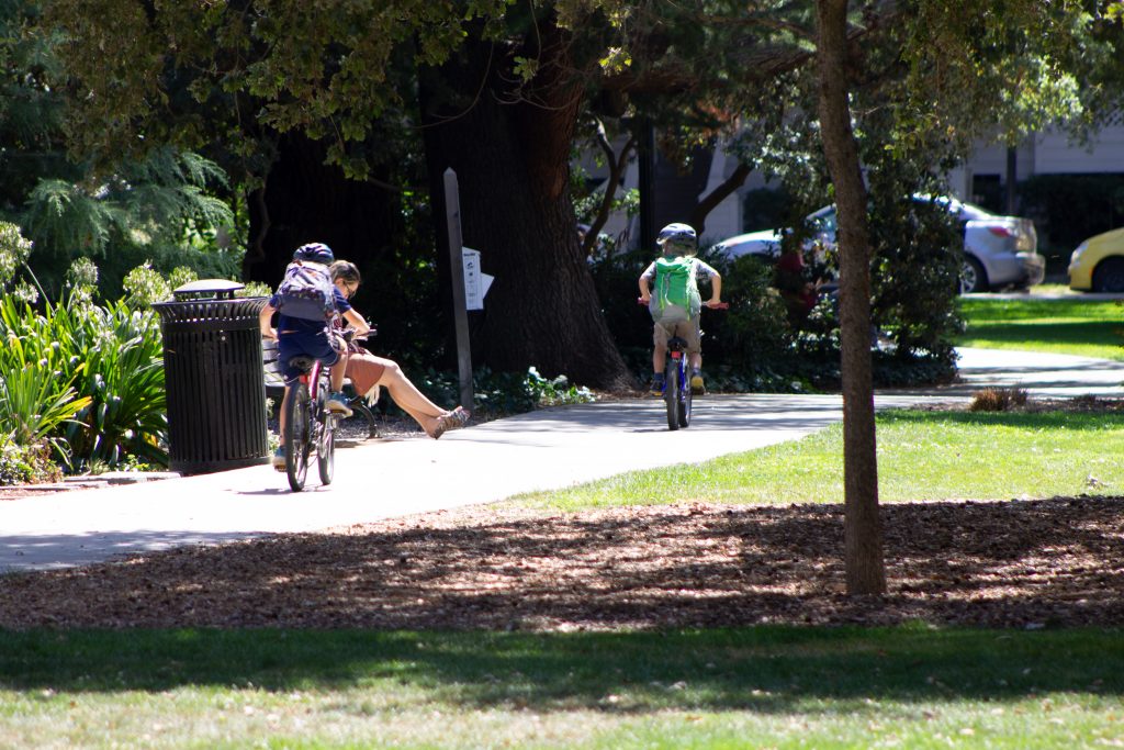
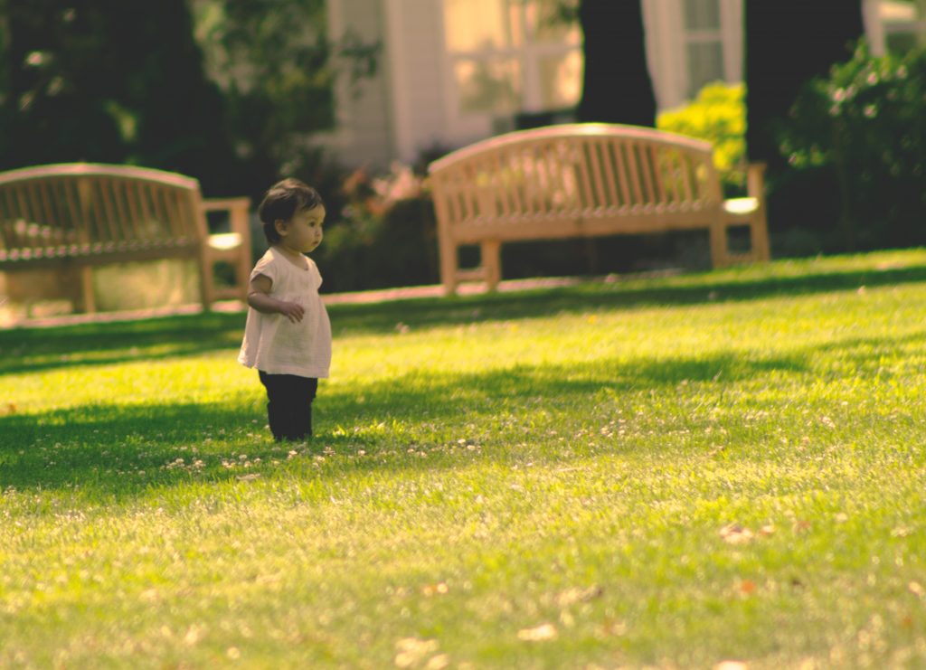
We had to take multiple street photography shots when we began to make our citizen diptychs in order for us to practice taking photos in public spaces. It was a bit of a frightening project for me because I get anxiety taking pictures of random people in public especially without them knowing I’m doing it because they might get mad,etc. Therefore, this project helped allow myself to step out of my boundaries and take a risk. With this project, we also had to develop the skills to take the perfect photo of someone who best identified the main character from our Listener Lyric Essay.
Example:
Final Product Editing the photo that would create a “instagram effect”
Citizen Diptych
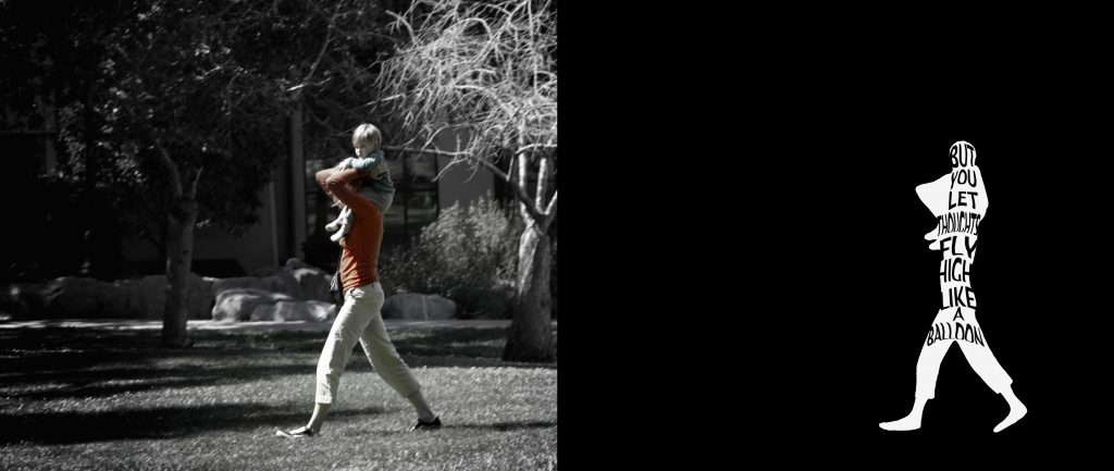
The Citizen project was a collaboration with the book we read in English, Citizen, and the lyrical essay we were asked to write afterwords. We were assigned to do more street photography, this time looking for people who in some way reflected our interview subject. Then after finding this image, we highlighted our desired subject and made the rest of the picture black and white. Then using the diptych format, we put a quote from our essay or interviewee into the outline of our object. This turned into a really cool image with a powerful message. My image is below.
Product Label
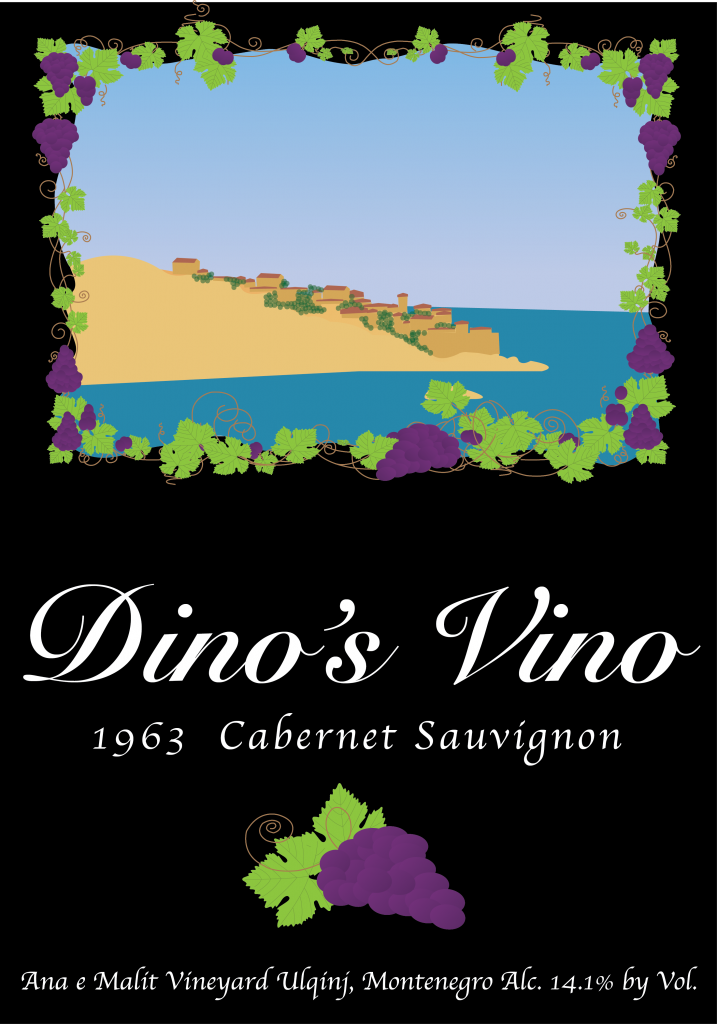
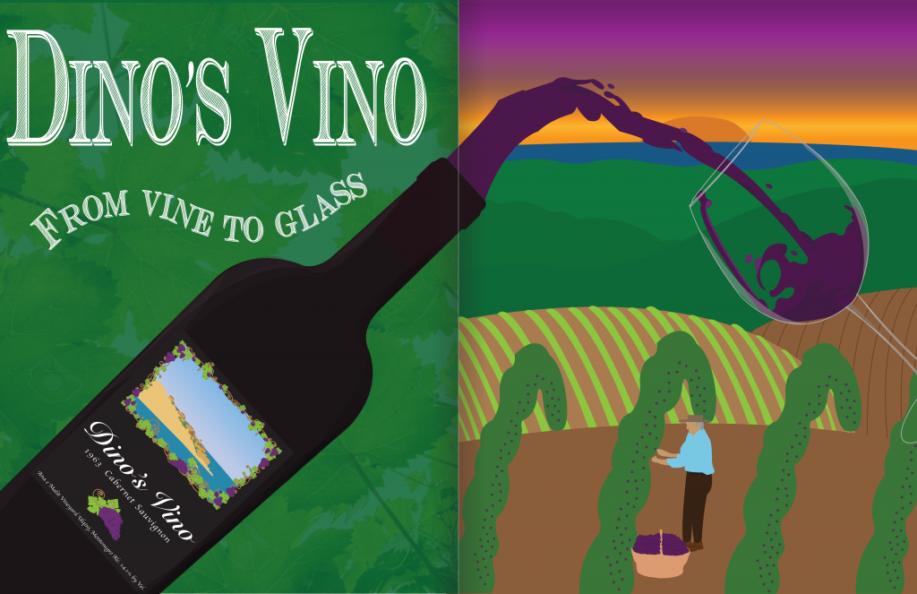
The Product label project was to create a food label for a product of our choice. We had to ensure that what we were creating was professional, went well for our product and appealed to our client, Mrs.P. In my case, I chose to design a label for a red wine. When creating the label, my design concept was to create a wine label that reflected the vineyards in Montenegro. Whenever I visited my family in Montenegro, they would take me to visit their neighbors who had this beautiful vineyard. Therefore, I wanted to attempt to create a wine label for them that portrayed a classy and vintage look as these neighbors were exactly that. I chose the design I did because in the background was a view of the old castle of Ulqinj, Stari Grad, that is a landmark of the area in which my family is from. This landmark is also known as a very classy and elegant area to stay, have dinner, etc. I thought that it would be perfect to have this view with grape vines surrounding it to allow for the vintage look to be represented. Once I chose my design, I started to create it using the application Adobe Illustrator. I was able to use various tools such as the pen tool, the brush tool, text and color scheme.
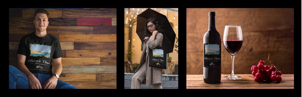
Product Triptych
Once I created my illustration of the label, I downloaded it as a PNG and went to the website Place It where I was able to generate my design onto various mockups. Once I selected the three mockups I felt best fit, I created a triptych on Adobe Photoshop of the images together. From this project, I learned that marketing and label creation is not easy. There is a long process that involves many various obstacles of the right design, color scheme, placement of various objects, etc. I chose the items to represent my design in my mockups to help present to the audience the vibe my label provides and how it can be applied to their day to day items.
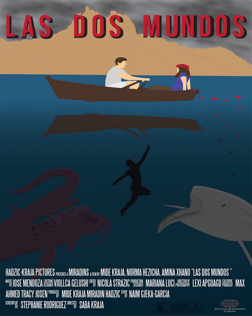
Movie Poster
This movie poster was created based off a story I wrote which is a drama, thriller and romance all in one. The scene I illustrated in the movie poster was when the couple were in the middle of the lake and what surrounds them is the beauty of the area they are in. While this is occurring, beneath them are various scary sea creatures and the boat reflected among the water. I used the application Adobe Illustrator to complete my poster. Aside from the story I developed to create my movie poster, I also had an artist that influenced it. My artist was Frida Kahlo who is a Mexican surrealist artist born on July 6, 1907. In my movie poster, I attempted to incorporate Frida’s influence by having bright colors at the top in contrast to the darker colors at the bottom. I also included bright red flowers which are a signature to the look of Frida Kahlo in many of her self-portraits.
Magazine Ad
In this project we had the option to either create a new label or used the former food label we created for the Product Label project. I chose to stick with the wine label I create previously, Dino’s Vino, because it meant a lot for me reflecting my neighbor’s vineyard back in Montenegro. Therefore in my Ad, I wanted to try to ensure my audience were plainfolks since back in Montenegro, that’s what my neighbors all consist of. To create this ad, I used applications Adobe Illustrator to create the ad itself and then Adobe Indesign to be the template for the ad.
Reflection: What did you value from the specific processes and productions in Design?
From all these process and productions in Design, I valued my growth in the skills I have using Adobe applications such as photoshop, illustrator and indesign. I was able to learn how to use different tools, functions and utilize the applications to had unique effects on my projects I have never done before. Overall while every project took patience and perseverance having to edit them the amount I did, it was worth it because they were able to come out the way I wanted them to.