Introduction
Using a variety of new applications, I learned so much at Freestyle Academy this semester. I got a chance to use DSLR cameras, Adobe applications such as Photoshop, Illustrator, and Dreamweaver. I enjoyed all of these lessons, regardless of how challenging they were. We were taught how to put our creativity to the test with design, poetry, photography, and so much more.
Being a english and digital media student at Freestyle has really been the best experience of my life. Straying away from typical english curriculum, we were taught how to think and write artistically, and use our imaginations to create raw writing. In digital media, I was aught how to use real world applications and treated like an adult. I was taught how to do captivating assignments that I genuinely enjoyed.
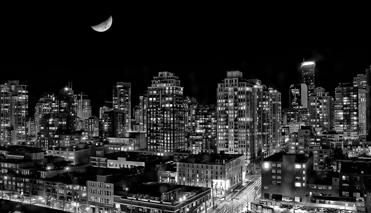
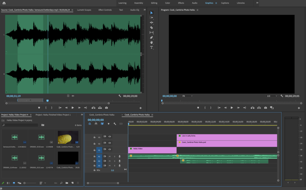
Haiku Project
This was my Haiku assignment. we combined projects from Digital Media and English to create something meaningful. We wrote our haiku’s in english, then look photos to reflect the meaning behind the poem. We then took the pictures to Premiere Pro in order to edit the poem together to produce a video.
Poetry
In our poetry unit, we were taught how to really speak and write with our hearts. We then took our poem from english to digital media, and created an artistic photo interpretation of the poem.
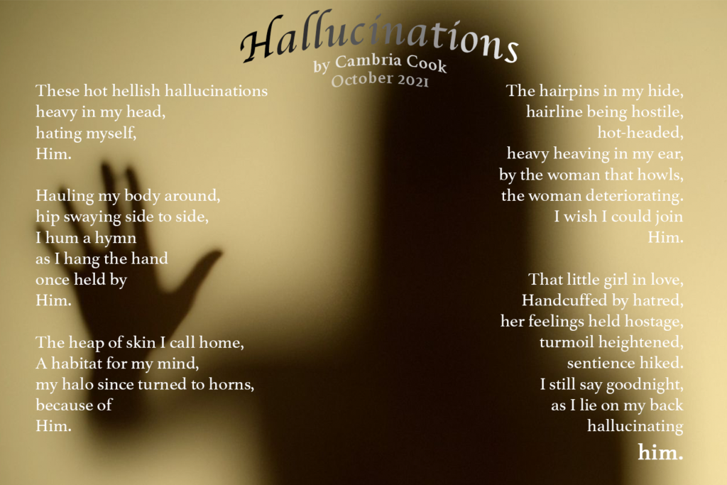
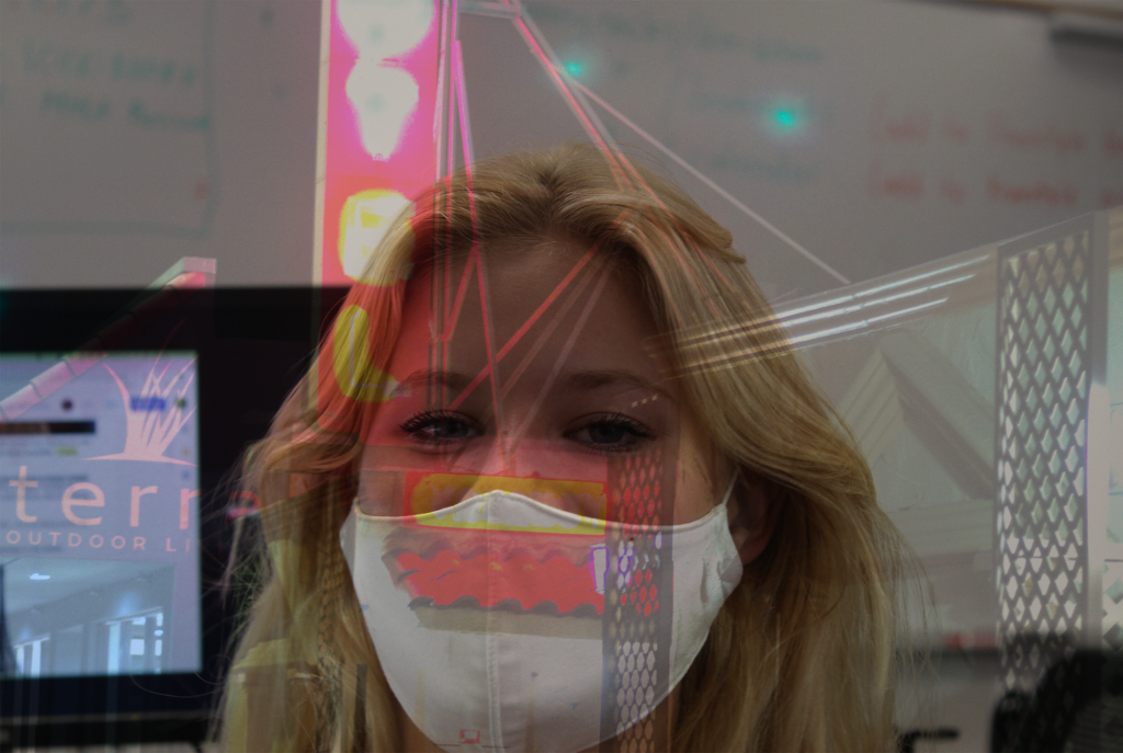
My poem really came from my heart and I really love how it turned out after integrating both my english and digital media skills to create this. If you click on the poem photo, you are brought to a link, which I coded using Dreamweaver, in order to bring the poem to life. We used Photoshop to create the picture itself, surrounded by the poem on top of it. Using Protools, we then added my voice presenting the poem, along with some somber music to really accentuate the listeners feelings.
Photoshop blend
mode editing
Photoshop proved a challenge for me throughout my first few months at Freestyle. I was able to pick up the basics quickly, however when getting into more difficult programs, I began to struggle to keep up. Into December, i’m much more confident using Photoshop and even use it to edit some of my personal photos.
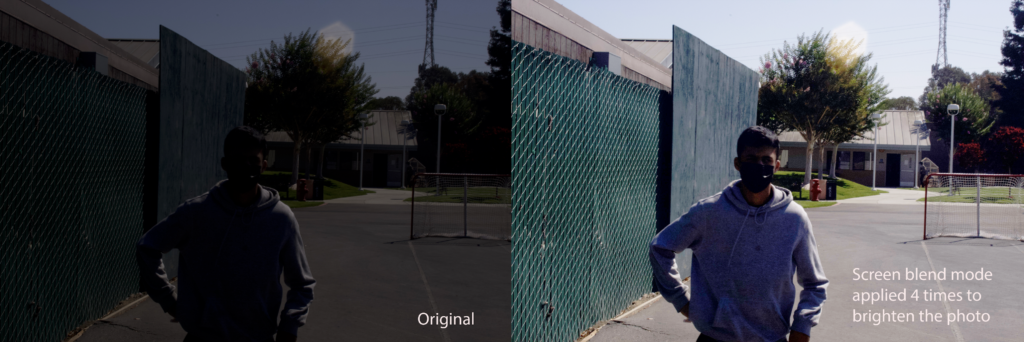
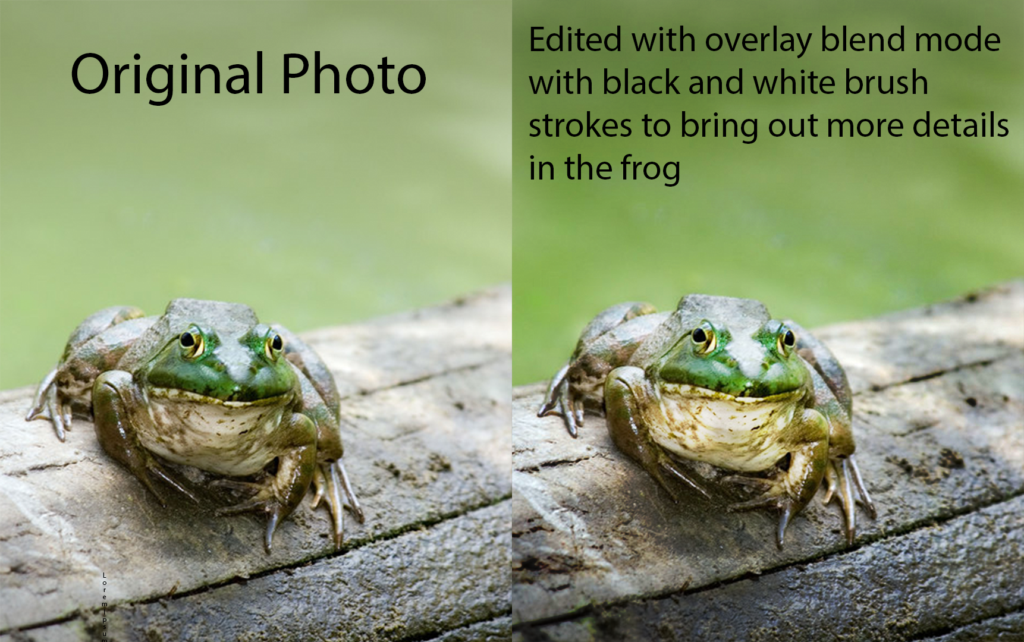
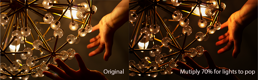
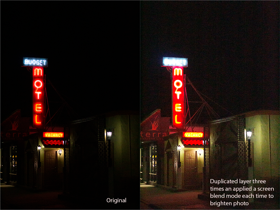
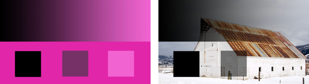
1) I like using the photoshop blend modes although I am not 100% confident using them yet. I like having the ability to be creative with my work.
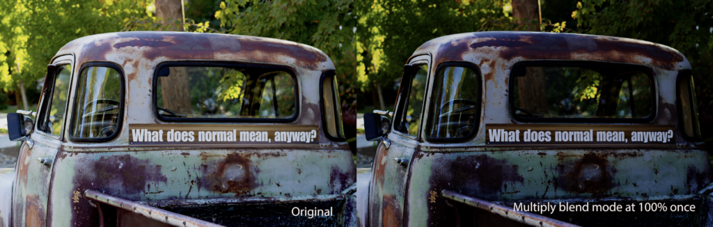
2) I valued the ability to learn to edit white and blacks using the brush tool because I think it really helps make your pictures pop and is a valuable tool in Photoshop.
Design
My first semester of design was amazing. Although it didn’t turn out to be the class I thought it would, I ended up loving what we did learn even more. So far this semester, i’ve used Adobe Photoshop and Adobe Illustrator, in order to create beautiful and very creative projects.
Alpha Name Photo Assignment
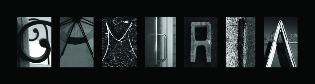
For this assignment, I used objects found around our school in order to create the illusion of letters found in everyday objects. After finding all the letters, I edited each individual photo, then pieced them together using an artboard in Photoshop. This was an exciting assignment and although it was challenging to find all the letters in my name, I enjoyed the rush of actually finding something that worked.
Conceptual Photo
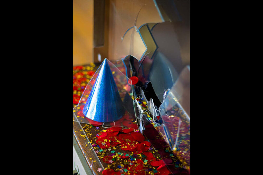
My conceptual photo captures the feeling of cowardice through trying new foods by using objects that show the emotions those two things create. In order to capture the feeling of cowardice, I used a broken television. The television represents the idea that people act cowardly because they are scared that people will judge them or see them fail to get the result they wanted if they had been bold. They feel as if everyone is watching them, which is why I chose to exemplify this with a television. The broken glass aspect of the object expresses how when cowardice, you tend to beat yourself up internally for not being valiant. In order to capture trying new foods, I thought about what that action makes me feel. As a person who enjoys trying new things, the emotion I chose to pair with it was excitement. The excitement of not knowing what taste will touch your tastebuds, and the surprise when it ends up being a taste you love. Because of this, I chose to show these emotions with a party hat and confetti, objects often associated with excitement and surprise.
In photoshop, I enhanced my photo by lowering the saturation and contrast on the bottom left corner of the picture, as well as on the top left. This made the bright white television stand less distracting to the viewer. I also lowered the saturation on the rectangle in the background in order to highlight the main areas of focus in the photo. On the focal points, I slightly turned up the contrast, and turned up the saturation in reds, blues, and yellows faintly. These changes enhanced the photo to make it more visually appealing.
Negative-Positive Space Halloween Project
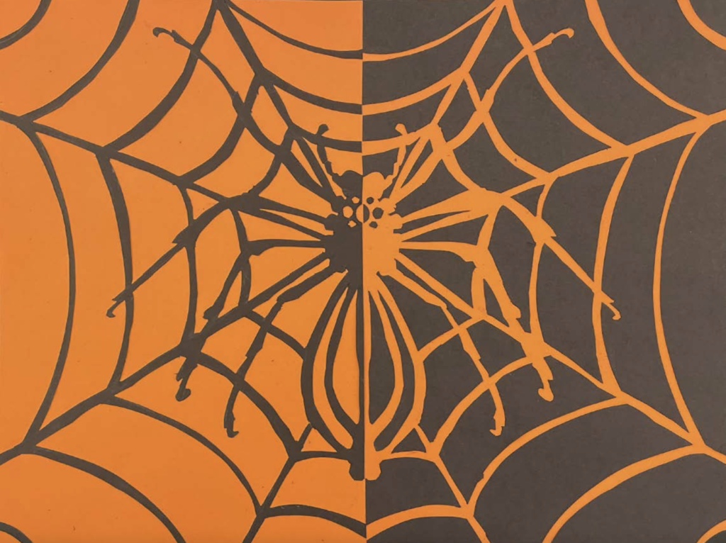
This was one of the more difficult projects I did in design this year. We used an exacto knife in order to cut out each individual piece of paper and flip it to the other side of the paper. A hand drew the spider free hand, and then carefully placed each piece of paper down so both sides were symmetric. This project was extremely difficult but I like how it turned out.
Color Theory Pastel Drawing Project
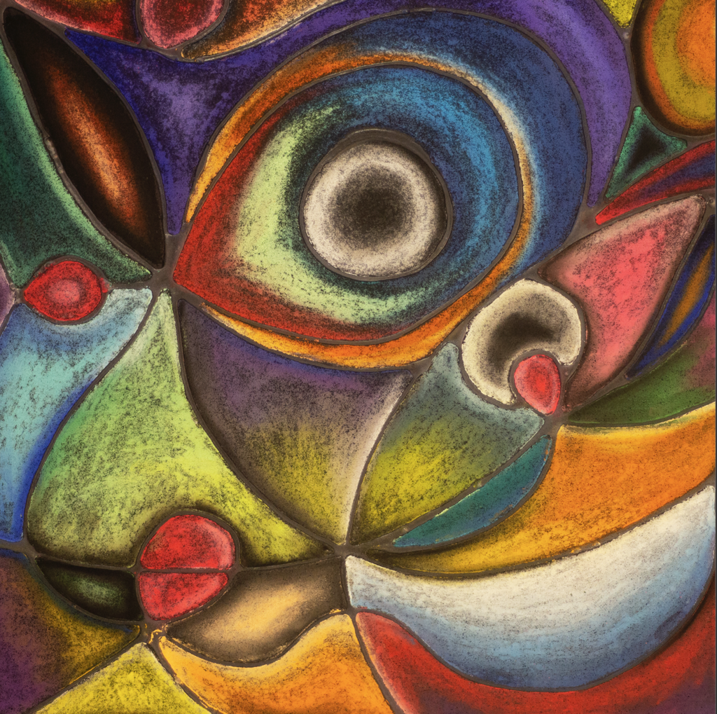
This project was calming, however it proved to be very time consuming. We strategically laid down strands of glue so that our original design would show through clearly and keep its black color. We then used color theory to design different colored sections into the artwork. I really love how this turned out and how peaceful this project was.