Explorations Website
Welcome to my explorations website. This is the last website that I created at Freestyle Academy during Senior year. The explorations unit consisted of three main projects, designing a Blink book in InDesign, creating a mini-project on any topic of my choice relating to web/audio, and a satire presentation. I had a blast working on the three projects, and I am happy with quality of work that I created. I wanted to make this site as clean and straightforward as I could. I accomplished this by color-coding the navigation with its appropriate content and using large bold text for easier readability. The design of this site was inspired by the "flat design" tend which suggests that a design looks best without unnecessary graphical features like drop shadows, gradients, and borders. In addition "flat" designs tend to use lots of colors to help separate between content. This can be seen with the color coordination of my navigation buttons. One of the requirements of this site for the explorations unit was to use to make a responsive website. Responsive websites add an a significant level of complication to building a site, because you have to not only worry about how a site looks on a desktop monitor, but how it looks on a mobile device. My website doesn't have the most "standard" layout due to the arrangement of content, so I ended up programming most of my responsive features inside of jQuery using the "resize" method. This method allows me much more flexibility than media queries inside of CSS.
Over the past two years at Freestyle my view on how web development and design works has entirely changed. I now have a strong understanding of how CSS, HTML, JavaScript, and PHP work together to create a site, and I am fully capable of creating an interactive and well designed website from scratch. I no longer see a drop down menu as a graphical feature, I instead see it as the images and code to build it. When I first started making web sties Junior year I spent most of my creation process inside Photoshop, but now I work almost entirely inside the browser and making a design almost entirely out of code. This method of making a website was incredibly beneficial for making a responsive site, because Photoshop restricts your ability to design beyond a fixed layout. I am very excited about what I have learned at Freestyle and I am incredibly thankful for the inspiration and knowledge that my teacher Mr. Florendo has given me. I have learned so much in the past two years, and I am excited for what I can learn in the future. If you would like to see more of my work click here to return back to my project listing page.
Blink Book
Confined Intensity
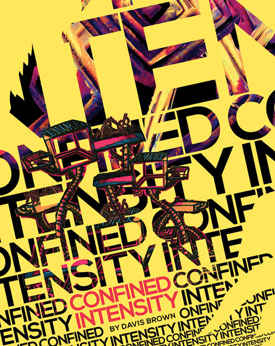 This is the front cover of my Blink book Confinded Intensity. I used the color yellow to help draw attention.
The Blink book was one of the core projects that I created during the explorations unit at Freestyle Academy. The title of my book is Confined Intensity, because I wanted the title to embody the sense of energy and emotion that I expressed in my creative writing pieces and art. The concept of "Blink" revolved around the book Blink that we read in English class. The book illustrated how powerful the subconscious mind can be in persuading the decisions we make and our personal beliefs. Subconsciousness was integrated in my art and writing, by setting a limit on the amount of time I had to create each piece. By setting a time limit I was forced into a state of spontaneous thought. Some of the mediums that I used for my art were colored pencil, pen, paper, and paint. After finishing all nine art pieces I scanned them and edited them inside of Photoshop. Most of the editing involved adjusting color and saturation of my images to create more contrast against their solid colored backdrops. For each page I decided to use a specific color scheme to create a stronger connection between my writing and art. I also used a lot of angles and lines to establish a sense of movement and energy. I am very happy with the way that my blink book turned out, and I am glad that I put in the effort adjusting each image to make it exactly as I had envisioned it.
 This art piece was first done with colored pencil, and then edited in Photoshop to increase saturation and darken its lines.
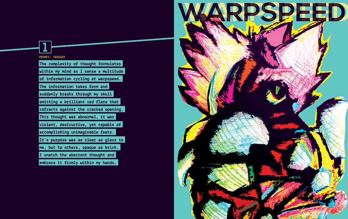
1 Thought
The complexity of thought formulates within my mind as I sense a multitude of information cycling at warpspeed. The information takes form and suddenly breaks through my skull emitting a brilliant red flare that refracts against the cracked opening. This thought was abnormal, it was violent, destructive, yet capable of accomplishing unimaginable feats. It’s purpose was as clear as glass to me, but to others, opaque as brick. I snatch the aberrant thought and embrace firmly within my hands.
 The art medium for this piece was colored pen. I then edited it by cropping out its background and then lengthening parts of its structure.
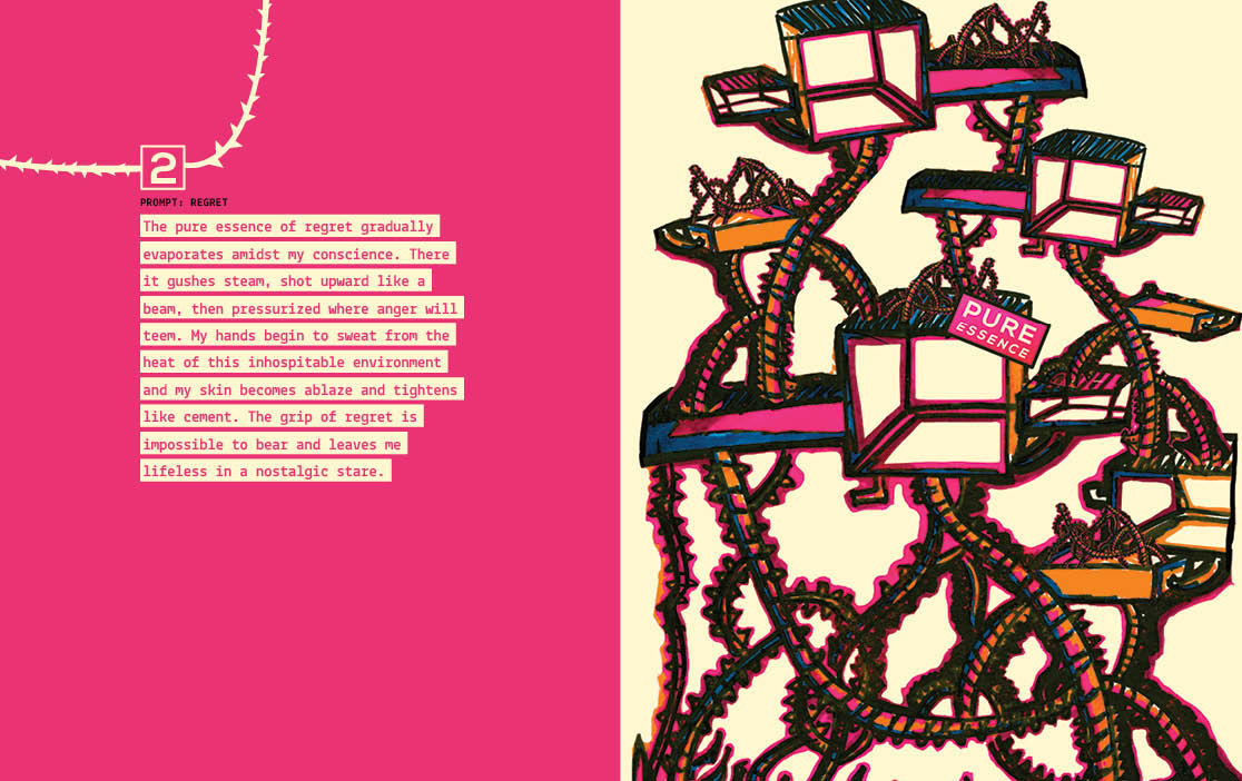
2 Regret
The pure essence of regret gradually evaporates amidst my conscience. There it gushes steam, shot upward like a beam, then pressurized where anger will teem. My hands begin to sweat from the heat of this inhospitable environment and my skin becomes ablaze and tightens like cement. The grip of regret is impossible to bear and leaves me lifeless in a nostalgic stare.
 The artistic medium for this image was chalk. I edited it by cropping out the background, adjusting color balance, and adding in text.
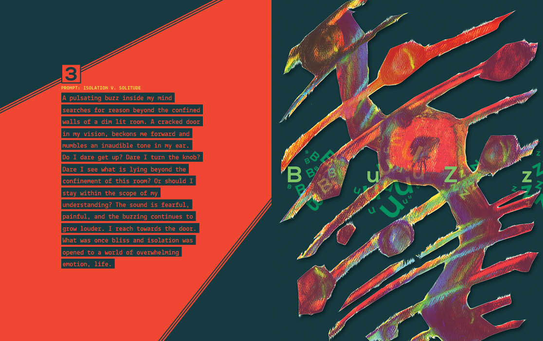
3 Isolation v. Solitude
A pulsating buzz inside my mind searches for reason beyond the confined walls of a dim lit room. A cracked door in my vision, beckons me forward and mumbles an inaudible tone in my ear. Do I dare get up? Dare I turn the knob? Dare I see what is lying beyond the confinement of this room? Or should I stay within the scope of my understanding? The sound is fearful, painful, and the buzzing continues to grow louder. I reach towards the door. What was once bliss and isolation was opened to a world of overwhelming emotion—life.
 The artist medium for this illustration was watercolor and Crayon. I significantly increased the saturation and color of the image, and filled the background with light blue.
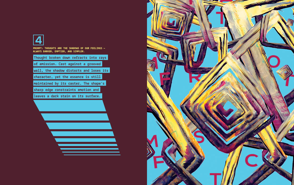
4 Thoughts are the shadows of our feelings — always darker, emptier, and simpler.
Thought broken down refracts into rays of emission. Cast against a grooved wall, the shadow distorts and loses its character, yet the essence is still maintained by its caster. The shape’s sharp edge constraints emotion and leaves a dark stain on its surface.
 The artist medium for this piece was oil pastel. I enjoyed working with this medium because I could smudge and blur the colors around.
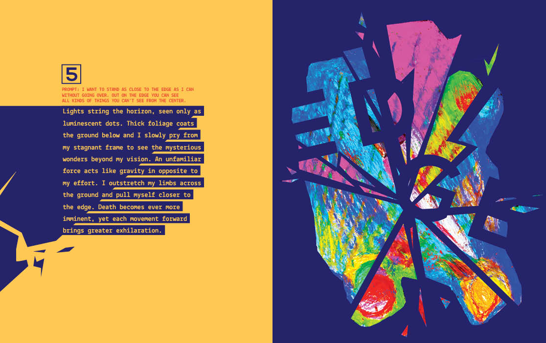
5 I want to stand as close to the edge as I can without going over. Out on the edge you can see all kinds of things you can see from the center.
Lights string the horizon, seen only as luminescent dots. Thick foliage coats the ground below and I slowly pry from my stagnant frame to see the mysterious wonders beyond my vision. An unfamiliar force acts like gravity in opposite to my effort. I outstretch my limbs across the ground and pull myself closer to the edge. Death becomes ever more imminent, yet each movement forward brings greater exhilaration.
 The artist medium for this piece was acrylic paint. I edited the picture by masking out my piece into the shape of a circle and then added a yellow background.
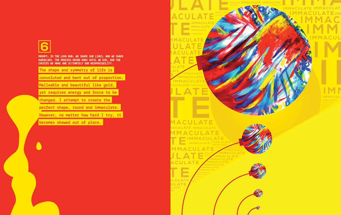
6 In the long run, we shape our lives, and we shape ourselves. The process never ends until we die. And the choices we make are ultimately our responsibility.
The shape and symmetry of life is convoluted and bent out of proportion. Malleable and beautiful like gold, yet requires energy and force to be changed. I attempt to create the perfect shape—round and immaculate. However, no matter how hard I try, it becomes skewed out of place.
 The artist medium for this piece was magazine collage. This is probably one of my favorite pieces from my Blink book.
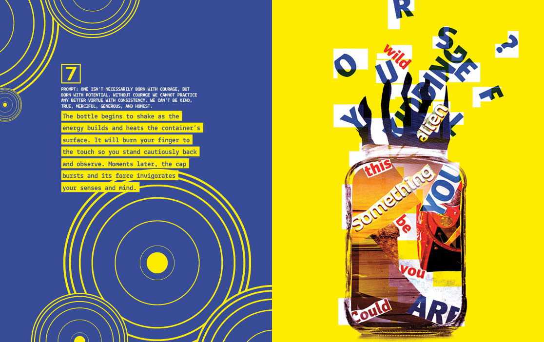
7 One isn’t necessarily born with courage, but born with potential. Without courage we cannot practice any better virtue with consistency, we can’t be kind, true, merciful, generous, honest.
The bottle begins to shake as the energy builds and heats the container’s surface. It will burn your finger to the touch so you stand cautiously back and observe. Moments later, the cap bursts and an its force invigorates your senses and mind.
 The artist medium for this pice was watercolor. I cropped out the image with a mask, and manipulated it to look like it was cracking.
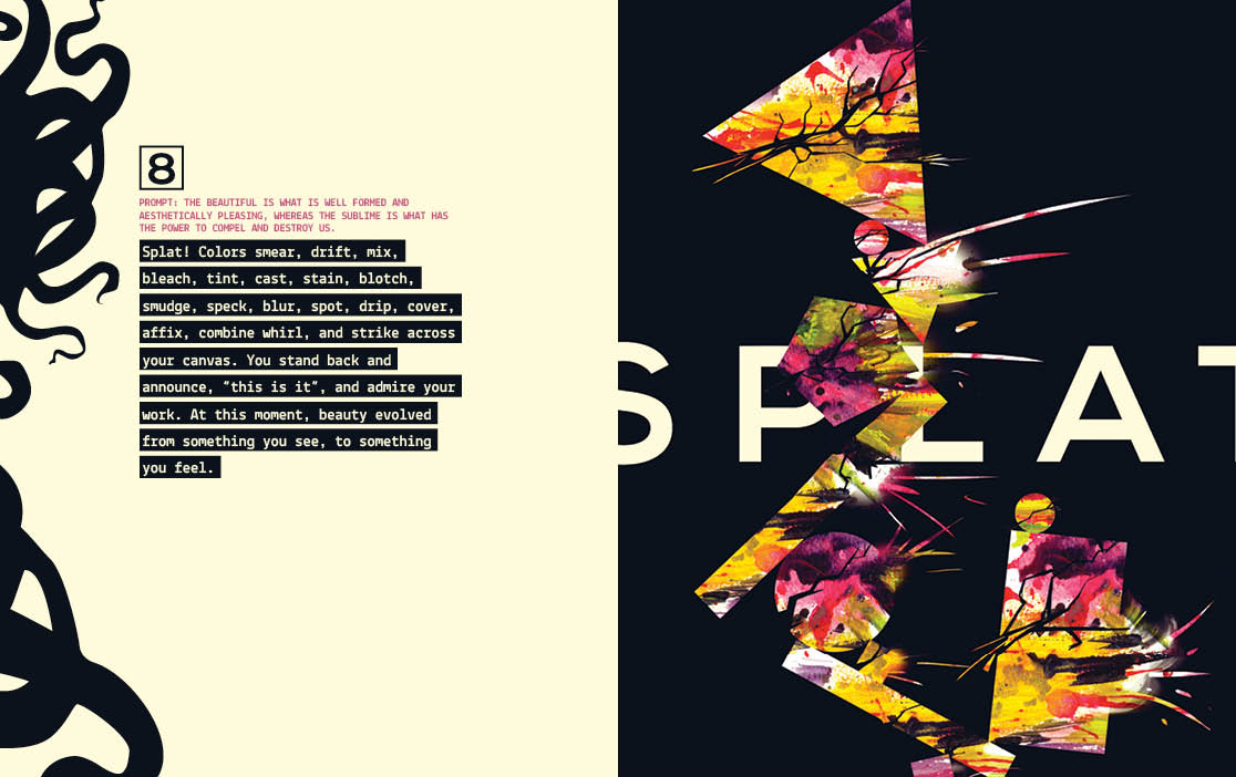
8 The beautiful is what is well formed and aesthetically pleasing, whereas the sublime is what has the power to compel and destroy us.
Splat! Colors smear, drift, mix, bleach, tint, cast, stain, blotch, smudge, speck, blur, spot, drip, cover, affix, combine whirl, and strike across your canvas. You stand back and announce, “this is it”, and admire your work. At this moment, beauty evolved from something you see, to something you feel.
 The artist medium for this piece was paper collage. I then edited the colors of the picture and cut out its background to make it look like the cubes were floating.
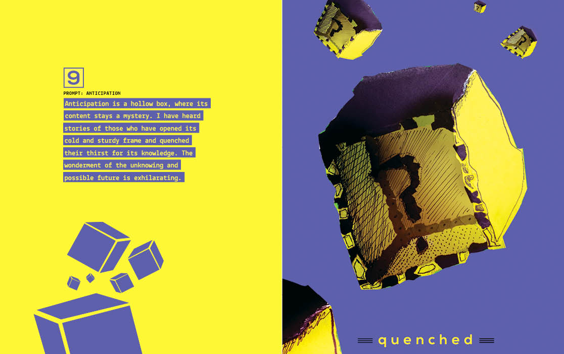
9 Anticipation
Anticipation is a hollow box, where its content stays a mystery. I have heard stories of those who have opened its cold and sturdy frame and quenched their thirst for its knowledge. The wonderment of the unknowing and possible future is exhilarating.
10 Amplified
The pure essence energy and emotion is stripped from the subconscious mind in an attempt interpret the insanity of the world. Here is the test. Visualize this book burned to ashes on a campfire with its remains used to create a taxidermy of a baby mackerel fish which is then wrapped tightly in bubble wrap and placed in the third row third column of an Oreo box then layered in a foot of cement, dropped in the middle of the pacific ocean by helicopter where it rests for two million years to be found by a superior alien race that breaks through the cement, tosses the Oreos away, freezes the taxidermy fish inside bubble wrap with liquid nitrogen, flavors it with guacamole and finally eats this ultimate creation as a rare delicacy.
Minigame
Rainbow Voyager
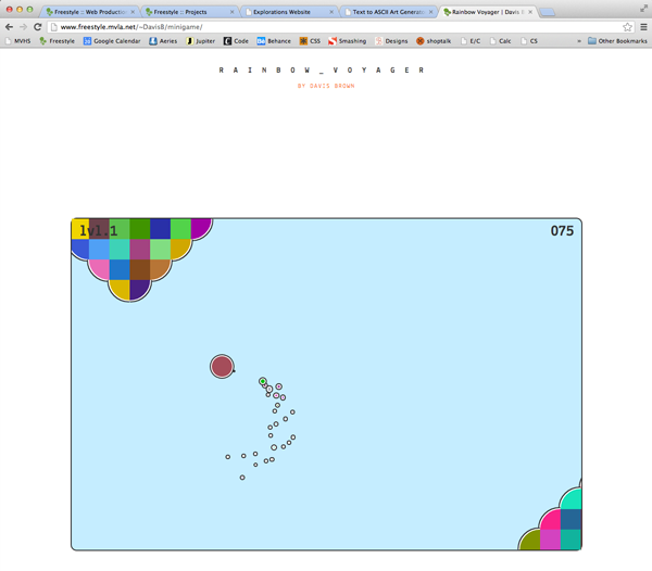 This is a screenshot from the Rainbow Voyager web game. The player is the colored ship in the center. You can see how challenging it is to avoid the oncoming walls.
For my mini-project at Freestyle Academy I decided to create a small game utilizing the knowledge that I have about jQuery, HTML5, CSS3, and some PHP. Rainbow Voyager is a skill based game that tests the user's ability to navigate around oncoming waves of rainbow colored mountains. If the user hits a mountain, they explode and the game restarts. They also have the option to enter their score onto the high score table and get recognition from family and friends. As the game progresses the mountains begin to move faster and grow larger. Typically the best players have quick reactions and can prepare accordingly for the size and speed of an oncoming obstacle. This game is truly the ultimate test of both mental focus and gaming skill.
The creation of Rainbow Voyager began by developing the gameplay mechanics like the controls of the user's ship, and how the mountain obstacles are generated. The ship was created with a combination of CSS3 for turning, and jQuery to animate it forward. As the ship moves I used the "append" method inside of jQuery to create the trail particle effect that is emitted from the ship. Once the particles are done animating, they are removed from the DOM to prevent the game from slowing down. The next component of the game was determining when the user hit an oncoming obstacle. This involved continuously finding the left and right coordinates of the player and all shapes on the screen. This proved to be complicated because by continually finding the coordinates can slow down the game significantly. The last functional component of the game was creating a php high score table. I achieved this by creating an HTML form that revives input by the user and then writes it to a text file along with the user's score. Then the entire text file is sorted using the php "rsort" method and printed out inside the high score table. Having a high score table definitely adds a level of competition to the game and entices players to play more, challenge their friends, and see their names' and scores' appear on the scoreboard live acton.
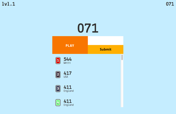 This is a screenshot of the highscore system in the game. Each game you can compare your score against your family and friends!
The game is played using the arrow keys on your keyboard. Press up to accelerate your ship forward, down to decelerate, and left and right to turn accordingly. The best method to avoid the walls is to keep moving, because it is difficult to accelerate up to max speed. Once I had all the functional aspects of the game working, I styled it with colors and borders to create a unique look. Some of the styling of the game was inspired by games like Helicopter and Robot Unicorn Attack. In the future I plan to make the game more graphically appealing by adding background elements like clouds or trees. Some elements that I might add will be power ups and different types of obstacle formations. Overall, I am very excited about the end result of this game, and I definitely plan to continue to improve and add to it in the future. Thank you to all of those that gave great insight on how it could be imporved and what features should be added.
Satire Project
Obsessive God
 This is my satire art project that I made in Design class.
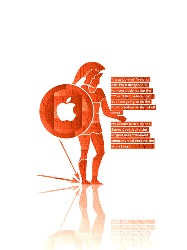
For the humor unit at Freestyle Academy I decided to create a caricature to represent a collection of experiences I had working with a client last year on his startup company website. What originally started as a standard project evolved into a website that was completely out of scope of the time commitment that I planned to devote to it. I slowly discovered through the creation process that the source of the issue was the fact that I had a poor client to designer relationship. A discussion about the style of a button would escalate to a battle of egos between whether the decision of the designer or client is more reliable in improving the quality of a site. I decided to illustrate the frustration I had during this project by creating a list of the top telltale signs that signify the qualities of a bad client. I illustrated this by creating a caricature of my client as a greek god warrior to represent his excessive ego, and an apple logo on his shield to demonstrate the fact that he had an obsession with Apple products and a vision since Sophomore year in high school to create a company that rivaled the success of Steve Jobs. The first key telltale sign was that you should leave your client when he claims that he is a prodigy storyteller and born from fire and ash. The second telltale sign is when your client has an obsession with Steve Jobs. Third, when you client demands a site as good as Apple’s for $50. And fourth when he/she believes that a few tripods and a camera is more equipment than all of Freestyle combined. Below is an example conversation that I had with my client.
Humor Presentation | stand-up comedy
The Telltale Signs to Leave Your Client Project
Narrator: Introduces and ends act
Apollo: Website client
Davis: Web Designer
/* Introduction */
Narrator
Ah, Ladies and Gentlemen welcome to an exciting evening, where we will see the undoubtable frustration and rally between two men and their quest to find peace among the formation of a Business web page. On my left (points to empty char) we have Apollo, a man who escaped the bounds of high school sophomore year in attempt to start a video business, and guides his entire existence from the words of the Steve Jobs book. All he currently desires in this world is a 20 page e-commerce site with reflective black buttons and jelly bean blue text. On my right we have a designer completely oblivious to hole he has trapped himself in and doesn’t have the bravery to finally reveal to Apollo that he is in-fact, not steve Jobs. Raise the curtains, and begin./* conversation. chess piece is moved after each turn */