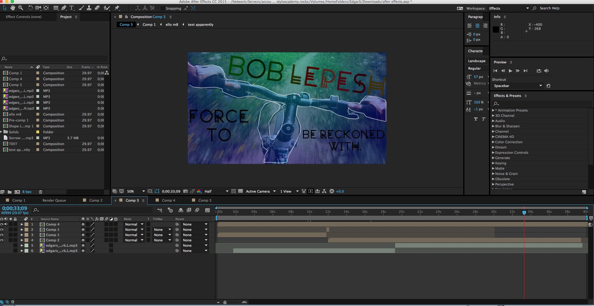
Welcome to my Profile Project Website! For this project we were asked to chose a person to profile who has made a positive impact in the community. For English, we wrote the text for our magazine article. In Design we created a magazine article layout with the text we wrote in English. In WebAudio we created this website and a commercial for our profile person.
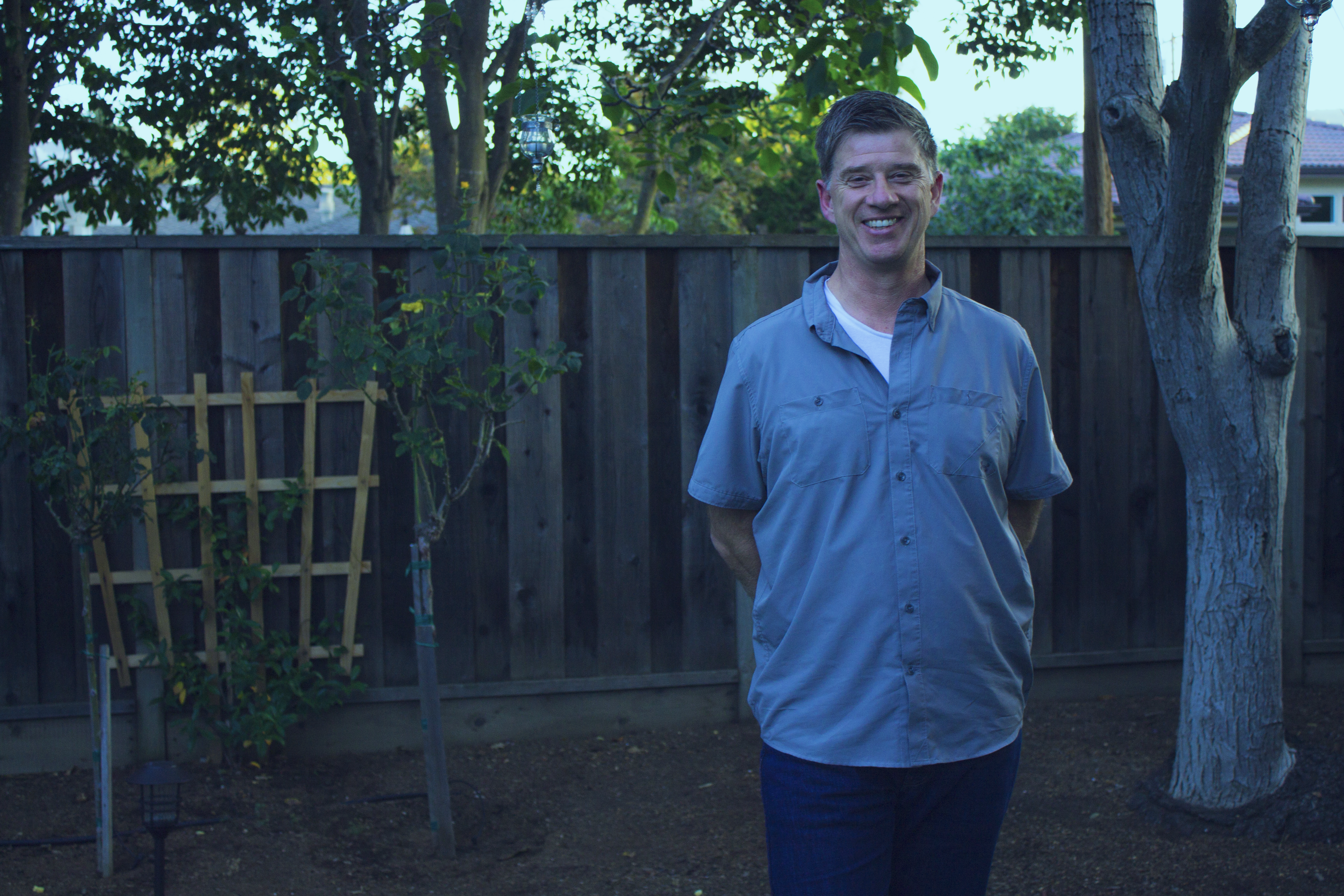
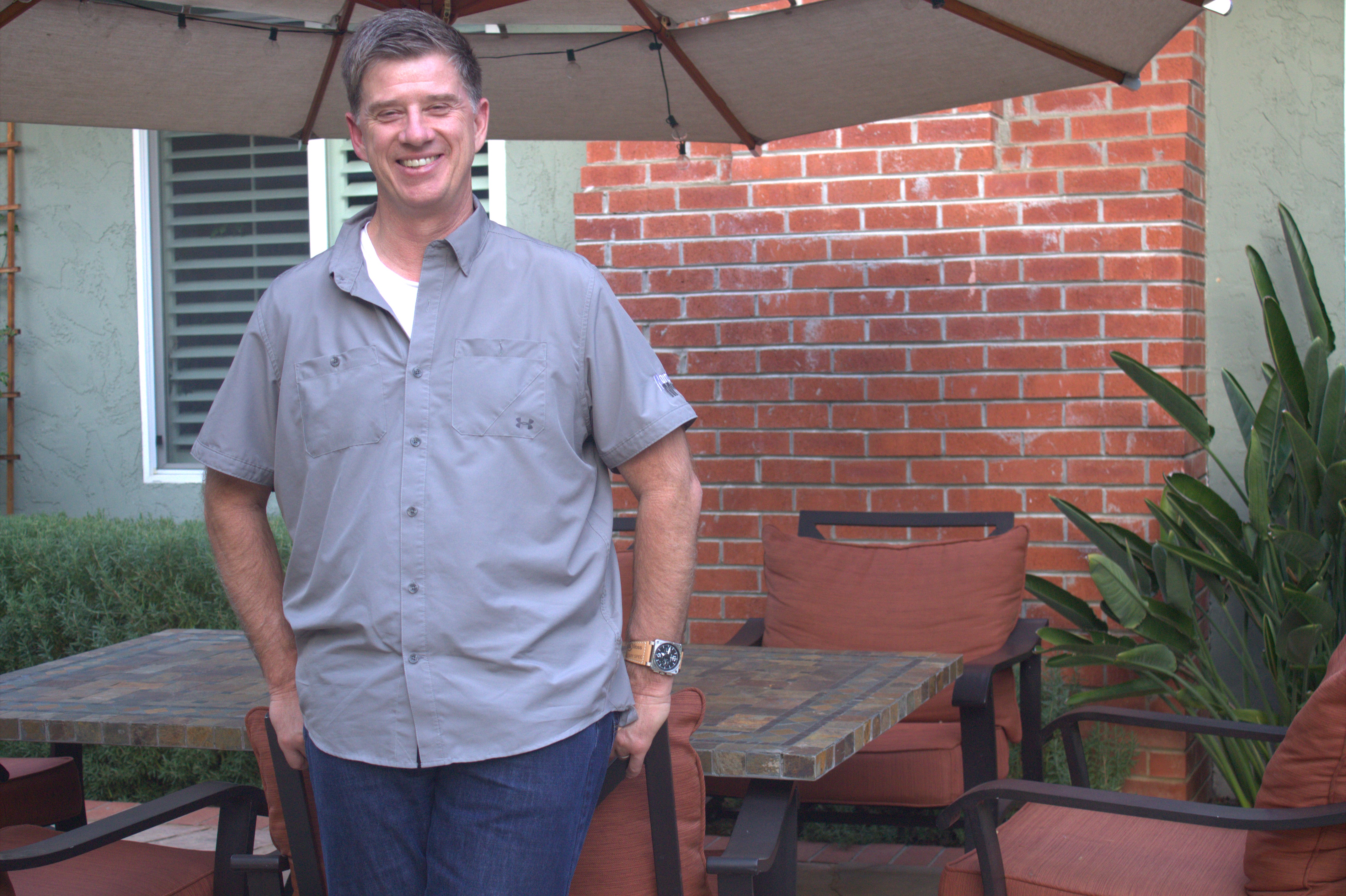
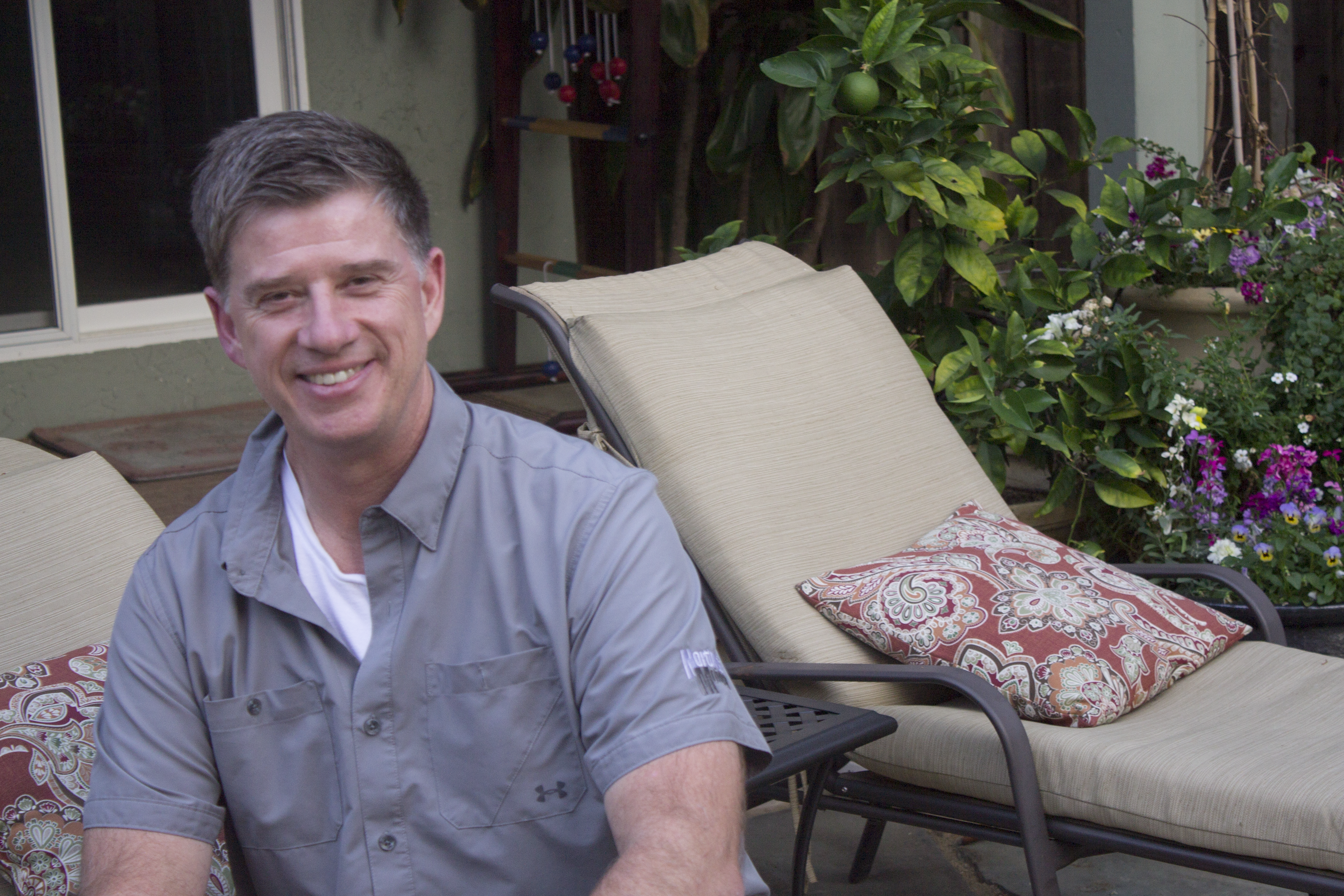
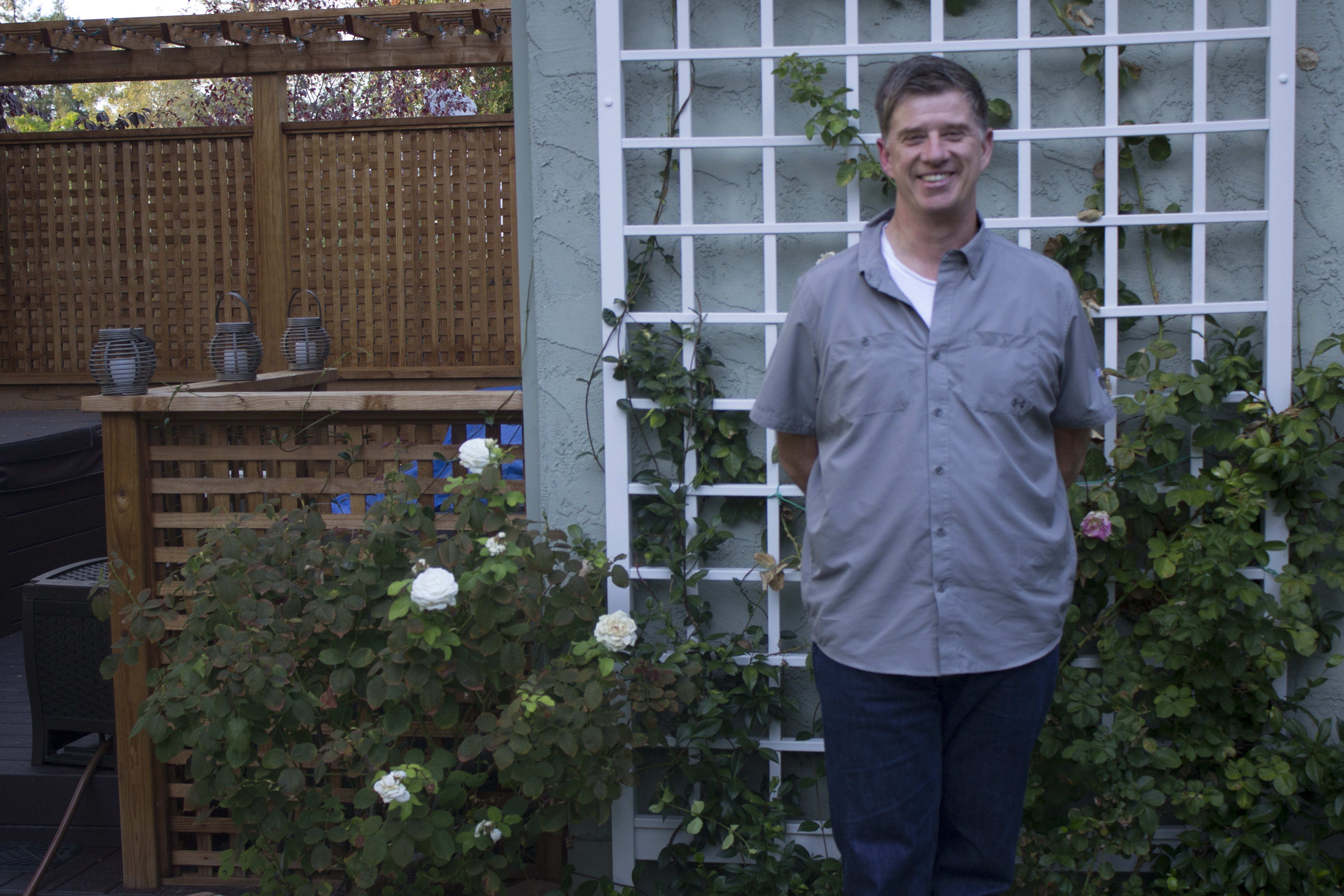
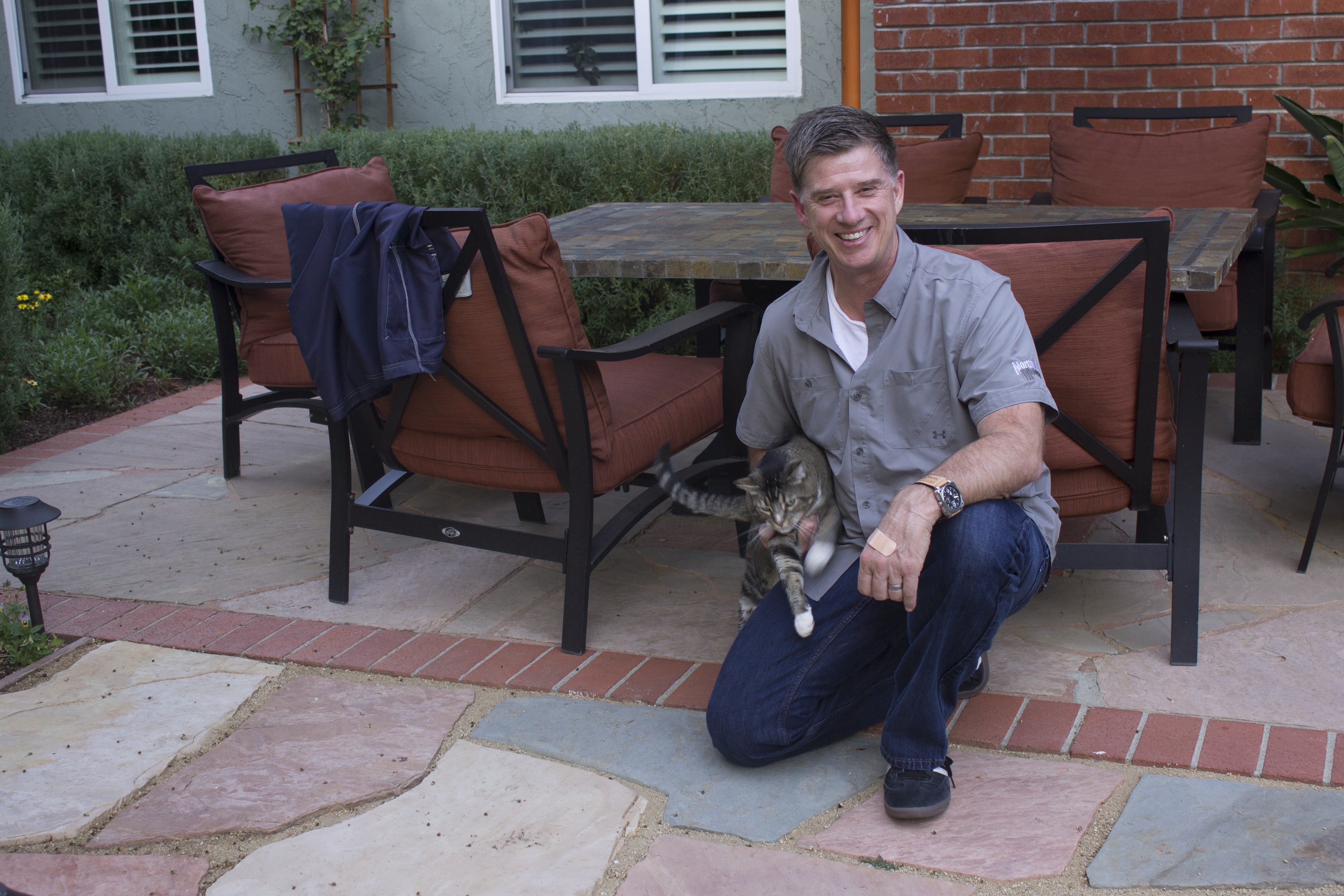
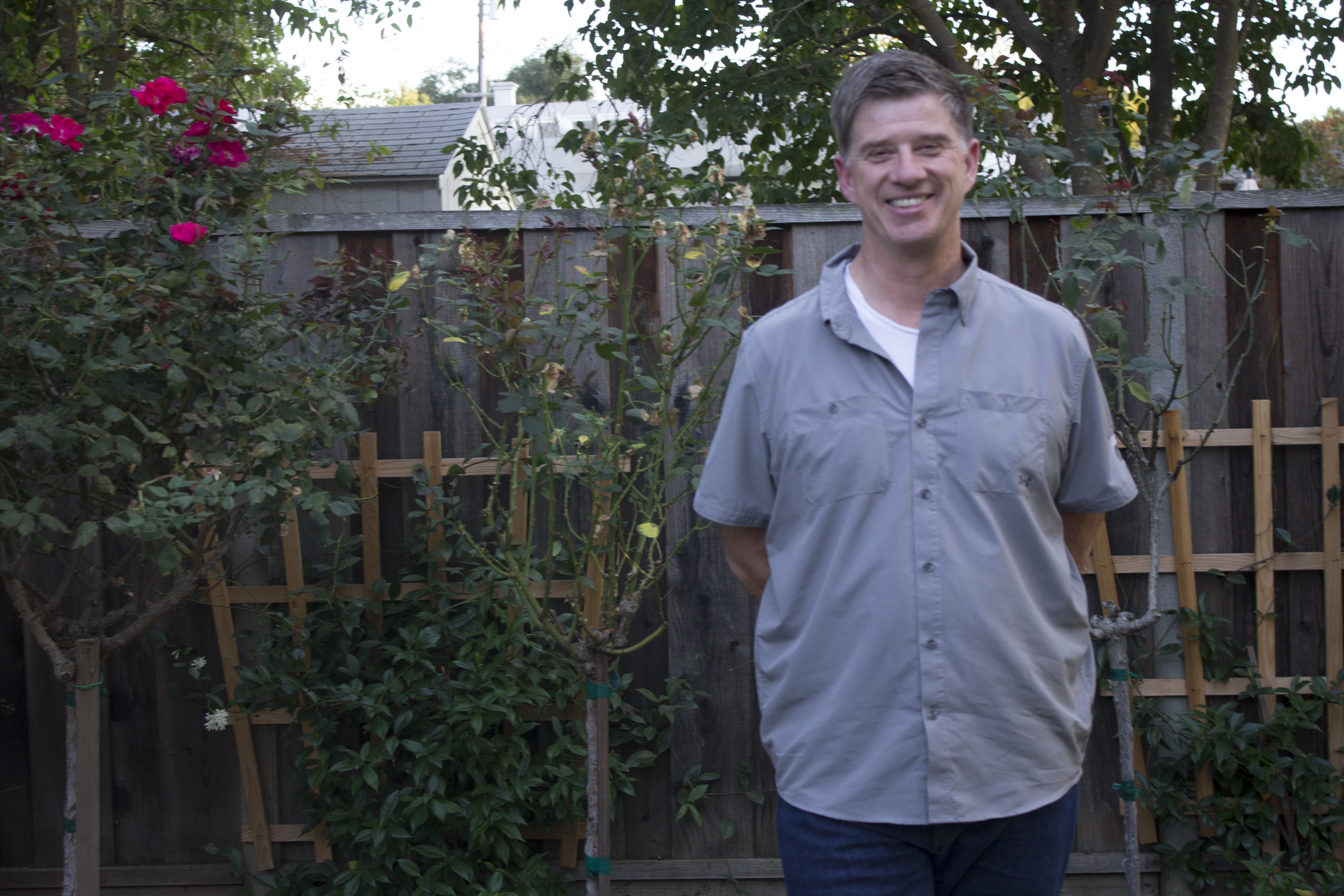
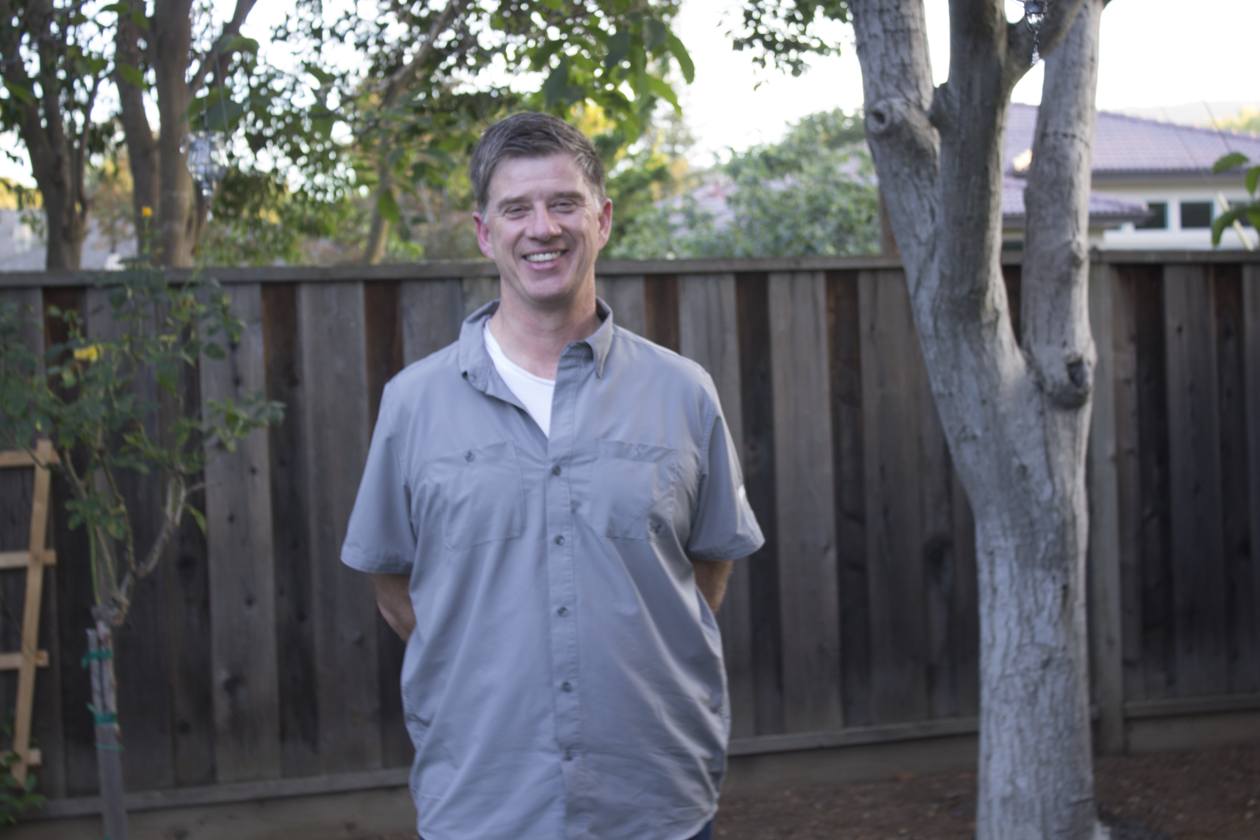
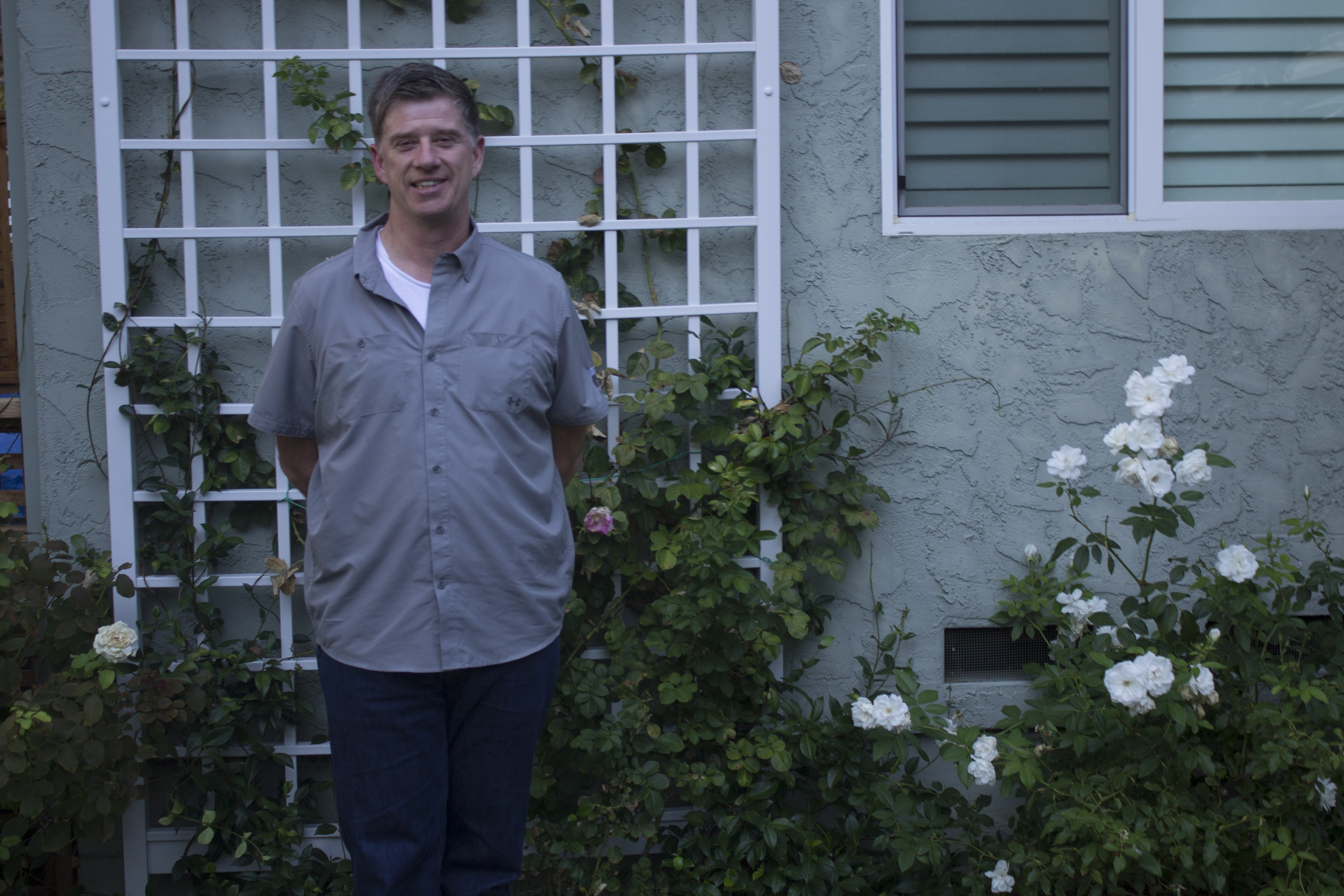
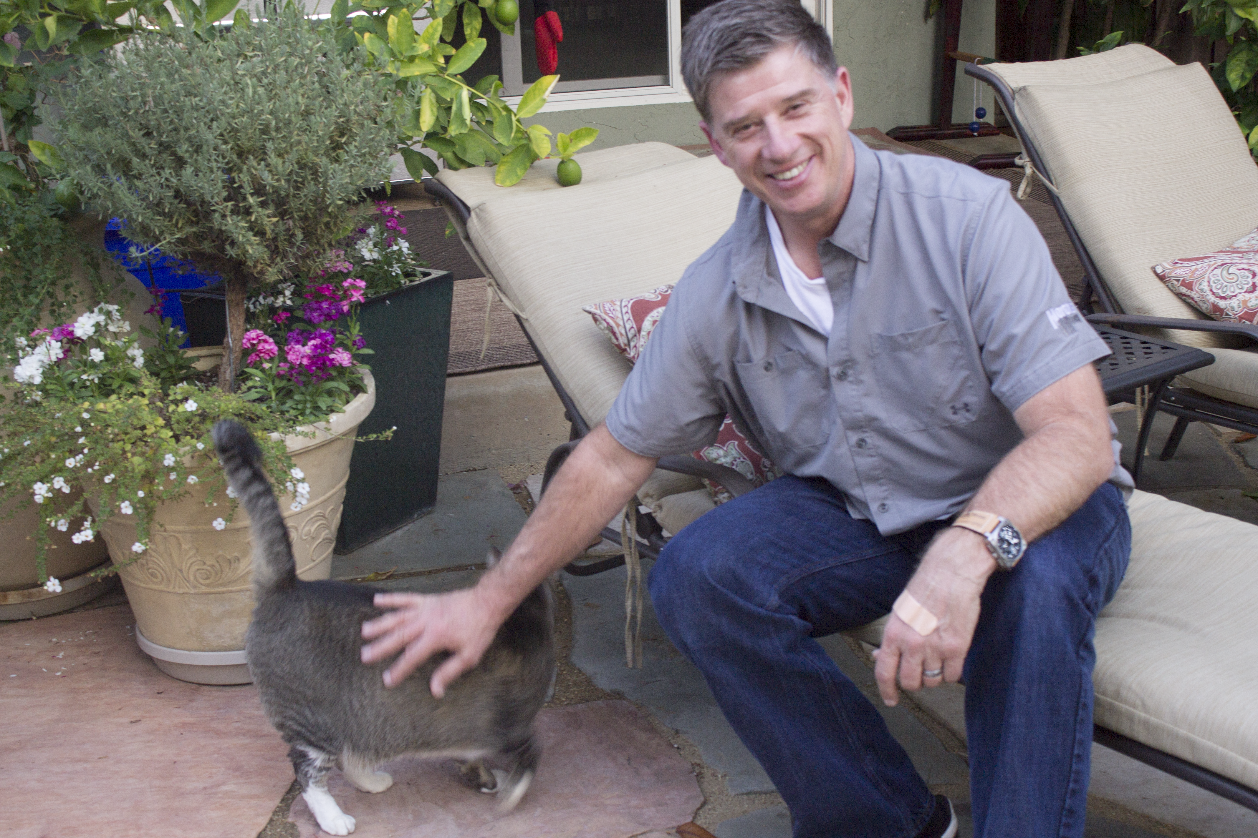
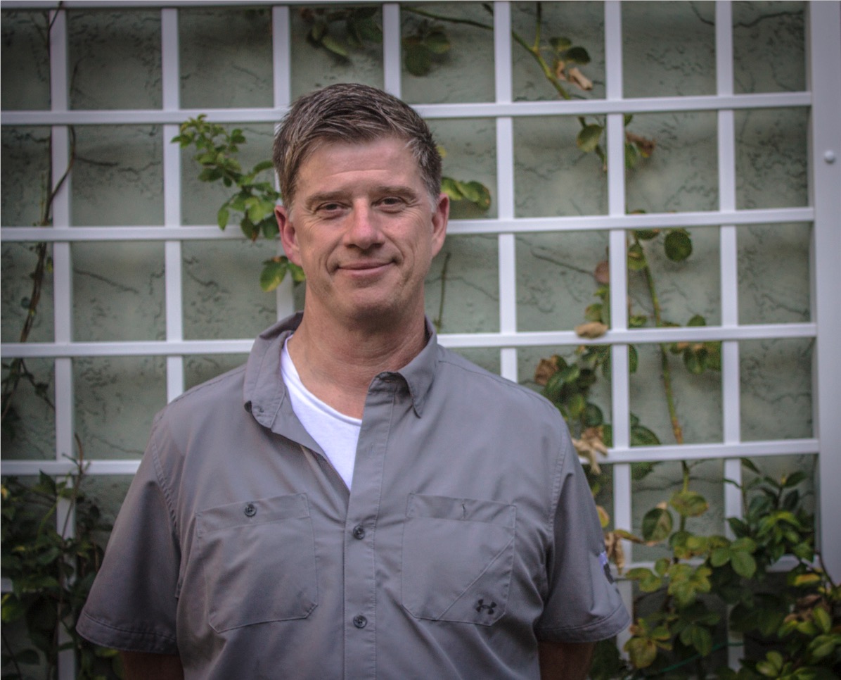
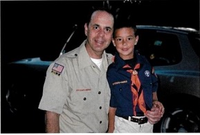
Bob Lepesh is a bay area native who has lived here ever since he was born. Ever since he was a kid, Bob has loved bikes. Even after a near death motocross accident where he punctured his lung and broke multiple ribs, Bob’s on-the-go, youthful, and active lifestyle never halted. He continues to do what he loves in every aspect of his life. He often bikes extensive lengths, multiple times a day. He frequently watches motocross events on TV, something Lepesh and his son William have enjoyed for years. The constant adrenaline rush of motocross and mountain biking is something that has continually helped keep Bob young throughout his years in the Golden State.
Bob’s chill, laidback persona is something you will see within seconds of striking up a conversation with him. To me, Bob is someone I undoubtedly consider a friend and a homie. It’s amazing being able to talk to someone who comes from the same place as you, who knows all of the cool spots around Los Altos, and what the true silicon valley lifestyle is like.
When I look back on the project, the most valuable skill I learned in all my classes was keeping a constant theme throughout each piece for each class. This was something I never had to do before, so although it was a challenge for me, it taught me something very important that I will now use throughout everything I create.
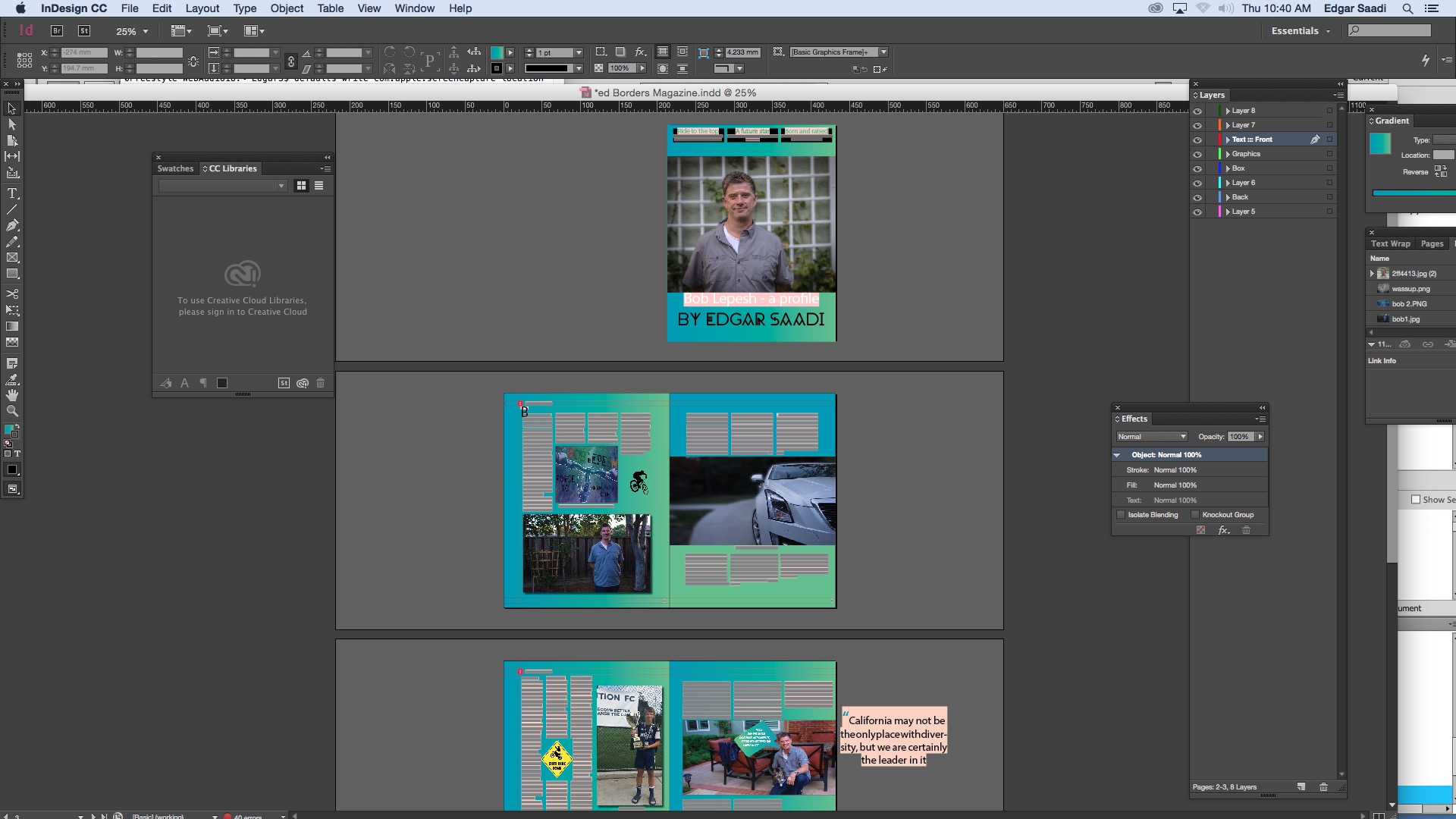
My magazine article was a huge project, and although it did take a significant amount of time, I was very happy with the outcome and it was a very rewarding project. The photoshoot and interviews were something I had previously done for my Documentary project, so I went into the project with some prior experience.
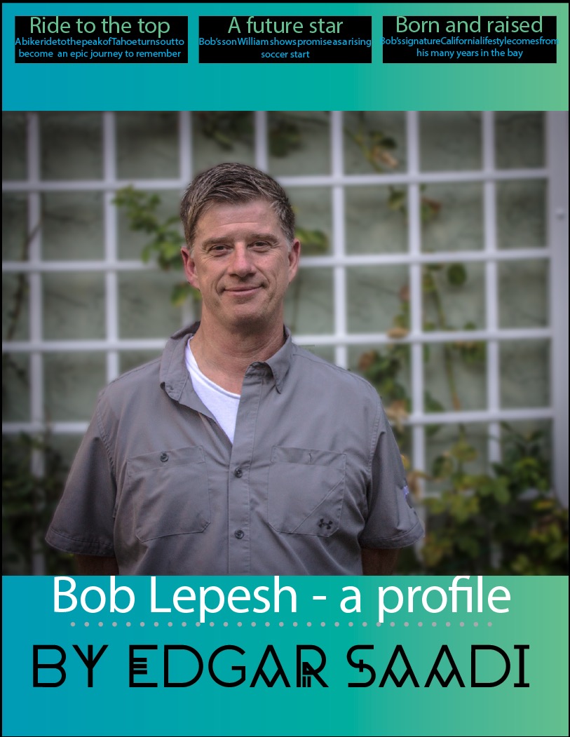
The longest part of the project for me was creating a layout that I was happy with. After pulling my hair out for seemingly endless hours about which swatches to use, how to align the text, and how to align the photos, I settled on a design I really liked, one that I felt represented Bob very well. The intended ‘feel’ of the color scheme was to be outdoorsy and on the go, and combined with my fonts, photos, and other elements i used in the piece, I was able to create exactly what I wanted.
