The design class started with Street photography in the Narrative Visual Perspective unit.
Here is an example of street photography:
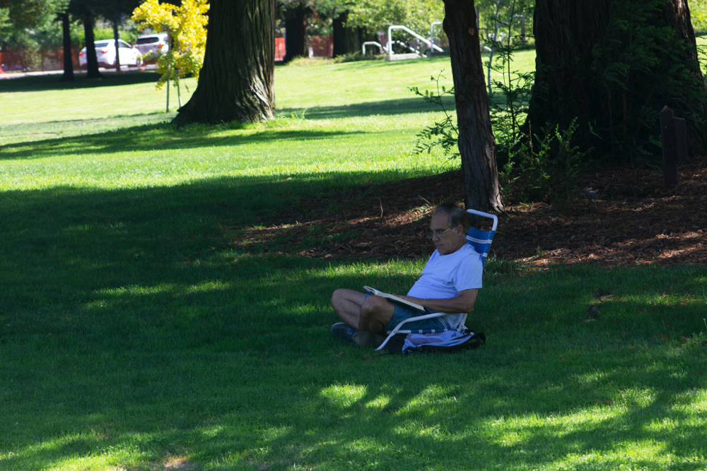
Street photography involve the photographer goes out in the public and take photo of them without them noticing them. I use a long-focus lens photo lens during the photography to capture the photo. The photo above was taken in a park after school.
Citizen Diptych
After we get used to the process of street photography, we move on the citizen project. The citizen diptych meant to deliver social issues like race, age, gender. The left side of the piece is a photo of a person or people with black and white filter expect the subject of the photo. On the right side of the piece is a sentence that is shaped in the subject of the photo on the left. The sentence is relate to the social issue the artist is try to convey.
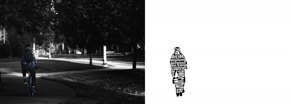
For this piece, I base my message on the lyrical essay I wrote. My lyrical essay “Cornered” presents the perspective of a Chinese person experiencing microaggressions both in the United States and in China. It is based on the story of a man who was tasked to expand the American market to China and all the stress that he experienced.
I chose this photo because the subject seems isolated. I use proportion in this piece by selecting an image where the subject seems small and uncomfortable. This discomfort presents itself in my lyrical essay with the way that my interviewee feels about the microaggressions he experienced. The paths in the image and the side of the image create the shape of a shore. This further creates a sense of isolation and connects to the interviewee’s job. The feeling of isolation is important because this loneliness causes a sense of unease.
I used the application Adobe Photoshop to edit the photo. First I put a filter on the photo to turn it black and white, but kept the subject in color. To place the text in the shape of my subject, I turned the text into images by rasterizing it. Then I used the warp tool to shape the text.
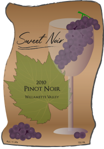
Product Label
The next project for design class is product design. We were assigned to design a product label for a wine, jams , honey jar, etc. I design a grape wine label. The name of the wine is Sweet Noir. Then I also put the label on other product that fit with my wine product.
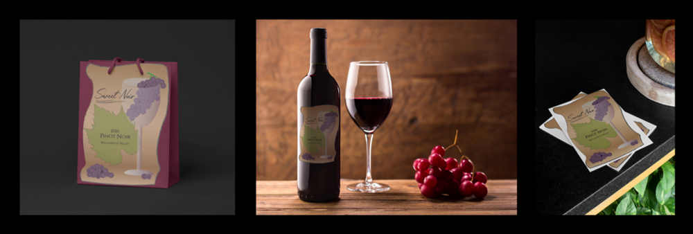
Product Triptych
Here is a triptych of my wine product. The label is put on mock up of a wine bottle, a bag and some stickers.
Here is the process of designing the Sweet Noir label.
At first, I drew three designs. I wanted the grape leaf and some aspects of grape wine. I wanted to keep the label simple because all of the wine labels I searched were very simple. The problem is the labels are not that appealing to a potential customer. I ended up with a label – wine with a grape inside and leaf behind it. I changed it from a leaf to a menu behind the wine glass later due to how hard it is to see the wine glass. I choose the color – purple, green and orange because it is a triadic color scheme. I chose a font that I feel fit the design of the label because the elegance of the front matches the elegance of the label.
I started the process of label drawing by finding reference photos in order to draw the grape leaf and wine glass. I had a problem with drawing the grape in the glass. The shape of the grape in the reference photo has an oval shaped, but it was hard to form the shape of the grape in general and the shading of the individual grapes. I realized that the illustration does not need to be realistic, so I made the grapes circular and shaded with a gradient. I made the paper a bit different by adding texture. The technique I learned is a shading layer for the grapes. There are gaps between the grapes and it does not look good without the shading layer.
I learned a lot about marketing and label creation. The visual is important for the customer to make an informed decision. The color theme and font choice can influence the intended consumer. The additional merchandise items in my triptych are based on the item I think would relate to each other. I tried to put a label on a hat, but it didn’t look right. So I chose a bag and card for the label since they fit the most with the wine label.
Movie Poster
This project about making a movie poster for a story that we created. The art style is base on another person’s art style.
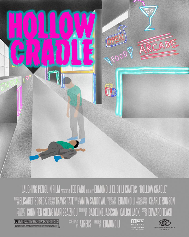
My movie poster is based on a murder mystery plot. The movie is about a boy named Michael, who was murdered on the street. Michael becomes a ghost wandering around the human world. Becoming a ghost has its advantages for solving this mystery, so Michael tried to gather evidence to find out the killer of his own murder. The movie poster displays the moment Michael becomes a ghost after being shot. The location of the murder took place in the middle of the night on the street. I created the poster by utilizing the applications,Adobe Photoshop and Corel Painter.
My poster is influenced by the contemporary artist, Brian Willmont. Willmont lives and works in Brooklyn, NY. What caught my eye when I first saw Willmont’s artwork is the atheistic feel of the artwork. By utilizing airbrush and digital programs, he creates a beautiful and unique texture in his pieces This type of texture is not what comes to mind when mentioning the airbrush tool. This unique texture using the airbrush tool represents a neon like appearance which is what inspired me to illustrate my piece the way I did. . This artwork’s environment is on a neon street. I am trying to capture the surreal feel of the art piece. I think that this art piece did not reflect much of Brain Willmont’s artwork in terms of style.
Artist: Brian Willmont
Title of Work: Untitled
Year Created: 2006
Dimensions: 60 x 48 inches
Magazine Advertisement
The latest project is about advertisement. We learn about advertisement use different method to trick or advertise the product or service that they presenting. For example, on CBSN News’ online website, a advertisement with a cleaning service named COIT unitized Scientific Language, Ethos and Bandwagon. Scientific Language is where an advertisement throw at the viewer a lot of pseudo-scientific or scientific term. Ethos is where an advertisement show that there is a or famous figure agree with them .. Their slogan is “Call COIT now and 40% off next cleaning”.
Here is advertisement of watch:
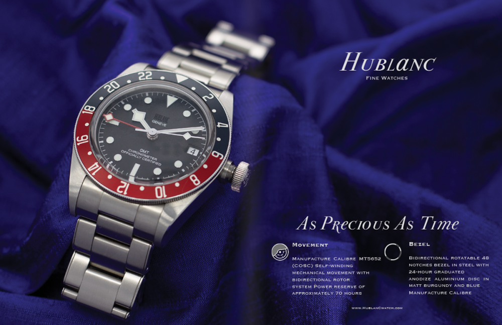
To create this advertisement, there are multiple steps. First I need to take a photo of the watch for the background of the advertisement. I unitized a light box for the best lighting. A light box is a box where a soft light is projected on the subject in the box. The soft light do not create much shadow, which allow the photographer to control the shadow for the photo using flashlights. I took multiple photo with different angles and positions and pick the best one in the background. I need the watch to be positioned toward the left hand side of the photo with a lot of space on the right.
The next step is to find a font for the advertisement. I need to have a good font to convey my viewer of my advertisement that this watch is worth buying. After that I put both the photo and font into use. I use Adobe Indesign to put the advertisement together. I make sure there is enough negative space to ensure the ad do not seems too busy.