About Conceptual
For this unit, we managed to develop our abstract thinking. We took more risks and thought more in depth about our work. We got to work with DSLR Cameras, Tascam Audio Recorders, Adobe Photoshop, Adobe Animate, Adobe Premiere Pro, Adobe After Effects, Adobe Audition, Avid Pro Tools, WordPress, and Google Apps. One thing I adore about being a Freestyle student is getting to work with what I specialize in, and that is being creative. with my more metaphorical and abstract creativity, the conceptual project allowed me to think even deeper than I already do. The skills I’m taught in English can really help me develop my writing skills and metaphorical thinking. Digital Media allows me to create programs and projects from what was taught in English.
Photo Haiku
In English class, We got to work with Haikus. Basically very short poems with a very deep meaning. We would write out our own Haikus in the class, before heading over to Digital Media to create a video and recording using Premiere Pro. Being able to play around with the different Recording Options and seeing how smoothly the video plays, felt very rewarding.
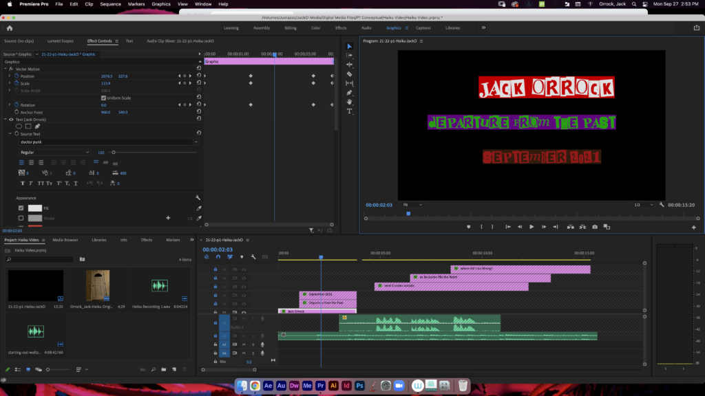
One thing I enjoyed about this unit was putting the video together. I had an amazing time sharing the work in progress with peers and seeing what I could produce. While the concept statement made things a bit harder, putting the project together was incredibly fun and made up for it.
Poem
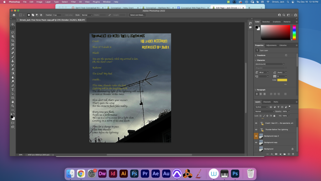
The Poem creating was by far my favorite unit. We were more free to do what we wanted without the restriction of a concept statement. I got to put my metaphorical storytelling to use and create a poem that I believe had a very different but compelling tone. I wrote the poem in English, and produced a Photoshop edit with an audio in Digital Media.
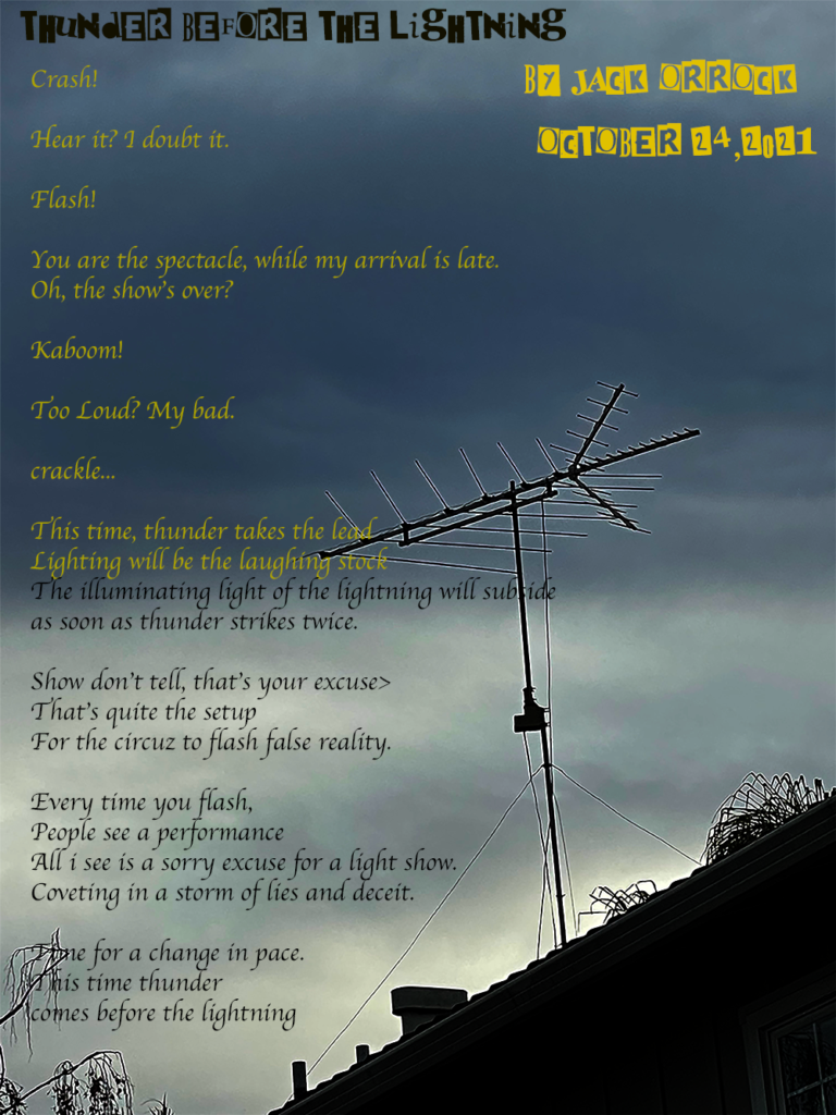
I really valued being able to embrace my creativity with this project. I got to use the tone I wanted, with free roam of being able to demonstrate the type of person I am.
Photoshop Blend Modes
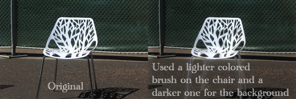
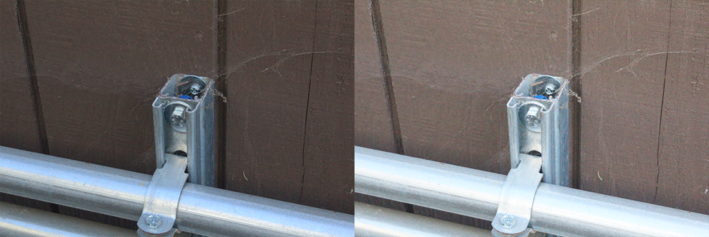
During these Practices, we got to edit photos using photoshop, trying out different settings. They can really make photos look more unique and find ways to create eye-catching pieces. I really valued the different ways to edit layers because of how cool it can be to change the lighting.

Design Projects
Design is the elective I chose to take at freestyle academy. Many of the projects had us think about the different elements and principles of art and design. I really enjoy being in this class because art and design are my best attributes, and I get to use them in this class. There’s a lot of freedom involved and getting to interact with my peers and produce amazing projects makes this a really enjoyable class.
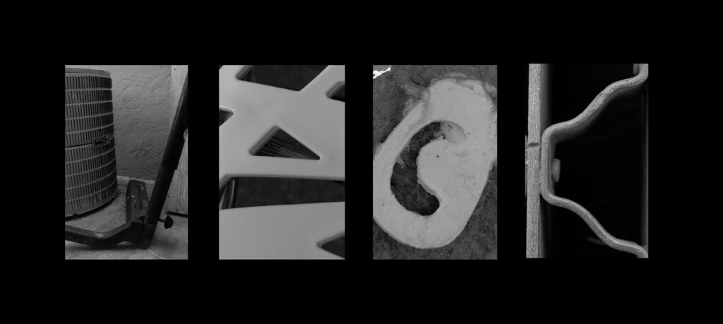
This is the Alpha Name Project, where we ad to find objects that looked like the letters in our name to form our name spelled out with these objects.
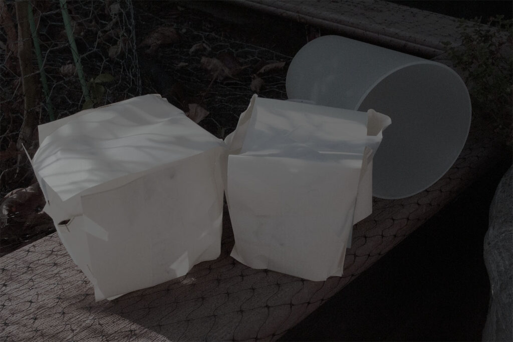
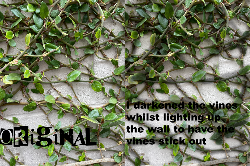
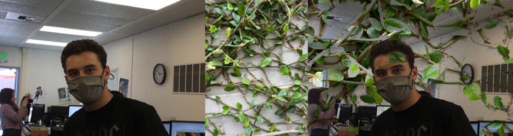
During this Project I put together a conceptual photo to go along with my concept statement: I am exploring the feeling of Sorrow through Walking Away from a Relationship.
Artist’s statement:
The objects I chose to use were two boxes I made out of paper and sealed tightly with tape, and a cup. I chose boxes to represent leaving a relationship since it could represent bottling up or storing away the memories one may have shared with someone, who they will no longer have in their life. I surrounded it with tape, as if refusing to look back on the past. I chose to use a knocked over cup to represent sorrow, since usually it can represent the spilling of emotions. When someone is in a sorrowful state, they may have no control over their emotions, and just end up letting them spill all over the place, just like a liquid spilling out of a fallen cup. The reason these connect is because when we end up leaving a friendship or romantic relationship with someone, of course it would bring sorrow. We would be sad to have to leave someone who mattered so much, and the more we’d think about it, the sadder we would become. Therefore the only way to recover is to not dwell on the past and move on. So we’d leave those memories behind, we’d “store them away.” We’d also leave that sorrow we felt behind, along with those memories, only to move on. The lighting is more dim, to give off a more gloomy vibe, which would associate with the feeling of sorrow. The cup was placed behind the boxes since usually the sorrow would come after the feelings of leaving a relationship. The deeper we submerge ourselves into the past, the more prominent the emotion will become, which sits in the far back.
Through Photoshop, I was able to learn how to efficiently edit photos, with many different tools to work with, and lots of room to experiment. I would get to adjust lighting, contrast, and saturation. Since in my original photo, the cup was blending into the background too much. I adjusted the contrast, to make it more visible, whilst also turning down the saturation to fit the tone. While the contrasting helped make the object I selected more visible, the saturation and lighting helped them still blend in and not stand out too much.
During this project, we would cut out a pattern on a piece of paper, only to flip the cut pieces around to create a symmetrical piece of both colored papers. I had a ton of fun with all the details on this piece, since my typical art style is usually something link this. Balancing out the symmetry wasn’t easy, but I’d say it turned out well none the less.
During this project, we learned about how color theory worked, and the different types of color schemes. we got to work with pastel and create numerous bubbles using different color schemes. Color theory is a method used to determine what colors to use in an artistic piece. It can help set mood and depending on the colors used can make the piece even better if the right ones are selected.