Introduction
This quarter’s projects are about taking creative risks and expressing oneself through poetry, music, photography, and website products made using DSLR cameras, WordPress, and Adobe applications.
I value the creative freedom and challenges that come with being a Freestyle student. In this English unit, we learned to write both Haikus and Free Verse Poems within word and syllable limits while also following a concept statement we received. In Digital Media, we used editing tools like Premiere Pro and Photoshop to show the emotions we were trying to express in our poetry through visuals.
Haiku
For the Haiku assignment, we wrote haikus in English using the concept statement as our inspiration. Then, we took a photo to go along with the Haikus and made Haiku poem videos using the photo and Haiku text for the visuals and adding music and transitions to enhance the message of the Haiku.
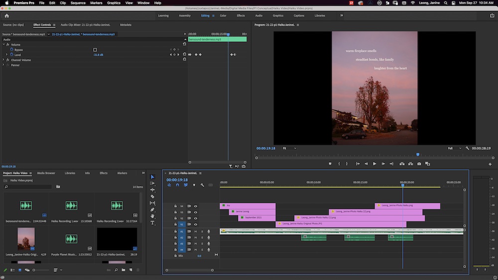
Through Haiku video production process, I valued learning how to troubleshoot and how to keyframing in Premiere Pro to “animate” objects in videos. I also valued the process of learning how to use new software.
POETRY
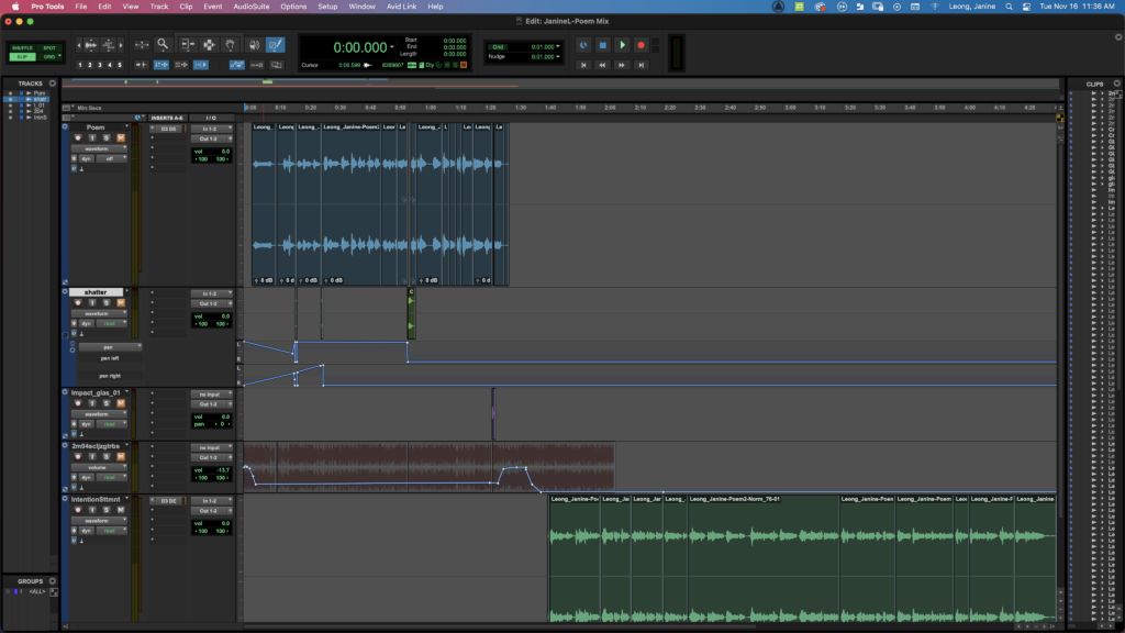
For the poetry assignment, we were given more freedom from syllable or rhyme structures. We wrote free verse poems about a theme of one’s choice. We used poetry techniques we learned about such as enjambment, consonance, assonance, and alliteration to communicate the theme. My poem started out as a sound poem where the goal was to use consonance, assonance, or alliteration to enhance the meaning of the poem. In Digital Media, we recorded the poems edited the audio in Pro Tools using sound effects and music to add to the meaning and other tools like equalizers to make the audio more high quality.
Intention Statement:
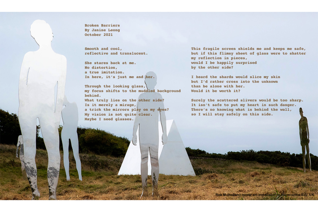
The poem Broken Barriers is a free verse poem about isolation, loneliness, and struggle of reaching out to others. In this poem, the speaker is somewhere safe, but is curious as to what would happen if she crossed the line between safety and uncertainty. Although the speaker is curious about the other side of the barrier, after weighing the consequences, the speaker decides to stay on the side of safety. I used consonance and alliteration with the “s” sound throughout the poem to create an almost slippery feel to the sound so that the poem felt unstable. The metaphor in the poem is the reflective glass barrier the speaker is staring at herself in, but can’t see through. Its reflective properties represent social self-consciousness and self-image. It can be seen as a metaphor for how we always worry about how we are perceived by others. It also has the literal meaning of checking how you look in the mirror to see how others perceive you. The barrier symbolizes the difficulty of reaching out to others and how making connections with others can make one feel vulnerable or uncomfortable. The glass also represents the feeling of isolation and of feeling trapped with no one to talk to. When the speaker talks about the barrier in the poem, it manifests as a wall or a fragile sheet of glass, depending on whether the speaker is leaning towards the decision of breaking through it or not. It shows how she perceives the barrier and the difficulty of breaking it. In between the fifth and sixth stanza, the lineation change from longer enjambed sentences to choppy, end-stopped lines show the shift from a questioning tone to a resigned tone. One poem I was inspired by was On Lockdown by Todd Boss. The author’s use of short enjambed lines and many short stanzas make the poem feel longer, which adds to the meaning of the author’s message about how the way time felt during the pandemic allowed people to gain wisdom. I also tried to use enjambment to enhance the message of my poem. For example, In the fourth stanza, I enjambed the sentence so that the word “but” had its own line. This helped the turning point be more obvious and made the reader pause for a little bit longer, building up a little suspense before the second part of the sentence. I incorporated the peer feedback I received to use less alliteration. I listened and took out some of the excessive “s” alliteration, but kept enough that it was noticeable and added to the unsettling sound experience of the poem.
In this project where I valued being creative about producing my poem in different formats. It helped me express the themes and ideas in the poem in different ways that I couldn’t just do through one medium.
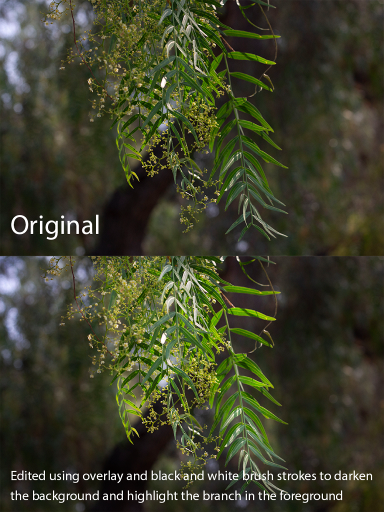
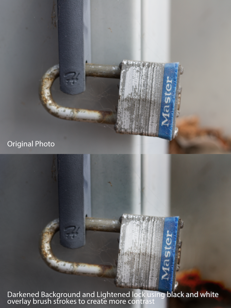
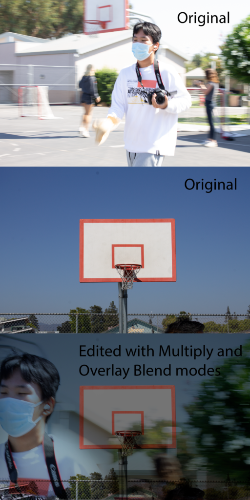
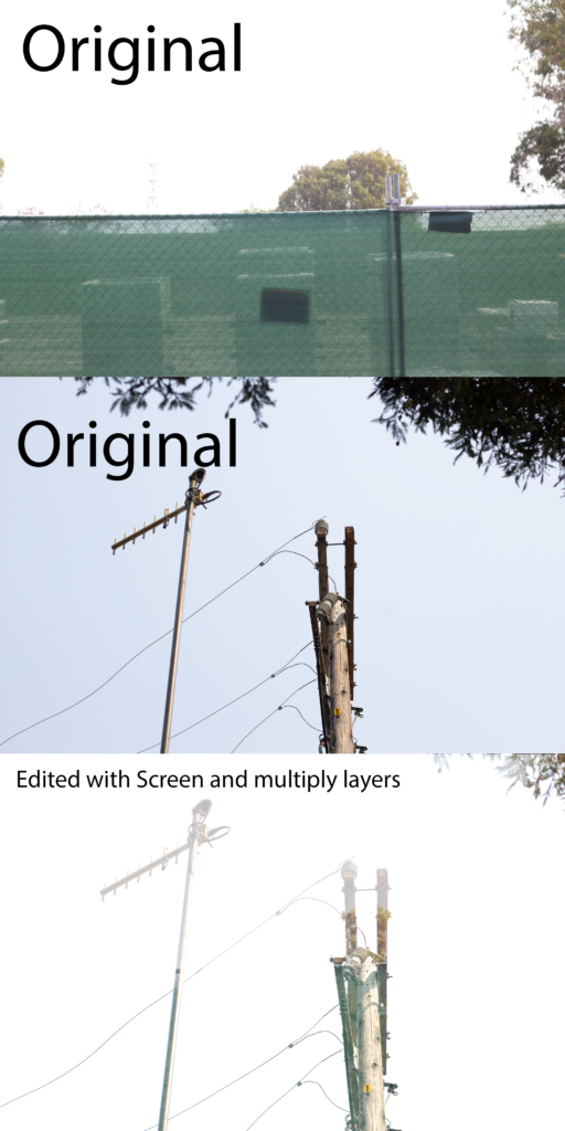
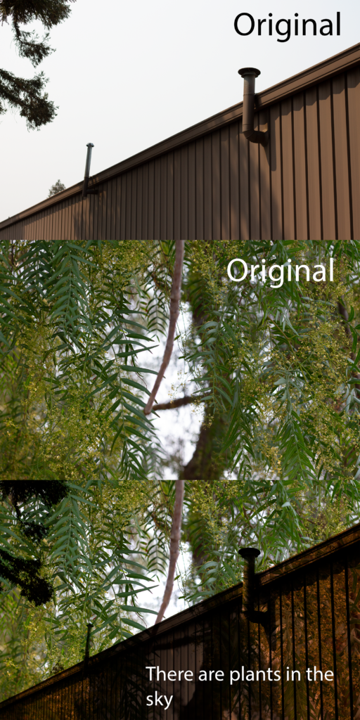
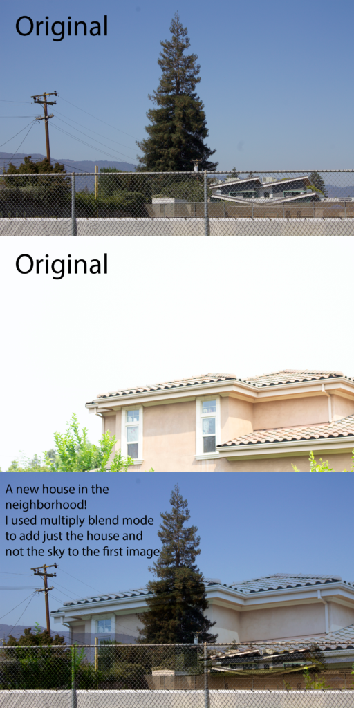
Photoshop Blend Mode Editing
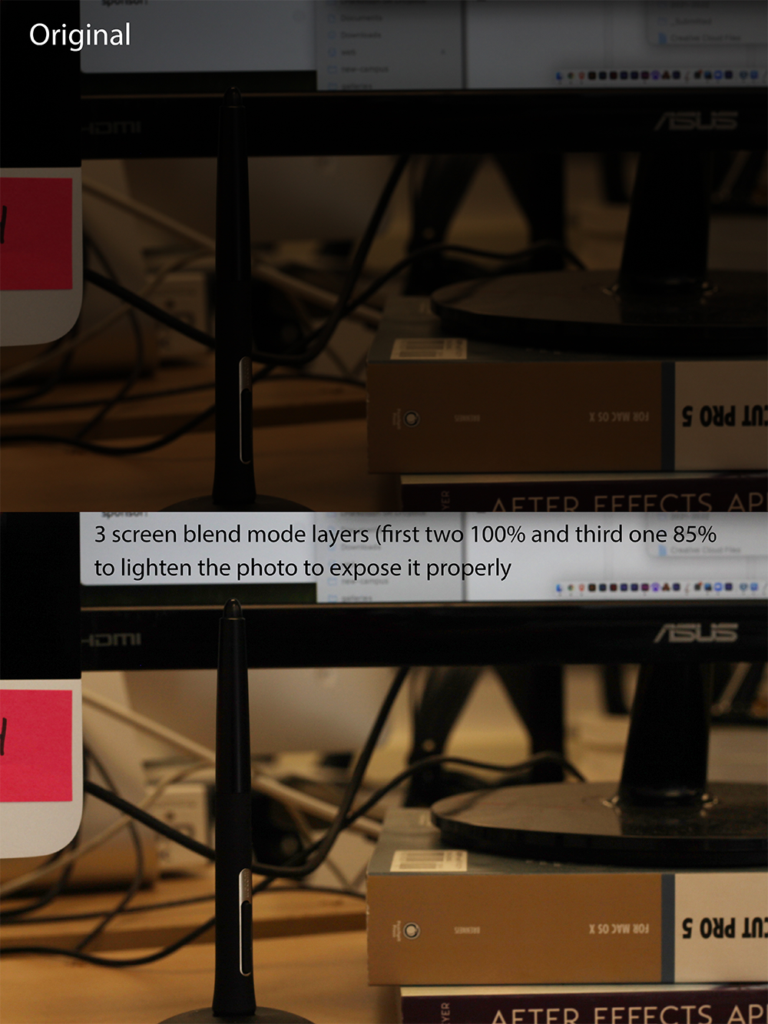
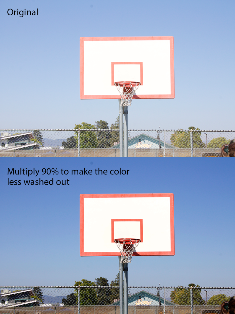
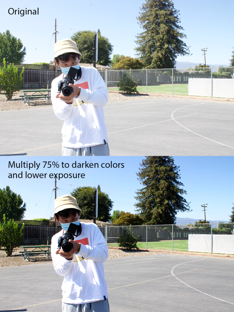
In this project we learned the difference between the Photoshop blend modes, Screen, Multiply, and Overlay, and how to use them.
I think the blend modes are useful for both lightening and darkening photos and combining two photos. I also think it’s cool how you can blend two photos and make them look realistic using the multiply blend mode and how you can use multiple blend modes to edit photos that seem complicated or hard to edit.
I valued learning how to use the blend modes to lighten and darken photos because I think that will be very useful for editing photos. I also valued learning how to use the overlay layer with the brush because I think that will also be useful for brightening or darkening specific areas of a photo.
Design
This quarter in Design, we were introduced to DSLR photography and Photoshop. I valued learning how to properly take picture manually and learning how to edit them.
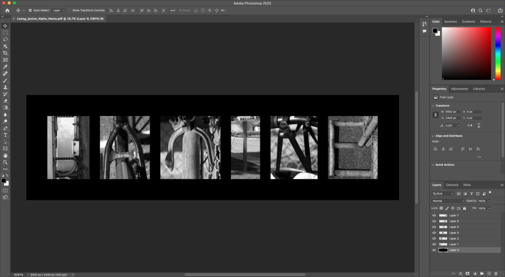
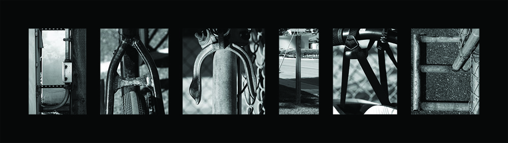
ALPHA name
For this assignment, we went out around campus and used our cameras to take pictures of objects that could look like our name’s letters in black and white. Then, we edited all the photos together in Photoshop to say our names.
Conceptual photography
For this project, we took photos of two items to represent the artist statements we wrote our Haikus about.
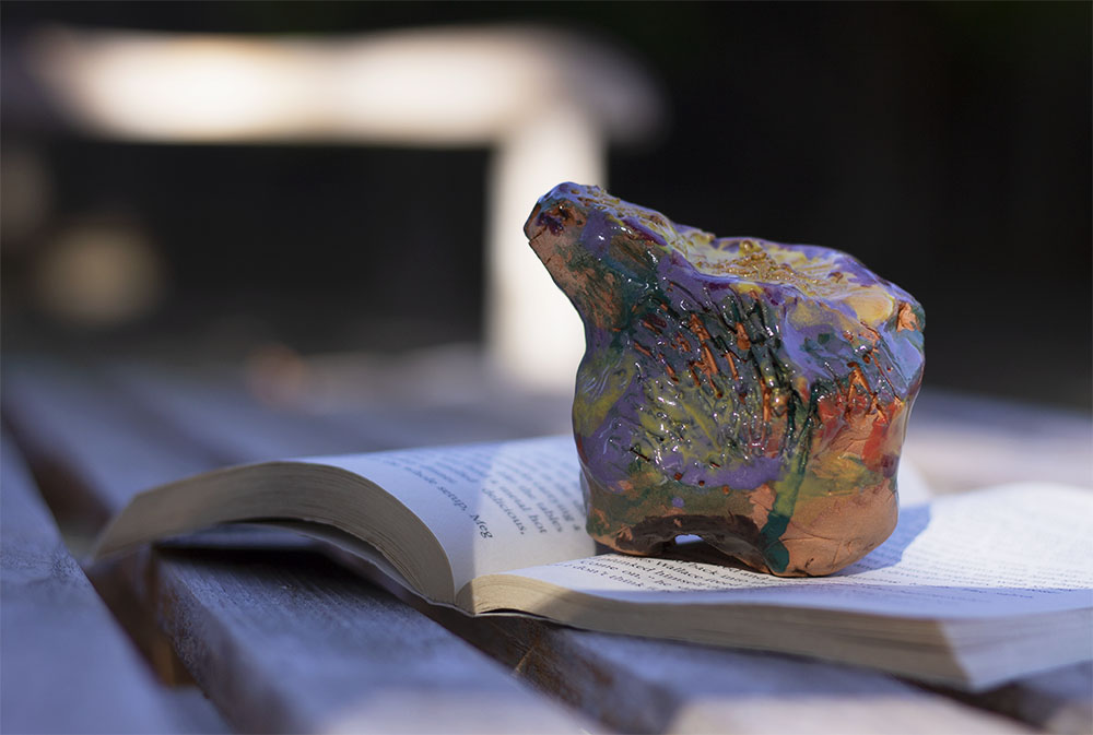
Concept Statement: I am exploring the feeling of joy through being welcomed into a new community.
Artist Statement:
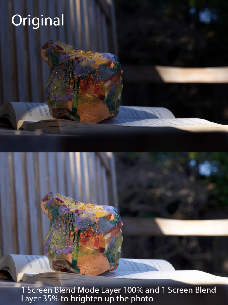
The book in my photo represents the feeling of joy and the clay sculpture represents the feeling of nervousness experienced when making new friends and opening yourself up to new people. I chose a book because I find joy in reading books and being transported into different worlds and stories through words and being able to imagine what you’re reading. I used the clay piece to represent feeling nervous because when I think of being welcomed into a new community, I feel joy, but at the same time meeting new people makes me feel very nervous. The chaos of the colors painted on the clay piece represent the feelings of nervousness and anxiety. I positioned my objects with the clay sculpture on the book to symbolize how sometimes the nervousness can feel overwhelming and the bench I used as the background exemplifies a place where people meet. I took the photo from a low angle so that the clay piece would look bigger in comparison to the book. It was also taken early in the morning so the sunlight was coming in at a low angle, creating longer shadows.
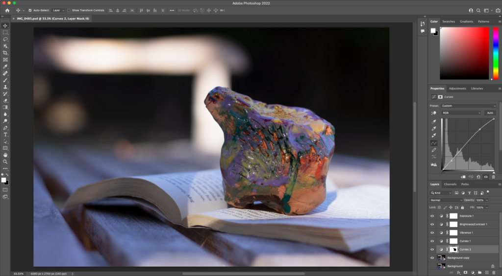
To edit this photo, I used what I learned about selections and adjustment layers in Photoshop. These skills and tools helped me make the clay sculpture stand out more in the final edited photo. To do this, I selected the clay piece using the magic selection tool and then inverted the selection so that everything except for the clay piece was selected. Then, I used a curves adjustment layer on the selection to adjust the exposure of the background to help contrast it against the clay piece.
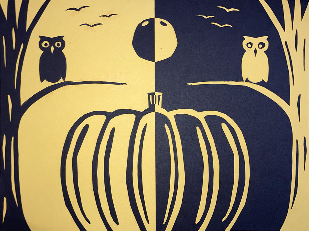
Negative Positive Space Halloween Project
For this project, we used a sheet of black paper and a half sheet of yellow paper and X-ACTO knives to make symmetric designs in opposite colors. Whenever we cut out a piece, we would flip it over to the other side so that the images were symmetrical.
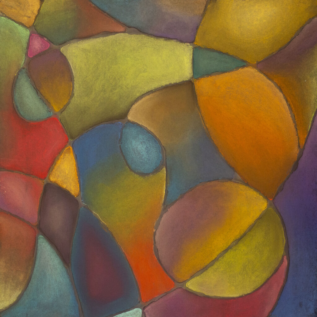
Color theory pastels
In this project, we used all the different color schemes we learned about in color theory (monochromatic, triadic, complementary, analogous, split complementary) and used a variety of them in the pastel drawing.