
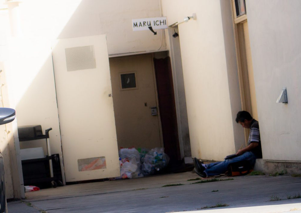
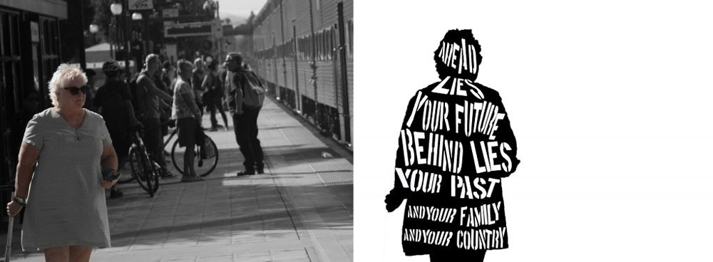
Street Photography and Citizen
At the beginning of the year, we were sent out to do some street photography so we’d get more comfortable with it for our Citizen project. at first it was awkward but after awhile we eventually got the hang of it.
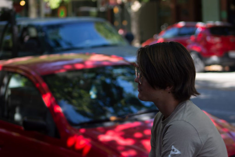
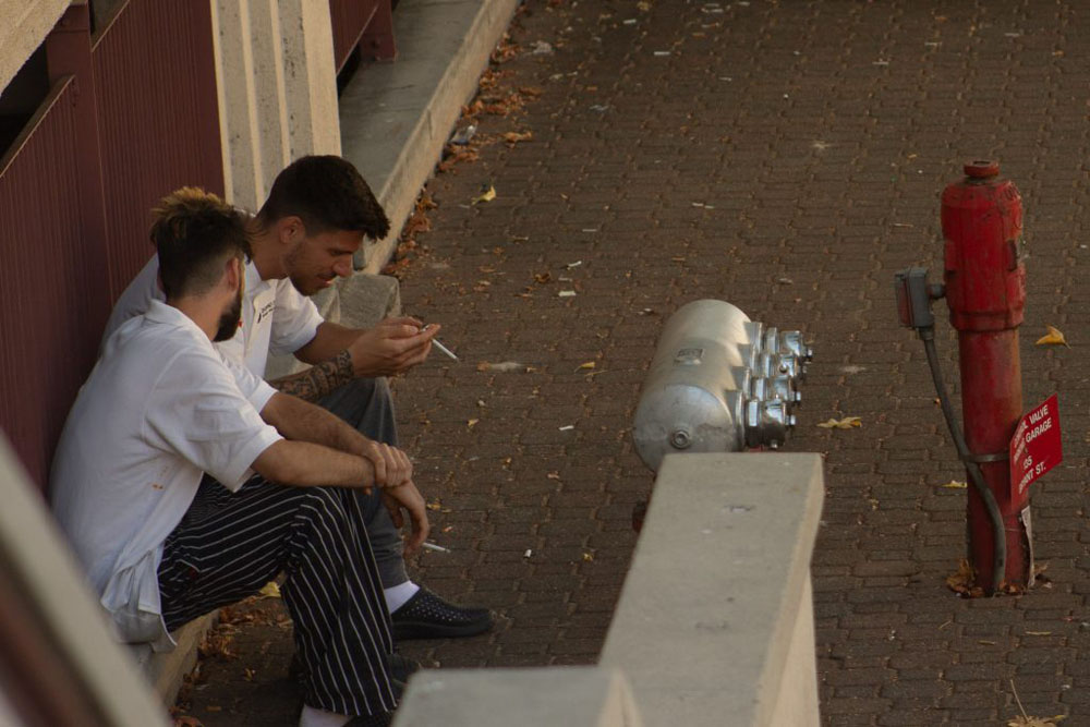
Once we we’re all comfortable with photographing stangers we utilized this skill in our Citizen project as a visual for our listerner lyric.
Product Label
To learn about marketing we designed mockup food labels. The skills we used in this project came in to play later on when we made movie posters and print advertisements.
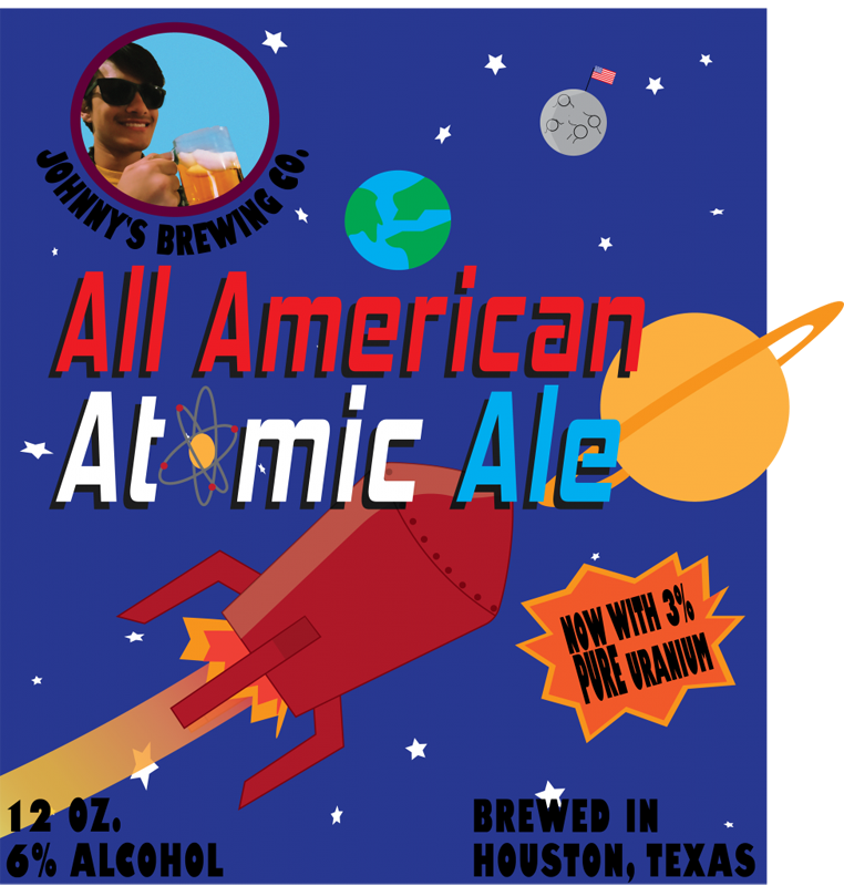
When challenged to create a label for a food item in design class, I decided that it would be fun to make a 50’s style label for a beer bottle. I took a lot of inspiration from fake products in video game worlds. Specifically from games such as Fallout and Bioshock. The aesthetic of the ads for Nuka Cola and Plasmids was what I was going for. The simplistic and 50’s cartoonish designs for those ads really struck a chord with me. The color scheme I used was built around the good ol’ American colors of red, white, and blue. The bright red spaceship against the dark blue backdrop of space, with white stars sprinkled about. I wanted to go for that ALL AMERICAN feel so that’s why I chose those colors. I went with a futuristic space-inspired font to enhance the 50’s sci-fi aesthetic.
When making the label, the big problem I faced was where to put emphasis. I wanted to have a big red rocket ship in the frame however it was taking all the emphasis away from the actual name of my product. To fix this I enlarged the title and made it a brighter color than black. I made the words follow a red white and blue pattern to go with the theme of the label. A cool technique I used in my label was when I took a photo and then used photoshop to make it look like an illustration for the business logo.
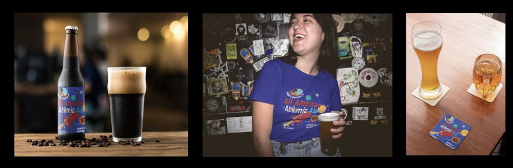
This project taught me about how to sell to different people. It taught me that when designing for a client, the best strategy is to pinpoint that target consumer and specifically sell to them. If you sell to everyone, you sell to no-one. For the other merchandise in my triptych, I chose a beer coaster and a t-shirt. I chose these because I felt that they went the best with the product was pushing.
Movie Poster
Using the marketing skills we learned about as well as the style of the artist we researched for our touchstone project we made mock movie posters. The description of my work is as follows.
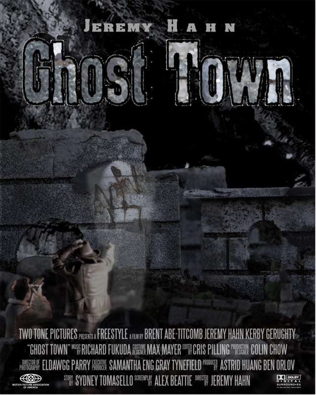
The story of my film takes place in 1957. An archaeological mission discovered ruins of a civilization deep below the surface of the Earth. This was a very impressive society dating back to before the Roman Empire with technological wonders that rival the inventions of today and enough gold to make an Aztec King blush. The further they explored into the city, the harder it was to get out and they soon realized that they weren’t alone. They now must find a way out of this forsaken nightmare before they are hunted down and slaughtered one by one. The scene I illustrated shows the moment when the archaeologists first discovered the abandoned city. As they are in awe of the spectacle before them, they notice the fossil of a beast embedded in the stone walls. To create the piece, I used miniatures for the ruins and pasted my actors in front using Adobe Photoshop.
The artist I was inspired by was the surrealist painter and sculptor H.R. Giger. The Swiss artist was famous for his nightmarish world of gothic horrors that merged humanity with the cold lifelessness of machines. His art often contained many human sexuality themes juxtaposed with mechanical tubing and structures. The color schemes of his pieces were always very desaturated with tints, tones, and shades of grays, browns, and dark greens. His most famous work was designing the Xenomorph and sets from the 1979 Ridley Scott horror film Alien. The art from that film was a major inspiration for my poster and it was what originally drew me to the artist in the first place. Something about the horrific design of the Xenomorph and the sets was so captivating that I knew I had to replicate it. You can see it in the desaturated color scheme of my poster and when you realize that the plot is basically just the story from Alien but set on Earth.
Print Advertisement
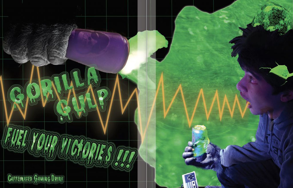
In order to learn more about marketing, we made magazine print advertisements of mock products. I chose to make an ad for a fake caffeinated energy drink targeted towards 13 year old boys who want to be pro-gamers. I used a contrast of dark and light colors to give off of a feeling of tech, electricity, and virtual reality. I also used a color scheme of purples and greens to convey energy.
These projects taught me a lot about selling things to people. I learned how to find an audience and market towards them relentlessly. First I have to narrow down my target audience to a specific group, Then I use the interests of this group to sell to them. For my movie poster, I used muted colors and horror elements to target to fans of the Alien movies, for my product label I used a 50s aesthetic to target consumer’s nostalgia, and for my print ad I used energy to target young boys.