Chrysalis Music Video Unit
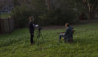
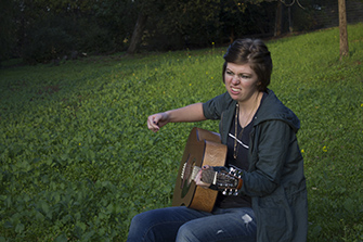
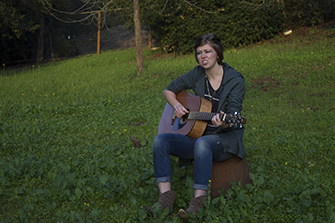
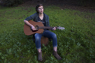
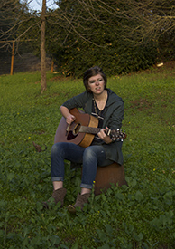
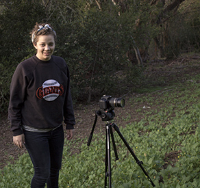
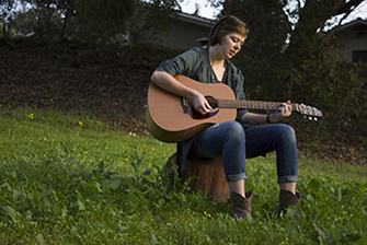
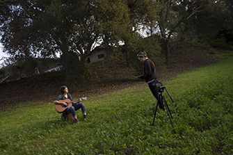
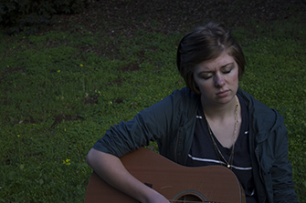
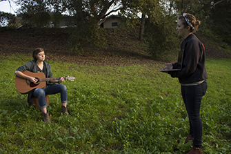
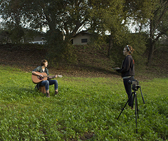
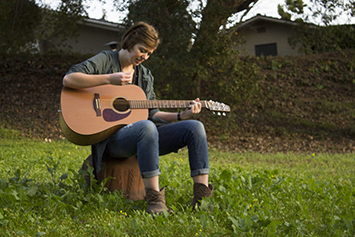
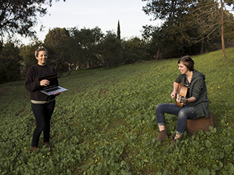
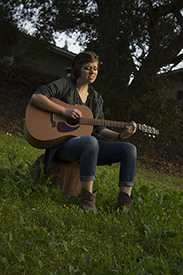
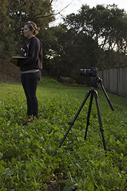
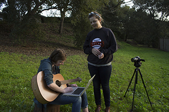
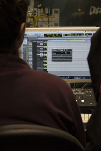
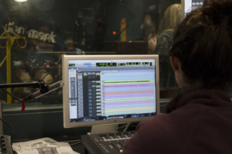
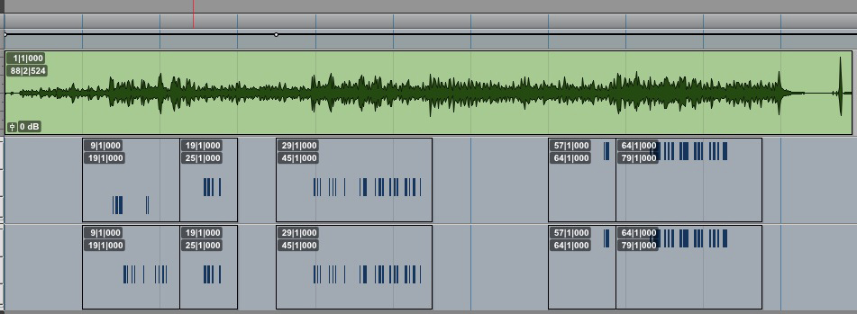
The main goal for my group was to get things done. We were lagging alot because our group didn't like the lyrics we made, didn't have a central theme of rebellion, and not a whole lot of agreement. Laurel and I liked softer rock, Andre liked hip hop, and Alex hard rock. We had a phenomenal instrumental, but it didn't really go with the lyrics. Annaka gave us an accoustic copy that allowed her more free room to sing along with it.When our group split, Laurel and I decided to use Annaka's version and to add electronic tambourines. I recorded both Alex's and Annaka's version. Later I tapped out the rhythm for the tambourines by connecting Reason to Protools and got feedback from Laurel. We needed to finish it all in less than two weeks. I learned how to work with alot of pressure.
Click here to download our song.


 1
1 2
2 3
3 4
4 5
5 6
6 7
7 8
8 9
9 10
10 11
11 12
12 13
13 14
14 15
15 16
16 17
17 18
18 19
19 20
20 21
21 22
22 23
23 24
24
Background:
Our group split near the end of the unit. It was right after I had submitted my poster.
I decided to keep Frosthetic since we had to match the t-shirt with the poster.
When we were brainstorming design ideas, people were really enthusiastic about skeletons and frozen material on it.
I thought about the frozen part of it, and immediately went to ice. I selected a part of ice cubes from the internet, distorted them a little, and then made them different levels of opaque. I wanted a cool to light look to the ice as if it was thawing. Because parts of the ice were opaque and I wanted this to be on a black shirt, I put a black background. The font I primarily wanted wouldn't save in Illustrator as a pdf, so I found an alternate one that still gave a good compostition to the whole of the design.
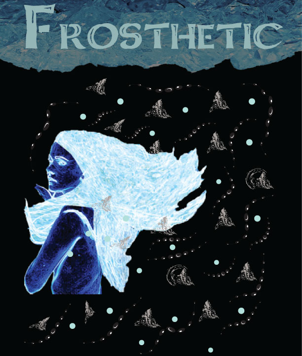
For the t-shirt, I wanted more of an aesthetic feel. I copied the font, ice, and the same stroke as I did for the poster. I added splotches to represent some mountain crests. When I looked at the ice, I immediately thought of somewhere in Alaska I had been to. There were mountains we hiked up, but still a huge chunk of ice dipped from the mountainside into a body of water. Then I remembered that I made a frozen girl when we practiced doing effects in photoshop and decided to use that. The grey mountain blotches around her weren't enough, so I added blue polka dots that were the same color of her hair. It looked too static, so I added the same stroke I had from the poster.
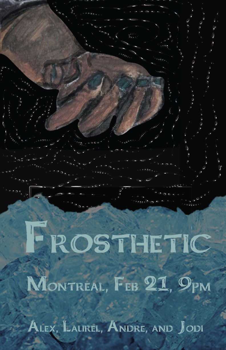
For the poster, I wanted the strokes to be like stars. The strokes also are meant to guide your eye around the hand. I used charcoal to draw the hand and paint to shade the hand. To make the hand I combined what I learned over the summer; how to draw hands at Cornish College of the Arts and how to mix acrylic colors from the CSMA painting class. I made it in the winter in preparation to make my college portfolio.
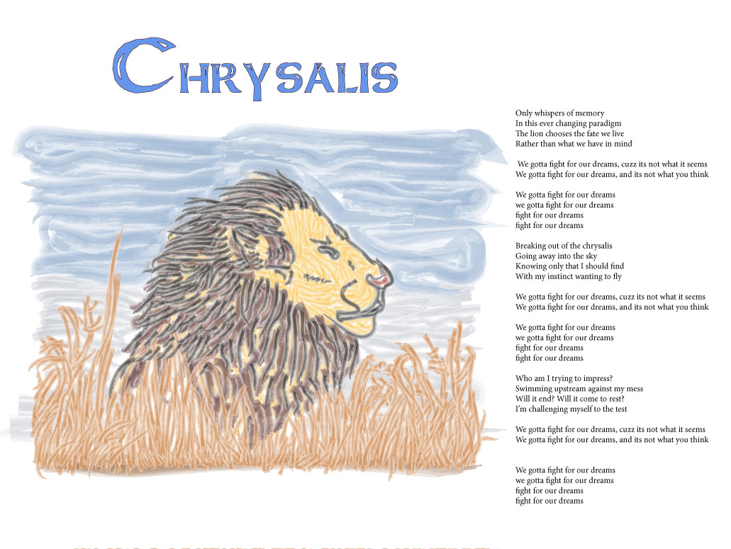
I decided to put a lion in an open feild as a symbol to being free. Our song dealt with rebellion and freedom.
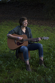
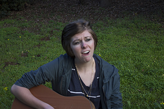
Here's the Music Video!