
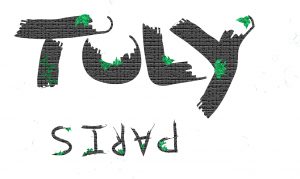
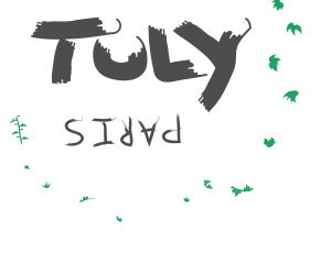
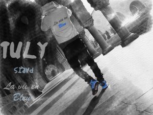
Tuly Hoodie #1
My name is Sacha Karoubi, Im 17, and this is my first year attending freestyle academy. Through attending freestyle, I have developed a love for design and a lot more of the arts in the world. Having a teacher like Mrs.Parkinson, I was pushed to my limits many times throughout this year, forcing me to put in a lot of overtime on most of my projects. Through these experiences, I believe it has made me a much better artist as well as has improved my work ethic. Next year, I will be attending the University of Layola Marymount in Los Angelas looking to further my design career as well as a career in marketing. I started my own clothing brand, Tuly, last years summer as I’ve always had a passion for clothes and anything to do with fashion. Being very incorporated in the trends of fashion and the different pieces that come from it, I decided to take those influences and make my own brand with it own designs. So far I have made 4 pieces, 3 shirts and a hoodie.
For my most recent project called Zenith, I designed 3 logos and 3 pieces of artwork to go on 3 shirts, each having a logo on the front and a piece of artwork on the back. When brainstorming how I would go about with this project, I decided to develop a different theme for each shirt. I designed a Bay Area themed shirt, one jungle themed shirt and one pier/aquatic themed shirt. although this next one I will be showing you is the Jungle themed one.
Tuly “The Bay” logo
Tuly “The Bay” back

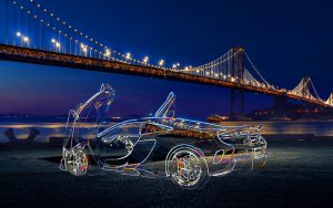
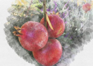
Tuly “The bay” Original Picture
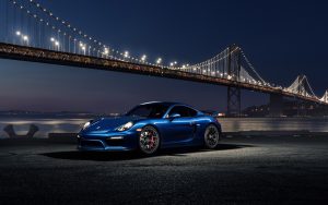
Tuly “The Bay” New Background
Throughout this year, I have developed many works of art, some good, and some not so good. Living in the Bay Area, its so surprise that my favorite of the bunch was the warriors/Bay Area themed shirt. Even if it is one of my best works, I know there is still a lot more skills to learn in photoshop and a lot more I could have done to both of these works in order to make them even better. Throughout my life, I’ve always loved cars so I thought that would be something cool to put on a shirt. Originally, I was going to keep the raw background of the photo, but through a lot of counseling and self-thought, I decided to import it onto this much cooler background that also happens to have the golden gate bridge in it. By erasing the Porsche in the imported background, it allowed me to add the McLaren from the original photo to where I outlined its edges, making it look lit up in the final product.
When thinking of how to design the logo, the idea of making a Bay Area themed shirt caught my mind. And when I think of the Bay Area, I think of two things, the Warriors and the lively City of San Francisco. Being such an active city, I got the inspiration of making my logo light up, getting the aesthetic of a lit up sign on a bar or restaurant window. And I think the only way to bring the logo justice was to stick to the most recognized colors in the Bay Area, blue and gold(really yellow).
Tuly tribal Artwork
Tuly “tribal” original photo
Tuly tribal Logo
Tuly tribal logo unedited
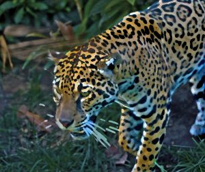
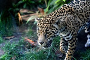
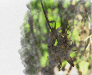
The next shirt I will be displaying is named “Tribal” as the designs give off a wild kind of ancient few to it. I love nature and the animals that come with it as well as the mysteries of nature. Having learned about ancient civilizations throughout high school, I though it would be cool to make something that had that same kind of ancient theme. This gave me the inspiration to make my logo look like cracked, moldy stone to give it the “ancient temple” aesthetic. The actual logo and the letters themselves I freehanded, and through the use of special brushed I made all the plant mold on the letters. When working on my artwork for the back, I shuffled through about 10 different pictures I took the week before that I thought would look good. None of them really caught my eye, which then influenced me to go to the Zoo and take pictures of some cooler, more wild animals. When shuffling through those photos, the photo of this jaguar caught my eye, and through a lot of touching up on photoshop using filters and HDRsI got the result I wanted. By making an HDR of the photo and bringing out all its colors, it helped in making the photo more vibrant and pop a bit more which ended up making the filtered photo come out a lot better.
The next project I will be displaying will be my Japanese Stab Binding book. The concept of this project was to have a Japanese like book that you would design yourself, doing both the exterior and interior. To go in the book itself, we made watercolors of pictures we took outside on photoshop through learning the technique on a youtube tutorial. To go with the watercolors, we sketched out illustrations on old Japanese newspaper that we molded onto a page which in my opinion ended up looking really cool. Although the sketches on the newspaper didn’t hold up as well as I expected, the concept itself I though was really cool. The next page we did, we sketched out Japanese writing/letters that outlined the theme of our book, with each letter having a message/meaning to it. For the exterior of this book, we covered it in very cool designed Japanese paper that our teacher had provided to us, and to go on top of that we made a little design using beads and frame to hold them up.
Tuly Commercial Art
Throughout this year, I have had a growing passion for graphic design as I have gotten better and better at it. When working on these two projects, I growed in the sense that I am more aware about every little detail in my work now as well as in my skills using photoshop. I learned more about strokes and editing them, illustrator and how to use it better, and how to import different pictures onto different backgrounds and still have them look professional. As my skills continue to grow, I hope to work as a cover artist and make song/album cover arts for various musical artists. I hope to continue to work on graphic design and to potentially make a future for myself out of it, so any help or suggestions would be very helpful. Thankyou