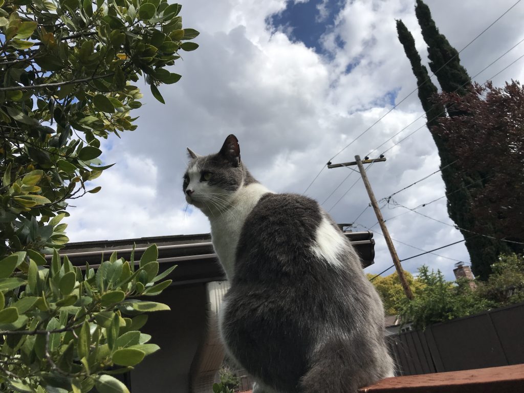
The goal was to use natural elements to frame our subject. And hey, look who finally made it on the photo blog! My third cat, Loki. I told you he existed. Disregarding the admittedly messy framing with the telephone pole and wires, I think I got lucky taking this photo at the right moment for Loki’s head to be framed just right with the bush next to him.
Category: Composition
One of our weekly photo blog challenges was to take a photo implementing creative compositional techniques in photography.
Using Props
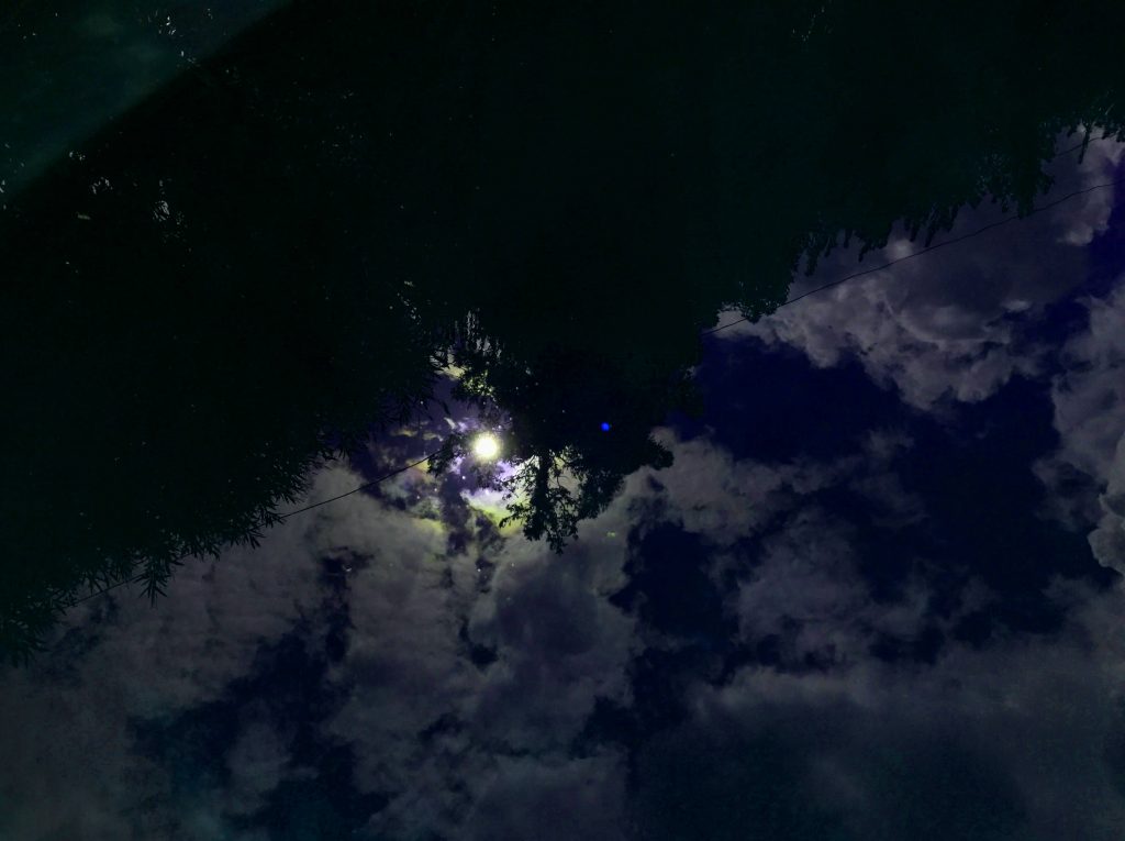
Here we were prompted to use props to make the photo interesting. So this may be kind of uninspired, but you can’t deny that reflections in water always look pretty cool. So here’s a picture taken down at my pool, reflecting the sun, intentionally framed in a half-decent position nested between some trees. Also I upped the saturation and adjusted the hue just to be obnoxious and make it slightly more interesting.
Depth of Field
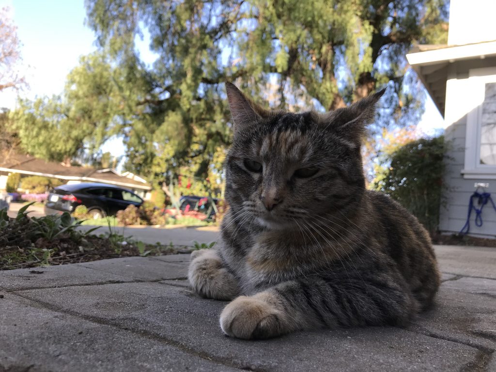
The goal here was to use depth of field to make something appear larger. Of course, my cat Sierra is already big enough to swallow a car, so that wasn’t so hard to do here.
Viewpoint
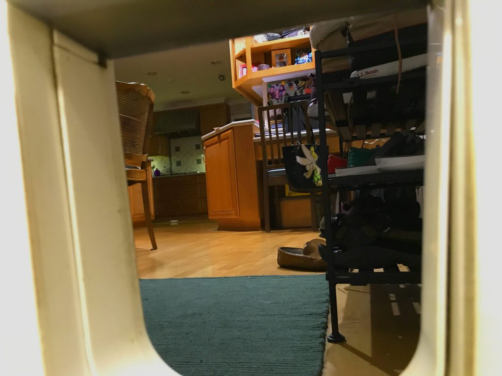
We were tasked with taking a photo from the viewpoint of another person. I refused. Instead I opted to raise the bar and take a photo from the viewpoint of a cat. Any one of my cats. Here’s the view that Garfield, Loki, Sierra, and a select number of miraculously surviving rats, birds, and lizards get to see as they enter the house.
Color Theory
We were tasked with color grading an image to make it look like a still from a movie. Here’s Garfield, yet again, hanging out. Except this time he’s color graded to look like he’s from a movie. It looks more like it’s from a movie than the original, except now it looks like it’s from Ghostbusters (2016), so in the wise words of a crazy old man, “I may have gone too far in a few places.” The glow effect was cranked up too high and now Garfield’s nose do’t look so good.
Anyway, here’s the original photo for comparison. I think it looks better, personally, and it makes me less sleepy to look at.
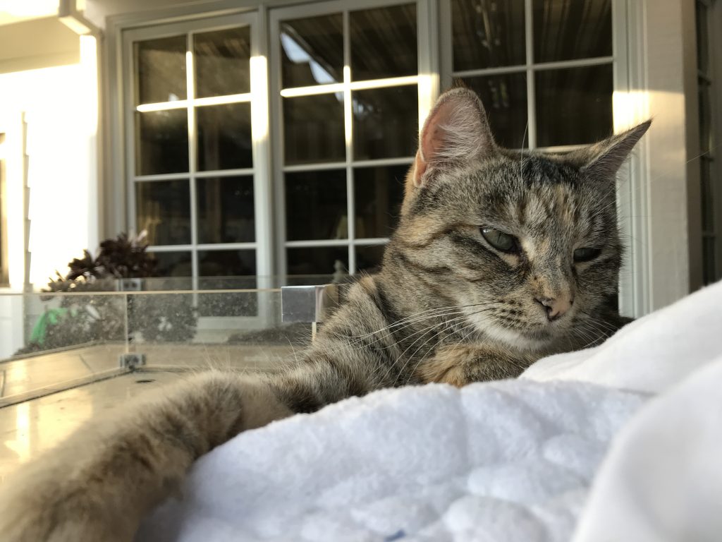
Rule of Odds
See, I told you I had more than just the one cat.
This is Sierra. A tiny torbie cat, four and a half years old, and increasingly touched in the head.
The “rule of odds” is a sort of composition that groups objects in threes, in a way, to appear more aesthetically pleasing to the eye. In this photo, specifically, Sierra is placed (on the rule of thirds, might I add) between the window/wall in the background and the white blanket in the foreground. This diagonally oriented frame is satisfying to the eye. At least, arguably. If you don’t like it, then whatever. That’s your problem.
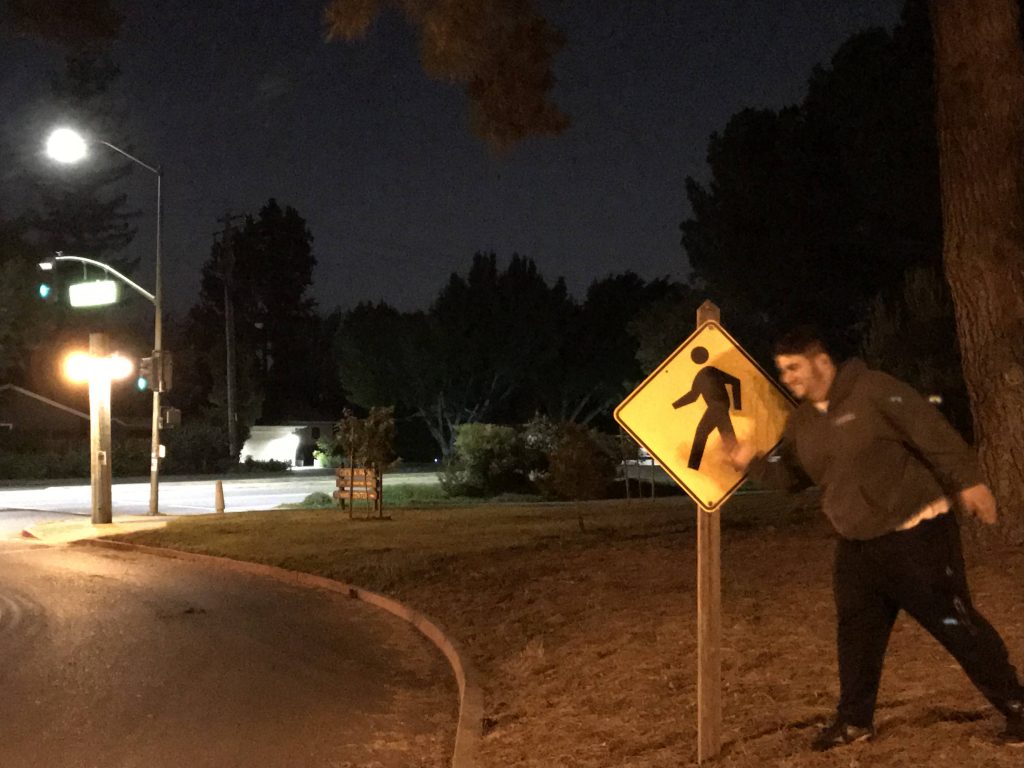
Rule of Thirds Emotion
I think this was actually scrapped alternative cover art for Change by The Dismemberment Plan.
This photo shows emotion through the rule of thirds by placing the pedestrian sign more or less on the gridline, with Travis Morrison (or Michael Smith) offset to the side. It makes you feel kind of uncomfortable, as if Travis/Michael isn’t actually the main subject, and is instead trying to fit in with the main subject by imitating it.
There are two possible futures: one in which this photo is used for a repress of Change, and one where this photo becomes album art for my own album of songs that will be bigger and better-er.
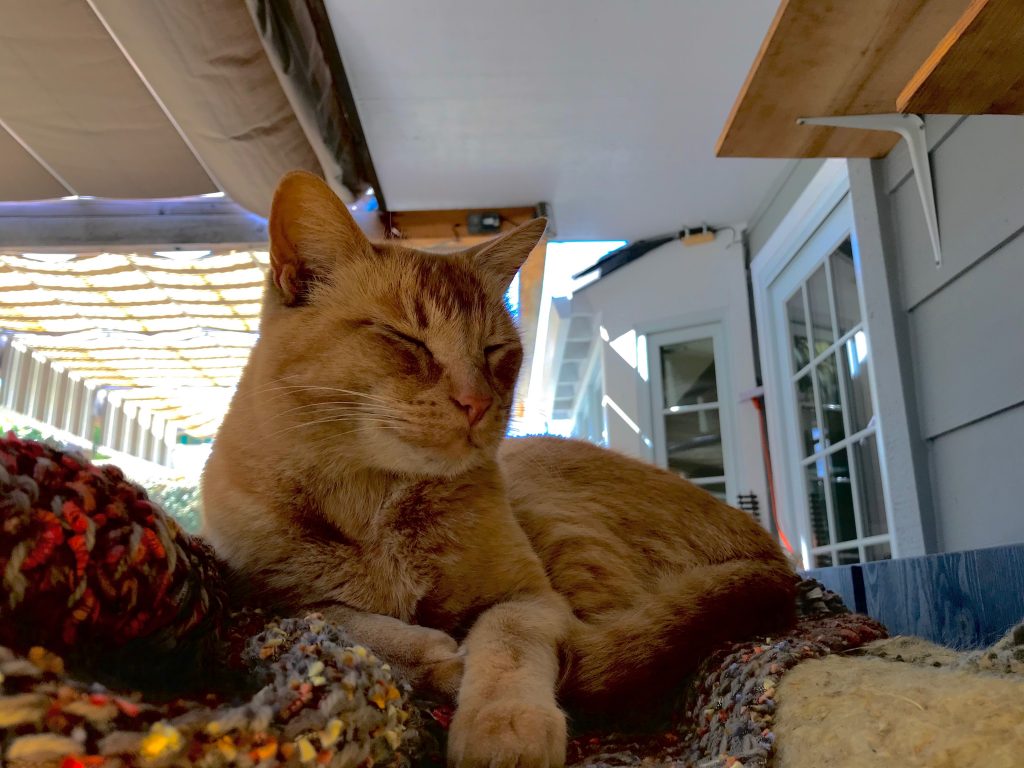
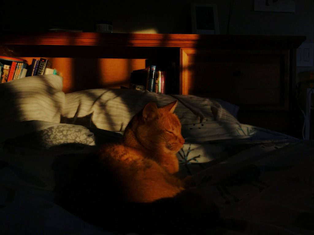
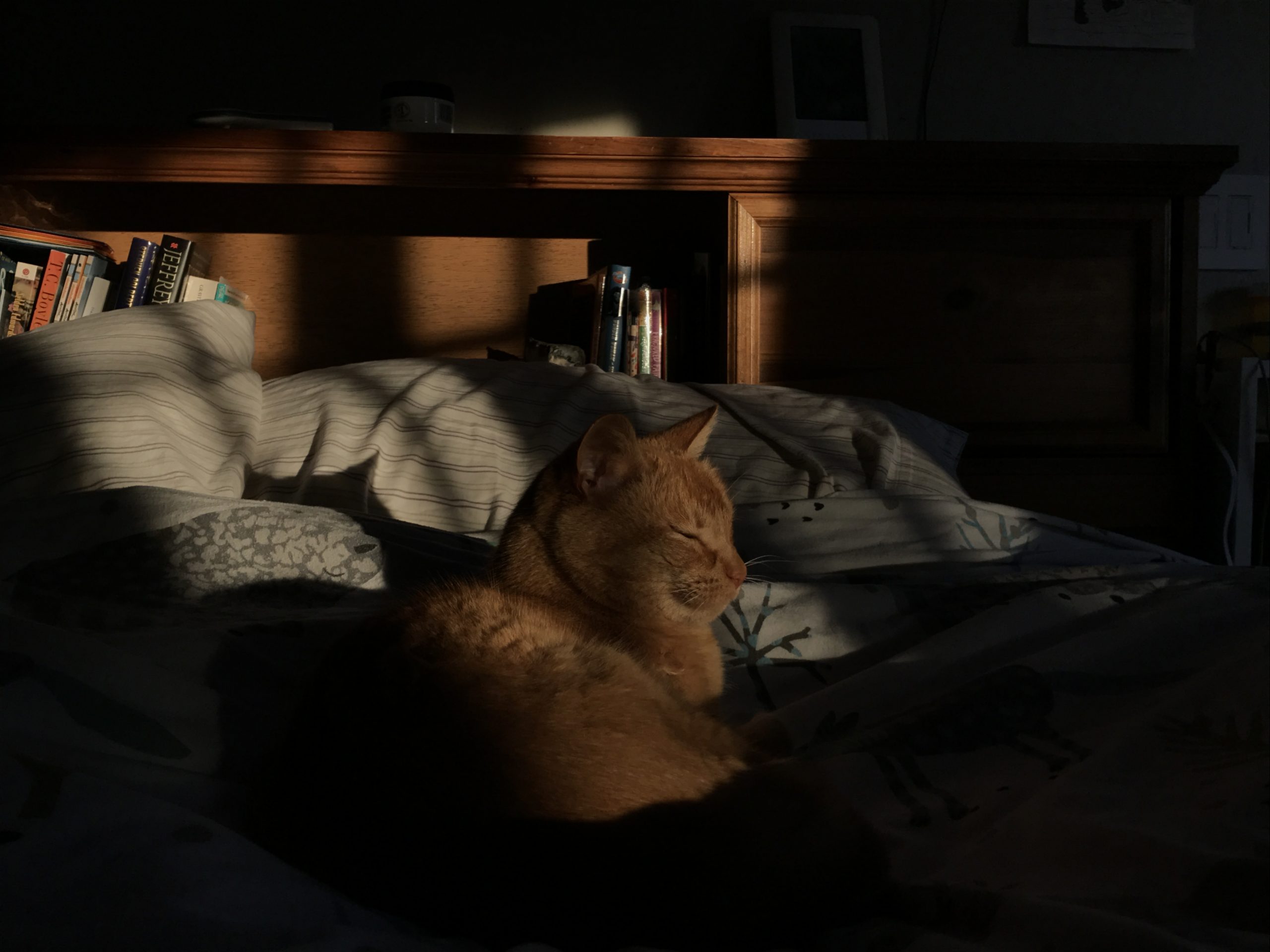
Lighting
Look at that beautiful orange cat. I swear I have 3 cats, this guy just happened to be around for both this photo and the last one when I need to take them.
Our prompt was to use the speed light creatively. Between you and me, I might have used the speed light. The alternative possibilities are up to you, and you can never prove which one actually happened.
I know the photo quality sucks but just look at that big orange cat. He’s so happy.
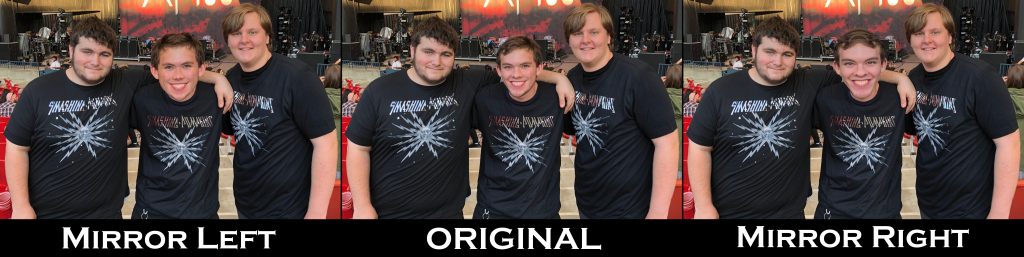
Symmetry Portrait
The picture in the middle is of me and my friends Michael Smith and William Schoppet before the Smashing Pumpkins concert on August 31, 2019. The other two pictures crawled out of a wormhole and aren’t supposed to exist in this dimension.
The idea of this project was to take a photo and make our face symmetrical to see how it looked. I didn’t quite follow the guidelines I was supposed to. It took em longer than it should have, and it looks much more monstrous than it should have.
Ooh, here’s a fun game you can play! Try to guess which picture of me is REAL! Two of them are edited just a little bit and I don’t look quite like I actually do on the streets. I bet you can’t guess which one.