![]() Starting off making my exploration project, I spent time brainstorming about a skill to focus on. I chose the re-creation of album art, applying my Adobe Illustrator skills and color theory knowledge. A couple of days later, I was inspired by the musician, EDEN and his album art. I realized I liked his album art because of the simplicity of it all. It really fit with his character and the type of music he makes. Although I don’t have my own music, I wanted to make minimalistic album art similar to his.
Starting off making my exploration project, I spent time brainstorming about a skill to focus on. I chose the re-creation of album art, applying my Adobe Illustrator skills and color theory knowledge. A couple of days later, I was inspired by the musician, EDEN and his album art. I realized I liked his album art because of the simplicity of it all. It really fit with his character and the type of music he makes. Although I don’t have my own music, I wanted to make minimalistic album art similar to his.
I did a lot of research on artists who have minimalistic album covers, and the types of art that are implemented. I saw a lot of photography and photoshop manipulation, so I decided to go on that path. Seeing my photography and photoshop skills from the beginning of the year, it was clear to me that I needed work on that particular skill.
After reviewing a lot of EDEN’s album art, I chose to put my own twist on it and photograph similarly but manipulate my photos in slightly different ways and apply a different color theme.
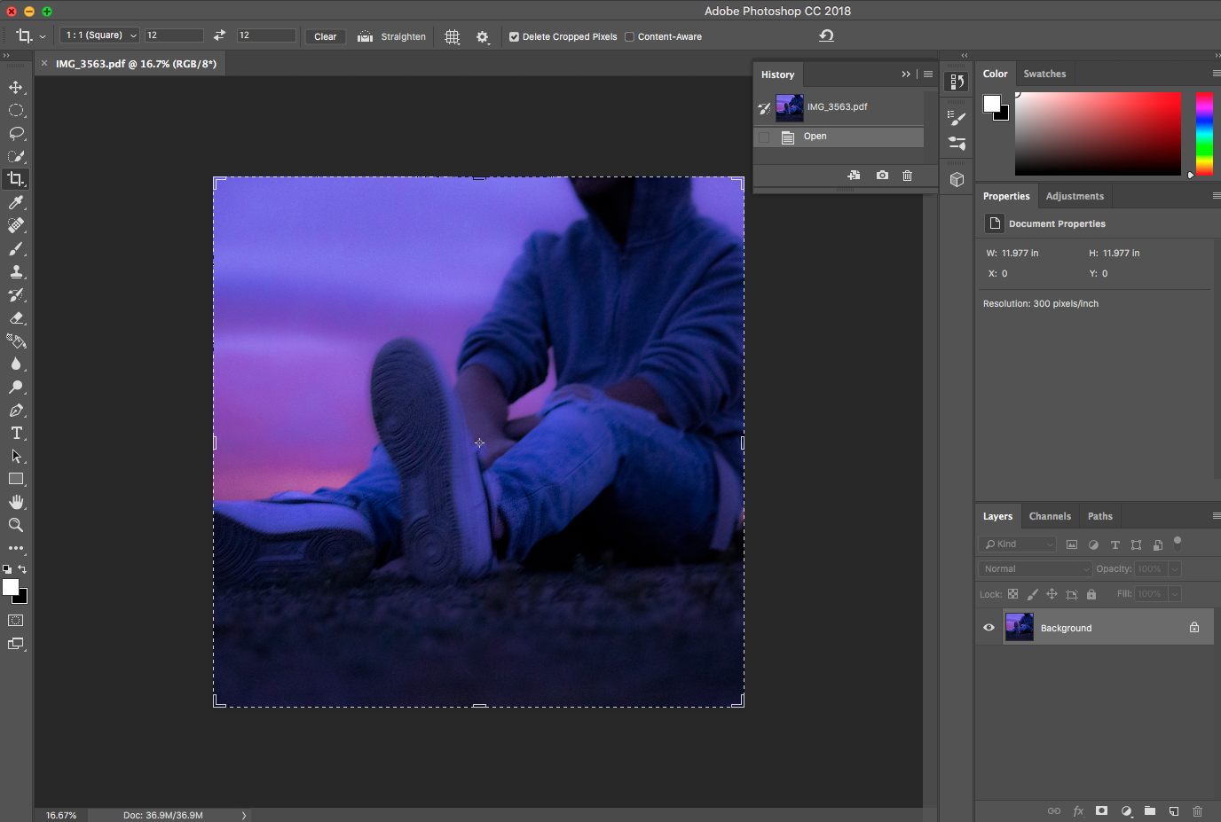
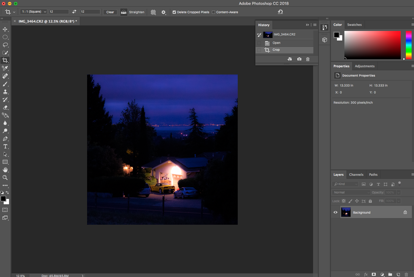
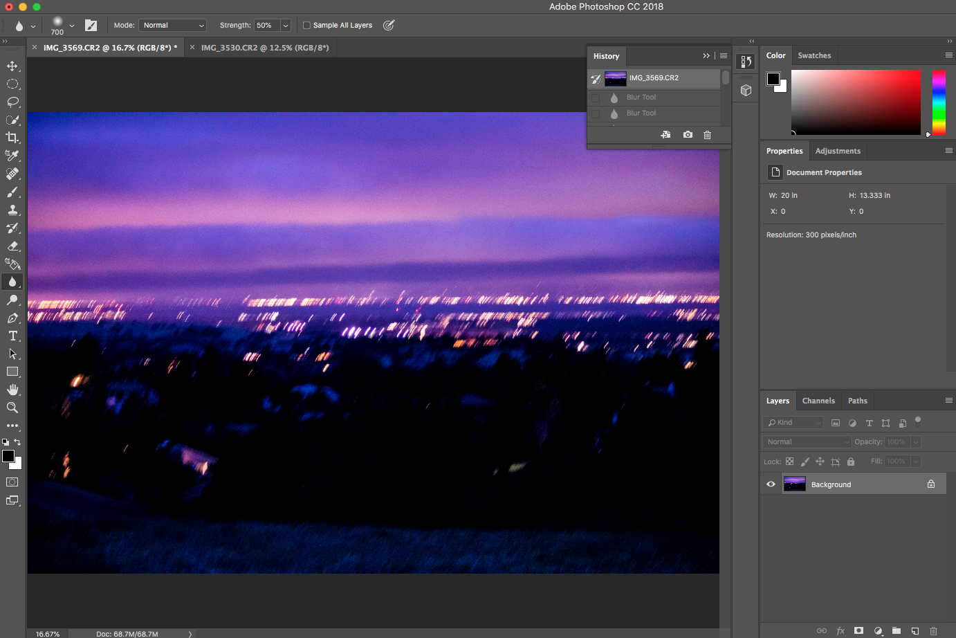
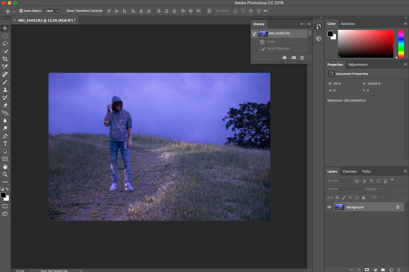
I started by questioning where the background in my photographs would be and what time of day as well. Because EDEN uses a lot of sunsets in the background of his photographs, I chose to shoot photos in Los Altos Hills, to get an outlook on the city and sunset during that time. My subject was my brother, who wore minimalistic clothing.
For the process of shooting, I took about 500 shots and only used 7 of them for my final project. I worked on my technique with shutter speed, aperture, and ISO settings.
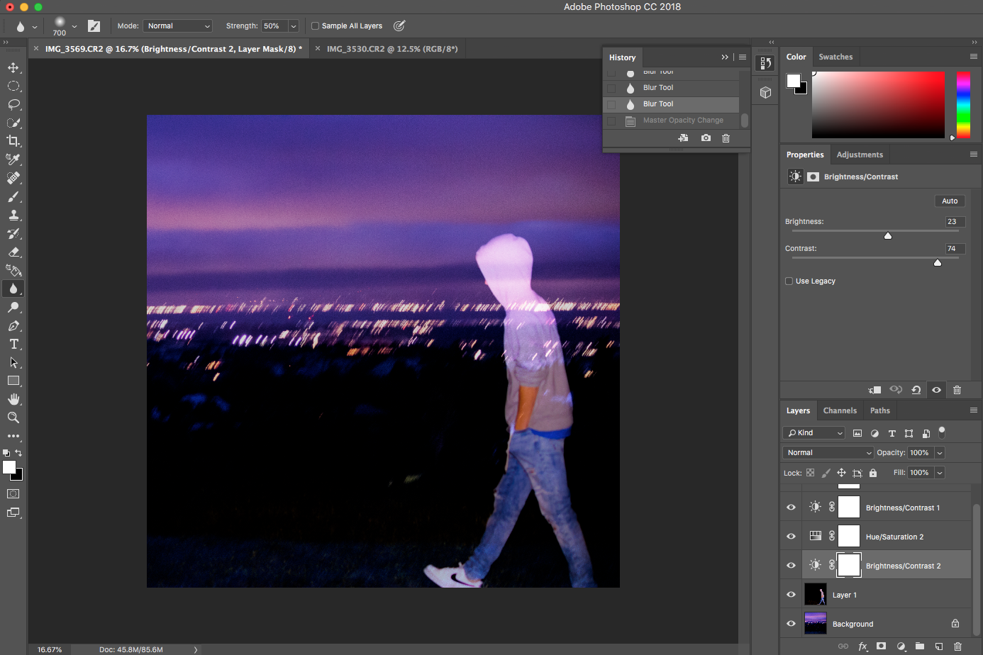
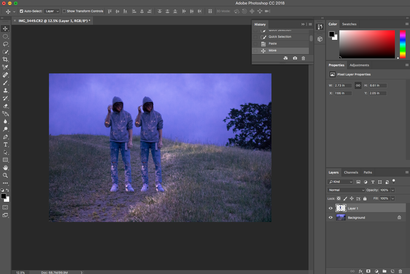
For this first album cover, I combined two photos using opacity levels. I took my first photo and selected the person to be the only thing apparent. I then edited the photo to enhance the purples and blues following the color scheme. I did the same with the second photo of the background outlooking the city and sunset. Once that was finished, I placed the first photo onto the second one, and reduced the opacity to 50% which made the boy’s body transparent. I cropped it to be a square for album art and placed the ‘SYD JOHNSEN’ cover title on it in a typewriter font. I made all of my artistic choices following the color scheme and minimalism.
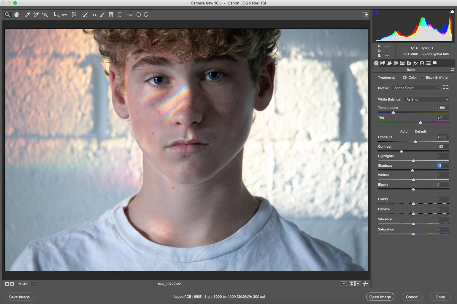
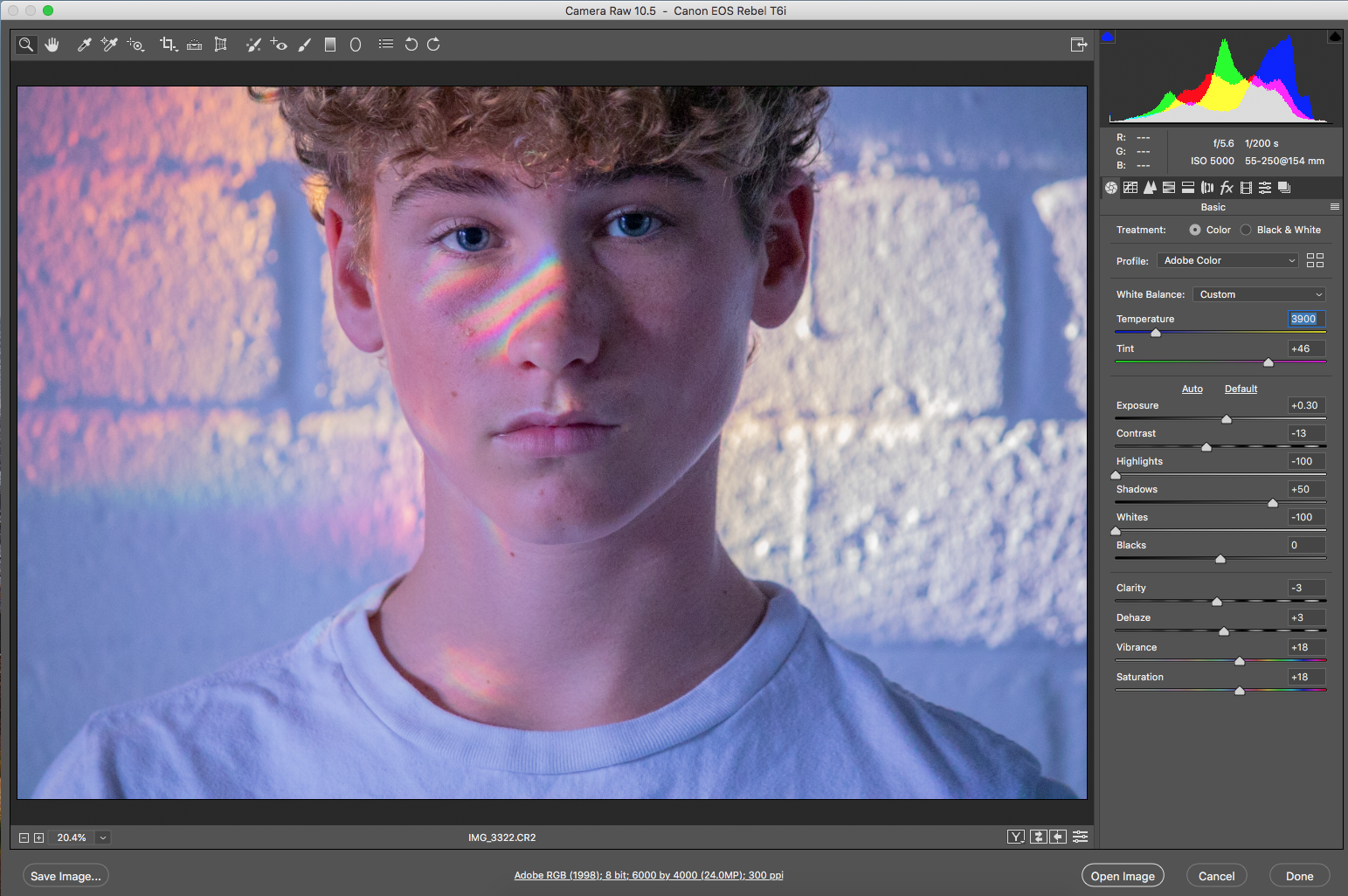
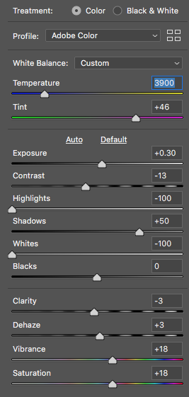
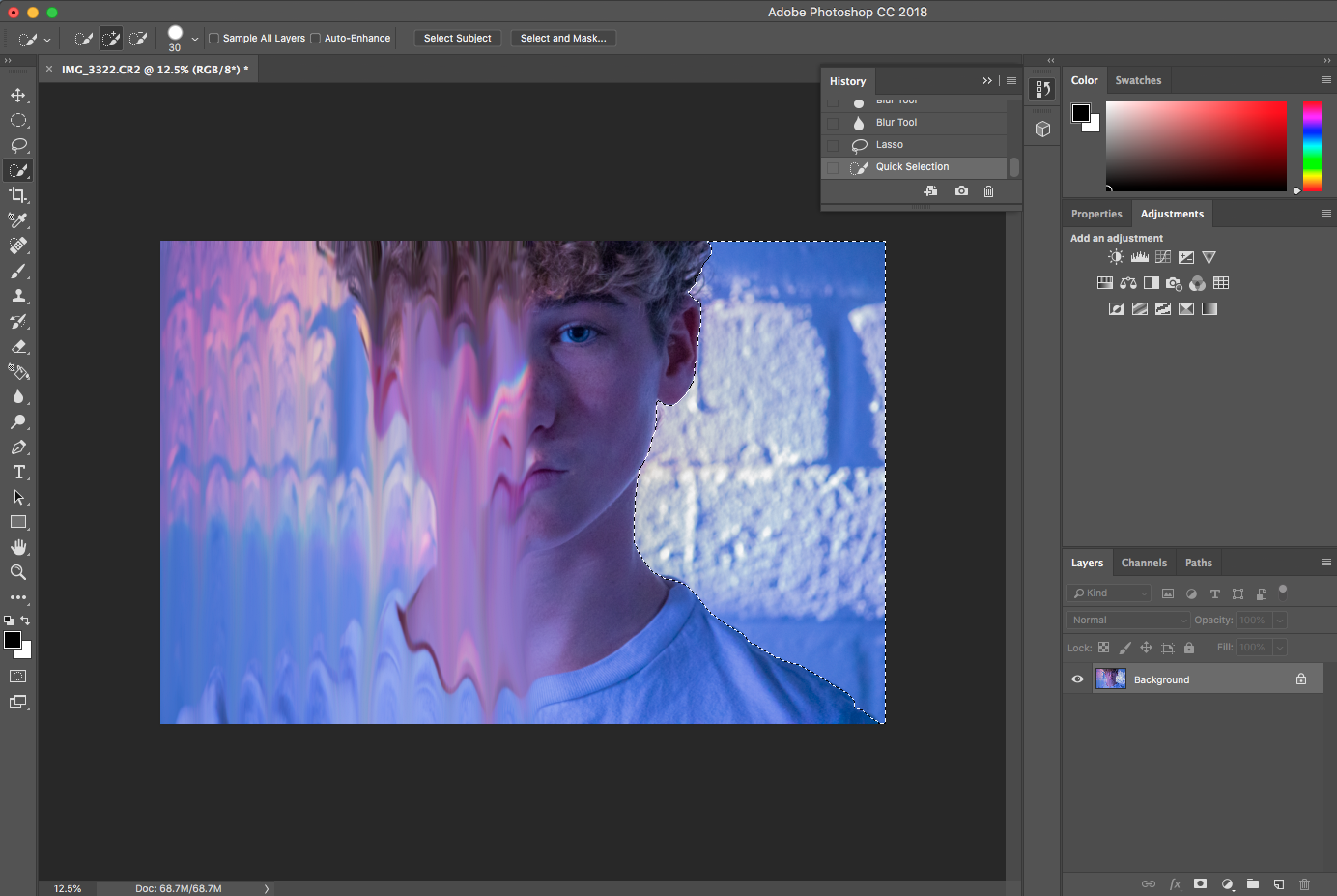
For this next cover, I redesigned one of the shots taken in EDEN’s ‘crash’ music video. I changed the temperature and tint of the photo to match the color scheme and had to enhance the purples and blues. I also did this by increasing the saturation and vibrancy of the photo. I also chose to learn a new tool in Photoshop called the Smudge tool. It took me many tries, but after tutorial videos, I got the hang of it and perfected my final piece.
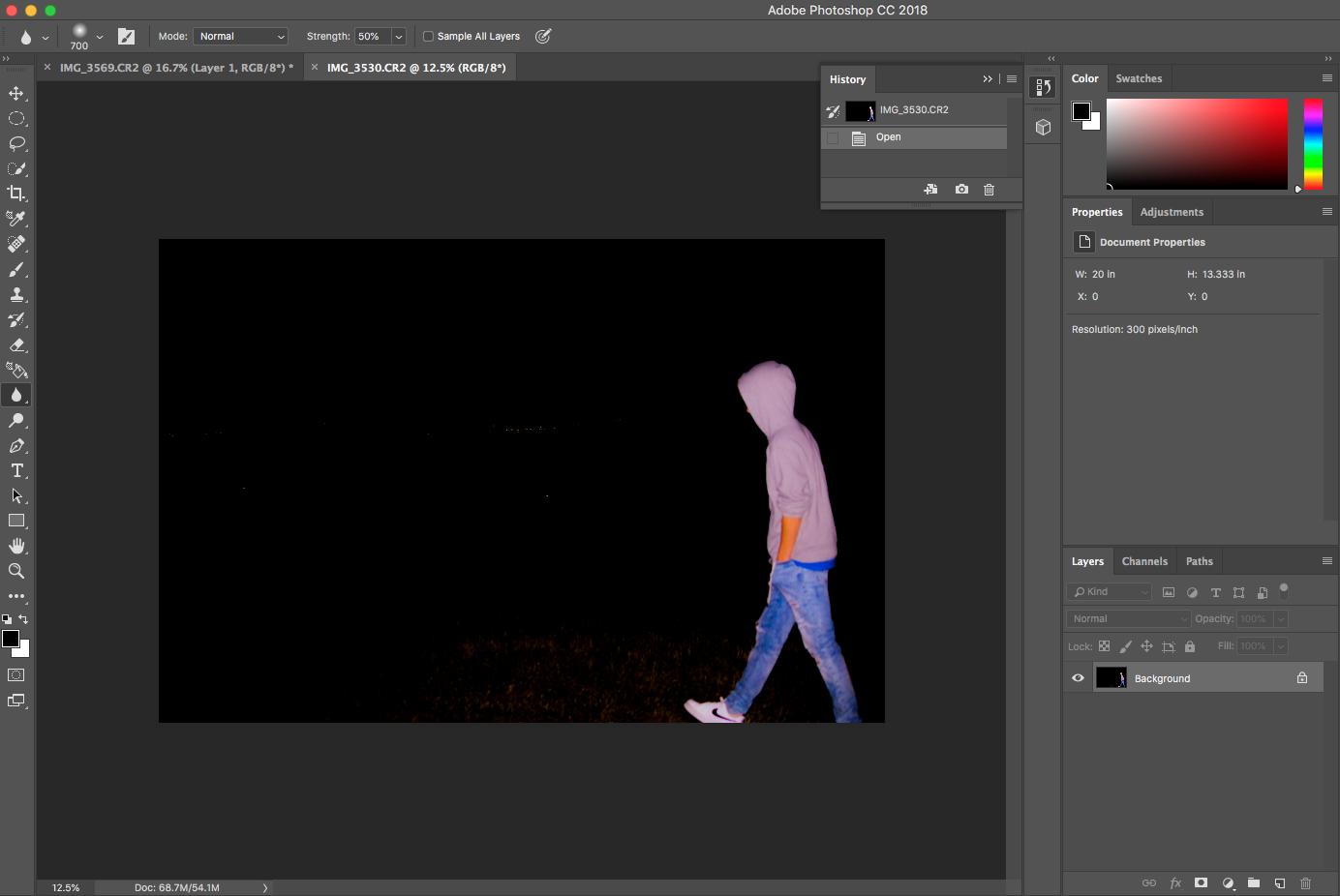
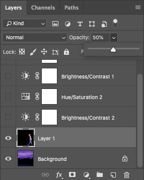
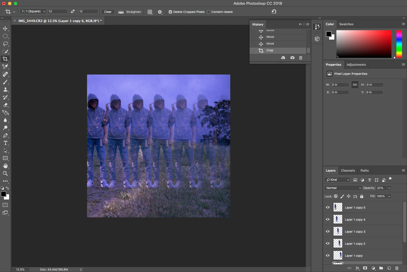
For the next album cover, I worked on my selection tool knowledge by selecting my brother’s body and placing him across the album cover evenly. As you can see, in the final project, I changed the opacity so that he became more transparent as you look towards the right.
For the final two album covers, I didn’t do any manipulation, but I adjusted the temperature and tint of the photographs in order to match the rest of the color scheme of the project as a whole.