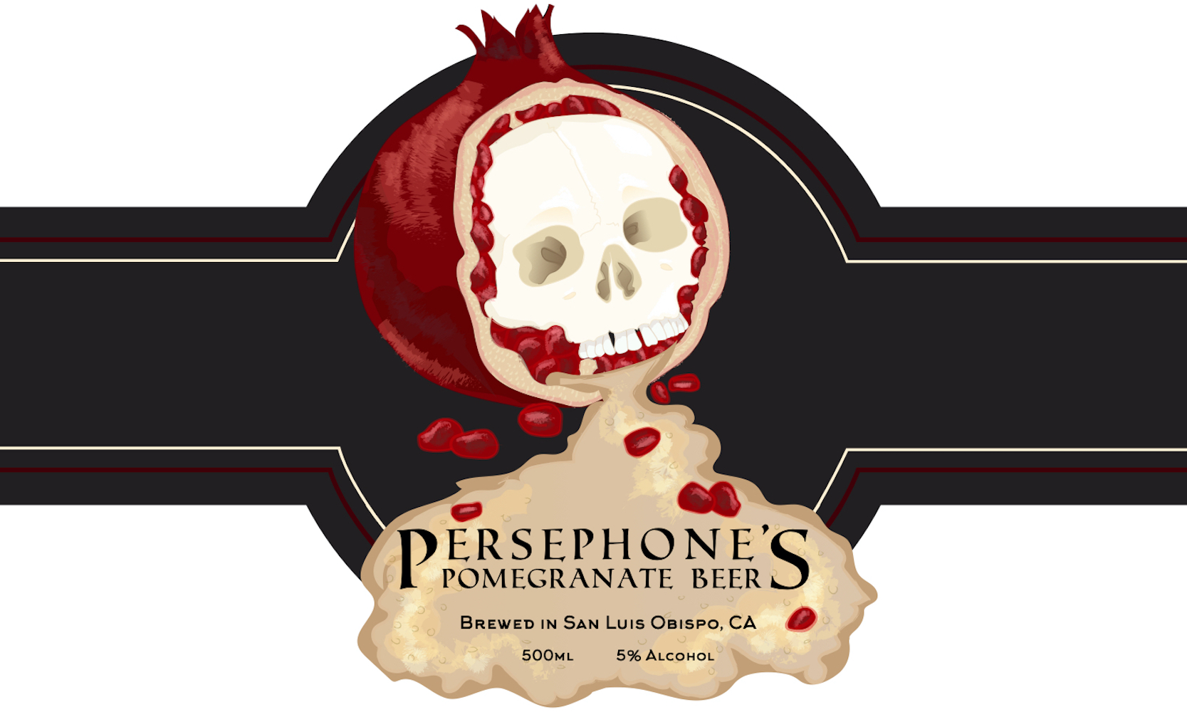
The concepts and styles that inspired me to design my beer label were aspects of Art Nouveau and vintage designs. I drew different pieces from these styles, such as semi-realistic imagery and straightforward labelling. This came across well using the analogous scheme I used of warm tones, therefore giving it a nostalgic scent of Autumn and Halloween. The fonts I chose also contributed to the more classic feel of the design, utilizing a more basic Roman font. By using this font, it also supported the title of the label itself, Persephone, the Greek Goddess of the changing seasons, famous for her love of pomegranates.
I created my label by utilizing the pen and pencil tools in Adobe Illustrator. Using these tools allowed me to reference and trace a stock photo to create a fusion of images. The images used in this piece were of an open pomegranate, a skull, and beer foam. As I built the outline of the piece, I used the photos themselves less and less, to the point where I only needed them for color reference. The issues I faced were few, as I’ve learned much from my past experiences with Adobe Illustrator. This time around, instead of spending hours and hours browsing and adjusting the brushes for each aspect, I stuck to one brush for texturing, giving the overall piece a sense of unity.
I learned more about how colors, patterns, and visual alignment influence the buyer’s standpoint, and the importance of detail. I chose additional merchandise (tote bag and t-shirt) due to the aesthetic I wanted my product to have. I was aiming for a dark-yet-attractive aesthetic that would appeal to those in a more alternative scene. Including these additional products helped me emphasize more that it wasn’t just a brand, but a visually appealing and beautiful label design.
Related website