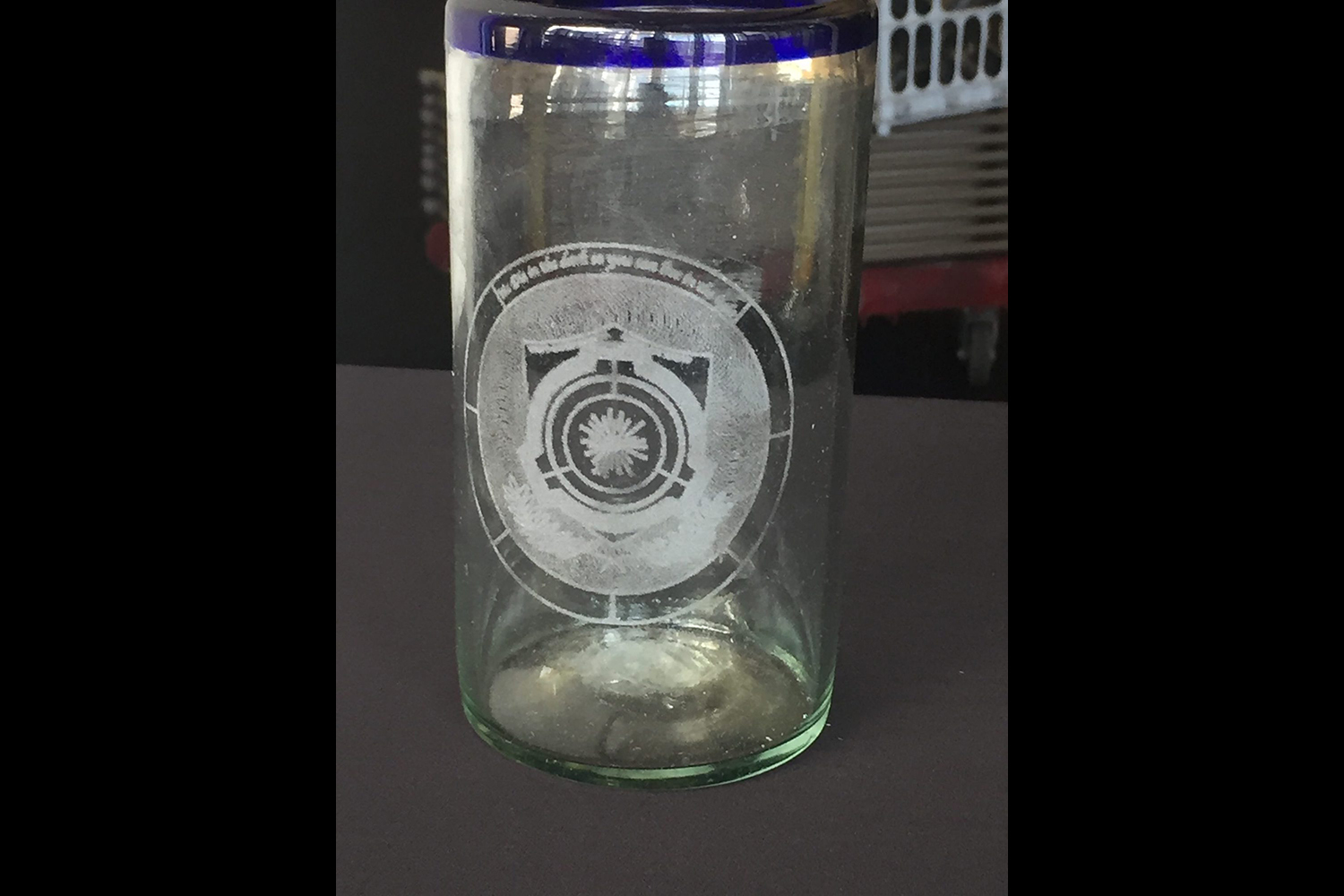
I wanted to have my own design for the foundation logo, I wanted to incorporate many of my own ideas for what the genre was too me. The genre is a science fiction genre about anomalous entities and the struggle of an organization to protect a world and hide the chaotic nature the phenomena and keep normalcy. Members of the community are people who make creative articles for the reading pleasures of others. Ordo contrs furor, roughly translates too order against the anger, and umbra est murus translates too the shadow of the walls. Which are mottos that I think an organization such as this one would claim as their own.I really love the genre and wanted to create my own sort of addition too it, I put the original motto of the SCP Foundation at the top of my document to complete my piece. The inside of my design aside from the logo contains an olive branch and shield, symbols of protection and peace, which I associate with justice. The very center contains a design that I made which I think looks akin to the Sun and its rays, shining light and our truth over everything else.
When making this project I learned how difficult it can be to create non-standard shapes. In Illustrator my knowledge of grouping and using different transformations enabled me to be able to create what I had envisioned. It also allowed my freehand design too look more or less completely centered and symmetrical. Creating spaced out lines between my circles proved to be very difficult and when looking at my art piece one can think that it isn’t perfect.
Related website