Street Photography
This assignment, in preparation for the next, was to go out in busy, public places over the span of one week and take pictures of people from a distance without them knowing. This assignment, in particular, was one of the hardest simply because I felt really awkward taking most of these pictures. because of that I also didn’t really like many of my photos because I was either rushing to avoid being seen or hiding behind something that actually interfered with the photo. Aside from my challenges, this assignment was quite enjoyable for me, as I got to try a new kind of photography, and I also think it pushed my artistic limits by forcing me to find beauty and art in common things.
Featured below is my Contact Sheet From this assignment. This was created using Adobe Photoshop.
SarahM_StreetPhoto
Citizen
Empathy
My Lyrical Essay focuses on the social exchanges and shifts in perspective that one has during the grief process after a great loss. I focused mainly on how my interview subject noticed the lack of empathy and recognition in her peers, and how she decided to deal with that.
I decided to photograph youth for this project because the most innocent and empathetic stage of who we are is usually when we are young. In order to achieve this, I took a trip to my local park. After taking over 200 photos, I narrowed them down by choosing ones that included more than one person in the photo. I wanted the child to be interacting with someone else to further highlight the idea of empathy in youth. I landed on this photo because I liked that the child was interacting with an adult because I thought it showed the idea of empathy fading over time as we age.
To create my diptych I used Adobe Photoshop. First I had to double my image side by side, and then work on the left side. I started by making my image black and white, and then later using the paintbrush tool to add color back into only the child. After this, I then made a selection using the lasso tool and pasted it on the right side over a plain black layer. FInishing the left side of the diptych, I went in and added a dramatic vignette in order to add emphasis toward the child and away from her surroundings. Lastly, I added in my text. To do this I used my text tool and typed out one word at a time. I then rasterized the text and used the warp tool to drag and pull the letters in whatever direction I wanted. I also chose this font because I wanted something more simple because I had a lot of words and I didn’t want the font to distract from that.

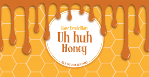
Food Label
Uh Huh Honey
After deciding to design a honey label, I knew I wanted to incorporate honeycomb into my design, which is exactly what I did. For my color scheme, I chose several different shades of yellow and orange to create a golden look for my label. I also chose a font that was playful and fun but also professional and easy to read.
Using Illustrator, I created my background layer of hexagons using the polygon tool and simply copy and pasted them repeatedly until they covered the artboard. After this, I added honey drips because I wanted to include additional objects on my label, though I didn’t want to distract from the honeycomb and wanted it to be obviously related to the product. To create the drips, I originally drew them out with the brush on one layer, and later went back in a traced them with the pen tool. I did this because I wanted to be able to go back in and edit or change them later. Finally, I went back in and added adjustments, highlights, and shadows to my entire label.
This project opened my eyes to just work much thought, time, and effort is put into something so small I learned just how much font and color scheme affects the feel of a piece of art. I decided to put my label on a mug because I felt as though my label had more of a relaxed, fun, and playful feeling. These are feelings that I personally also associated with mugs because you usually use them while relaxing and drinking coffee or tea, or on a desk with colored pencils or something playful filling it. I also chose a bag because I wanted to feature products that show my label more up close, and maybe on a less conventional item.
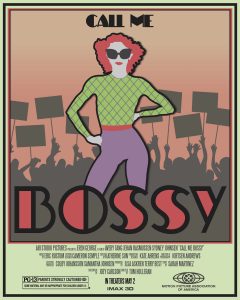
Movie Poster
Call me Bossy
My movie takes place in the 1960s and focuses on women’s rights. The story follows a young woman who has always dreamt of pursuing a career in journalism at a fashion magazine. After landing an internship at Trendsetter Magazine, she begins to think that her dream is slowly becoming a reality. Though a few months into the job, she was sexually harassed by her boss, and after discussing with her wildly feminist friends, they encouraged her to go to the police. After going to the police, and nothing being done, she decided to take matters into her own hands. After discovering all the abuse that had her boss had done to women in the office over the years, they all gathered and protested the office and the city courts that refused to acknowledge what had been done. The rest of the movie follows the movement that the main character leads and how they fought for justice. Eventually, the main character with the support of all the other women started their own magazine, called BOSSY, all about women and empowering them in the workplace. I used Illustrator to depict the main character leading a protest, which happens multiple times throughout the movie.
Kiki Koglenik, feminists and pop artist, was the inspiration for my movie poster. After moving to New York from Austria in 1961, Kogelnik took a dive headfirst into her work. Through her art and her life in general, Kogelnik continuously and openly defied gender norms. Kogelnik was not only one of the few successful female pop artists of her time, but also one of the few artists to ever use pop art as a platform to promote feminism. Pop art was commonly perceived as a male dominant and sexist art, though Kogelnik countered that and painted women in a new light. Most of her feminist art featured things such as body parts, bold colors, and fashion art aspects with very little form. I drew most of my inspiration from her pieces Now is the Time II, War Baby, and Green Lady. First off, I made sure to feature black outlines, flat layers, and bold fonts, to create the look of pop art. I used elements of design that Kogelnik featured in her art to create a piece illustrating my character leading some sort of protest or group of people. My art features a bold color scheme, use of pattern on the main subject to draw emphasis, and very 2D looking shapes. I also utilized Koglenik’s use of gradient backgrounds and fashion in my poster as well. I used a gradient in the background and put elements of fashion on the main subject
Magazine Advertisement
Formless Footwear
For this project, despite that I had already previously designed a product, I decided to take a more modern approach to my advertisement and create a new product. Her is where Formless Footwear was born. Formless Footwear is an online company that allows you to purchase ready-to-buy or custom designed and personalized Nike Air Force 1. My target audience is teens, probably ages 13-20.
To create this ad, I used Adobe Photoshop to create Air Force 1 stickers, Adobe Illustrator to create my designs and my logos, and Adobe InDesign to place everything together and for text and object effects.
Overall, I enjoyed the opportunity to create an entire ad in design because I feel like it is a good way to combine and apply all of the lessons and techniques that our previous projects have focused on. featured below is my finished Formless Footwear ad.