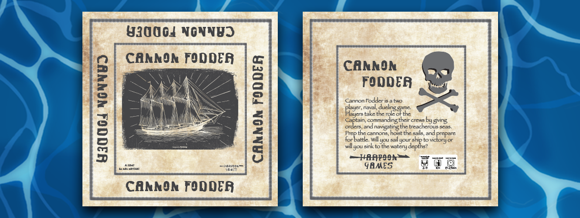
Having a captivating box is essential to selling your game in the board game industry. I wanted my design to be interesting and also showcase the nature of my game. I decided on a more simplistic design to show that my game isn’t very complicated, yet somewhat refined.
Originally, I was going to have the box be a dark shade of blue. I was very disappointed with my first draft, and spent a lot of time thinking about where I wanted to take the design. It wasn’t until a friend suggested to incorporate the aesthetic of old sea charts that I completely scrapped the blue and went for a parchment texture. I found a wonderful free piece online by the artist carterart, which I chose as the centerpiece of the box. The one thing I want to add to the design would be to include an image of the physical game on the back of the box, to show consumers what the actual product looks like. Due to the game not being complete during this design process, I was unable to take the photo of the finished physical game. Despite this drawback, I was very pleased with the final product.