Epiphanies Out of Fear
A diptych is two images that look very different, but relate to each other in some way. In Design class we took a few phrases from our personal poems, and photographed images that represent the phrases to form a diptych. We used photoshop to edit the photos' exposure, saturation, and temperature. Then we put the two photos together on an artboard.
Artist Statment
“The pressures, the fear”
“Everything is released and I reach enlightenment”
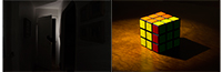
For the first statement I photographed a dark hallway as seen on the left. At the end of the hallway is a slightly opened door, and if you look closely you can see a hand grabbing the door. This represents age old fears that everyone knows are just tall tales to freak you out, but you can’t help but get a little nervous when you hear or think about it. On the right of the diptych is a photo of a Rubik's Cube and you can see that you only need one move to solve the puzzle. This is a metaphor for enlightenment or when you are tackling a difficult subject and you finally get that ‘eureka’ moment.
For the left side I set up a flash to go off behind the door so that when I took the picture, the flash became the only source of light. This gives the picture an eery glow to emphasize a sense of fear. I also took the picture after dark and turned off all the lights to ensure that the extra flash is the only source of light. I used my sister to model the hand coming out of the doorway and wrapped her hand around the door so that it looked like she was opening it. Then on Photoshop I darkened the side of the hallway so you couldn’t see the pictures on the walls as much. This helped bring the focus to the doorway. In the photo on the right, I angled the cube and the lighting so that the cube’s shadow mimics that of the light coming out of the doorway in the left picture. On the right there is a spotlight around the cube to help emphasize the idea of an epiphany. The light also helps give the picture a bit of an eery glow similar to that on the left. I chose the right picture to have a lot more color, especially warm color, so that it feels more comforting to the viewer. It also help the picture pop out more than the left. This again is to emphasize an epiphany.